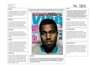
Salford City College
Eccles Centre
AS Media Studies
Foundation Portfolio
Masthead
The masthead is located across the primary optical
area and the terminal area. This is a typical layout
for mainstream magazines. It is a bold serif font in a
bright blue colour which contrasts from the
background.
Main image
The main image is a close up image of Kanye west
and is framed by the text. Readers will recognise
Kanye West and be drawn to the magazine
therefore buying it. The image also has direct
address drawing you to the magazine even more.
Model credit
The model credit is incorporated in the main
coverline. This could be to emphasize on having a
well-known artist like Kanye west appearing in the
magazine this would attract a large audience to the
magazine.
Coverlines
The coverlines feature other artists that appear in
the magazine this will attract a wide audience to the
magazine as it branches out to fans of the artists.
There is also a coverline along the top of the
magazine which states about an exclusive report
this will attract readers because I cannot be found
out anywhere but in this magazine as it’s an
exclusive. The coverlines help frame the main
image.
Main cover line
The main coverline is situated in the primary optical
area this is so it is one of the first things a reader
would see. The main coverline quotes Kanye west
saying ‘he is rap’ this is effective because it adds
personal quality to the cover. The quote is made to
stand out because it is in blue whereas the rest of
the main coverline is in pink.
Colour
The main colour scheme used within the cover is black,
pink and blue. The magazine uses the bright colours
which contrast well with each other to stand out. The
colours used are quite unusual because they are
generally feminine colours whereas the rap culture and
the cover of this magazine is more male dominated.
Typefaces
The serif fonts used are large, easy to read and well-
spaced out. This gives the cover a more formal look.
However in the main coverline a sans serif font has been
used this gives the magazine a more smooth look fitting
to the genre.
Photography Lighting
Low key lighting has been used on this image to
emphasize on Kanye Wests face. This also contrasts well
with the bright coloured writing. The centre of his face
has been illuminated slightly this is to draw the reader to
his eyes and feel intimidated. This links in well with the
main coverline were he says ‘I am rap’ and also with the
genre of music.
Design Principles Used?
The Guttenberg design principle has been applied to this
front cover because the main coverline is located in the
primary optical area along with the masthead which also
crosses into the strong fallow area. This means these
items will be easily seen and then easily recognisable.
There is empty space in the terminal area and the weak
fallow area.
House Style
The house style of ‘VIBE’ is the large masthead in a serif font along the top of the magazine.
This gives the cover a more formal look to attract an older demographic. The majority of the
text on the cover has been capitalised this along with the main image gives the magazine a
more formal and stern look.
Comment on how the design of the magazine cover attracts the target audience: the cover attracts
its target audience through its use of the contrast between bright colours on a dark background.

Magazine cover analysis_vibe

  • 1.
    Salford City College EcclesCentre AS Media Studies Foundation Portfolio Masthead The masthead is located across the primary optical area and the terminal area. This is a typical layout for mainstream magazines. It is a bold serif font in a bright blue colour which contrasts from the background. Main image The main image is a close up image of Kanye west and is framed by the text. Readers will recognise Kanye West and be drawn to the magazine therefore buying it. The image also has direct address drawing you to the magazine even more. Model credit The model credit is incorporated in the main coverline. This could be to emphasize on having a well-known artist like Kanye west appearing in the magazine this would attract a large audience to the magazine. Coverlines The coverlines feature other artists that appear in the magazine this will attract a wide audience to the magazine as it branches out to fans of the artists. There is also a coverline along the top of the magazine which states about an exclusive report this will attract readers because I cannot be found out anywhere but in this magazine as it’s an exclusive. The coverlines help frame the main image. Main cover line The main coverline is situated in the primary optical area this is so it is one of the first things a reader would see. The main coverline quotes Kanye west saying ‘he is rap’ this is effective because it adds personal quality to the cover. The quote is made to stand out because it is in blue whereas the rest of the main coverline is in pink. Colour The main colour scheme used within the cover is black, pink and blue. The magazine uses the bright colours which contrast well with each other to stand out. The colours used are quite unusual because they are generally feminine colours whereas the rap culture and the cover of this magazine is more male dominated. Typefaces The serif fonts used are large, easy to read and well- spaced out. This gives the cover a more formal look. However in the main coverline a sans serif font has been used this gives the magazine a more smooth look fitting to the genre. Photography Lighting Low key lighting has been used on this image to emphasize on Kanye Wests face. This also contrasts well with the bright coloured writing. The centre of his face has been illuminated slightly this is to draw the reader to his eyes and feel intimidated. This links in well with the main coverline were he says ‘I am rap’ and also with the genre of music. Design Principles Used? The Guttenberg design principle has been applied to this front cover because the main coverline is located in the primary optical area along with the masthead which also crosses into the strong fallow area. This means these items will be easily seen and then easily recognisable. There is empty space in the terminal area and the weak fallow area. House Style The house style of ‘VIBE’ is the large masthead in a serif font along the top of the magazine. This gives the cover a more formal look to attract an older demographic. The majority of the text on the cover has been capitalised this along with the main image gives the magazine a more formal and stern look. Comment on how the design of the magazine cover attracts the target audience: the cover attracts its target audience through its use of the contrast between bright colours on a dark background.