SlideShare a Scribd company logo
Masthead-Is boldandconventionallyplaced inthe top third, is usually
formattedbehind the image as it is easily recognisable. “Kerrang!” is a
strong title that is impactful andreflects the genre well as it is a harsh
word whichcan relate to rock and metal music. The title also harmonises
with the image nicelyas well as theyare very energetic and controversial.
Buzz/Puffs- Are short advertisements to endorse a
consumer to buy their product in this case using
competitions to tempt the reader to buy the issue.
The use of drop shadow and the shape of the puff
replicate thislookof anadvertisementwhichmakesit
stand out from the image and shows importunacy to
attract the reader to important information.
Banner- Advertisesspecialfeatureswithinthe magazine
almostlike abuzzword.These are usuallyfeaturedin
thisparticularmagazine howeverthe formatisslightly
differentdependingonthe frontimage andis
sometimesplacedonthe bottomof the page. This
bannerhas a strongdark backgroundwithpreviewsof
the postersitis advertisingalongwithvariousother
imageswhichletsthe readerassociate thatspecific
productwiththe band. Usuallythisbanneradvertises
postersinmostissues.
Strapline-asubheadinginanewspaperormagazine
article or inany advertisement.Inthiscase the
strapline isn’tactuallypurposelyadvertisingthe article
justsuggestingitscontentsasa part of the coverline
storyand producesexcessknowledgeaboutitthan
the actual coverline title.Thisisaffective topersuade
consumerstobuy theirproductas itteasestheminto
wantingtoread the full article within.
Coverlines- Goingagainstoriginalconventionsand
are placedonthe right handside of the page andare
usuallyplacedonthe left.Shortinformative
sentencestosave overclutteronthe page specifically
causedby the image whichallowsthemtobe clearly
read. The use of drop shadowanda bright
backgroundcolourmakesthe textreallystandout.In
thisissue there are several cover-linesandunusually
a lot of themformattedinseveral placesaroundthe
page almostas if to fitas many interestingstoriesin
as possible withouteffectingthe maincoverlinesand
othercontentaroundthe page.
Colourscheme- Usuallyaparticularcolourscheme is
carriedthroughoutthe multiple issuesof the
magazine howeverisnotalwaysnecessary;However
thisisa magazine thatdoesfollowthatparticular
conventionasthe mastheadisusuallyredandother
titlesandcoverlinesvarybetweenredandyellow
withblackor white boardersandthistheme is
followedthroughoutthe magazine.These coloursare
veryboldand standout verywell toattract as much
attentionaspossible andallowingeverythinginthe
page to be eye catchingas the page is busyandcan be
difficulttotryand observe all the differentaspects
but due to the colourscheme ishas harmonisedthat
conceptand allowsthe texttobe visible andvisually
interesting
Barcode/date/price- usuallyunderthe codesand
conventionsthe placementof barcodes,pricesand
date/issue numberisusuallyseparatedwiththe barcode
discreetlyplacedinthe cornerandthe restof the
informationelsewhere onthe covernormallylocatedbythe
mast head.
Image- the frontcoverimage inthisissue followsthe
conventionsof usual magazine imagesintermsof
format,a mediumclose-upformatof the mainfigures
givesanappropriate amountof content,The image is
alsoplacedon the rightside of the page ratherthan
centredas itcreatesmore room on the leftthirdof
the page tobe filledwiththe large coverline and
othermultiple imagesinthiscase withoutcorrupting
the overall image.The use of compositionis
interestingasthere isone mainfigure alongwiththe
restof the membersfromthe bandincludedinthe
backgroundwhichcreatesa depthinthe photograph
whichworkswell due tothe consistentlayering
throughoutthe cover. The use of multiple imagesis
interestingasmostmusicmagazinesdon’talways
include thishoweverworkswellincorrespondence
withtheirspecificcoverlinesthathave beenincluded
at the bottomof the page.
Title- the fontandthe backgroundmakesthe title veryboldand
informative howeverisstill veryinterestinganddoesnottake up too
much of the page,The fontisa similarfonttosome of those usedon
the cover page therefore there isasense of fluiditythroughoutthe
magazine.The shape of thistitle isalsodifferentfromsome of other
publications.
Issue numberanddate- Althoughthisisincludedon
the cover page itis usuallyincludedinthe contents
page alsoas a part of variousconventions.
Image- Imagesonthiscontentspage are obviouslythe
maincoverstoriesandthe inclusionof these onthe
contentspage isto buildadditional interestsandalso
to create a sense of fascinationof the story.Inthe
OzzyOsbourne image Ilike howthe background has
beencroppedbehindthe subjectandappearsasif the
Ozzyisn’ta part of the image and islayeredtolook
layeredwhichsimilartechniquesare usedonthe cover
page.These imagesare obviouslysetupfromaphoto
shootand are notnatural imagesthatthe editorshave
decidedti use howeverhave deliberatelytakenthese
specificpicturesasa part of creatingthispage and to
enthuse the consumerstoreadthe articlesavailable.
Folios- The Foliosare the mostimportantkeyelement
of a contentspage as itis whatnavigatesthe readerto
each article thereforetheymustbe informative yet
lookattractive.Theyare usuallycharacterizedinto
sections,eitheralphabetically,chronologicallyandalso
by contents.Usuallyfolioscanbe organisedintermsof
the contentand similarcontentcanbe grouped
togetherandinthisinstance itis clearthat the editors
have usedthismethodtoorganise theirfoliosand
each article hasbeenputintoa category e.g.news,
feedbacketc.The folioshave beenformattedinthe
centre thirdof the page,there isno specificconvention
to followintermsof formaton the contentspage as it
isnot visible whendisplayed,thereforethe editors
have decidedtoplace itinthe middle thirdtodraw
attentionfromthe twocoverfeaturesabove and
below,itmayhave alsobeenplacedtobalance the
compositionof the page andto fitin the gapsbetween
the two articles.
Review-The maincoverstoryusuallyhasa
review,abrief summaryof the article asa
formof a teaserto persuade the viewerto
readthe storythere isalmostalwaysa
reviewinamagazine contentspage to
explainpartof a particularstory. Although
inthiscase ismixedwiththe editorial andis
usuallyseparate fromthis.
Editorials- inmostmagazinesthere issome
formof letterfromthe editortointroduce
the magazine howeverthere isnotone in
thismagazine howeverisonlyone fromthe
mainfeaturedbandinthiscase “blackveil
brides”therefore the reviewthatisat the
bottomof the page acts as an guest
editorial howeverthisisobviousfromthe
title whichisveryliteral.
Colourscheme- Asapart of the codesand
conventionsof magazine publication
usuallyaparticularcolourscheme is
completedthroughoutthe magazineand
usuallythroughouteachmagazine andwill
veryrarelychange howeversome change
theircolourschemeseveryissue.Thisred’s,
Yellow’sandblackhave beenfollowed
throughfromthe frontpage whichisstill
effectivewhenemphasisingaspecificpiece
of importantinformation.The blackandred
colourscontrast well alongwithwhite
therefore reallydrawsthe viewers’
attentiontothese bigblocksof colour.
Subtitle- Thissubtitleshasalayoutand
overall impactverysimilartothe
contentspage howeverhasnospecific
conventionslimitingthe positiononthe
page as longas there is an obvious
sense of flowespeciallyfocusedon the
text,inthiscase doesnot affecteither.
Title- inthiscase the title isverylarge and colourful against
the backgroundit hasa sansserif fontwhichisconsidered
more modernand representsthe magazinewell.The titleis
one of the firstthingsthatthe eye of the consumersee’s
firsthoweverinthiscase isprobablyfocusedmore onthe
image howeverthe title Isjustaseffective becauseof the
size,contrastand vibrancy againstthe background.
Pull Quote- aPull Quote isa piece of text
highlightedandemphasisedinanarticle said
by the articlessubjects.Pullquotesgenerally
breakup the large amountsof textandcreate
a focus pointwithinthe bottomrightsection
of the page.It alsoallowsthe readertofeel
personallyconnectedwiththe subjects.
Image- the mainimage represents
the interestsof the intended
audience andisnot the main
coverstory howeverits
importance seemsinflated
throughthe use of imagery.This
image representsa“Fall outboy”
concert andby showingthisimage
wouldappeal tothe target
audience due tothe coloursand
the overall impression.The image
flowsoverbothpagesandfills
almostall of the page whichstates
itsimportance.The image has
beenformattedsothatthe main
bandmemberisfocussedtowards
the textwhichallowsthe article to
flowintermsof how the
consumerwill followthe content.
Folio’sandeditorcredit- These
are followedthroughoutthe
magazine inthe corner,it isnot
visible onthisphotocopyhowever
doesfeature onbothof the
cornersof bothpages.On the
bottomrightside of the second
page there isa small quote of the
editorwhichstatestheirnames
alongwiththeirphotographers
whichdoesnotchange the layout
of the page and justdiscreetly
givesthe informationwhichis
usuallyvisible tothe readerwhen
theyturn the pagesdue to its
cleverplacing.
Columnsandformatting- Columnsonthese pagesare featuredinalandscape format
howeverinsmall columnswhichflowinthe waythatthe consumerseye wonderswhich
allowsgoodflowanda tidierpage alongwitha more accurate informativearticle asitis
fullyunderstandableinthe orderithas beenplaced. The articlesandall the textonthis
page has beenwritteninasans serif fontwhichlooksinformalwaytoattract the reader
more.
Drop Cap- Drop cap is usually
where one specificletterhas
beenemphasisedtostandout
specificallyatthe beginningof
an article or paragraph to
encourage the flowof text.
These Dropcaps are usually
emphasisedthroughcolour,
scale and alsofont.In thiscase
there Isonlyone of the entire
page at the beginningof the
article.
Standfirst- A standfirstisa
brief introtothe featured
article to entice the readerto
continue tobe interestedinthis
page and itscontents.It is
usuallyemphasisedthrough
font,size or colourandis similar
to a synopsis.Thisstandfirstis
veryshort andsnappyto get
straightto the pointand uses
colourto enhance the band
name.
Mast Head- Islarge and formattedbehindthe mainimage which
followscodesandconventionsasusuallylongermastheadtitles
are formattedbehindthe image.The title “Total Guitar”ismore of
a factual name to obviouslystate the theme of the magazine.
Price/Date/Issue Number- Thesevital
elementsof amagazine have beencleverly
placedwithinthe mastheadasa part of the
word;thisis convenientbecause itdoesn’t
waste space on the paperthat can be filled
withmore content
Strapline- Inthiscase the strapline isalmost
like aslogan to advertise purchase,Itisalso
factual alongwithdecorative.Some other
straplinesinthisissue have beenplacedinto
appearlike a puff forexample underthe main
coverline whichcanvisuallyattractthe
consumerto readthe straplines.
Buzz/Puffs –There are multipleof these onhis
page that are effectiveintheircontentfor
example “free digital edition”isagoodform of
advertisementasthe consumerfeelsthatthis
magazine isa goodvalue formoneyand also
connectswiththemthroughsomethingthat
theyrelate too,inthiscase technology. The
use of vibrantcoloursare veryeffectiveto
catch the eye of the consumerbecause there is
multiple coloursonthispage howeverthere
are a fewelementsthatstandoutmore than
otherswhichiseffectiveuponsellingthis
product.The use of differentpuff shapesinthis
issue isalsoveryeffective asthe page doesn’t
seemlike ithasbeenfilledwithrepetitive
contentand isdifferenttothe usual standard
puff shape.
Banner- Inthiscase the Banneris not as obviousasitis
not separatedfromthe page bycolour or bya box which
workswell inthismagazine andadvertisesmanydifferent
productsthat can be foundwithinthe productwhichis
effectiveinselling;tobe able to sell anwide varietyof
produce;whichwouldenthuse the buyer. Itisformatted
at the verytopof the page underthe codesand
conventionsbecauseitcanbe visiblefromthe shopshelf
and advertisesthisproductjustbuyshowingthe verytop
thirdof a page.
Coverline- Thismagazine islimitedinthese andhas
focussedonone dominantcoverline whichislarge
enoughtofill the leftthirdof the page and perhapseven
more howeverisveryeye grabbinginresponse tothe
image throughitsscale and colour.It usesa famousname
to gainattentionfromthe readerthat wouldbe an
influential figure inthisgenre of music.The smallerCover
line isa lotlessemphasisedprobablybecause of itsless
knowncontentsinresponse to“slash”howevercanstill
be eye catchingbecause it has beenplacedinanempty
part of the page as an attemptto fill the page andto
equallybalance the composition.
Image- The maincoverstory image hasbeenformatted
similarlyto“kerrang”onthe right side of the page to
balance the coverlineswiththe image andalsonotto
interruptthe mastheadtoo much.It is a mediumclose
up witha directgaze intothe camera. Theiruse of props
isappropriate forthe magazine due to itsgenre andalso
title thereforeattractsa lotof readers.
Background- Althoughthere isnotmuchcolourinthe backgroundthere isstill
evidence of shadowsandgradientsinthe backgroundwhichpersonallyIthinkis
veryinterestingasit’sa subtle a change in colourhoweverIthinkcompletesthe
page as it fadesintothe coverlines.Ialsothinkthatthe backgroundcontraststhe
mastheadverywell astheyare complete oppositeshoweverIthinkworkswell to
emphasise the mastheadasmuch as possible aswell ascreatingacleanand
finishedfeel.
Barcode/ Date/Price and Locationof printing- Althoughsome of thisinformationhasbeen
repeatedelsewhere inthe magazineitstill followsthe codesandconventionsof the mediain
magazine productionasthe barcode recordspurchasesandrequiresdate tothe manufacturer
and isusuallyplacedIna cornerof the magazine usuallyinthe bottomthirdsomewhere
where itiseasilylocatedforthe ease of the shopsalesrepresentative.Althoughitisquite
large it hasbeeneasilydisguisedbythe inclusionof acolouredbannertodistractattention
away fromit.
Colourscheme- Inthispage the colourscheme is
unusuallynotcontinuedthroughoutthe pages
howeverissimilarasredandorange harmonise
each otherandred isthe fundamental colour
alongwithyellowtomake orange therefore they
can linkina similarwayto this.Thispage is very
much limitedincolourasthere isonlya few
differentcoloursthatare importanton thispage.
Title- Thiscontentstitle isaverybasicfonthoweverisveryboldandclear,
thisdrawsmost of the attentionalongwiththe image andsubheadings
howeverisdominantlymore eye catchingthanthese.
Folio’s- Inthiscase the folio’shave been
organisedinchronological orderfor efficiency as
thismagazine isgreatlyformative therefore this
organisationwouldbe more appropriate
althoughthere isa separate categoryforfeatures
alongside the monitorcategorythisshowsthat
feature andeffectiveorganisationhasbeen
considered whenarrangingthesearticles.The
Folio’sonthispage has onlybeenformattedon
the right handside of the page alongside the
maincoverstory image.
Image- The editorshave usedasimilarmainimage
to the cover page whichsuggeststhatthese are
linkedanditisthe main coverstorytherefore
suggestswhyitisthe largestimage onthe page so
that itis the mainfocusof the magazine to
advertise thisspecificmaincoverstoryalongwith
the otherlessimportantarticles.Thismain
photographislargerthan the traditional cover
page medium-close uphence the reasonthatitIs
the contentsimage andnot the coverpage.There
isno specificreference of directionof eye contact
suggestedbythisphotographyotherthanthe
guitarthat pointsto the foliossuggestingthe
connectionandthe change infocus.The three
smallerimagesisobviouslynotstudiobased
photographyanddo notconnect withthe camera
like the mainphotographydoeswhichsuggests
that theyare notas importantas the main“slash”
coverstory,thisis alsoobviousdue toitsformat,
three consistentlysmallerimagesatthe bottomof
the page,there isno special eye catchingsubject
matterin anyof these images.
Reviews- Thereisverylittle article reviewsin
thismagazine andonlyincludesshort/brief
explanationsof eacharticle howeverdoesnot
describe anyparticulararticle ina lotof depth
includingthe maincoverstoriestherefore all of
these elementssuggeststhatthispage was
plannedtobe organisedandnot specifically
appealingtothe eye.Every magazine will usually
include some kindof reviewwhendescribingthe
foliosof the magazine itisvital forthe consumer
to understandwhattheyare buyingwhichisthe
purpose of the contentspage and itsreviews.
Editorials- Usuallyinmagazinesthere are multiplelettersfromthe editorshoweverthisissue doesnotincludeaneditorial
howeverdoescreditthe editorsname inthe bottomlefthandcornerwhichsuggeststhattheydidnotwantto emphasise
thisinanywayas it wouldbe difficulttoinclude anymore informationonthispage withoutpossiblydeletingaimage
whichthenwoldleave the overappearance andcompositionof the page unbalanced.
Date- The date of thisspecificissue hasbeen
placedinthe bottomcorner of the page whichis
usuallyincludedinthe contentspage througha
seriesof codeshoweverthishasbeenverysubtly
placedinthe corner ina small fontwhichsuggests
that thisinformationisnotimportantasithas been
repeatedonthe previouspage therefore itis
unnecessaryinformationandhasnotbeenplaced
for the reader.
Image-The image isveryvisuallyattractive andthe mainfocusof
the both pagesdue to the intense backgroundcoloursandthe
contrastingforegroundcoloursof the yellowandpurple tint.
Althoughthe subjectisnotfacingthe article the linesinthe guitar
are and thislinearshape focusesthe attention tothe article along
withherpose isbenttowardsthe article andtherefore distracts
the readerfrom the image thentothe article whichisthe
intension.
Advertisement-There are
variousadvertisementsonthis
page,the most obviousisonthe
rightside of the secondpage as
an advertisementforguitar
accessorieswhichisveryeye
catchingdue to its strongly
pigmentedcolourationhowever
balancesthe colourfromthe
otherpage so it doesnotappear
to lookempty.The otheradvert
isin the top cornerof the first
page where itis advertising
ShawTaylor’sTour ina very
discreetandinformativeway.
Title-The titleonthisdouble page spreadisverysimilarthroughout
the magazine includingthe frontcover,howeveritcontrastswell with
the white backgroundandboldlystandsout.The firstfocuson the
secondpage isthe title due toitsformatplacingis withinthe topthird
similarlytothe coverpage and thisplacementcreatesflowwithinthe
page and the articlesdue to our culture.
Foliosandeditorial credit-SimilartoKerrang
there isa small sectiononthe bottomof the page
that givescredittothe editorand identifiesthe
issue date.Thishasbeenplacedhere sothat it
doesnotdistract attentionawayfromthe image
whichisthe main focuson thispage alongwith
the overall article.
Columnformat-There isonlytwocolumnsonthispage andflowsverywell withlittle
interruptionfromdropcapsand pull quotes.Thispositioningworkswell tocontinue
the flowof eye contact,it alsocontinuesthe geometricflowasthe whole double
page spreadhas beengeneralisedinacolumnformat.The use of informal language
relatestothe readerand doesnotover complicate the overall article.Thisarticle has
beenwrittenIa continuousfontwhichisaserif fontof some form whichisbelieves
to appearmore formal and tidywhichcontinuesthe ideaof keepingacleanand
informative feel.
Standfirst-The standfirstinthis
page is clearlyidentifiable under
the maintitle andis a different
colourand a much smallerscale.
The shortnessof the sentence
looksvisuallyattractivefroma
distancesandbreaksupthe dark
colourson the page It alsolinks
to the colourscheme.
Drop cap-There Isonlyone drop
cap on thisdouble page spread
whichisagain at the beginning
of the article andunusuallyis
formattedina sans serif font
whichisdifferentfromthe rest
of the article whichisn’ta
unusual howeverthe twofonts
have completelydifferentsocial
opinionsastothe moodthey
portray.
Pull Quote- There are noPull
Quotesincludedonthe second
page withinthe article and
insteadhasbeenplacedwithin
the image nexttothe subject
whichworkswell because itcan
connectthe quote to the subject
more and it feelsmore personal
for the readerto be able to
make thisconnection.

More Related Content

What's hot

As evaluation question 1
As evaluation question 1As evaluation question 1
As evaluation question 1
10riccinie
 
Music Magazine Research (Unfinished)
Music Magazine Research (Unfinished)Music Magazine Research (Unfinished)
Music Magazine Research (Unfinished)
SamChittock
 
Research into exisiting magazines
Research into exisiting magazinesResearch into exisiting magazines
Research into exisiting magazines
jessicamaythorpe
 
Deconstructing music magazines
Deconstructing music magazinesDeconstructing music magazines
Deconstructing music magazines
annaloynsasmedia
 
Magazine cover analysis
Magazine cover analysisMagazine cover analysis
Magazine cover analysis
mrcaptainpanda
 

What's hot (20)

Question 1
Question 1Question 1
Question 1
 
The codes and conventions
The codes and conventionsThe codes and conventions
The codes and conventions
 
As evaluation question 1
As evaluation question 1As evaluation question 1
As evaluation question 1
 
As evaluation question 1
As evaluation question 1As evaluation question 1
As evaluation question 1
 
The codes and conventions
The codes and conventions The codes and conventions
The codes and conventions
 
Evaluation - Question 1
Evaluation - Question 1Evaluation - Question 1
Evaluation - Question 1
 
Music Magazine Research (Unfinished)
Music Magazine Research (Unfinished)Music Magazine Research (Unfinished)
Music Magazine Research (Unfinished)
 
Analysing contents pages prep for blog ppt
Analysing  contents pages prep for blog pptAnalysing  contents pages prep for blog ppt
Analysing contents pages prep for blog ppt
 
research and planning presentation 3
research and planning presentation 3research and planning presentation 3
research and planning presentation 3
 
Magazine Cover Terminology
Magazine Cover TerminologyMagazine Cover Terminology
Magazine Cover Terminology
 
Ancillary Task 2 Codes and conventions
Ancillary Task 2 Codes and conventionsAncillary Task 2 Codes and conventions
Ancillary Task 2 Codes and conventions
 
Research into exisiting magazines
Research into exisiting magazinesResearch into exisiting magazines
Research into exisiting magazines
 
Codes and conventions covers
Codes and conventions coversCodes and conventions covers
Codes and conventions covers
 
Deconstructing music magazines
Deconstructing music magazinesDeconstructing music magazines
Deconstructing music magazines
 
research and planning presentation 2
research and planning presentation 2research and planning presentation 2
research and planning presentation 2
 
Magazine cover analysis
Magazine cover analysisMagazine cover analysis
Magazine cover analysis
 
Textual analysis
Textual analysisTextual analysis
Textual analysis
 
Evaluation - Question 1
Evaluation - Question 1Evaluation - Question 1
Evaluation - Question 1
 
Main task magazine analysis
Main task   magazine analysis Main task   magazine analysis
Main task magazine analysis
 
Codesandconventions
CodesandconventionsCodesandconventions
Codesandconventions
 

Viewers also liked (6)

Photoshop pixel explosion tutorial
Photoshop pixel explosion tutorial Photoshop pixel explosion tutorial
Photoshop pixel explosion tutorial
 
Skills development key shortcuts
Skills development key shortcutsSkills development key shortcuts
Skills development key shortcuts
 
Website research inspiration
Website research inspirationWebsite research inspiration
Website research inspiration
 
Character Profiles
Character ProfilesCharacter Profiles
Character Profiles
 
Contents page
Contents pageContents page
Contents page
 
ProvectaPOS
ProvectaPOSProvectaPOS
ProvectaPOS
 

Similar to Music magazine analysis (1)

Magazine Cover Layout Research & Analysis
Magazine Cover Layout Research & AnalysisMagazine Cover Layout Research & Analysis
Magazine Cover Layout Research & Analysis
Amy0895
 
Tolu Awojobi AS Media Coursework Magazine Analysis
Tolu Awojobi AS Media Coursework Magazine AnalysisTolu Awojobi AS Media Coursework Magazine Analysis
Tolu Awojobi AS Media Coursework Magazine Analysis
ToluwalojuAwojobi
 
Music magazine annotations presentation.
Music magazine annotations presentation.Music magazine annotations presentation.
Music magazine annotations presentation.
carasearle
 
Magazine Analysis
Magazine AnalysisMagazine Analysis
Magazine Analysis
asmediae13
 

Similar to Music magazine analysis (1) (20)

Technical Magazine Deconstruction
Technical Magazine DeconstructionTechnical Magazine Deconstruction
Technical Magazine Deconstruction
 
Magazine Cover Layout Research & Analysis
Magazine Cover Layout Research & AnalysisMagazine Cover Layout Research & Analysis
Magazine Cover Layout Research & Analysis
 
Magazine content analysi
Magazine content analysiMagazine content analysi
Magazine content analysi
 
Research
ResearchResearch
Research
 
Technical deconstruction docx
Technical deconstruction docxTechnical deconstruction docx
Technical deconstruction docx
 
Review Of A Kerrang Cover
Review Of A Kerrang Cover Review Of A Kerrang Cover
Review Of A Kerrang Cover
 
Magazine front cover and contents page analysis
Magazine front cover and contents page analysisMagazine front cover and contents page analysis
Magazine front cover and contents page analysis
 
Tolu Awojobi AS Media Coursework Magazine Analysis
Tolu Awojobi AS Media Coursework Magazine AnalysisTolu Awojobi AS Media Coursework Magazine Analysis
Tolu Awojobi AS Media Coursework Magazine Analysis
 
Annotating flatplans
Annotating flatplansAnnotating flatplans
Annotating flatplans
 
Contents analysis
Contents analysisContents analysis
Contents analysis
 
Question 1
Question 1Question 1
Question 1
 
Main Task - Magazine Analysis
Main Task - Magazine AnalysisMain Task - Magazine Analysis
Main Task - Magazine Analysis
 
Sam Knappett's media magazine evaluation
Sam Knappett's media magazine evaluationSam Knappett's media magazine evaluation
Sam Knappett's media magazine evaluation
 
Magazine analysis
Magazine analysisMagazine analysis
Magazine analysis
 
F:\Magazine Radials
F:\Magazine RadialsF:\Magazine Radials
F:\Magazine Radials
 
Magazine Analysis
Magazine AnalysisMagazine Analysis
Magazine Analysis
 
Music magazine annotations presentation.
Music magazine annotations presentation.Music magazine annotations presentation.
Music magazine annotations presentation.
 
Task 1 + 2
Task 1 + 2Task 1 + 2
Task 1 + 2
 
Evaluation 1
Evaluation 1 Evaluation 1
Evaluation 1
 
Magazine Analysis
Magazine AnalysisMagazine Analysis
Magazine Analysis
 

Recently uploaded

Additional Benefits for Employee Website.pdf
Additional Benefits for Employee Website.pdfAdditional Benefits for Employee Website.pdf
Additional Benefits for Employee Website.pdf
joachimlavalley1
 
Industrial Training Report- AKTU Industrial Training Report
Industrial Training Report- AKTU Industrial Training ReportIndustrial Training Report- AKTU Industrial Training Report
Industrial Training Report- AKTU Industrial Training Report
Avinash Rai
 

Recently uploaded (20)

50 ĐỀ LUYỆN THI IOE LỚP 9 - NĂM HỌC 2022-2023 (CÓ LINK HÌNH, FILE AUDIO VÀ ĐÁ...
50 ĐỀ LUYỆN THI IOE LỚP 9 - NĂM HỌC 2022-2023 (CÓ LINK HÌNH, FILE AUDIO VÀ ĐÁ...50 ĐỀ LUYỆN THI IOE LỚP 9 - NĂM HỌC 2022-2023 (CÓ LINK HÌNH, FILE AUDIO VÀ ĐÁ...
50 ĐỀ LUYỆN THI IOE LỚP 9 - NĂM HỌC 2022-2023 (CÓ LINK HÌNH, FILE AUDIO VÀ ĐÁ...
 
Solid waste management & Types of Basic civil Engineering notes by DJ Sir.pptx
Solid waste management & Types of Basic civil Engineering notes by DJ Sir.pptxSolid waste management & Types of Basic civil Engineering notes by DJ Sir.pptx
Solid waste management & Types of Basic civil Engineering notes by DJ Sir.pptx
 
How to Break the cycle of negative Thoughts
How to Break the cycle of negative ThoughtsHow to Break the cycle of negative Thoughts
How to Break the cycle of negative Thoughts
 
The Art Pastor's Guide to Sabbath | Steve Thomason
The Art Pastor's Guide to Sabbath | Steve ThomasonThe Art Pastor's Guide to Sabbath | Steve Thomason
The Art Pastor's Guide to Sabbath | Steve Thomason
 
Additional Benefits for Employee Website.pdf
Additional Benefits for Employee Website.pdfAdditional Benefits for Employee Website.pdf
Additional Benefits for Employee Website.pdf
 
UNIT – IV_PCI Complaints: Complaints and evaluation of complaints, Handling o...
UNIT – IV_PCI Complaints: Complaints and evaluation of complaints, Handling o...UNIT – IV_PCI Complaints: Complaints and evaluation of complaints, Handling o...
UNIT – IV_PCI Complaints: Complaints and evaluation of complaints, Handling o...
 
aaaaaaaaaaaaaaaaaaaaaaaaaaaaaaaaaaaaaaaaa
aaaaaaaaaaaaaaaaaaaaaaaaaaaaaaaaaaaaaaaaaaaaaaaaaaaaaaaaaaaaaaaaaaaaaaaaaaaaaaaaaa
aaaaaaaaaaaaaaaaaaaaaaaaaaaaaaaaaaaaaaaaa
 
Overview on Edible Vaccine: Pros & Cons with Mechanism
Overview on Edible Vaccine: Pros & Cons with MechanismOverview on Edible Vaccine: Pros & Cons with Mechanism
Overview on Edible Vaccine: Pros & Cons with Mechanism
 
Phrasal Verbs.XXXXXXXXXXXXXXXXXXXXXXXXXX
Phrasal Verbs.XXXXXXXXXXXXXXXXXXXXXXXXXXPhrasal Verbs.XXXXXXXXXXXXXXXXXXXXXXXXXX
Phrasal Verbs.XXXXXXXXXXXXXXXXXXXXXXXXXX
 
Sectors of the Indian Economy - Class 10 Study Notes pdf
Sectors of the Indian Economy - Class 10 Study Notes pdfSectors of the Indian Economy - Class 10 Study Notes pdf
Sectors of the Indian Economy - Class 10 Study Notes pdf
 
The Challenger.pdf DNHS Official Publication
The Challenger.pdf DNHS Official PublicationThe Challenger.pdf DNHS Official Publication
The Challenger.pdf DNHS Official Publication
 
Basic_QTL_Marker-assisted_Selection_Sourabh.ppt
Basic_QTL_Marker-assisted_Selection_Sourabh.pptBasic_QTL_Marker-assisted_Selection_Sourabh.ppt
Basic_QTL_Marker-assisted_Selection_Sourabh.ppt
 
The approach at University of Liverpool.pptx
The approach at University of Liverpool.pptxThe approach at University of Liverpool.pptx
The approach at University of Liverpool.pptx
 
The geography of Taylor Swift - some ideas
The geography of Taylor Swift - some ideasThe geography of Taylor Swift - some ideas
The geography of Taylor Swift - some ideas
 
Students, digital devices and success - Andreas Schleicher - 27 May 2024..pptx
Students, digital devices and success - Andreas Schleicher - 27 May 2024..pptxStudents, digital devices and success - Andreas Schleicher - 27 May 2024..pptx
Students, digital devices and success - Andreas Schleicher - 27 May 2024..pptx
 
How to Split Bills in the Odoo 17 POS Module
How to Split Bills in the Odoo 17 POS ModuleHow to Split Bills in the Odoo 17 POS Module
How to Split Bills in the Odoo 17 POS Module
 
Industrial Training Report- AKTU Industrial Training Report
Industrial Training Report- AKTU Industrial Training ReportIndustrial Training Report- AKTU Industrial Training Report
Industrial Training Report- AKTU Industrial Training Report
 
MARUTI SUZUKI- A Successful Joint Venture in India.pptx
MARUTI SUZUKI- A Successful Joint Venture in India.pptxMARUTI SUZUKI- A Successful Joint Venture in India.pptx
MARUTI SUZUKI- A Successful Joint Venture in India.pptx
 
Embracing GenAI - A Strategic Imperative
Embracing GenAI - A Strategic ImperativeEmbracing GenAI - A Strategic Imperative
Embracing GenAI - A Strategic Imperative
 
Palestine last event orientationfvgnh .pptx
Palestine last event orientationfvgnh .pptxPalestine last event orientationfvgnh .pptx
Palestine last event orientationfvgnh .pptx
 

Music magazine analysis (1)

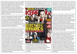
  • 1. Masthead-Is boldandconventionallyplaced inthe top third, is usually formattedbehind the image as it is easily recognisable. “Kerrang!” is a strong title that is impactful andreflects the genre well as it is a harsh word whichcan relate to rock and metal music. The title also harmonises with the image nicelyas well as theyare very energetic and controversial. Buzz/Puffs- Are short advertisements to endorse a consumer to buy their product in this case using competitions to tempt the reader to buy the issue. The use of drop shadow and the shape of the puff replicate thislookof anadvertisementwhichmakesit stand out from the image and shows importunacy to attract the reader to important information. Banner- Advertisesspecialfeatureswithinthe magazine almostlike abuzzword.These are usuallyfeaturedin thisparticularmagazine howeverthe formatisslightly differentdependingonthe frontimage andis sometimesplacedonthe bottomof the page. This bannerhas a strongdark backgroundwithpreviewsof the postersitis advertisingalongwithvariousother imageswhichletsthe readerassociate thatspecific productwiththe band. Usuallythisbanneradvertises postersinmostissues. Strapline-asubheadinginanewspaperormagazine article or inany advertisement.Inthiscase the strapline isn’tactuallypurposelyadvertisingthe article justsuggestingitscontentsasa part of the coverline storyand producesexcessknowledgeaboutitthan the actual coverline title.Thisisaffective topersuade consumerstobuy theirproductas itteasestheminto wantingtoread the full article within. Coverlines- Goingagainstoriginalconventionsand are placedonthe right handside of the page andare usuallyplacedonthe left.Shortinformative sentencestosave overclutteronthe page specifically causedby the image whichallowsthemtobe clearly read. The use of drop shadowanda bright backgroundcolourmakesthe textreallystandout.In thisissue there are several cover-linesandunusually a lot of themformattedinseveral placesaroundthe page almostas if to fitas many interestingstoriesin as possible withouteffectingthe maincoverlinesand othercontentaroundthe page. Colourscheme- Usuallyaparticularcolourscheme is carriedthroughoutthe multiple issuesof the magazine howeverisnotalwaysnecessary;However thisisa magazine thatdoesfollowthatparticular conventionasthe mastheadisusuallyredandother titlesandcoverlinesvarybetweenredandyellow withblackor white boardersandthistheme is followedthroughoutthe magazine.These coloursare veryboldand standout verywell toattract as much attentionaspossible andallowingeverythinginthe page to be eye catchingas the page is busyandcan be difficulttotryand observe all the differentaspects but due to the colourscheme ishas harmonisedthat conceptand allowsthe texttobe visible andvisually interesting Barcode/date/price- usuallyunderthe codesand conventionsthe placementof barcodes,pricesand date/issue numberisusuallyseparatedwiththe barcode discreetlyplacedinthe cornerandthe restof the informationelsewhere onthe covernormallylocatedbythe mast head. Image- the frontcoverimage inthisissue followsthe conventionsof usual magazine imagesintermsof format,a mediumclose-upformatof the mainfigures givesanappropriate amountof content,The image is alsoplacedon the rightside of the page ratherthan centredas itcreatesmore room on the leftthirdof the page tobe filledwiththe large coverline and othermultiple imagesinthiscase withoutcorrupting the overall image.The use of compositionis interestingasthere isone mainfigure alongwiththe restof the membersfromthe bandincludedinthe backgroundwhichcreatesa depthinthe photograph whichworkswell due tothe consistentlayering throughoutthe cover. The use of multiple imagesis interestingasmostmusicmagazinesdon’talways include thishoweverworkswellincorrespondence withtheirspecificcoverlinesthathave beenincluded at the bottomof the page.
  • 2. Title- the fontandthe backgroundmakesthe title veryboldand informative howeverisstill veryinterestinganddoesnottake up too much of the page,The fontisa similarfonttosome of those usedon the cover page therefore there isasense of fluiditythroughoutthe magazine.The shape of thistitle isalsodifferentfromsome of other publications. Issue numberanddate- Althoughthisisincludedon the cover page itis usuallyincludedinthe contents page alsoas a part of variousconventions. Image- Imagesonthiscontentspage are obviouslythe maincoverstoriesandthe inclusionof these onthe contentspage isto buildadditional interestsandalso to create a sense of fascinationof the story.Inthe OzzyOsbourne image Ilike howthe background has beencroppedbehindthe subjectandappearsasif the Ozzyisn’ta part of the image and islayeredtolook layeredwhichsimilartechniquesare usedonthe cover page.These imagesare obviouslysetupfromaphoto shootand are notnatural imagesthatthe editorshave decidedti use howeverhave deliberatelytakenthese specificpicturesasa part of creatingthispage and to enthuse the consumerstoreadthe articlesavailable. Folios- The Foliosare the mostimportantkeyelement of a contentspage as itis whatnavigatesthe readerto each article thereforetheymustbe informative yet lookattractive.Theyare usuallycharacterizedinto sections,eitheralphabetically,chronologicallyandalso by contents.Usuallyfolioscanbe organisedintermsof the contentand similarcontentcanbe grouped togetherandinthisinstance itis clearthat the editors have usedthismethodtoorganise theirfoliosand each article hasbeenputintoa category e.g.news, feedbacketc.The folioshave beenformattedinthe centre thirdof the page,there isno specificconvention to followintermsof formaton the contentspage as it isnot visible whendisplayed,thereforethe editors have decidedtoplace itinthe middle thirdtodraw attentionfromthe twocoverfeaturesabove and below,itmayhave alsobeenplacedtobalance the compositionof the page andto fitin the gapsbetween the two articles. Review-The maincoverstoryusuallyhasa review,abrief summaryof the article asa formof a teaserto persuade the viewerto readthe storythere isalmostalwaysa reviewinamagazine contentspage to explainpartof a particularstory. Although inthiscase ismixedwiththe editorial andis usuallyseparate fromthis. Editorials- inmostmagazinesthere issome formof letterfromthe editortointroduce the magazine howeverthere isnotone in thismagazine howeverisonlyone fromthe mainfeaturedbandinthiscase “blackveil brides”therefore the reviewthatisat the bottomof the page acts as an guest editorial howeverthisisobviousfromthe title whichisveryliteral. Colourscheme- Asapart of the codesand conventionsof magazine publication usuallyaparticularcolourscheme is completedthroughoutthe magazineand usuallythroughouteachmagazine andwill veryrarelychange howeversome change theircolourschemeseveryissue.Thisred’s, Yellow’sandblackhave beenfollowed throughfromthe frontpage whichisstill effectivewhenemphasisingaspecificpiece of importantinformation.The blackandred colourscontrast well alongwithwhite therefore reallydrawsthe viewers’ attentiontothese bigblocksof colour.
  • 3. Subtitle- Thissubtitleshasalayoutand overall impactverysimilartothe contentspage howeverhasnospecific conventionslimitingthe positiononthe page as longas there is an obvious sense of flowespeciallyfocusedon the text,inthiscase doesnot affecteither. Title- inthiscase the title isverylarge and colourful against the backgroundit hasa sansserif fontwhichisconsidered more modernand representsthe magazinewell.The titleis one of the firstthingsthatthe eye of the consumersee’s firsthoweverinthiscase isprobablyfocusedmore onthe image howeverthe title Isjustaseffective becauseof the size,contrastand vibrancy againstthe background. Pull Quote- aPull Quote isa piece of text highlightedandemphasisedinanarticle said by the articlessubjects.Pullquotesgenerally breakup the large amountsof textandcreate a focus pointwithinthe bottomrightsection of the page.It alsoallowsthe readertofeel personallyconnectedwiththe subjects. Image- the mainimage represents the interestsof the intended audience andisnot the main coverstory howeverits importance seemsinflated throughthe use of imagery.This image representsa“Fall outboy” concert andby showingthisimage wouldappeal tothe target audience due tothe coloursand the overall impression.The image flowsoverbothpagesandfills almostall of the page whichstates itsimportance.The image has beenformattedsothatthe main bandmemberisfocussedtowards the textwhichallowsthe article to flowintermsof how the consumerwill followthe content. Folio’sandeditorcredit- These are followedthroughoutthe magazine inthe corner,it isnot visible onthisphotocopyhowever doesfeature onbothof the cornersof bothpages.On the bottomrightside of the second page there isa small quote of the editorwhichstatestheirnames alongwiththeirphotographers whichdoesnotchange the layout of the page and justdiscreetly givesthe informationwhichis usuallyvisible tothe readerwhen theyturn the pagesdue to its cleverplacing. Columnsandformatting- Columnsonthese pagesare featuredinalandscape format howeverinsmall columnswhichflowinthe waythatthe consumerseye wonderswhich allowsgoodflowanda tidierpage alongwitha more accurate informativearticle asitis fullyunderstandableinthe orderithas beenplaced. The articlesandall the textonthis page has beenwritteninasans serif fontwhichlooksinformalwaytoattract the reader more. Drop Cap- Drop cap is usually where one specificletterhas beenemphasisedtostandout specificallyatthe beginningof an article or paragraph to encourage the flowof text. These Dropcaps are usually emphasisedthroughcolour, scale and alsofont.In thiscase there Isonlyone of the entire page at the beginningof the article. Standfirst- A standfirstisa brief introtothe featured article to entice the readerto continue tobe interestedinthis page and itscontents.It is usuallyemphasisedthrough font,size or colourandis similar to a synopsis.Thisstandfirstis veryshort andsnappyto get straightto the pointand uses colourto enhance the band name.
  • 4. Mast Head- Islarge and formattedbehindthe mainimage which followscodesandconventionsasusuallylongermastheadtitles are formattedbehindthe image.The title “Total Guitar”ismore of a factual name to obviouslystate the theme of the magazine. Price/Date/Issue Number- Thesevital elementsof amagazine have beencleverly placedwithinthe mastheadasa part of the word;thisis convenientbecause itdoesn’t waste space on the paperthat can be filled withmore content Strapline- Inthiscase the strapline isalmost like aslogan to advertise purchase,Itisalso factual alongwithdecorative.Some other straplinesinthisissue have beenplacedinto appearlike a puff forexample underthe main coverline whichcanvisuallyattractthe consumerto readthe straplines. Buzz/Puffs –There are multipleof these onhis page that are effectiveintheircontentfor example “free digital edition”isagoodform of advertisementasthe consumerfeelsthatthis magazine isa goodvalue formoneyand also connectswiththemthroughsomethingthat theyrelate too,inthiscase technology. The use of vibrantcoloursare veryeffectiveto catch the eye of the consumerbecause there is multiple coloursonthispage howeverthere are a fewelementsthatstandoutmore than otherswhichiseffectiveuponsellingthis product.The use of differentpuff shapesinthis issue isalsoveryeffective asthe page doesn’t seemlike ithasbeenfilledwithrepetitive contentand isdifferenttothe usual standard puff shape. Banner- Inthiscase the Banneris not as obviousasitis not separatedfromthe page bycolour or bya box which workswell inthismagazine andadvertisesmanydifferent productsthat can be foundwithinthe productwhichis effectiveinselling;tobe able to sell anwide varietyof produce;whichwouldenthuse the buyer. Itisformatted at the verytopof the page underthe codesand conventionsbecauseitcanbe visiblefromthe shopshelf and advertisesthisproductjustbuyshowingthe verytop thirdof a page. Coverline- Thismagazine islimitedinthese andhas focussedonone dominantcoverline whichislarge enoughtofill the leftthirdof the page and perhapseven more howeverisveryeye grabbinginresponse tothe image throughitsscale and colour.It usesa famousname to gainattentionfromthe readerthat wouldbe an influential figure inthisgenre of music.The smallerCover line isa lotlessemphasisedprobablybecause of itsless knowncontentsinresponse to“slash”howevercanstill be eye catchingbecause it has beenplacedinanempty part of the page as an attemptto fill the page andto equallybalance the composition. Image- The maincoverstory image hasbeenformatted similarlyto“kerrang”onthe right side of the page to balance the coverlineswiththe image andalsonotto interruptthe mastheadtoo much.It is a mediumclose up witha directgaze intothe camera. Theiruse of props isappropriate forthe magazine due to itsgenre andalso title thereforeattractsa lotof readers. Background- Althoughthere isnotmuchcolourinthe backgroundthere isstill evidence of shadowsandgradientsinthe backgroundwhichpersonallyIthinkis veryinterestingasit’sa subtle a change in colourhoweverIthinkcompletesthe page as it fadesintothe coverlines.Ialsothinkthatthe backgroundcontraststhe mastheadverywell astheyare complete oppositeshoweverIthinkworkswell to emphasise the mastheadasmuch as possible aswell ascreatingacleanand finishedfeel. Barcode/ Date/Price and Locationof printing- Althoughsome of thisinformationhasbeen repeatedelsewhere inthe magazineitstill followsthe codesandconventionsof the mediain magazine productionasthe barcode recordspurchasesandrequiresdate tothe manufacturer and isusuallyplacedIna cornerof the magazine usuallyinthe bottomthirdsomewhere where itiseasilylocatedforthe ease of the shopsalesrepresentative.Althoughitisquite large it hasbeeneasilydisguisedbythe inclusionof acolouredbannertodistractattention away fromit.
  • 5. Colourscheme- Inthispage the colourscheme is unusuallynotcontinuedthroughoutthe pages howeverissimilarasredandorange harmonise each otherandred isthe fundamental colour alongwithyellowtomake orange therefore they can linkina similarwayto this.Thispage is very much limitedincolourasthere isonlya few differentcoloursthatare importanton thispage. Title- Thiscontentstitle isaverybasicfonthoweverisveryboldandclear, thisdrawsmost of the attentionalongwiththe image andsubheadings howeverisdominantlymore eye catchingthanthese. Folio’s- Inthiscase the folio’shave been organisedinchronological orderfor efficiency as thismagazine isgreatlyformative therefore this organisationwouldbe more appropriate althoughthere isa separate categoryforfeatures alongside the monitorcategorythisshowsthat feature andeffectiveorganisationhasbeen considered whenarrangingthesearticles.The Folio’sonthispage has onlybeenformattedon the right handside of the page alongside the maincoverstory image. Image- The editorshave usedasimilarmainimage to the cover page whichsuggeststhatthese are linkedanditisthe main coverstorytherefore suggestswhyitisthe largestimage onthe page so that itis the mainfocusof the magazine to advertise thisspecificmaincoverstoryalongwith the otherlessimportantarticles.Thismain photographislargerthan the traditional cover page medium-close uphence the reasonthatitIs the contentsimage andnot the coverpage.There isno specificreference of directionof eye contact suggestedbythisphotographyotherthanthe guitarthat pointsto the foliossuggestingthe connectionandthe change infocus.The three smallerimagesisobviouslynotstudiobased photographyanddo notconnect withthe camera like the mainphotographydoeswhichsuggests that theyare notas importantas the main“slash” coverstory,thisis alsoobviousdue toitsformat, three consistentlysmallerimagesatthe bottomof the page,there isno special eye catchingsubject matterin anyof these images. Reviews- Thereisverylittle article reviewsin thismagazine andonlyincludesshort/brief explanationsof eacharticle howeverdoesnot describe anyparticulararticle ina lotof depth includingthe maincoverstoriestherefore all of these elementssuggeststhatthispage was plannedtobe organisedandnot specifically appealingtothe eye.Every magazine will usually include some kindof reviewwhendescribingthe foliosof the magazine itisvital forthe consumer to understandwhattheyare buyingwhichisthe purpose of the contentspage and itsreviews. Editorials- Usuallyinmagazinesthere are multiplelettersfromthe editorshoweverthisissue doesnotincludeaneditorial howeverdoescreditthe editorsname inthe bottomlefthandcornerwhichsuggeststhattheydidnotwantto emphasise thisinanywayas it wouldbe difficulttoinclude anymore informationonthispage withoutpossiblydeletingaimage whichthenwoldleave the overappearance andcompositionof the page unbalanced. Date- The date of thisspecificissue hasbeen placedinthe bottomcorner of the page whichis usuallyincludedinthe contentspage througha seriesof codeshoweverthishasbeenverysubtly placedinthe corner ina small fontwhichsuggests that thisinformationisnotimportantasithas been repeatedonthe previouspage therefore itis unnecessaryinformationandhasnotbeenplaced for the reader.
  • 6. Image-The image isveryvisuallyattractive andthe mainfocusof the both pagesdue to the intense backgroundcoloursandthe contrastingforegroundcoloursof the yellowandpurple tint. Althoughthe subjectisnotfacingthe article the linesinthe guitar are and thislinearshape focusesthe attention tothe article along withherpose isbenttowardsthe article andtherefore distracts the readerfrom the image thentothe article whichisthe intension. Advertisement-There are variousadvertisementsonthis page,the most obviousisonthe rightside of the secondpage as an advertisementforguitar accessorieswhichisveryeye catchingdue to its strongly pigmentedcolourationhowever balancesthe colourfromthe otherpage so it doesnotappear to lookempty.The otheradvert isin the top cornerof the first page where itis advertising ShawTaylor’sTour ina very discreetandinformativeway. Title-The titleonthisdouble page spreadisverysimilarthroughout the magazine includingthe frontcover,howeveritcontrastswell with the white backgroundandboldlystandsout.The firstfocuson the secondpage isthe title due toitsformatplacingis withinthe topthird similarlytothe coverpage and thisplacementcreatesflowwithinthe page and the articlesdue to our culture. Foliosandeditorial credit-SimilartoKerrang there isa small sectiononthe bottomof the page that givescredittothe editorand identifiesthe issue date.Thishasbeenplacedhere sothat it doesnotdistract attentionawayfromthe image whichisthe main focuson thispage alongwith the overall article. Columnformat-There isonlytwocolumnsonthispage andflowsverywell withlittle interruptionfromdropcapsand pull quotes.Thispositioningworkswell tocontinue the flowof eye contact,it alsocontinuesthe geometricflowasthe whole double page spreadhas beengeneralisedinacolumnformat.The use of informal language relatestothe readerand doesnotover complicate the overall article.Thisarticle has beenwrittenIa continuousfontwhichisaserif fontof some form whichisbelieves to appearmore formal and tidywhichcontinuesthe ideaof keepingacleanand informative feel. Standfirst-The standfirstinthis page is clearlyidentifiable under the maintitle andis a different colourand a much smallerscale. The shortnessof the sentence looksvisuallyattractivefroma distancesandbreaksupthe dark colourson the page It alsolinks to the colourscheme. Drop cap-There Isonlyone drop cap on thisdouble page spread whichisagain at the beginning of the article andunusuallyis formattedina sans serif font whichisdifferentfromthe rest of the article whichisn’ta unusual howeverthe twofonts have completelydifferentsocial opinionsastothe moodthey portray. Pull Quote- There are noPull Quotesincludedonthe second page withinthe article and insteadhasbeenplacedwithin the image nexttothe subject whichworkswell because itcan connectthe quote to the subject more and it feelsmore personal for the readerto be able to make thisconnection.