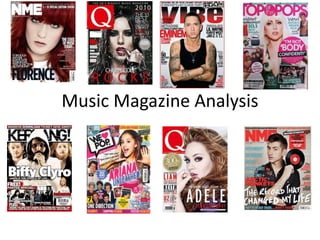
The document analyzes the design elements of various magazine covers and pages.
For a music magazine targeted at teenage girls, the cover uses bright pink colors, curly feminine typography, and a close-up photo of a popular young female singer. Smaller images of boy bands are also used to attract the target audience.
In contrast, a magazine called Q uses a revealing photo of Beyoncé on the cover along with masculine colors and layout, signaling its target audience is primarily adult males.
The contents of a magazine aimed at teenage girls uses pink and yellow colors, rounded letters, and images next to article titles to make it easier for a younger audience to read.
An introduction to Philippine Festival Dances (Religious and Secular Festival...Jewel Jem
An introduction to Philippine Festival Dances, meaning, nature and background
Why Filipinos Dance Festival Dances and what benefits do we get from doing it?
Contains some Festival names, Origin places, religious Figures and/or industry and Month Celebrated
Some Famous Religious Festivals
> Sinulog Festival
> Dinagyang Festival
> Ati-Atihan Festival
Some Secular Festivals
> Bangus Festival
> Panagbenga Festival
> Binatbatan Destival
This presentation aims at providing basic knowledge on music of Indonesia for non-English native students who want to enhance their reading skill. I would like to thank the Wikipedia, YouTube, Google and other websites concerned for their contribution.
Medieval Era Music - Grade 9 1st Quarter Western Classical MusicJewel Jem
MAPEH 9 - MUSIC
Medieval Era Music
Grade 9 1st Quarter Western Classical Music
Introduction to first quarter of Grade 9 lesson, about European Medieval Period
Third quarter powerpoint presentation for Moro Islamic Music.
Like, comment, download and follow guys.
Reference: Music and Arts Learners Module.
Credits: YouTube, Google Photo, Google GIF etc..
If you want guys the original presentation just search me on my FB account
Jetlee Cumbe.
Synthetic Fiber Construction in lab .pptxPavel ( NSTU)
Synthetic fiber production is a fascinating and complex field that blends chemistry, engineering, and environmental science. By understanding these aspects, students can gain a comprehensive view of synthetic fiber production, its impact on society and the environment, and the potential for future innovations. Synthetic fibers play a crucial role in modern society, impacting various aspects of daily life, industry, and the environment. ynthetic fibers are integral to modern life, offering a range of benefits from cost-effectiveness and versatility to innovative applications and performance characteristics. While they pose environmental challenges, ongoing research and development aim to create more sustainable and eco-friendly alternatives. Understanding the importance of synthetic fibers helps in appreciating their role in the economy, industry, and daily life, while also emphasizing the need for sustainable practices and innovation.
Francesca Gottschalk - How can education support child empowerment.pptxEduSkills OECD
Francesca Gottschalk from the OECD’s Centre for Educational Research and Innovation presents at the Ask an Expert Webinar: How can education support child empowerment?
Acetabularia Information For Class 9 .docxvaibhavrinwa19
Acetabularia acetabulum is a single-celled green alga that in its vegetative state is morphologically differentiated into a basal rhizoid and an axially elongated stalk, which bears whorls of branching hairs. The single diploid nucleus resides in the rhizoid.
The Roman Empire A Historical Colossus.pdfkaushalkr1407
The Roman Empire, a vast and enduring power, stands as one of history's most remarkable civilizations, leaving an indelible imprint on the world. It emerged from the Roman Republic, transitioning into an imperial powerhouse under the leadership of Augustus Caesar in 27 BCE. This transformation marked the beginning of an era defined by unprecedented territorial expansion, architectural marvels, and profound cultural influence.
The empire's roots lie in the city of Rome, founded, according to legend, by Romulus in 753 BCE. Over centuries, Rome evolved from a small settlement to a formidable republic, characterized by a complex political system with elected officials and checks on power. However, internal strife, class conflicts, and military ambitions paved the way for the end of the Republic. Julius Caesar’s dictatorship and subsequent assassination in 44 BCE created a power vacuum, leading to a civil war. Octavian, later Augustus, emerged victorious, heralding the Roman Empire’s birth.
Under Augustus, the empire experienced the Pax Romana, a 200-year period of relative peace and stability. Augustus reformed the military, established efficient administrative systems, and initiated grand construction projects. The empire's borders expanded, encompassing territories from Britain to Egypt and from Spain to the Euphrates. Roman legions, renowned for their discipline and engineering prowess, secured and maintained these vast territories, building roads, fortifications, and cities that facilitated control and integration.
The Roman Empire’s society was hierarchical, with a rigid class system. At the top were the patricians, wealthy elites who held significant political power. Below them were the plebeians, free citizens with limited political influence, and the vast numbers of slaves who formed the backbone of the economy. The family unit was central, governed by the paterfamilias, the male head who held absolute authority.
Culturally, the Romans were eclectic, absorbing and adapting elements from the civilizations they encountered, particularly the Greeks. Roman art, literature, and philosophy reflected this synthesis, creating a rich cultural tapestry. Latin, the Roman language, became the lingua franca of the Western world, influencing numerous modern languages.
Roman architecture and engineering achievements were monumental. They perfected the arch, vault, and dome, constructing enduring structures like the Colosseum, Pantheon, and aqueducts. These engineering marvels not only showcased Roman ingenuity but also served practical purposes, from public entertainment to water supply.
Operation “Blue Star” is the only event in the history of Independent India where the state went into war with its own people. Even after about 40 years it is not clear if it was culmination of states anger over people of the region, a political game of power or start of dictatorial chapter in the democratic setup.
The people of Punjab felt alienated from main stream due to denial of their just demands during a long democratic struggle since independence. As it happen all over the word, it led to militant struggle with great loss of lives of military, police and civilian personnel. Killing of Indira Gandhi and massacre of innocent Sikhs in Delhi and other India cities was also associated with this movement.
June 3, 2024 Anti-Semitism Letter Sent to MIT President Kornbluth and MIT Cor...Levi Shapiro
Letter from the Congress of the United States regarding Anti-Semitism sent June 3rd to MIT President Sally Kornbluth, MIT Corp Chair, Mark Gorenberg
Dear Dr. Kornbluth and Mr. Gorenberg,
The US House of Representatives is deeply concerned by ongoing and pervasive acts of antisemitic
harassment and intimidation at the Massachusetts Institute of Technology (MIT). Failing to act decisively to ensure a safe learning environment for all students would be a grave dereliction of your responsibilities as President of MIT and Chair of the MIT Corporation.
This Congress will not stand idly by and allow an environment hostile to Jewish students to persist. The House believes that your institution is in violation of Title VI of the Civil Rights Act, and the inability or
unwillingness to rectify this violation through action requires accountability.
Postsecondary education is a unique opportunity for students to learn and have their ideas and beliefs challenged. However, universities receiving hundreds of millions of federal funds annually have denied
students that opportunity and have been hijacked to become venues for the promotion of terrorism, antisemitic harassment and intimidation, unlawful encampments, and in some cases, assaults and riots.
The House of Representatives will not countenance the use of federal funds to indoctrinate students into hateful, antisemitic, anti-American supporters of terrorism. Investigations into campus antisemitism by the Committee on Education and the Workforce and the Committee on Ways and Means have been expanded into a Congress-wide probe across all relevant jurisdictions to address this national crisis. The undersigned Committees will conduct oversight into the use of federal funds at MIT and its learning environment under authorities granted to each Committee.
• The Committee on Education and the Workforce has been investigating your institution since December 7, 2023. The Committee has broad jurisdiction over postsecondary education, including its compliance with Title VI of the Civil Rights Act, campus safety concerns over disruptions to the learning environment, and the awarding of federal student aid under the Higher Education Act.
• The Committee on Oversight and Accountability is investigating the sources of funding and other support flowing to groups espousing pro-Hamas propaganda and engaged in antisemitic harassment and intimidation of students. The Committee on Oversight and Accountability is the principal oversight committee of the US House of Representatives and has broad authority to investigate “any matter” at “any time” under House Rule X.
• The Committee on Ways and Means has been investigating several universities since November 15, 2023, when the Committee held a hearing entitled From Ivory Towers to Dark Corners: Investigating the Nexus Between Antisemitism, Tax-Exempt Universities, and Terror Financing. The Committee followed the hearing with letters to those institutions on January 10, 202
Instructions for Submissions thorugh G- Classroom.pptxJheel Barad
This presentation provides a briefing on how to upload submissions and documents in Google Classroom. It was prepared as part of an orientation for new Sainik School in-service teacher trainees. As a training officer, my goal is to ensure that you are comfortable and proficient with this essential tool for managing assignments and fostering student engagement.
Unit 8 - Information and Communication Technology (Paper I).pdfThiyagu K
This slides describes the basic concepts of ICT, basics of Email, Emerging Technology and Digital Initiatives in Education. This presentations aligns with the UGC Paper I syllabus.
2. Sell lines
The sell lines are there
to advertise the inside
of the magazine. The
colours are very
versatile therefore
presenting the
magazine to both a
male and female
audience. However,
the use of young teen
boys in the images
suggest the target
audience is more a
younger female target.
Focal point
The main image is a medium shot
of a popular female signer. This
attracts the target audience of
girls, as she could be seen as an
idol to them. The signer herself
appears to look also quite young,
so the audience could potentially
relate to her. Her costume is very
sparkly and girly, and she has
long hair, which most girls want.
The medium shot of Arianna
focuses on her beauty and looks,
which could portray what's inside
the actual magazine.
Masthead
The typography for the masthead is written in very curly
letters, appearing girly. This is reinforced by the bright,
attractive pink colour, and tiny stars surrounding the
masthead. Not only is the pink a stereotypical girly colour, it
is also very bold and eye grabbing, ideal for catching the
audiences attention.
Strap line
The strap line includes the institutional name- BBC- and a small insight of what is
inside the magazine, advertising it to the audience. It is placed above the masthead
so it is easily spotted but not the main focal point of the magazine.
Inserts
Smaller images are made
obvious by being put in coloured
boxes. The images are of
famous chart singers, suggesting
that’s what the magazine purely
focuses on. The use of
abbreviations are appropriate to
the target audience of younger
teens, as they will be familiar
with the language from text
speak. This creates an extent of
personal identity for the
audience.
Barcode/price
This is presented as the
smallest part on the front
cover. Its placed at the bottom
so it doesn’t distract the
audience from the main
images, although the price is
important.
Advertisement
The use of another famous,
female singer attracts the
target audience. The medium
close up of the singer focuses
on her makeup, suggesting
that’s what the magazine is
trying to advertise. The smaller
images of clothes and makeup
attract the audience as girls
are stereotypically into
shopping, clothes and makeup.
3. Inserts
The popular boy band advertise what’s inside the actual magazine, and make
the target audience interested, as one direction have an audience of young
girls, similar to this magazine. They are also advertising their dolls to the
audience. They are shown to be looking straight into the camera, making the
audience feel like they are looking at them directly. Because its in a bubble,
the image is very prominent and eye catching to the audience.
Front cover
The smaller insert of the front cover is in
the top right corner, fitting in with a ‘Z’
reading pattern. Having page numbers
pointing at parts of the front cover is good
for the audience as the main aspects that
originally attracted the audience are made
easy to find on the contents page. The fact
that the story lines are singled out on the
front cover, and their page numbers are
written in larger font and bolder colour
than the rest suggest that they are the
most important articles in the magazine
and makes the audience want to read them
first.
Contents
The contents has the same
typography to the front cover.
The curly tails on individual
letters portray a young girly
girl audience. The pink and
yellow colours are also very
gender specific colours,
relating to the audience. The
boxed off sections make it
easier to read and find pages,
suggesting that the target
audience is young and maybe
slightly uneducated. The
columns create a sense of
balance and evenness for the
contents page.
Typography
The text speak abbreviations used in the subheadings relate to the
target audience. Young teens spend most of their time on social
networks and texting on their phones, therefore the heart icon rather
than the word love, seems more familiar to the audience. The rounded
letters are also girly, and look like most girls hand writing. The
‘scrapbook’ layout creates an almost messy look, and looks more
attractive to the target audience.
Strapline/masthead
The bold pink, boxed of strip across the top makes it one of
the most eye catching parts of the page. A different
typography is used however it is still curly, rounded writing
relating to the young female audience. It adds to the scrap
book appearance and makes the whole page look attractive
and interesting, rather than the page you typically skip.
4. Main Image
The medium long shot of Cheryl shows off her dress, hair
and makeup. This relates to the audience as young girls
want to look like her and are interested in clothes and
make-up. Cheryl is a well know figure in the pop industry
so people are more likely to want to read an article on her.
Quote
The quote is placed at the top of the double page spread on the left. Its in
a bright pink colour and put in a white bubble to make it stand out from
the blue background. This means it is the first thing the audience will see
and read. The controversial comment made by Cheryl gives us an idea of
what she talks about in her interview and makes the audience interested
in reading the rest.
Competitions
The strip along the right hand side of the
second page includes a small additional story
line that relates to the main one on the double
page spread. It also includes a relevant
competition for the audience to enter. This
includes the audience and gives the article a bit
more excitement and entertainment. Having it
on the right page means it’s the last thing they
read, as it is not considered as important as the
main article, however the audience then have
the time to consider taking part in the
competition as they’ve already read the article
itself.
Links
The multi media platform added to the article relates
to the audience. This is because as well as reading girly
magazines, they also enjoy using social media
platforms and the internet. Including an insert of a
screenshot of the video online, encourages the
audience to visit the site and watch the video in full.
Speech bubbles
The speech bubbles added over the top
of the image add to the scrapbook feel
of the whole magazine, similar to the
contents page. This makes the
magazine attractive to the target
audience.
Bubbles
The magazine is set out in boxed off columns. The
round bubbles with additional information in stand
out because of the contrast in shapes.
5. Feature article photo
The main image on the centre of the front cover is essentially the main focal
point, and the first thing the audience will notice. The fact that Beyoncé is
willing to be interviewed by Q and be on the front cover suggests the
magazine has a lot of influence. The majority of Q magazine readers are male,
suggested by the stereotypical male colours of the front cover. Using a
seductive looking photo of an attractive woman, Beyoncé, appeals to the male
audience and makes them want to read the article involved. Her outfit
although being white, suggesting purity, is also very revealing which interests
a male audience rather than a female one.
Strapline
The strapline is at the top of the page so the audience notices it first. It is
boxed off in dark dull colours which contrasts to the blue green and white
in the main background, making it stand out. It advertises the fact that the
magazine is a 20th anniversary special edition. This links to the theme of
‘20’ portrayed across the whole front cover, making the audience feel like
that could be the theme within the magazine as well.
Columns
The column structure of the
front cover suggest formality
and importance of the
magazine. It is a more
sophisticated layout, suggesting
the magazine is targeted at
more sophisticated or educated
audience. The writing is white
which complements her dress
which is also white. This gives
the front cover a colour theme
which is attractive for the target
audience to look at.
Sub heading
This subheading is written in black bold letters suggesting to the
audience that this specific article is important. It also includes the
number 20, fitting in with the familiar theme the rest of the
conventions of the front cover seem to include.
Stickers
This sticker also fits in with the 20th anniversary theme. It is also placed
in a red circle making it stand out from the rest of the front cover as the
only other red thing is the logo.
Masthead
Using the logo for the masthead is effective because it advertises
the magazine and makes it easily recognisable for the audience.
The red suggests danger and action, suggesting that’s what the
contents of the magazine will be like.
6. Strapline/ Masthead
Using the common colour red for the front cover, contents page
and double page spreads creates a sense of conformity. It keeps
the magazine clean and minimal, attracting a more sophisticated
audience as apposed to a scrapbook lay out. A bar of bright red
colour across the top of the page makes it look more attractive
and makes the audience slightly more convinced into reading it,
rather than jumping straight into the magazine. Having the issue
number in large letters at the top also suggests popularity and
consistency as it is already the 292nd issue.
Reviews
Having a review on the contents page is effective
as it shows how popular the magazine is. It also
tells the audience peoples opinions on the
articles inside the magazine before they have
read them so they get an idea on what it will be
like.
Images
Using images of the articles on certain
pages attracts the audience. This is
because it suggests the article will look
more attractive to read, rather than large
chunks of text. It also suggests they are
the more important or interesting articles
because they are listed with a preview
(image). They are quite neutral colours so
they don’t distract the audience
completely from reading the rest of the
page.
Stickers
The magazines main article in on John Lennon
to commemorate his 70th birthday. They have
made four different covers for john Lennon,
suggesting the magazine is influential and
respectful of well known figures in the music
industry.
Column contents
The contents has the page number and
article heading in bold, with extra
information underneath in smaller text.
This suggests this is additional
information the audience can read
making the page more interesting. This
portrays the magazine to be targeting a
more educated audience as they are
expected to read more about the article
before turning to the actual page.
7. Feature
The large section of text for the
whole feature article, suggests
that the magazine is targeting an
educated audience, who have a lot
of time on their hands to sit down
and read a large article, for
example students or people of an
ABC1 audience as they have a
more sophisticated level of
language so will understand and
be able to read the text easily. The
long 3 column layout makes the
article look formal as apposed to a
children's pop magazine which will
have a scrapbook layout.
LetterImage
The image used is very
seductive. Lady Gaga is shown
to be wearing very minimal
clothing and a lot of makeup.
This appeals to the male side of
the target audience – which is
the majority- so persuades
them to buy the magazine. The
black and white tones suggest
vintage and old fashioned. This
contrasts the actual image as
you would expect a black and
white image to be classy
whereas it is the opposite. Her
hair is also mirroring Marylyn
Monroe's image, who is a
typical well known sex image,
appealing to the male
audience.
The red letter fits in with the
colour theme. It also takes over
the whole article and
dominates the page. This could
appeal to male audience as
they are also stereotypically
dominating figures. The
typography used for this letter
is very block like and squared
off. This appears more
masculine rather than girly, as
apposed to the rounded
writing you would find in a
female targeted magazine.
8. Strapline
Having the strapline at the bottom of the page
rather than the top if very effective. Being at the
bottom means it is the last thing the audience
read, therefore it is going to be stuck in their
head whilst reading the contents and will want to
go straight to that page. It also says ‘JLS special’,
appealing to a female audience as they are
generally going to want to see JLS topless. The
pink arrow on top of a yellow box makes it stand
out and appear as an important article to the
audience.
Sub stories
Having smaller sub stories of the front cover entice the audience into
buying and reading the magazine if its something they are interested in.
The use of the word ‘yours’ involves the audience making them feel like
they are being spoken to directly.
Logo/masthead
The black and yellow next to each other make the logo stand out
from the rest of the magazine cover. The pink heart icon typically
has girly connotations relating to the magazines target audience.
Rather than having a strap line across the top, they have included
text into the logo itself. This creates a scrapbook feel to the
cover and makes it more interesting for a younger audience to
read.
Main image
The main focal point on
the front cover is a
medium close up of
Rihanna who is a well
know pop icon and idol to
most young girls, who is
this magazine’s target
audience. It shows off her
make up and nails, which
appeals to a female
audience as they may
aspire to get her ‘look’.
Stickers/advertisement
Although it is a music magazine, having other things girls
are interested in, such as clothes, is effective in grabbing
their attention and interest. The ‘pop star look’ could relate
to the advertisement of clothes the magazine includes and
this interests the female audience as they want to look like
their favourite celebrity.
Columns
Columns would
usually suggest
format and
sophistication.
However for this
magazines the
columns have
been made to
look less formal
by boxing them
off using
different
colours; this
makes it more
appealing to
read.
9. Introduction
Having an introduction from one of
the writers in the magazine
involves the audience and makes
them feel like they're being spoken
to directly. The ‘Emily x’ at the end
appears in a casual font making it
look like she's actually written it.
This makes the magazine feel more
personal and once again more like
a scrap book or diary.
Images
Having images on a contents
page makes it easier and more
appealing to read, which is useful
for a younger or less educated
audience. The pop stars in the
pictures aren't being serious and
appear ‘ normal’. This creates
personal identity for the
audience as they can relate to
the celebrity's. It also suggests
that these certain articles are
most important making the
audience want to turn to them
first.
Masthead
The black bold writing would stereotypically fit for a
male orientated magazine. However, it fits well with
this magazine with the colour theme and scrap book
effect. ‘We’ includes the audience in the magazine and
suggests that if the magazine creators love ‘it’ the
audience will as well.
Strapline
This strapline is at the bottom of the page as it is not as
important as the rest of this page. However, the blue colour
contrasts to the pinks and yellows on the rest of the page
and makes it stand out. The continuous line of images
(posters) adds to the scrap book theme and suggests that
their target audience is younger people as they would
prefer to look at large colourful images rather than read
chunks of text.
Contents
The pink and black is attractive to a female
audience. Pink is stereotypically a girly
colour therefore attracts them to read it.
Having large numbers next to smaller
sections of text splits it up and makes it
easier for younger people to read. The fact
that the O’s have been coloured in gives it
an original appearance as though someone
has drawn it rather than typed it. Rather
than going into detail on the article, it just
has a small hint, making the audience still
want to read it.
10. Pull Quotes
Having a pull quote as header for
this double page is very effective.
This is because it makes the
audience want to read the rest of
the article instead of looking at the
pictures and skipping pages. It also
uses blocks of pink to highlight to
part of the quote they think a
female audience will be most
interested in: first kisses. It doesn’t
reveal too much information than
the audience doesn’t feel the need
to read the rest.
Images
Having smaller images
within the text breaks it
up and makes it easier
to read. It adds a bit of
colour and interests the
audience. The audience
also want to see a face
to who the article is
about.
Poster
The large poster on the
left hand side is
effective as girls want to
have good-looking boys
on their walls if they are
a fan of Justin Bieber.
He appears very stylish
and any males in the
audience may be
interested in looking like
this.
Competition
Having a competition creates entertainment for the
audience. It also interests a female audience as Justin
Bieber is one of the biggest pop icons that appeal to girls.
Column layout
The column layout makes the article look slightly more formal
and structured than the front cover and contents page.
However it is done in colour which makes it more visually
appealing for the audience. The typical girly colours pink and
yellow also play a part in this. It makes it clear when the
magazine member is speaking and when the pop star is
speaking.
11. Summary
Most music magazines have similar conventions such as the
layout for double page spreads. Most music magazines have a
focal point on the front cover, generally being a medium close up
of a well known musician/singer. I found that the magazines
aimed more at younger girls had conventions such as ‘emojis’
and girly colours, where as magazines for an older audience such
as NME, are more dull colours and sophisticated layouts.