Contemporary philippine arts from the regions_PPT_Module_12 [Autosaved] (1).pptx
dec mag
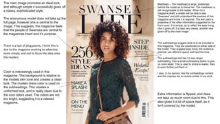
1. Masthead – The masthead is large, positioned
behind the model as to frame her. The masthead, is
still recognizable to the reader. When on a
magazine shelf, a reader will be able to see
“Swansea” and still understand the premise of this
magazine and know it is regional. The text used is
projective of the other information suggested on the
front cover. It is simple, as to reflect the easy living
vibe it gives off. It is also very classy, another vibe
given off by the main image.
The subheadings suggest what is to be included in
this magazine. They are positioned on either side of
the model. They suggest easy living, the audience
member can afford to spend and has free time.
The subheadings text has it’s own larger
subheading, then a small subheading below to give
us more detail. This is used to entice a reader, then
to even further pull them in.
I also, in my opinion, like the subheadings content
and this inspires me to include similar in my work.
The main image promotes an ideal look,
and although simple it successfully gives off
a classy, sophisticated style.
The anonymous model does not take up the
full page, however she is central to the
image. This suggests, the magazine feels
that the people of Swansea are central to
the magazines heart and it’s purpose.
Color is interestingly used in this
magazine. The background is relative to
the models skin tone and creates a clean
look. The models dress color is used on
the subheadings. This creates a
uniformed look, and is really clean due to
the cool colors used. The colors are not
too bright, suggesting it is a relaxed
magazine.
Extra information is flipped, and does
not take up much room due to this. This
also gives it a lot of space itself, as it
isn't covered by the model.
There is a lack of plug points, I think this is
due to the magazine wanting to advertise
more simply, and not to force the idea onto
the readers.
3. This magazine uses a lack of information
concept, to entice an audience member. It
balances the success on knowledge of the
personality, and loyalty of the area. One can
gather that this product will be for those
who are knowledgeable of that presented
by this magazine.
We can also fit it into the regional
magazine genre as it uses the typewriter
font used by many regional magazines.
This is one of the only relative
conventions.
The image is shown
bordered by color, and the
main image does not
intersect into the
masthead, a common
feature of modern
magazines. This could
suggest that the magazine
is extremely proud of it’s
heritage and does not
want to cover any trace of
it.
The extra info is presented where the tagline
would be, and the tagline where we would
see the extra information. Subversion of
money and knowledge- a projection of what
the target audience most values.
5. Branded, uniformity of brand.
Remains the typewriter
font.
Relative images to contents. Shows
beauty of the area.
Features very culturally based
articles. The text contents
aren’t shown in a hierarchy
form, which shows the brand
respect all forms of culture in
the area.
Uses of pops of color to add elegance, the
gold, fun and exciting in the pink.
Extra info.
The contents is spaced really
well, as to not crowd all the
information.
On the cover shows they
are a uniformed brand.