
Recommended
More Related Content
What's hot
What's hot (18)
Viewers also liked
Viewers also liked (20)
Similar to Task 3
Similar to Task 3 (20)
Recently uploaded
Recently uploaded (20)
Task 3
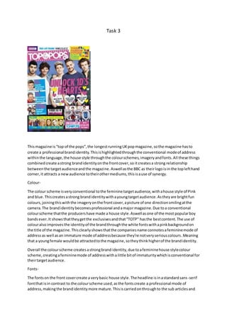
- 1. Task 3 Thismagazine is“top of the pops”,the longestrunningUKpopmagazine,sothe magazine hasto create a professional brandidentity.Thisishighlightedthroughthe conventional modeof address withinthe language,the house style throughthe colourschemes,imageryandfonts.All these things combinedcreate astrong brandidentityonthe frontcover,so itcreatesa strong relationship betweenthe targetaudienceandthe magazine.Aswellasthe BBC as theirlogoisin the toplefthand corner,it attracts a newaudience totheirothermediums,thisisause of synergy. Colour- The colour scheme isveryconventional tothe feminine targetaudience,withahouse style of Pink and blue.Thiscreatesastrong brandidentitywithayoungtargetaudience.Astheyare brightfun colours,joiningthiswiththe imageryonthe frontcover,apicture of one directionsmilingatthe camera.The brandidentitybecomesprofessional andamajor magazine.Due toa conventional colourscheme thatthe producershave made a house style.Aswellasone of the most popularboy bandsever.It showsthattheygetthe exclusivesandthat“TOTP” hasthe bestcontent.The use of colouralsoimprovesthe identityof the brandthroughthe white fontswithapinkbackgroundon the title of the magazine.Thisclearlyshowsthatthe companiesname connotesafemininemode of address as well asan immature mode of addressbecause they’re notveryseriouscolours.Meaning that a youngfemale wouldbe attractedtothe magazine,sotheythinkhigherof the brandidentity. Overall the colourscheme createsastrongbrand identity,due toafemininehouse stylecolour scheme, creatingafemininemode of addresswitha little bitof immaturitywhichisconventional for theirtargetaudience. Fonts- The fontson the front covercreate a verybasic house style.The headline isinastandardsans-serif fontthat isin contrast to the colourscheme used,asthe fontscreate a professional mode of address,makingthe brandidentitymore mature.Thisiscarriedonthroughto the sub articlesand
- 2. theirstandfirsts.Creatingaconsistenthouse styleof fonts,thisaddstothe ideaof the brandidentity beingprofessionalism.But incomparisonthe companiesname inthe magazine,usesanaspectof serif font,whichgivesanimmature andfeminineaspecttothe brand identity. Overall the fontscreate a mature brandidentity,whichisunconventionalconsidering theirtarget audience are youngfemales.Meaningthatthere isa mixedhouse style. Language- The language of the frontcoveris immature asa few abbreviationsandcontractionsare used.Thisis broadcastedwithinthe headline,“UNLOCK1D’SHEARTS” the language createsan immature mode of address.Whichisa goodadvertisingtechnique asittargetsa youngaudience sotheylook towardsthe immature language whichalsohasintriguinglanguage.The house stylelanguageis intriguing,due togetthe audience tobuythe magazine.Meaningthatthe brandidentityis professionalasitshowsthat ithas interestingcontents.Thisintrigue isalsobackedupbythe sub- articleslanguage. Overall the language createsabrandidentitythatisintriguing.Meaningthatthe audience are interestedinwhat’sinsidethe magazine. Layout- The layoutof the magazine’sfrontcover isvery immature andshowsthe brandidentitytobe less professionalthanthe otherelements.Thisisbecause thenitisattractive tounderstandfora youngertargetaudience,thisisconventional.The layoutshowsthe mode of addresstobe busyand clutteredwithlotsof content.The layouthasOne Directioninthe middle of the magazine,which showsthe brand identitytobe amajor magazine,because of the stigmaOne Directionhas. Overall the layoutisclutteredandalittle immature,whichcreatesamode of addressthat suitsthe target audience.Whichmeansthatthe brandidentityisimprovedinthe eyesof itstargetaudience. Colour-
- 3. The colour scheme of the contentspage isconventional topopmagazinesappealingtoa young female audience becauseit’spinkonawhite background.Thiscarriesonthe original house style fromthe frontcoveras it isthe basisof the same colour scheme.Thismeansthatthe mode of addressisverysimilartothe mode of addressonthe front cover.Thiswasdone to keepthe audience relationshipsimple.Thismeansthatconsistentlystrongbrandidentitycanbe made,as theyconnote the pinkcolourscheme withthe magazine. Fonts- The majorityof fontsare sans-serif buthave animmature aspecttoit thisis the same house style fontas there wason the frontcover,thiscontinuesthe mode of addressfromthe frontcover. Thishas an importantimpacton the readeras it createsconsistencywithinthe magazine.This eventuallycreatesastrongbrand identity.Due tothe factthat the fontsare the same but a little bit more feminine.Meaningthatayoungfeminine audience wouldbe attractedtothe magazine.Butit still looksprofessional. Language- The language hascreateda house style withinthe magazine,astheybothattract the youngeraudience,asitsmode of addressisimmature butfun.This createsthe ideaof interest towardsa youngertargetaudience because theylikethe use of contractions,withfunimaginative ideasthissetsa funmode of addressfor the restof the magazine.Forexample “we <3boys” uses the “<3” as itis sharpand fun.In comparisontousingthe word“love”is tooserious,fora young target audience. Thiscreatesafunbrandidentity,whichisimportanttoayoungtarget audience. Layout- The layoutof the contentspage has a stronghouse style aslike the frontpage,itis cluttered, so itshowsthe magazine to have lotsof content.Thismeansthe mode of addressisbusy.The use of varioussubarticles,meansthatthe brand identityisgood asithas lotsof exclusives.Meaningthe magazine isseenasprofessional. Colour- The colourscheme onthe double page spread hasgone againstthe house style of the magazine,due toitbeingon a blue backgroundwhereasthe restof the magazine hasa pinkcolour scheme.The blue backgroundcreatesamasculine mode of addressthislinkstowhomthe article is about.Thismeansthat the brand identityisweak, due tothe colourscheme notappealingtoits target audience. Fonts- The fontsinthe double page spreadare sans-serifwiththe boldeffectbeingusedwell.This createsa professional andorganisedmode of addressbecause itshowstheyhave takencare with the fonts.The fontscontinue withthe house style of the magazine butare more masculine thanthe restof the magazine.Thismeansthatthe brand identityhasreallybeeneffectedbecause they’re still femininebutnotto the extreme of the othertwo pages.Therefore the targetaudience won’t connote anythingdifferentwiththe magazine.
- 4. Language- The language usedcontinuesthe house style of informalwriting,forexample,“One DirectionUNWRAPPED!”makesthe page seemlike agossippage.Thismeans thatthe mode of addressisveryimmature and“gossipy”thishasbeendone because the targetaudience of young females,wantthis.Thisgivesabrandidentityof agossipmagazine,whichisastrengthtowardsthe target audience. Layout- The layoutof the double page spread hascarriedon the house style font,fromthe contents page.As ithas a conventional formal 3columnedlayout,withastandfirstabove them.Thiscreatesa professionalbutbusymode of addressasthe whole page iscovered.Thisgives astrongbrand identityasitshowsthe magazine tohave lotsof information.Soitshowsthe brandidentitytobe value formoney.