This is my textual analysis of NME January 2012 front cover, contents page and double page spread. Click the full screen button to enlarge the presentation:)
Here i have edited four different magazine covers. one being in interview, the next a food magazine, a home and furniture magazine and finally a fashion/interview based magazine.
Welcome to TechSoup New Member Orientation and Q&A (May 2024).pdfTechSoup
In this webinar you will learn how your organization can access TechSoup's wide variety of product discount and donation programs. From hardware to software, we'll give you a tour of the tools available to help your nonprofit with productivity, collaboration, financial management, donor tracking, security, and more.
How to Make a Field invisible in Odoo 17Celine George
It is possible to hide or invisible some fields in odoo. Commonly using “invisible” attribute in the field definition to invisible the fields. This slide will show how to make a field invisible in odoo 17.
Unit 8 - Information and Communication Technology (Paper I).pdfThiyagu K
This slides describes the basic concepts of ICT, basics of Email, Emerging Technology and Digital Initiatives in Education. This presentations aligns with the UGC Paper I syllabus.
Model Attribute Check Company Auto PropertyCeline George
In Odoo, the multi-company feature allows you to manage multiple companies within a single Odoo database instance. Each company can have its own configurations while still sharing common resources such as products, customers, and suppliers.
Macroeconomics- Movie Location
This will be used as part of your Personal Professional Portfolio once graded.
Objective:
Prepare a presentation or a paper using research, basic comparative analysis, data organization and application of economic information. You will make an informed assessment of an economic climate outside of the United States to accomplish an entertainment industry objective.
Honest Reviews of Tim Han LMA Course Program.pptxtimhan337
Personal development courses are widely available today, with each one promising life-changing outcomes. Tim Han’s Life Mastery Achievers (LMA) Course has drawn a lot of interest. In addition to offering my frank assessment of Success Insider’s LMA Course, this piece examines the course’s effects via a variety of Tim Han LMA course reviews and Success Insider comments.
2024.06.01 Introducing a competency framework for languag learning materials ...Sandy Millin
http://sandymillin.wordpress.com/iateflwebinar2024
Published classroom materials form the basis of syllabuses, drive teacher professional development, and have a potentially huge influence on learners, teachers and education systems. All teachers also create their own materials, whether a few sentences on a blackboard, a highly-structured fully-realised online course, or anything in between. Despite this, the knowledge and skills needed to create effective language learning materials are rarely part of teacher training, and are mostly learnt by trial and error.
Knowledge and skills frameworks, generally called competency frameworks, for ELT teachers, trainers and managers have existed for a few years now. However, until I created one for my MA dissertation, there wasn’t one drawing together what we need to know and do to be able to effectively produce language learning materials.
This webinar will introduce you to my framework, highlighting the key competencies I identified from my research. It will also show how anybody involved in language teaching (any language, not just English!), teacher training, managing schools or developing language learning materials can benefit from using the framework.
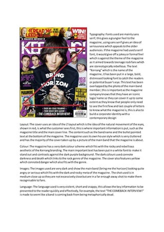
1. Typography:Fontsusedare mainlysans
serif,thisgivesagrungierfeel tothe
magazine,usingsansserif givesanideaof
seriousnesswhichappealstothe older
audiences.If the magazine hadusedaserif
font,itwouldgive off a jokeyor formal feel
whichisagainstthe theme of the magazine
as it aimedtowardsteenage rockfanswhich
are stereotypicallyrebellious.The text
“Kerrang”whichis the name of the
magazine,ithasbeenputin a large,bold,
distressedlookingfonttocatchthe readers
or potential buyer’seye.Thistexthasbeen
overlappedbythe photoof the mainband
member,thisisimportantasthe magazine
companyknowsthat theyhave an iconic
logo/name so theycan coverit upto some
extentastheyknow that people onlyneed
to see the firstfew andlast couple of letters
to know whatthe magazine is,thisisalsoto
builda corporate identitywitha
contemporarydesign
Layout:The coverusesan ideaof the Z layoutwhichisthe ideaof the natural movementof the eyes,
shownin red, is whatthe customerseesfirst,thisiswhere importantinformationisput,suchasthe
magazine title andthe maincoverline.The contentsuchas the bandname and the bulletpointed
textat the bottomof the magazine.The magazine usesitsownhouse style whichis verycluttered
and has the majorityof the covertakenup by a picture of the mainband that the magazine isabout.
Colour:The magazine hasa verydarkcolour scheme whichfitswiththe rockyandrebellious
aestheticof the Kerrangbranding.The mainimportanttexthasbeenputina white fontto make it
standout and contrastsagainstthe darkpurple background.The darkcoloursusedconnote
darknessanddeathwhichlinkstothe rock genre of the magazine.The coveralsofeaturesyellow
whichconnoteddangerwhichalsofitswiththe genre.
Images:The imagesusedare verydark and show the mainband (bringme the horizon) lookingquite
angry or serious whichfitswiththe darkandrocky metaof the magazine.The shotusedisin
mediumclose upsotheyare notexcessivelyclosebutare ina far enoughaway shot to make them
recognisable tofans.
Language:The language usedisveryviolent,shortandsnappy,thisallowsthe keyinformation tobe
presentedtothe readerquicklyandeffectively,forexample,the text“THECOMEBACK INTERVIEW!”
ismade toseemlike aband iscomingback frombeingmetaphoricallydead.
2. Double Page spreadanalysis.
Layout:The layoutof the double page spreadhasa large blockof textinthe middle of the pages,
thisisthe title orcoverline of the article.Thisisjustabove a brief overview of the smallerfonted
storybelow.The pagescontaina picture of the band memberwhichgave the interview orstory.
Typography:There are a fewdifferenttypesof fontonthe cover whichall connote verysimilar
things.The firstfontisverylarge in the middle,thisfontisinorange andis ina crayon-yfontwhich
connotesimmaturityandthe wayithas beendone seemsverypsychoticwhichconnotesangerand
mental instabilities,thisbeingthe largestfontonthe page makesitattract the mostattention,thisis
alsowhythe fontisin orange.The smallerfontswhichcontainthe maininformationare in serif font
withkeyinformationaboutthe personwritingthe article inlarger,capitalizedorange text.
Colour:The colourscheme of the double page spreadisoff white blackandorange.These colours
have beenchosen aswhite andblackcontrast againsteach otherandthe orange ischosenas it
brightand standsout ontop of the otherneutral,monochrome colours,soitstandsoutand gives
the magazine some character,thisconnotesstandingoutandimmaturity.The orange alsoconnotes
a sense of angerand aggression asit islinkedtothe mix of angerfrom redand happinessfrom
yellow,thislinkconnotesimmaturity.
Images:The double page spreadonlyuses2images,one of a band memberwithascared expression
on hisface above a dinosaur,thisconnotesfearandimmaturity. He iswearingall blackclothes
whichadds to the rock genre style whichconnotesangerandthe image isinlongshot.
3. ContentsPage Analysis.
Colours:The coloursusedare
verysimilartothat of the
double page spreadasit has a
solidwhite background,this
setsa good base for the
magazine tobe builtuponas
mostcoloursshow up well on
white.The backgroundof the
mastheadisinyellow witha
blackfont,these colours
togethercontrastwell and
alsoconnote the ideaof
danger.The photographof
the band usedisingreyscale,
thisremovesfromthe
amountof coloursonthe
page whichmakesthe
reader’s attentionbe drawn
elsewhere,butstillnoticing
the photoof the band, it also
givesa classic,orold style
theme tothe photograph
whichissuitable togo with
the band as theyare quite an
old,classicrock band.
Overlayingthe picture issome
textinred,thisis the main
coverline of the magazine so
it hasbeenmade to standout
infront of the picture.The colourred has beenchosenasitconnotesangerand danger,linkingwith
the yellowandblackdangertheme.
Typography:The typographyusedonthe contentspage is mainlyserif,thisconnotesmore of a
serious,modernisticfeel assansserif fontsare usuallyseentobe quite cheeryandimmature.The
mastheadof the contentspage isin the house style of font,whichisa bold,serif fontwitha
distressedorbrokenlook,thisbuildsonthe page’saestheticandthe overall magazine genre. The
contentslistitself hasamixture of boldandregularfontstylingwithavarietyof differentcolours
withinit.The firstonesare the subheadingsof the contentslistwhichare ina bold,yellowfontwith
a black background,thishasbeendone toinformthe readereasilywhatsectionof the magazine
that theyare goingtobe lookingatand where tofindeachpart of the magazine.The next
typographystyle inthe contentslististhe maincontentsinformationwhichisinaboldblackfonton
a white background,thishasbeenmade like thissoitiseasyto read andcan draw the reader’s
attentiontothe parts that theywantto see.Below thisisregulartextina smallerfontsize inalight
greycolour,thisis the descriptionof eachpartof the magazine,ithasbeenmade to be smallerand
lesseye catchingsothat the reader notices other,more importantaspectsandonlyreadsthe
4. descriptionif thatiswhattheyare lookingator interestedin. The final typographystyleinthe main
contentslististhe page numberswhichare ina bold,serif font.The numbersare putinred to make
themfitthe theme of the magazine page and alsoto make themstandout so thatthe readercan
easilyfindwhatpage theyare lookingfor. The contentspage onlyhasone noticeable bitof sansserif
typographyonit whichreads“Win!”thishas beenputin a yellow circularbannerwitharedtext,
thisconnotesimmaturityandalack of seriousnessasitisadvertisingacompetitionof some variety.
Layout:The layoutof the contentspage is typical of a musicmagazine asit usesthe Z ideaof the
natural movementof the eyes,showninredonthe page,thisiswhere the magazine creatorswould
put the mostrelevantinformation.The contentspage hasalarge picture of the bandwhichthe main
interview isabouttakingupalarge portionof the page,thisistypical of a musicmagazine of the
rock genre.Overlayingthe photographisthe coverline of the issue,thismakesitmore prominent
on the page and drawsattentioneasier.Italsohasan image of the shoestheyare tryingto promote.
The colour scheme isconventional of the rockgenre as ithas lotsof coloursthat connote dangerand
the photographgivesof a grungyaestheticwhichlinkstothe rockgenre. The contentspage alsois
conventional of thatof a regularcontentspage withthe magazine contentsorganizedinalistformat
withthe page numbersnexttothe varioustitles.
Language:The contentspage usesveryminimalisticlanguage whichistypical of thatof a rock
magazine asit allowsinformationtobe passedonto the readerquicklyandeffectively without
takingup a lotof room onthe contentspage.