
Recommended
More Related Content
What's hot
What's hot (20)
Viewers also liked
Viewers also liked (20)
Similar to Front Cover Analysis of Q Magazine Typography, Layout, Colour, Image and Language
Similar to Front Cover Analysis of Q Magazine Typography, Layout, Colour, Image and Language (20)
Recently uploaded
Recently uploaded (20)
Front Cover Analysis of Q Magazine Typography, Layout, Colour, Image and Language
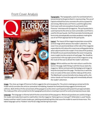
- 1. Front Cover Analysis Typography- The typographyusedisfunand boldwhichis conventional tothe genre thatitis representing.The use of Capital andboldfontalso connotesthe artistas powerful and strong.MainlySansserif fontisusedthroughoutthe frontcover withone exceptionof apull quote from Florence’interview withQmagazine.The pull quotethatis usedrepresentsthe artistasmore vulnerable aserif fontis usedforthispull quote.Serif fontconnotesfemininityand femininitystereotypicallyconnotesweaknessmakingthe use of serif fontappropriate forthispull quote. Layout- The layoutof the magazine gravitatesaroundthe central image whichattracts the reader’sattention.The coverlinesare positioneddowneitherside of the magazine especiallythe leftsideasthismaximisessellingpotential as whenadvertisedthisthe reader’sfirstviewof the product. All Standfirstsare positionedbelow the coverlinesgiving more insightintothe contentsof eachpage.The Headline ispositionedinthe toprightcornerof the magazine using the route of the eye to attract the reader’sattention. Colour- White andblue are the maincoloursusedforthe texton the page,bothfittinginwiththe house style of q magazine.White contrastswiththe backgroundimage to helpthe textpopfromthe page.The blue tiesinwiththe mise-en-scene of the coverandthe makeupof the artist. The Masthead isconventionallyredasalwayswithq,the colourstandsout fromthe page and immediatelyattracts the reader’sattention. Image- The close upimage of Florence furthersuggeststhe artistaspowerful.The artistismakingeye contactwiththe readerwhichconnotesthe artistas somewhatintimidating,howeverherhandpositioningsuggestsfemininityand softness.Bothof these fitthe conventionsof the popgenre asthe artist isportrayedas bothpowerful yetapproachable. The makeupof the artistcomplimentsthe typographyandcolourscreatinganoverall funandcontemporaryhouse style. Language- The language isinformal whichfitsthe conventionsof the popgenre.Rhetorical questionsare usedtointrigue the readerand make themwantto read furtherintothe magazine ’Dance geniusornoisygit?’ Alliterationisused‘heroin, hookersandhair metal’toalsocreate eye-catchingandattractingtitlesthatcause the readerto wantto knowmore.This taboolanguage suchas ‘hookers’alsofitsQ’sedgyanddaring house style.
- 2. Typography- The typographyof the contentspage isboldsans serif whichgivesthe contentsmagazineanedgyandcurrentfeel whichfitswithQ’shouse style. Layout- The majorityof the page is takenup by a picture of one of the feature articlesinthe magazine,the lefthandsize is dominatedbythe contentslisting.The bottomrightof the contentspage has the review sectionandabannerrunsacross the top of the page.All sectionsof writingare insquaresor rectanglesgivingthe magazine anedgyandcontemporaryfeel. The use of consistentrectanglesandsquaresalsogivesthe magazine anorderedandconsistentfeel whichshowsitis aimedat an olderaudience. Colour- The coloursusedare black,white andredall of which are boldandstrikingcolours,fittinginwithQ’sedgyandvibrant house style.Textiscolouredblackona white background,these twocontrastingcoloursallow the texttobe shownmore clearly to the reader.The image isdark and the coloursin the image have low saturationwhichgivesthe contentspage adark and gloomyfeel.ThiscomplimentsQ’ssomewhatgrungyfeel/vibe and appealstoQ’s demographicaudience. Image- The image hasa lowsaturationwhichfitsinwithq’sdarkhouse style.The bandrepresentedare all also makingeye contactwiththe readerwhichmakesthemappearintimidatingwhichisstereotypical toQmagazine and the waytheyrepresenttheirbrand. Language- The language usedinthe standfirstsgrabs the attentionof the readerandthe use of ellipsiscauses the readerto be intriguedandluresthemintoreadingthe magazine article.The language isinformalandmature whichsuitsthe more mature demographicaudience.Pull quotesare usedtogive the readeraninsightintothe articlescontentsanddrawattention.