
Recommended
More Related Content
What's hot
What's hot (20)
Similar to Contents page analysis
Similar to Contents page analysis (20)
More from jamiedawsonvyners
More from jamiedawsonvyners (20)
Recently uploaded
Recently uploaded (20)
Contents page analysis
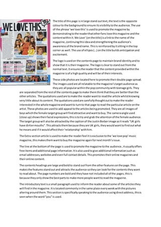
- 1. The title of thispage isinlarge stand outtext,the textisthe opposite colourto the backgroundto ensure itsvisibilitytothe audience.The use of the phrase ‘we love this’isusedtopromote the magazine by demonstratingtothe readerthatotherfans love thismagazine andthe contentwithinit.We Love’(onthe title) isalinkto the name of the magazine,continuingthisideaandstrengtheningthe audience’s awarenessof the brandname.Thisis reinforcedbyitsittinginthe top corner as well.The use of ellipsis(…) onthe title buildsanticipationand excitement. The logo isusedon the contentspage to maintainbrandidentityandto showthat itis theirmagazine.The logoisclearto standout fromthe normal text.Itensuresthe readerthat the contentprovidedwithinthe magazine isof a highqualityandwill be of theirinterests. These side photosare locatedhere topromote theirdouble page spread. The imagesusedare all relatable tothe magazine'stargetaudience as theyare all popularwithinthe popcommunitywithteenage girls.They are separatedfromthe restof the contentspage tomake themthinkthattheyare betterthanthe otherarticles. The quotationsusedare tomake the readerwantto readthe article whilstknowing very little aboutitscontent.The quotationsusedare carefullythoughtouttomake the reader interestedinthe wholemagazineandwantto turnto that page toread the particulararticle onthe artist.These photosare usedto add appeal tothe articlesbeingpromoted.Theyare all imagesof boyswhichthe female targetgroupwill findattractive andwanttobuy.The cameraangle used (close up) showstheirfacial expressions,thisistotry and grab the attentionof the female audience. The target groupwill alsobe attractedby the captionof the JustinBieberimage asitreads“UK girls have dirtiermouths”.Thisattractsthembecause theyare UK girls,theywouldwanttofindoutwhat he meansand if it wouldaffecttheir‘relationship’withhim. The Extra sectionarticle isusedtomake the readerfeel itisexclusive tothe ‘we love pop’music magazine,thismakesthemwanttobuythe magazine againfornextmonth’sissue. The line at the bottomof the page is usedtopromote the magazine tothe audience,itusuallyoffers free itemsandadditional page information.Itisalsousedtogive additional informationsuchas email addresses,websitesandevenfull contactdetails.Thispromotestheironline magazinesand theironline content. The contentsheadingsare large andboldto stand outfrom the otherfeaturesonthe page.This makesthe featuresstandoutand attracts the audience sotheycan lookforthe contentstheywant to readabout. The page numbersare boldand theyhave not includedall of the pages,thisis because theyonlyshowthe bestpartsto make more people wanttoread the magazine. The introductorytextisa small paragraphusedto informthe readeraboutsome of the articlesthey will findinthe magazine.Itislocatedcommonlyinthe same place everyweekwiththe pictures alteringaroundthem.Thissectionisspecificallyspeakingtothe audience usingdirectaddress,thisis seenwhenthe word“you”is used.
- 2. The main image isthe firstthingthat catchesthe reader’sattention.The Saturdaysare usedasthe image because theyare a well-recognisedpopbandwithlotsof fans.Theiroutfitsrelate tothe pop genre as theyare bright,colourful andstandout to normality,thisisacommonconvention.The lightingisusedtomake the coloursstandout evenmore thanusual.The posesbeingmade attract a youngfemale audience becauseitpromotes‘girl power’.The use of theirimage istopromote their page whichisnumber24. The girl'shair isalso speciallydonetostandout,theyall hair different stylestoreflecttheirpersonalities,the same withtheirmake-up.Itisacommonconventionfor femalesinthe popgenre todressinthese costumeswiththe hairandmakeupto standout to their fans.Theyare positionedcentral inthe frame toshow theyare all the same and theirbodylanguage enticesyoutowant to readmore about theirarticle asit promotessecrets. The layoutof the contentspage isspeciallysetuptoattract the targetaudience.Itfeaturesa crampedspace withlots of contentandlotsof pictureswithcolours.ThisAttractsthemas itgives the illusionthatthere ismore contentthanthere isinthe magazine.The use of imagesdownthe side are anotherfactor that givesanillusionof more contentastheycome with a caption. The celebritiesare all popularwiththe targetaudience soitiseffectivetheyhave beenusedforthe contentwithinthe magazine.The targetaudiencewillfeel the magazine hasadirectfriendshipwith the artistsand that everythingtheyseeinthe magazine isthe truth.Usingthistechnique ismore likelytobuildupbrandloyaltyandtrustbetweenthe targetaudienceandthe magazine,inother words,the audience will trustinthe magazine more if theythinkthattheygetupclose withthe celebsandhave a friendlychatter.Theywillthinkthatthe magazine isclose enoughtogetthe inside gossipwhichwill heightensales. The fontsusedon thispage is speciallyusedtoattract the target audience.The firstfontvisibleis the title,thisisboldandblackto stand out to the colourand smallerwritingonthe restof the page. The editorsnote isvisible nextanditissimple andeasywritingtoread,thisisappropriate due tothe youngtarget audience.The fontusedonthe sell lines andquotesare alsosimple,thisisusedsothey are easyto readand so there isno confusion.The colourof the sell linesstandouttothe restof the coloursusedonthe page as it isbrighterandmore prominentonthe background.The use of fonts and coloursare also verysimilarintheirothermagazines,thisenablesthemtocementthe brand identity. The editorsnote isanotherspecificallymade featuretotargetand speaktotheiraudience.The language usedisbasicand theyspeakindirectaddress.Thisisdone tomake the audience feel they are speakingasif theyare fiends.Thisbox standsoutbecause itisdull comparedto the restof the page,for example thereislesscolourinvolvedasitisblack writingona white background.
- 3. The title forthe page ‘We love this’encouragesthe readertoreadthe textfurtherdownthe page and attract themto read the articlesforthe restof the magazine,the title givesthe influencetothe readerthat everyone whoreadsitlovesit,thisinfluencesthe reviewsof the magazine'scontent. The backgroundis a new colouron thiseditionforChristmas,This usuallyonlychangesinthe seasons.The colourchangesforthe younger audience astheymaystill believe inChristmas,this,makesthe magazine populararoundthese seasonal times. The logo isagainplacedinthe topright to maintainthe brandidentityof the magazine.Itreflectsthe genre of musicincludedthatthe articlesare basedupon,thisencouragesthe readerthatthismagazine isforthem and theywill wanttobuythe nextissue. The imageson the side of the page are promotingtheirownpage withinthe issue of the magazine. Theyare usedto relate toall of the targetaudience.The imagesare usedwiththe quotesfromthe article, thisprovidesasneakpeektotheirpagesthatwill attempttodrag the readerinand make themexcitedtoreadthem. The use of a quotationunderthe mainimage isusedbecause itdrawsthe youngaudience toread the article.Usuallythe mostexcitingpartof the interview isusedasaquote,thisisusedto relate to the audience andmake themfeel secure whenreadingthe magazine. The contentssectionhasusedbrightand boldcolourstostand out. Theyonlyfeature the numbers withimportantandworthy informationonthem.Theycanpromote articles,interviews,tables, quizzesandnewaboutthe artiststours andlife. The page numberat the bottomrightof the page letsthemknow whatpage theyare on and where aboutson the page the page numberswill be foundoneachpage. The bar across the bottomislocatedinthe same place everyweekandfeaturesthe same information.The postersbeingpromotedmake the readerfeeltheyare notpayingforthemevenif it doesnotsay free,thisisbecause of the salestechniquesused.The readerthinkitispart of a deal on the coverwhenitis not.This sectionalsofeaturestheirwebsite topromote theironline content such as excessnewsabouttheirfavourite artistsorbands. The introductorytextislocatedinthe same place as usual but featuresanew mini article.This usuallygivesthe readerataste of the type of articlestheywill findthroughoutthe magazine.The ladywritingitincludeshersignature atthe bottom, thisgivesthe readerasense of securityasthey feel comfortablereadingthe magazineknowingthe same people are writingit.
- 4. The main image relatestothe targetaudience because OllyMursispopularwithinthe pop communitywithlotsof younggirl fans.Thisattracts themto readthe magazine tosee hisfeature article.Hispose attracts the audience ashe is usingdirectaddressbylookingatthemandsmiling. Thismakesthe readerfeel he isdirectlytargetingthemandtheyshouldreadfurtheronthroughout the magazine.The mediumclose upimage isusedtomake the readerfeel theycanrelate tothe magazine if theyrecognise the artiststraightaway,thisalsoshowshischoice of costume whichis againconventional tothe popgenre.The lightingishighkeytomake himstandout inthe image. Thisis a conventionasthe imagesare alwaysbright,thisgivesthe bestversionof themselvestothe magazine'saudience.The image representsaneyelinematchashe isstaringdirectlyintothe camera whichissupposedtorepresentthe audienceseyes,ittheywere flickingthroughthe mag,they wouldstopand readthe article due to this. The layoutof the page is specificallydesignedtoaspectsof itstandout to the audience.The magazine laysitout to the publicationsensure reading/understandingthe contentspage isassimple as possible.Forexample,the numbersdirectingthe audiencestothe pagesare boldandclearly visible,the coloursalsomatchthe restof the coloursusedon the page. The mode of addressusedinthiscontentspage isverycasual and relaxed.The sell linesare usedto soundlike theyare talkingasfriends,forexample “yeahi'dgive RitaOraa cuddle ….andmaybe a snog”.That is the type of informationyouwouldtell aclose friend.Thisisanexample of how the mode of addresstalksto the audience totry and getthemto feel comfortablewhenreadingitto builduployaltyandconstantreaders. Thiscontentspage is veryboyheavy.Because OllyMursisthe featuredartist,the targetaudience whowill pickupthiseditionwill be particularlyinterestedinyoung,attractive male artists. There are twopuffsonthispage,theyare specificallyusedtogive the readermore informationand chancesto findoutwhat else isinside the magazine.Thisattractsthe targetaudience because they usuallyassociate puffswithfree extrasinsidethe magazine suchaspostersora chance to win something. Brand identityismaintainedthroughoutthe contentspage asthere isthe same layoutas previous magazines,the same fontisusedandit featuresits logoandtraditional ‘WELOVETHIS’. Maintaining brand identitywill encourage the readertocontinue buyingthe magazine andwill encourage new readersas itis uniquelyidentifiable. The language usedinthe editor'snote isbasicand theyspeakindirectaddress.Thisisdone to make the audience feel theyare speakingasif theyare fiends.Again,thisbox standsoutbecause itisdull comparedto the restof the page,for example there islesscolourinvolvedasitis blackwritingona white background.
- 5. Thiscontentspage is unique toBBC’stop of the pops,it usesa layoutnotcommonlyseeninpopmagazinesinordertostand out fromthe crowd.For example the diagramof the frontcoverof the mag. Thisisusedthe reiterate whatcontentisinside the magazine and itprovidesanease forthe readertosee what page eachsell line ison. The front coverimage isusedon the contentspage forbrand identityasitusesthe logofor ‘topof the pops’again.Thisisusually verycommonin musicmagazinesasitcreatessynergybetweenthe twopageswhichis vital forthe readerto create a connection,his makesthe magazine flow betterwhenbeingread.The image is positionedof centre andslightlywonkywhichisoverlappingthe title box.Thiscreatesthe illusionthatithasbeenplaceddownthere afterbeingread,thismakesthemwantto openitagain andread on. The ‘we love shopping’categorymakesthe readerdrawntoall of its contentsinside.Thisisbasedforgirlswholove fashionbutdon’t wantto spendhundredsof poundsonoutfitstheywill outgrow.These feature cheapand fashionableitemsthattheywouldlovewearing. The winsand offersiscentralisedandaccompaniedbyapicture,thisisin hopto attract the target audience.The use of winsattractspeople because theycangetsomethingvaluableforvirtuallyno money.Thisisappealingtoall agesas theywouldall wanttowinsomething.Offersreferto discounts,thisisattractive tochildrenastheywouldbe more likelytoget theirparentstobuyit for them. The use of ‘ all about you’istargetingeachreaderdirectly,itgivesthemgamesandquizzestotest theirpersonality,thisisincludedasthe youngertargetaudience lovedoingthese personalitytests and quizzes. Thisimage isusedas one directionare a popularboyband withlotsof fans,thisdraws the readeris as theywouldlike theirmusic. Thismakestheirmagazine more appealingtoawidervarietyof audiences.Forexample evenif youdidnotlike all popartistsandsongs,youwouldfeel youstill like wantto buy itbecause yourfavourite boybandare featured.Thismidshotisalso usedtoshow the costume of the boy bandas theyare wearingconventional clothes.The lightingusedishighkeyto brightlyshowof the image of the band.The highkeylightingisusedtoshow the nice andfriendly side tothe band,theyare all smilingandare positionedopenlytothe camera. The celebsandgossipsectionisusedasan extrafeature to the page.It splitsthe contentsupinto categoriestomake it easiertoreadfor the audience.Thisincreasesthe customersatisfactionso
- 6. theyare more likelytoreadandbuythe magazine fromthemagain.The use of highlightemphasises whattheythinkwill suitthe targetaudience the mostandwhattheywoulddefinitelywanttoread. The ‘we love boys’box dragsin the female targetaudience astheybelieve theywill seenew good lookingboys.Thisiseffective asnaturallytheywill wanttolookonthe pagesdedicatedtosee what the magazine means. The issue of the 3D glassesisusedto promote themwiththe magazine.Thismakesthe readerfeel theywouldbe missingoutwithoutthe glassesandwillgoandbuythem.Thissalestrickis to attract the youngertargetaudience into buyingthe magazine.Italsoadvertisesthe factthattheyare the onlymusicmagazine thatusesthis. The title of the contentspage is ‘inside the mag’thistellsthe readerwhatison the page.Thisisused to make the readerwant to getto the actual articlesquicker. The publicationusedensure reading/understandingthe contentspage isassimple aspossible,for example the boxeshave theirownheadlinesandthe page numbersare veryclearto the audience. The use of a heart designinthe ‘We Love’categoriesisparticularlyimportant –the use of the love heartsis very‘school girl’,thisrelatestothe targetaudience astheyare school girls. The fontsusedin thiscontentspage are verygirly.For example thisisthe type of writingthey commonlyuse whendoodlinginschool.Thisrelatestothemastheywill feel comfortable readingit. Thisfontusedalsokeepsbrandidentityanddifferentiatesitfromothers,thisisbecause thistype of fontusedit completlydifferentfromothermagazines.Thismakesthe readerfeel theybelongas part of the magazine'saudience whichrelatestothe blumlerandkatztheory.