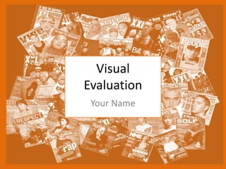
3. Research
• The strengths of my research was finding existing music
magazines to help me get ideas for creating my own
magazine. This helped me because I could see how to design
mine and if the masthead should be in the middle of the
screen in big text or hidden behind the main picture.
• The weaknesses of my research was definitely when I had to
choose all the analysis information because when I
researched ones from the Internet it was quite hard to figure
what the target audience was because the colour scheme that
I might associate boys with could also be targeted at girls so it
is quite difficult to create a neutral colour scheme that I would
want females and males to be attracted to.
4. Planning
• The mood board was a big strength in my planning as it really
helped me bring an idea of what I wanted to do with my
magazine. It kind if finalised some colours, images of famous
singers and also the mood of my magazine.
• The weakness of my planning was the mind maps because my
personal opinion and preference I don’t think it helps me
bring ideas together and it takes me longer to think of ideas
through a mind map and then writing them down after is an
even longer process. To improve this I would use a method
that is better for me that would be a lot more quicker too.
5. Time Management
• I think I did manage my time well because from the schedule
that I made for the process of the magazine I definitely
worked quicker than I planned to. This helped me a lot
because it gave me time to look back and thoroughly check
my work and to make sure that it was how I wanted it to be.
• If I had additional time, I would have added more pages for
the magazines such as interviews. I did really want to do this
but if I did this I would have gone over the time limit I had
even with the spare time I had as I feel it wouldn’t be enough
to cover the planning of the interviews. I would also liked to
have added a little album of my artists top songs or a couple
artists top songs.
6. Technical Qualities
The similarities of both my magazine and the
professional one is the placing of the masthead and
the photo of the famous artist in the middle of the
screen. You can also see that we both have barcodes
and little writing around the magazine to hint what it
is all about and possible sneak peaks of what is
inside.
The difference with our magazines is that the bottom
one has more writing than mine and it also tells you
who the person is which is a good thing because
some people might want to learn about music and
want to know who the magazine is based on and
people like them.
7. Aesthetic Qualities
I like that my magazine has a colour scheme and has a good mix of photos to writing.
I also tried to add photos of my friends and not famous people so I added both. I
think I should have probably kept it to maybe one artist but I wanted to add more
stories that could link to the different people. I would improve my front cover by
adding the name of the musician as most of the professional magazines have that
and I would want people to think it is professionally made.
8. Audience Appeal
I think I have targeted my audience by making the magazine gender neutral by adding
photos of males and females. I also think that it is very clear that the age is targeted is
older teens and students as the artists I have picked the younger audience might not
know who they are so they would less likely to read it.
10. Feedback 1
• What did you like about the product?
– I liked that you included your own friends and
tried to make it more of your own magazine by
doing that and creating your own scandal.
• What improvements could have been made to
the product?
– To improve your magazine you could have added
more stories like the scandal or interviews with
the same artists you have included or new ones.
11. Feedback 2
• What did you like about the product?
– I liked that you kept a simple colour scheme throughout
your product and didn’t over do it and kept it plain with
black and white, but because you added the pop of blue it
makes it doesn’t make it look plain. I also liked how the
front cover of your magazine had the photo and it had the
same colours throughout the magazine.
• What improvements could have been made to the product?
– Inside your magazine I think there is a good amount of
writing but from the front cover you cant really tell what
the magazine as a whole is about or who the person is.
12. Feedback 3
• What did you like about the product?
– I liked the scandal part of your magazine as the title of that
page really grabs your attention of the reader, also the fact
that you have added a little photo beside the title about
jail you can see that the rapper has been sent to prison
and makes it more real and intrigues you to read on.
• What improvements could have been made to the product?
– Instead of adding contents page, I think if you added more
scandals, interviews and things like that it would make
your magazine a lot better.
13. Peer Feedback Summary
• What do you agree with from your peer
feedback?
– I agree with adding more scandals and interviews and
things like that as I did want to do that but there
wasn’t enough time or space for me to do that.
• What do you disagree with from your peer
feedback?
– I disagree about taking out the contents page because
people might not want to have to look through the
whole magazine to find one page so I think the
contents page makes it a lot easier and quicker to find.
14. Peer Feedback Summary
I would change my product by including more
writing, more photos of friends and people that are
not famous. I would add more things to the contents
page as I would have more things to include in for it.
I also agree with how someone said that my front
cover doesn’t really tell you much about the
magazine I defiantly would add the name of the
person who is representing as it might draw more
people in.
Editor's Notes
What were the strengths of your research? How did your research help your product?
What were the weaknesses of your research? What could you have done better/improve? What effect would this have had on your product?
What were the strengths of your planning? How did your planning help your product?
What were the weaknesses of your planning? What could you have done better/improve? What effect would this have had on your product?
Did you manage your time well? Did you complete your project on time or would your products have improved with additional time?
What would you have done if you had more time to produce your work?
Compare your work to similar existing products and discuss the similarities and differences
Put your final piece(s) in the centre of a page alongside an existing product
Use text boxes and arrows
Does your work look good? Was it creative? What aspects of your game’s visuals do you like? What would you improve? How would you improve it?
Discuss the strengths and weaknesses
Put your final piece(s) in the centre of a page and analyse them
Use text boxes and arrows
How have you appealed to your target audience? What specific bits of content would appeal to your target audience.
Refer to your findings from your questionnaire.
Put your final piece(s) in the centre of a page and analyse them
Use text boxes and arrows
What changes would you make to your product based upon your peer feedback and why?