SlideShare a Scribd company logo
1 of 8
Question One 1 Lauren Pratt What ways does your media product use, develop or challenge forms and conventions of real media products?
I believe my media product uses conventions of a real magazine in order to attract the readers. As I created it from a real magazine template which enabled me to take real techniques and recreate them for my product. Starting with my front cover, similar to ‘Q’ I chose to imitate their well known colour scheme (black/white/red) to give my magazine an authentic feel. Sticking to their recognized rock and pop genre I felt this method captured the right target audience and I sought to target the same kind of ‘indie’ audience therefore by sticking to the same colours and distinctive lay out conventions the audience would see, recognise and associate with my magazine as they would with ‘Q’. Another usual technique used for magazines is an abbreviated mast head like ‘Q’ magazine shortened from ‘cue the music’ so for realism I also called my product ‘M’ taken from ‘music bands and singers’. Using one large, bold letter will make my front cover easier to recognise and read as it takes much less time to recognise my magazine, which also appeals to different types of consumers as a person with bad eyesight or dyslexia can read easier a short headline. I also advertised the same selling line as ‘Q’ above the logo “THE UK’S BIGGEST MUSIC MAGAZINE”  which is to mainly target the audience and show what my magazines about. 2 Lauren Pratt Q magazine logo. My magazine logo.
Lauren Pratt 3 	When researching house styles I found that most well established magazines had their own unique house style which made the magazine cover instantly recognisable and made the audience associate that style with that certain magazine. This made me want to have a unique house style for my magazine as this would make it more unique and make it sell better to my target audience. This is why I used the same font throughout the magazine and used a font featured in Q. Also the same font was throughout and the same style of pictures, this helps with the continuity of the magazine and makes it seem more professional. It also makes the magazine pages look like they are linked.
	For my magazine to appear realistic I decided to create my magazine similar to Q using classic ‘rock-pop’ mise-en-scene, conventions and layouts. I chose bold, similar models to appear on my magazine so it would be the first thing to catch the readers eye. I even shot them in the same way to look professionally done. According to my research, majority of people are attracted to the main image of a magazine cover first. The actual magazine had the model bent back with harsh lighting to create a shadow so I did the same, and I believe the overall affect looked really professional. The model I used was in an actual band so she would appeal to wide audience because a) she can be a role model to females and b) men could be attracted to her picture and want to read her story.                                   Lauren Pratt 4 Photo shoot set. My front cover image. My inspiration from Q.
Lauren Pratt 5 	In addition I used a small number of cover lines on my front cover though I didn't feature that many as I want the attention on the image and logo. I also used a conventional puff in the first cover line by using the word “exclusive”.  					On my contents page I added small images that have 					something to do with the contents page e.g. a band, the 				magazines front cover. The purpose of adding small pictures 				was so my contents page would look more detailed and not 				so plain. I used the same colours that appeared on the front 				cover  to ensure the pages relate to one another linking the 				magazines genre.
6 Another method I felt I had to use to create an authentic effect was to include on a double page spread an interview with celebrity artist- offering the latest news and gossip. Every music magazine I researched whatever the genre, always publicised an in depth interview with a current phenomenon so I did the same to compete with other magazines and attract my audience with a scoop that was “un-miss able”. I created the interview in a classic question/answer means  separated by columns like Q and other magazines making text easier to read apposed to one huge portion of text. With my other pages such as contents, I replicated one small technique which after research proved to be on all music magazines- page identification. This is located on the very bottom of each page showing the page number, date and the magazines logo. I chose to use this method as it instantly made my pages look instantly genuine also giving efficiency to the readers so they can clearly see the page numbers. Q’s page ID. My magazine page ID.                                        Lauren Pratt
7 Lauren Pratt I also edited my pictures in a conventional way, by using programs that actual publishers for wide read magazines would use: Adobe Photoshop and Indesign. These programs allowed me to edit, change and emphasise the image I already had to a high quality ready for a magazine. Without  these techniques used my magazine wouldn’t appeal to any audience really as it would look amateur, scruffy and insignificant to others- so why would the public want to spend money on it. I did create my double page spread in a conventional way (columns, typical layout of  questions and answers) however the images I featured on this page were different because instead of placing a picture of an artist singing like my template- I decided to create a Polaroid to place on my double page spread. From my research I didn’t find a music magazine that used a Polaroid image and I thought the idea would look affective and different. Before After
Lauren Pratt 8 	I feel my magazine doesn’t actually go against conventional methods in any main way as I based 	my magazine around my Q template, so I researched and witnessed first hand how to create a 	professional music magazine and I abided by the ways they created theirs. My magazine does not 	so much challenge the conventions but I would say expands on them. It uses the same kinds of 	colours that other same genre magazines would ‘Q’ for the same purpose- to attract the right 	audience.

More Related Content

What's hot

Media evaluation
Media evaluationMedia evaluation
Media evaluationChris
 
Music Magazine Evaluation
Music Magazine EvaluationMusic Magazine Evaluation
Music Magazine Evaluationguest6d0ca6
 
Evaluation
EvaluationEvaluation
EvaluationPCaudy
 
Progresssion presentation
Progresssion presentationProgresssion presentation
Progresssion presentationATurner3
 
Reflection of experiments
Reflection of experimentsReflection of experiments
Reflection of experimentsDodohMoatshe
 
Evaluation
EvaluationEvaluation
EvaluationGEeegi
 
Media
MediaMedia
MediaLaura
 

What's hot (12)

Evaluation
EvaluationEvaluation
Evaluation
 
Evalu 111
Evalu 111Evalu 111
Evalu 111
 
Media evaluation
Media evaluationMedia evaluation
Media evaluation
 
Music Magazine Evaluation
Music Magazine EvaluationMusic Magazine Evaluation
Music Magazine Evaluation
 
Evaluation
EvaluationEvaluation
Evaluation
 
Evaluation
EvaluationEvaluation
Evaluation
 
Question 1
Question 1Question 1
Question 1
 
How did you attract
How did you attractHow did you attract
How did you attract
 
Progresssion presentation
Progresssion presentationProgresssion presentation
Progresssion presentation
 
Reflection of experiments
Reflection of experimentsReflection of experiments
Reflection of experiments
 
Evaluation
EvaluationEvaluation
Evaluation
 
Media
MediaMedia
Media
 

Similar to MEDIA QUESTION 1

Similar to MEDIA QUESTION 1 (20)

Amelia evaluation
Amelia evaluationAmelia evaluation
Amelia evaluation
 
Amelia evaluation
Amelia evaluationAmelia evaluation
Amelia evaluation
 
Media evaluation
Media evaluationMedia evaluation
Media evaluation
 
Evaluation of music magazine
Evaluation of music magazineEvaluation of music magazine
Evaluation of music magazine
 
Evaluation 1
Evaluation 1Evaluation 1
Evaluation 1
 
Evaluation
EvaluationEvaluation
Evaluation
 
Evaluation
EvaluationEvaluation
Evaluation
 
Evaluation
EvaluationEvaluation
Evaluation
 
Powerpoint evaluation writting
Powerpoint evaluation writtingPowerpoint evaluation writting
Powerpoint evaluation writting
 
Evaluation question 1
Evaluation question 1Evaluation question 1
Evaluation question 1
 
Question One Final Draft
Question One Final DraftQuestion One Final Draft
Question One Final Draft
 
Evaluation of Lyrics
Evaluation of LyricsEvaluation of Lyrics
Evaluation of Lyrics
 
Evaluation of Lyrics
Evaluation of LyricsEvaluation of Lyrics
Evaluation of Lyrics
 
Music Magazine Evaluation
Music Magazine EvaluationMusic Magazine Evaluation
Music Magazine Evaluation
 
Music Magazine Evaluation
Music Magazine EvaluationMusic Magazine Evaluation
Music Magazine Evaluation
 
Evaluation
EvaluationEvaluation
Evaluation
 
Music magazine evaluation
Music magazine evaluationMusic magazine evaluation
Music magazine evaluation
 
My Evaluation
My EvaluationMy Evaluation
My Evaluation
 
Exam
ExamExam
Exam
 
Evaluation
EvaluationEvaluation
Evaluation
 

MEDIA QUESTION 1

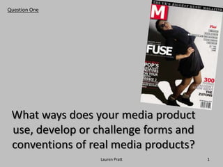
  • 1. Question One 1 Lauren Pratt What ways does your media product use, develop or challenge forms and conventions of real media products?
  • 2. I believe my media product uses conventions of a real magazine in order to attract the readers. As I created it from a real magazine template which enabled me to take real techniques and recreate them for my product. Starting with my front cover, similar to ‘Q’ I chose to imitate their well known colour scheme (black/white/red) to give my magazine an authentic feel. Sticking to their recognized rock and pop genre I felt this method captured the right target audience and I sought to target the same kind of ‘indie’ audience therefore by sticking to the same colours and distinctive lay out conventions the audience would see, recognise and associate with my magazine as they would with ‘Q’. Another usual technique used for magazines is an abbreviated mast head like ‘Q’ magazine shortened from ‘cue the music’ so for realism I also called my product ‘M’ taken from ‘music bands and singers’. Using one large, bold letter will make my front cover easier to recognise and read as it takes much less time to recognise my magazine, which also appeals to different types of consumers as a person with bad eyesight or dyslexia can read easier a short headline. I also advertised the same selling line as ‘Q’ above the logo “THE UK’S BIGGEST MUSIC MAGAZINE” which is to mainly target the audience and show what my magazines about. 2 Lauren Pratt Q magazine logo. My magazine logo.
  • 3. Lauren Pratt 3 When researching house styles I found that most well established magazines had their own unique house style which made the magazine cover instantly recognisable and made the audience associate that style with that certain magazine. This made me want to have a unique house style for my magazine as this would make it more unique and make it sell better to my target audience. This is why I used the same font throughout the magazine and used a font featured in Q. Also the same font was throughout and the same style of pictures, this helps with the continuity of the magazine and makes it seem more professional. It also makes the magazine pages look like they are linked.
  • 4. For my magazine to appear realistic I decided to create my magazine similar to Q using classic ‘rock-pop’ mise-en-scene, conventions and layouts. I chose bold, similar models to appear on my magazine so it would be the first thing to catch the readers eye. I even shot them in the same way to look professionally done. According to my research, majority of people are attracted to the main image of a magazine cover first. The actual magazine had the model bent back with harsh lighting to create a shadow so I did the same, and I believe the overall affect looked really professional. The model I used was in an actual band so she would appeal to wide audience because a) she can be a role model to females and b) men could be attracted to her picture and want to read her story. Lauren Pratt 4 Photo shoot set. My front cover image. My inspiration from Q.
  • 5. Lauren Pratt 5 In addition I used a small number of cover lines on my front cover though I didn't feature that many as I want the attention on the image and logo. I also used a conventional puff in the first cover line by using the word “exclusive”. On my contents page I added small images that have something to do with the contents page e.g. a band, the magazines front cover. The purpose of adding small pictures was so my contents page would look more detailed and not so plain. I used the same colours that appeared on the front cover to ensure the pages relate to one another linking the magazines genre.
  • 6. 6 Another method I felt I had to use to create an authentic effect was to include on a double page spread an interview with celebrity artist- offering the latest news and gossip. Every music magazine I researched whatever the genre, always publicised an in depth interview with a current phenomenon so I did the same to compete with other magazines and attract my audience with a scoop that was “un-miss able”. I created the interview in a classic question/answer means separated by columns like Q and other magazines making text easier to read apposed to one huge portion of text. With my other pages such as contents, I replicated one small technique which after research proved to be on all music magazines- page identification. This is located on the very bottom of each page showing the page number, date and the magazines logo. I chose to use this method as it instantly made my pages look instantly genuine also giving efficiency to the readers so they can clearly see the page numbers. Q’s page ID. My magazine page ID. Lauren Pratt
  • 7. 7 Lauren Pratt I also edited my pictures in a conventional way, by using programs that actual publishers for wide read magazines would use: Adobe Photoshop and Indesign. These programs allowed me to edit, change and emphasise the image I already had to a high quality ready for a magazine. Without these techniques used my magazine wouldn’t appeal to any audience really as it would look amateur, scruffy and insignificant to others- so why would the public want to spend money on it. I did create my double page spread in a conventional way (columns, typical layout of questions and answers) however the images I featured on this page were different because instead of placing a picture of an artist singing like my template- I decided to create a Polaroid to place on my double page spread. From my research I didn’t find a music magazine that used a Polaroid image and I thought the idea would look affective and different. Before After
  • 8. Lauren Pratt 8 I feel my magazine doesn’t actually go against conventional methods in any main way as I based my magazine around my Q template, so I researched and witnessed first hand how to create a professional music magazine and I abided by the ways they created theirs. My magazine does not so much challenge the conventions but I would say expands on them. It uses the same kinds of colours that other same genre magazines would ‘Q’ for the same purpose- to attract the right audience.