
Recommended
More Related Content
What's hot
What's hot (18)
Similar to Evaluation question 1
Similar to Evaluation question 1 (20)
Recently uploaded
Recently uploaded (20)
Evaluation question 1
- 1. Evaluation Question 1 In what ways does your media product use, develop or challenge forms and conventions of real media products?
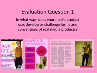
- 2. Conventions of a front cover • A convention of a pop magazine is a main image which does not cover the masthead this is done because pop magazines are usually aimed at early teenagers and magazine producers want to make sure it is clear simple and easy for their target audience to read. Therefore I have not covered the masthead with my main image. • The main image in a pop magazine is usually a medium long shot so that we are able to see what the celebrity is wearing and therefore in my magazine I also decided to use a medium long shot. Also through my research I noticed that a lot of pop magazines have their main image towards the right of the magazine and so I also made sure my main image was towards the right of the cover. • Another convention of a magazine cover is the rule of three I have made sure that my magazine also fits to the this convention by keeping my magazine in a rule of three as I feel this makes the magazine look more clear and makes the layout more simple. • The masthead of all we love pop magazines are on the left and I have also fit to this convention by keeping my masthead pop girl towards the left of the magazine. • Most main image used in a pop magazine are usually seemed as though they are natural images they are photographs which are made out to look less treated and edited even though they usually are edited quite a lot readers wouldn’t notice this. Therefore I have edited my image to look as though it is a natural photograph by using less filters and lower brightness. • Most main images are cut out in pop magazine covers so I also decided to cut out Lucy to fit to the conventions but also because I wanted to use a baby pink colour for the background for my cover. • I have also gone against the conventions of a pop magazine by having the strapline on my magazine at the top if the magazine whereas most magazines would have it at the bottom of the magazine. I decided to do this because if it is at the top of the magazine people are more likely to read and it ‘s more likely to catch their attention because it’s at the top. • I have also kept all my cover lines to the left of my magazine instead of having them on both like most magazines would. I decided to go against this convention because I wanted my magazine to have a simple and neat look so that it would be clear and easy to read for my target audience because during my research I found out that my target audience prefer a simple and clear look. My magazine cover An existing cover
- 3. Conventions of a contents page • Most pop magazines have an introduction on their contents page so that the reader feels more included, comfortable and it is like a warm welcome into the magazine for the reader. It also helps them get to know a little more about the magazine. Therefore I have also added a introduction so that the reader gets to know the magazine better. • All magazines have a list of their cover lines within their contents pages therefore I have also included a list of the cover lines telling the reader exactly what is featured in the magazine. • Most magazines also include page numbers next to the cover lines so readers know exactly what is featured on which page of the magazine also the page numbers help readers find a certain page they are looking for. • Another convention of a contents page are images of people/artists featuring in the magazine so I have included images of the people I have featured in my magazine so that people become familiar with them but also so that they know who is in the magazine. • Most magazine contents pages will have a main cover line which would usually be the most special and exclusive article featuring in their magazine, this is usually different, bolder and stands out more than the rest of the articles. I have also kept my main article separate in a different font and colour so that it stands out more and people know that is the main article in my magazine. • Most magazines have quotes from articles featuring within their magazines however I have not done this on my contents page because I wanted my contents to be simple and easy to read for my audience and adding too much writing on my contents may put them off reading the magazine as teenagers don’t like reading much. • Most magazines would also have more images on their contents however I decided not to include too many images in my contents and only have 2 images because I didn’t want my magazine to have a messy and unclear look I wanted it to stay simple and clear instead.
- 4. Conventions of a double page spread• A convention of a double page spread is having the artist/celebrity featuring in the articles name in big bold writing at the top and so I have also kept my artists name at the top of the article so that readers know who this article is about. • There is also usually an introduction on most double page spread article so readers know more about the article and the setting of the interview I have also kept an introduction at the start of my article so that readers feel more included and know more about the interview. • A lot of double page spread articles have interviews which are in a question and answer form therefore for my interview I also decided to use a question and answer form because I felt that this would be the most appropriate for my teenage audience as they would find this form much more easier and clearer to understand. • Most magazines will have their articles in a columned form therefore I have also kept my article in this form as its much clearer. • Most double page spreads would also have a image of the artist the article is about which would cover one whole side of the article I have also done the same because i want people to know who the article is about and exactly what they look like. • Another convention of a double page spread interview is having a quote which has been pulled out from the article and shown in bolder writing compared to the rest of the writing, I have also used quotes which have been pulled out of my article this is so that people know what has been said in the article before reading it I think teenagers would like this as they don’t like reading much and so this is a good way for them to know what has been said in the article without having to read it. • However I have gone against the conventions by having more than one pull quote but I think this is a good idea as it gives across more to the reader without having to read the whole article. • Most magazines would not have their pull quotes on their main image on the article however I decided to try this out as I thought it will make my magazine standout and look different t o others.
- 5. Overall throughout my magazine I think I have managed to stick to the main codes and conventions of a magazine with the genre of pop however I have at the same time challenged and changed a few elements of conventions of magazines just so that my magazine is slightly different to most magazines but also so that it is appropriate and matches to my target audience of teenagers correctly. These changes are appropriate because kept my research in mind at the same time.