
Recommended
More Related Content
What's hot
What's hot (18)
Similar to Lana Del Rey Digipak Advert
Similar to Lana Del Rey Digipak Advert (20)
Recently uploaded
Recently uploaded (20)
Lana Del Rey Digipak Advert
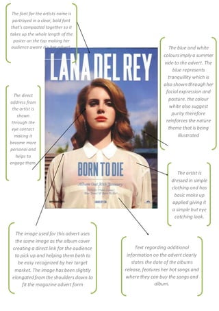
- 1. The font for the artists name is portrayed in a clear, bold font that’s compacted together so it takes up the whole length of the poster on the top making her audience aware it’s her advert. The direct address from the artist is shown through the eye contact making it become more personal and helps to engage them. The artist is dressed in simple clothing and has basic make up applied giving it a simple but eye catching look. Text regarding additional information on the advert clearly states the date of the albums release, features her hot songs and where they can buy the songs and album. The blue and white coloursimply a summer vide to the advert. The blue represents tranquillity which is also shown through her facial expression and posture. the colour white also suggest purity therefore reinforces the nature theme that is being illustrated The image used for this advert uses the same image as the album cover creating a direct link for the audience to pick up and helping them both to be easy recognized by her target market. The image has been slightly elongated from the shoulders down to fit the magazine advert form