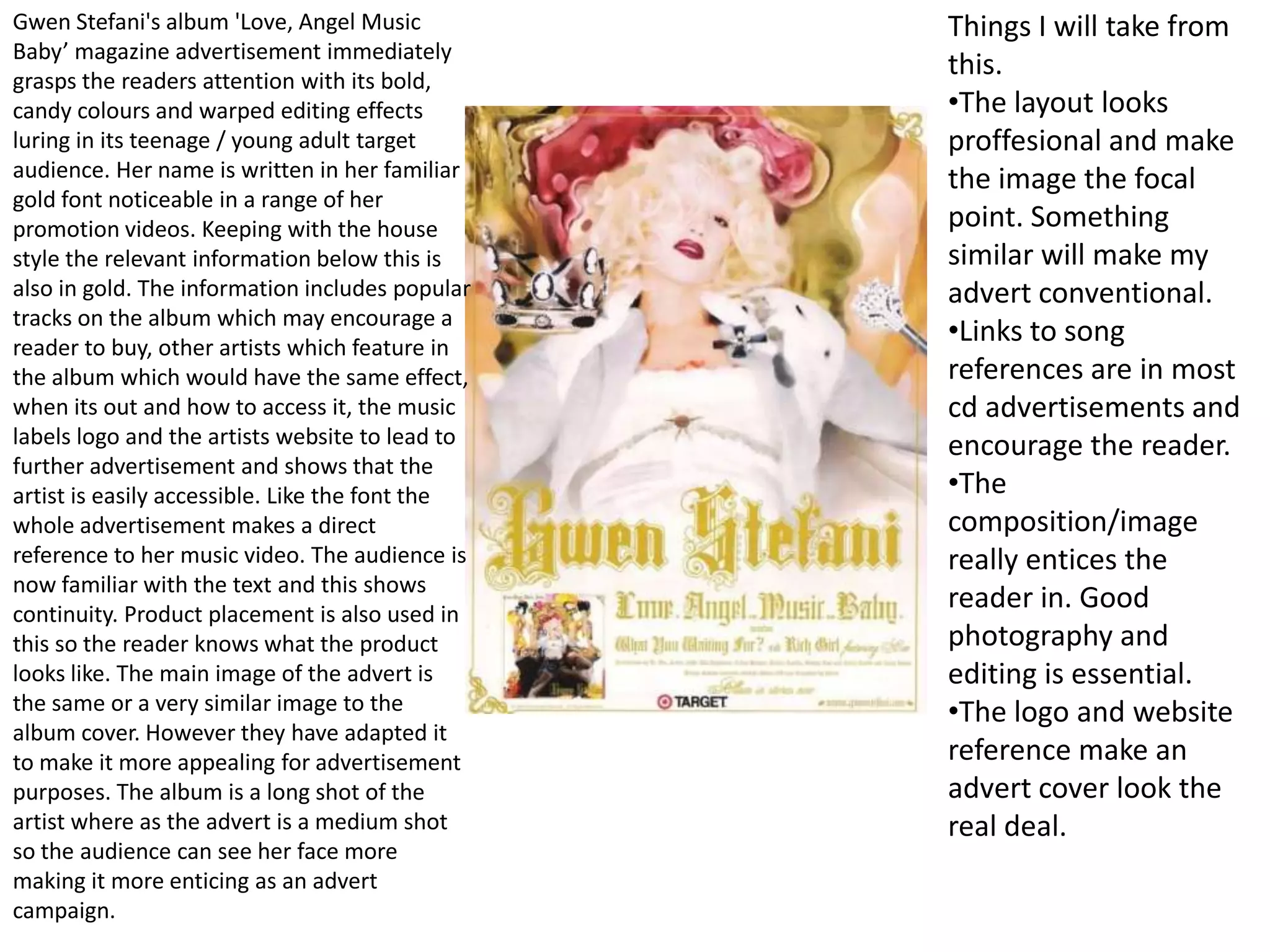
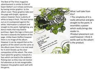
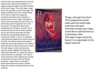
Gwen Stefani's album 'Love, Angel Music Baby’ magazine advertisement immediately grasps the readers attention with its bold, candy colours and warped editing effects luring in its teenage / young adult target audience. Her name is written in her familiar gold font noticeable in a range of her promotion videos. Keeping with the house style the relevant information below this is also in gold. The information includes popular tracks on the album which may encourage a reader to buy, other artists which feature in the album which would have the same effect, when its out and how to access it, the music labels logo and the artists website to lead to further advertisement and shows that the artist is easily accessible. Like the font the whole advertisement makes a direct reference to her music video. The audience is now familiar with the text and this shows continuity. Product placement is also used in this so the reader knows what the product looks like. The main image of the advert is the same or a very similar image to the album cover. However they have adapted it to make it more appealing for advertisement purposes. The album is a long shot of the artist where as the advert is a medium shot so the audience can see her face more making it more enticing as an advert campaign. Things I will take from this. The layout looks proffesional and make the image the focal point. Something similar will make my advert conventional.
Links to song references are in most cd advertisements and encourage the reader.
The composition/image really entices the reader in. Good photography and editing is essential.

Cd ad analysis

  • 1.
    Gwen Stefani's album'Love, Angel Music Baby’ magazine advertisement immediately grasps the readers attention with its bold, candy colours and warped editing effects luring in its teenage / young adult target audience. Her name is written in her familiar gold font noticeable in a range of her promotion videos. Keeping with the house style the relevant information below this is also in gold. The information includes popular tracks on the album which may encourage a reader to buy, other artists which feature in the album which would have the same effect, when its out and how to access it, the music labels logo and the artists website to lead to further advertisement and shows that the artist is easily accessible. Like the font the whole advertisement makes a direct reference to her music video. The audience is now familiar with the text and this shows continuity. Product placement is also used in this so the reader knows what the product looks like. The main image of the advert is the same or a very similar image to the album cover. However they have adapted it to make it more appealing for advertisement purposes. The album is a long shot of the artist where as the advert is a medium shot so the audience can see her face more making it more enticing as an advert campaign. Things I will take from this. The layout looks proffesional and make the image the focal point. Something similar will make my advert conventional.
  • 2.
    Links to songreferences are in most cd advertisements and encourage the reader.
  • 3.
    The composition/image reallyentices the reader in. Good photography and editing is essential.