
Recommended
More Related Content
What's hot
What's hot (17)
Similar to Mumford and Sons' "Wilder Mind
Similar to Mumford and Sons' "Wilder Mind (20)
More from sarahpoore17
More from sarahpoore17 (20)
Recently uploaded
Recently uploaded (20)
Mumford and Sons' "Wilder Mind
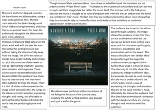
- 1. MEDIA STUDIES Mumford and Sons’ digipack provides the band name and album name, using a clear and capitalised font. The text contrasts with the darker background which makes it very prominent, and since they are a popular band, this helps the audience to recognisethe album cover even froma distance. Though some of their previous album covers haveincluded the band, the members are not present on the ‘Wilder Mind’ cover. This implies to the audience that Mumford and Sons arenot trying to sell their image/style but rather the music itself. This is important in the folk genre because the music is thought to be natural and pure and fromthis we can deduce that the band are confident in their music. The fact that they are not featured on the album cover shows that they do not need to rely on current fashions and trends or their individual or combined appearancein order to sell records. The audience are drawn to the album cover through curiosity. The image allows the audience to feel that they are sat on the bench with the city spread out before them in their own eyes, and this may open up thoughts, memories, possibilities and eventualities within the viewer. This links to the album title ‘Wilder Mind’ because through the image the audience are encouraged to think further than what is in frontof them. The obscurity of this title allows the audience to interpret different ideas. For example, it could be used to imply that the music on the album is the artists ‘wilder mind’, a way of expressing the thoughts and emotions that are in the band members’ head. Ultimately this makes the audience feel that they havean emotional connection with the band since they are sharing thoughts and emotions with the audience. The blue, orangeand black colours in the photo work well with the text because they allow the writing to stand out without taking the attention fully away fromthe image. The different tones of orangehave a high visibility and so helps to catch the attention of the viewer as well as representing creativity, success, determination and happiness. These connotations representthe band well because it tells the audience how music focused they are and how they want their audience to enjoy the music. There is a hint of a blue undertonewithin the image which advocates that the songs on the album are full of emotion, expressing thoughts and reality, and this helps to portray the genre because it shows the music they are producing is pure and ‘real’. The album cover conforms to the conventions of the folk genre because of the colours used, including the white writing which is very popular and typical within the genre.