The document analyzes and summarizes several album covers:
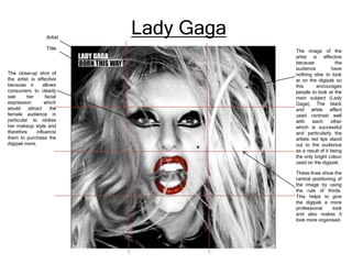
- The Lady Gaga album cover uses a close-up black and white portrait that draws attention to her red lips and allows fans to idolize her style.
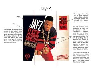
- The Jay-Z album cover portrays him as a criminal through his clothing and accessories, relating to the album title "Classic Gangster" and intended audience.
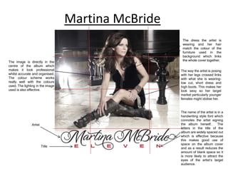
- The Martina McBride cover matches her dress and pose to the background furniture, making her look sexy and appealing to younger female fans.