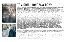
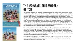
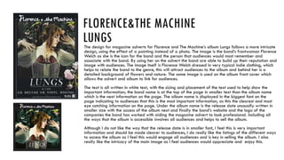
MAGAZINE ADVERT ANALYSIS
To gain inspiration for my own
magazine advert I have
researched other indie artist
magazine adverts.
TOM ODELL
TOM ODELL-LONG WAY DOWNThis is a magazine advert for the indie artist Tom Odell’s debut album Long Way Down. The
main design of this advert is to use a midshot of the artist (Tom) with a blurred out
background of a cobbled street. By using an image of the artist audiences are able to build
up an connection, this is furthered by the use of direct address with Tom directly facing the
camera, builds up audiences knowledge of the artist-this is particularly important for a debut
album. The blurred out background also places a lot of empathise on the artist.
The colour scheme is un-complex using white and gold for the text which is all written in
capitals creating a bold and clear look and shades of blue within the artist’s outfits. These
colours complement each other and do not clash or overpower audiences. The use of gold
works very effectively to highlight the important information on the page, looking eye
catching and interesting to audiences. The layout of the text also aides this, with the more
important information being placed at the top of the page in larger bolder text for
audiences to read first, before sizing down to list the accolades and then becoming more
prominent again for the release date. The release date is conveyed in number form rather
than in text and this creates a sleek and professional look. The accolades work well to
encourage and influence audiences to purchase the album and build up the artist’s
reputation. The only other information on the page is the logos of the record label and
companies that the artist is linked too. The different size and boldness of text allows for
audiences to understand what is the important and noteworthy information within their first
look at the poster.
There is a clear link between the magazine advert and the album through the use of the same
main image, and this will allow audiences to grow familiar with the artist and understand
exactly what the advert is advertising.
I really like the idea of using the artist on the advert and having this tie in with the album
design as this creates fluidity across each product for audiences. I also like the direct address
as I feel this helps to connect the artist to audiences and the way the release date is in
numerical form as this looks sleek and effective.
THE
WOMBATS
THE WOMBATS-THIS MODERN
GLITCH
The magazine advert for the Wombats second studio album This Modern Glitch follows a very bright
and clear colour scheme that predominantly features the colour blue. This bright colour is eye catching
and interesting without being overpowering providing a neutral tone. The text is white and yellow, with
the yellow being utilised to show the key information to audiences. All the text is written in capitals
creating a clear and defined look. The text is positioned so that the artist and album name is at the top
of page in white text showing that is some of the most important information for audiences, and then
under the main image is the release date and some of the singles on the album are written in yellow
showing how this is more interesting information for audiences. The last and lowest line of text is of the
social media links and the logos of the companies that the band have worked with. This is all important
information that informs the audiences of the necessary information. These colours work well together
and compliment both each other and the main colour of the blue.
The main image is the same image that is used for the album, helping to create an link between for
audiences. The main image does not feature the band/artist in this case however is still effective in
catching the audiences eye and looking interesting within the magazine. The main image also relates
well to title of the album allowing common ideas and theme’s to be clear across the advertisement. The
overall design is shown to be someone holding the main image which continues to fit in with the theme of
the album, presenting this theme across the advert.
I really like how this advert has included the best singles on the advert and how the colours all work
together really well. I like the idea of using colour within the text to highlight what is important to
audiences, as I feel this is effective and clear.
FLORENCE&THE
MACHINE
FLORENCE&THE MACHINE
LUNGSThe design for magazine adverts for Florence and The Machine’s album Lungs follows a more intricate
design, using the effect of a painting instead of a photo. The image is the band’s frontwoman Florence
Welch as she is the icon for the band and the person that audiences would most remember and
associate with the band. By using her on the advert the band are able to build up their reputation and
image with audiences. The image itself is Florence Welch dressed in very typical indie clothing, which
helps to relate the band to the genre, this will attract audiences to the album and behind her is a
detailed background of flowers and nature. The same image is used on the album front cover which
allows the advert and album to link for audiences.
The text is all written in white text, with the sizing and placement of the text used to help show the
important information; the band name is at the top of the page in smaller text than the album name
which is the next information on the page. The album name is displayed in the biggest font on the
page indicating to audiences that this is the most important information, as this the clearest and most
eye catching information on the page. Under the album name is the release date unusually written in
smaller size with the access of the album next and finally the band’s website and the logo of the
companies the band has worked with aiding the magazine advert to look professional. Including all
the ways that the album is accessible involves all audiences and helps to sell the album.
Although I do not like the way that the release date is in smaller font, I feel this is very important
information and should be made clearer to audiences, I do really like the listings of the different ways
to access the album as I feel this would engage all audiences and is key in selling the album. I also
really like the intricacy of the main image as I feel audiences would appreciate and enjoy this.

Magazine Advert Analysis

  • 1.
    MAGAZINE ADVERT ANALYSIS Togain inspiration for my own magazine advert I have researched other indie artist magazine adverts.
  • 2.
  • 3.
    TOM ODELL-LONG WAYDOWNThis is a magazine advert for the indie artist Tom Odell’s debut album Long Way Down. The main design of this advert is to use a midshot of the artist (Tom) with a blurred out background of a cobbled street. By using an image of the artist audiences are able to build up an connection, this is furthered by the use of direct address with Tom directly facing the camera, builds up audiences knowledge of the artist-this is particularly important for a debut album. The blurred out background also places a lot of empathise on the artist. The colour scheme is un-complex using white and gold for the text which is all written in capitals creating a bold and clear look and shades of blue within the artist’s outfits. These colours complement each other and do not clash or overpower audiences. The use of gold works very effectively to highlight the important information on the page, looking eye catching and interesting to audiences. The layout of the text also aides this, with the more important information being placed at the top of the page in larger bolder text for audiences to read first, before sizing down to list the accolades and then becoming more prominent again for the release date. The release date is conveyed in number form rather than in text and this creates a sleek and professional look. The accolades work well to encourage and influence audiences to purchase the album and build up the artist’s reputation. The only other information on the page is the logos of the record label and companies that the artist is linked too. The different size and boldness of text allows for audiences to understand what is the important and noteworthy information within their first look at the poster. There is a clear link between the magazine advert and the album through the use of the same main image, and this will allow audiences to grow familiar with the artist and understand exactly what the advert is advertising. I really like the idea of using the artist on the advert and having this tie in with the album design as this creates fluidity across each product for audiences. I also like the direct address as I feel this helps to connect the artist to audiences and the way the release date is in numerical form as this looks sleek and effective.
  • 4.
  • 5.
    THE WOMBATS-THIS MODERN GLITCH Themagazine advert for the Wombats second studio album This Modern Glitch follows a very bright and clear colour scheme that predominantly features the colour blue. This bright colour is eye catching and interesting without being overpowering providing a neutral tone. The text is white and yellow, with the yellow being utilised to show the key information to audiences. All the text is written in capitals creating a clear and defined look. The text is positioned so that the artist and album name is at the top of page in white text showing that is some of the most important information for audiences, and then under the main image is the release date and some of the singles on the album are written in yellow showing how this is more interesting information for audiences. The last and lowest line of text is of the social media links and the logos of the companies that the band have worked with. This is all important information that informs the audiences of the necessary information. These colours work well together and compliment both each other and the main colour of the blue. The main image is the same image that is used for the album, helping to create an link between for audiences. The main image does not feature the band/artist in this case however is still effective in catching the audiences eye and looking interesting within the magazine. The main image also relates well to title of the album allowing common ideas and theme’s to be clear across the advertisement. The overall design is shown to be someone holding the main image which continues to fit in with the theme of the album, presenting this theme across the advert. I really like how this advert has included the best singles on the advert and how the colours all work together really well. I like the idea of using colour within the text to highlight what is important to audiences, as I feel this is effective and clear.
  • 6.
  • 7.
    FLORENCE&THE MACHINE LUNGSThe designfor magazine adverts for Florence and The Machine’s album Lungs follows a more intricate design, using the effect of a painting instead of a photo. The image is the band’s frontwoman Florence Welch as she is the icon for the band and the person that audiences would most remember and associate with the band. By using her on the advert the band are able to build up their reputation and image with audiences. The image itself is Florence Welch dressed in very typical indie clothing, which helps to relate the band to the genre, this will attract audiences to the album and behind her is a detailed background of flowers and nature. The same image is used on the album front cover which allows the advert and album to link for audiences. The text is all written in white text, with the sizing and placement of the text used to help show the important information; the band name is at the top of the page in smaller text than the album name which is the next information on the page. The album name is displayed in the biggest font on the page indicating to audiences that this is the most important information, as this the clearest and most eye catching information on the page. Under the album name is the release date unusually written in smaller size with the access of the album next and finally the band’s website and the logo of the companies the band has worked with aiding the magazine advert to look professional. Including all the ways that the album is accessible involves all audiences and helps to sell the album. Although I do not like the way that the release date is in smaller font, I feel this is very important information and should be made clearer to audiences, I do really like the listings of the different ways to access the album as I feel this would engage all audiences and is key in selling the album. I also really like the intricacy of the main image as I feel audiences would appreciate and enjoy this.