
Recommended
More Related Content
What's hot
What's hot (20)
Similar to Magazine advert analysis.
Similar to Magazine advert analysis. (20)
More from AmyShields00
More from AmyShields00 (20)
Recently uploaded
Recently uploaded (20)
Magazine advert analysis.
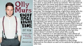
- 1. This advert featuring Olly Murs is a very effective advert. It is clear as too what it wants to achieve. The mid shot of Olly along with his name and album name equally share the page, this is because both his image and his name are equally as important when it comes too attracting fans. The colour scheme of this advert is very aesthetically pleasing. The background being a light blue along with his outfit corresponding with the couples in the text makes the advert both eye catching whilst being minimalistic. The colours in this advert consist of Burgundy, black and the light blue of the background, taking a look at Olly's previous albums it is clear too see that these are colours he regularly use which can be seen as a selling point of the advert. The use of similar colours means that’s fans of Olly's will easily be able to spot the advert and know who it is instantly before they can see his face and name clearly. The fonts used are all slightly similar however are noticeably different. This can connote to the fact this album doesn’t stretch far from what Olly usually produces, however it is still advertising a new album of his. Olly is seen looking straight into the camera, which is conventional for most adverts, suggesting that he is rather mainstream. The advert obtains very little information and only tells the audience a few songs featured on the album as well as his website for people to refer too.
- 2. This advert by the band green day is less conventional then most adverts but still follows the normal codes and conventions of magazine advertisement. The band title is displayed conventionally at the top of the screen as a masthead of the page. However above the title of the band they are featured a tag line ‘the wait is finally over’ suggesting that this is a advert particularly appealing to old fans of green day. The main masthead of the bands name is featured in the typical green day font in white. This adheres to the colour scheme whilst being able to stand out on the dark background. The whole colour scheme is predominately black, white red/orange and yellow. They are all slightly separate shades. The background is mostly black but with the centre of the screen behind the silhouettes glowing, Symbolising a fire. The advert also features a website and the bottom along with the date it can be purchased and the formats available. Unlike most music adverts the poster does not show the artists in question. From looking at most adverts, there usually is a full bleed image of the artist, often a close up which is used to promote the artist and attach audiences attention. However other then the name there is nothing else attracting people too this advert under the basis that its green day bringing out a new album.
- 3. This advert by Jessie. It is very clear when it comes too portraying the artist and its music. Jessie's mise-en-scene and body language overall conveys a fierce and care free attitude that Jessie J is commonly known as Portraying. The overall colour scheme is Black, White with accents of gold. The colour scheme is very successful with being aesthetically pleasing as the accents of gold are even carried out though the detail on Jessie’s lip and her earrings. Her name is featured in bold gold writing in the middle of the page under Jessie's page. This is a effective positioning as when looking at a poster the middle tends too be at the audiences eye contact. Her eyes also have dark makeup around them which helps them to stand out even further. The shot of Jessie is a direct close up and features Jessie making direct eye contact with the audience, this is direct address between the artist and the audience. This is common in music adverts as having direct eye contact with the camera can help when attracting the audiences attention. Also the close up makes her easily recognisable which will be a clear selling point for the album. However where this advert does mostly follow the codes and conventions, it also differs slightly as the picture isn’t a full bleed which I personally feel is my least favourite
- 4. This advert by Ellie Goulding is very affect with promoting her album. The full bleed is a close uo/mid shot of the artist, looking away from the camera. This could symbolise the way in which Ellie and her music are quite quiet, timid and sweet. Half of her face is in a slight shadow which could connote the idea that she is still quite closed and reserved and doesn't necessarily act herself. This could alternatively be a link too the idea of the spotlight that’s on her as a artist and that she doesn’t necessarily shine under it like some other more big artists do. The name of her album is lights. Which ties all the loose ends of the advert together, i.e the glow in the font and her hair.