Embed presentation
Download to read offline


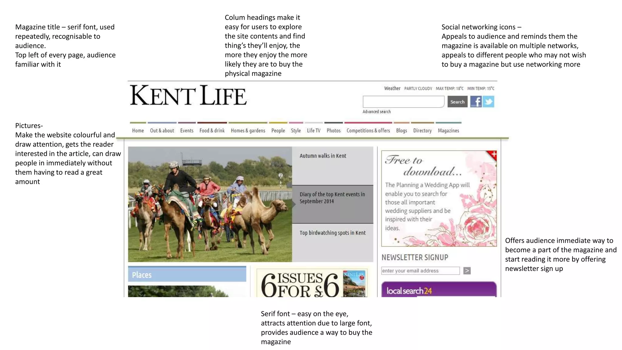
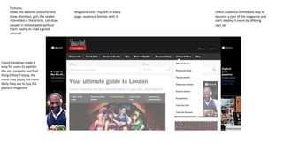
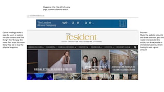
The document discusses design elements for a magazine website that appeal to audiences and encourage purchasing the physical magazine. These include using the magazine's recognizable serif title font consistently on pages and in the top left corner to create familiarity. It also recommends using colorful pictures to draw readers in without extensive reading, column headings to help users easily explore content and find things they'll enjoy, and offering a newsletter signup to get audiences involved with the magazine online. The goal is to make readers enjoy the online content so much that they are more likely to buy the physical magazine.
