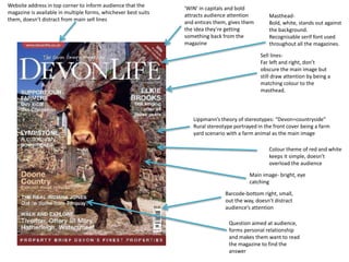
Masthead- 
Bold, white, stands out against 
the background. 
Recognisable serif font used 
throughout all the magazines. 
Sell lines- 
Far left and right, don’t 
obscure the main image but 
still draw attention by being a 
matching colour to the 
masthead. 
Colour theme of red and white 
keeps it simple, doesn’t 
overload the audience 
‘WIN’ in capitals and bold 
attracts audience attention 
and entices them, gives them 
the idea they’re getting 
something back from the 
magazine 
Main image- bright, eye 
catching 
Barcode-bottom right, small, 
out the way, doesn’t distract 
audience’s attention 
Question aimed at audience, 
forms personal relationship 
and makes them want to read 
the magazine to find the 
answer 
Website address in top corner to inform audience that the 
magazine is available in multiple forms, whichever best suits 
them, doesn’t distract from main sell lines 
Lippmann’s theory of stereotypes: “Devon=countryside” 
Rural stereotype portrayed in the front cover being a farm 
yard scenario with a farm animal as the main image
Main image- bright, eye 
catching 
Barcode-bottom right, small, 
out the way, doesn’t distract 
audience’s attention 
Website address in top corner to inform audience that the 
magazine is available in multiple forms, whichever best suits 
them, doesn’t distract from main sell lines 
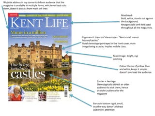
Masthead- 
Bold, white, stands out against 
the background. 
Recognisable serif font used 
throughout all the magazines. 
Lippmann’s theory of stereotypes: “Kent=rural, manor 
houses/castles” 
Rural stereotype portrayed in the front cover, main 
image being a castle, implies middle class. 
Colour theme of yellow, blue 
and white, keeps it simple, 
doesn’t overload the audience 
Castles = heritage 
Stereotypically attract an older 
audience to visit them, hence 
an older audience for the 
magazine
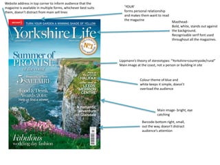
‘YOUR’ 
forms personal relationship 
and makes them want to read 
the magazine 
Lippmann’s theory of stereotypes: “Yorkshire=countryside/rural” 
Main image at the coast, not a person or building in site 
Colour theme of blue and 
white keeps it simple, doesn’t 
overload the audience 
Barcode-bottom right, small, 
out the way, doesn’t distract 
audience’s attention 
Website address in top corner to inform audience that the 
magazine is available in multiple forms, whichever best suits 
them, doesn’t distract from main sell lines 
Masthead- 
Bold, white, stands out against 
the background. 
Recognisable serif font used 
throughout all the magazines. 
Main image- bright, eye 
catching
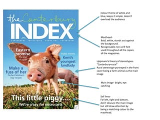
Colour theme of white and 
blue, keeps it simple, doesn’t 
overload the audience 
Masthead- 
Bold, white, stands out against 
the background. 
Recognisable non serif font 
used throughout all the copies 
of the magazines. 
Lippmann’s theory of stereotypes: 
“Canterbury=rural” 
Rural stereotype portrayed in the front 
cover being a farm animal as the main 
image 
Main image- bright, eye 
catching 
Sell lines- 
Far left, right and bottom, 
don’t obscure the main image 
but still draw attention by 
being a matching colour to the 
masthead.
Website address in top corner to inform audience that the 
magazine is available in multiple forms, whichever best suits 
them, doesn’t distract from main sell lines 
‘YOUR’ 
forms personal relationship 
and makes them want to read 
the magazine 
Colour theme of red, black 
and white keeps it simple, 
doesn’t overload the audience 
‘FREE EVENTS’ in capitals and 
bold attracts audience 
attention and entices them, 
gives them the idea they’re 
getting something back from 
the magazine 
Sell lines- 
Far left and right, don’t 
obscure the main image but 
still draw attention by being a 
matching colour to the 
masthead. 
Kilbourne’s representation theory- 
Model with perfect skin and edited to 
look incredible 
Main image- bright, eye 
catching, very pretty 
Barcode-bottom right, small, 
out the way, doesn’t distract 
audience’s attention
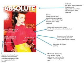
Masthead- 
Bold, white, stands out against 
the background. 
Recognisable non serif font 
used throughout all the 
magazines. 
Kilbourne’s representation theory-female 
with perfect skin and edited to look 
incredible 
Colour theme of red, yellow 
and white keeps it simple, 
doesn’t overload the audience 
Main image- bright, eye 
catching 
Question aimed at audience, 
forms personal relationship 
and makes them want to read 
the magazine to find the 
answer 
Sell lines- 
Far left and right, don’t 
obscure the main image but 
still draw attention by being a 
matching colour to the 
masthead. 
Model looks like a young 
adult, attracts younger 
audience as they feel familiar 
with her due to being similar 
ages
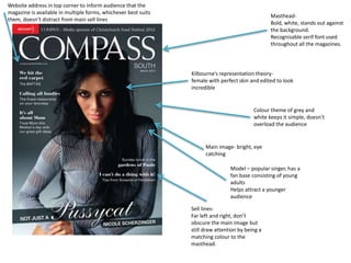
Website address in top corner to inform audience that the 
magazine is available in multiple forms, whichever best suits 
them, doesn’t distract from main sell lines 
Masthead- 
Bold, white, stands out against 
the background. 
Recognisable serif font used 
throughout all the magazines. 
Kilbourne’s representation theory-female 
with perfect skin and edited to look 
incredible 
Colour theme of grey and 
white keeps it simple, doesn’t 
overload the audience 
Main image- bright, eye 
catching 
Model – popular singer, has a 
fan base consisting of young 
adults 
Helps attract a younger 
audience 
Sell lines- 
Far left and right, don’t 
obscure the main image but 
still draw attention by being a 
matching colour to the 
masthead.
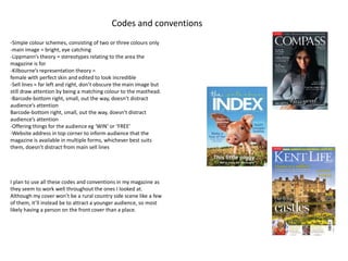
Codes and conventions 
-Simple colour schemes, consisting of two or three colours only 
-main image = bright, eye catching 
-Lippmann’s theory = stereotypes relating to the area the 
magazine is for 
-Kilbourne’s representation theory = 
female with perfect skin and edited to look incredible 
-Sell lines = far left and right, don’t obscure the main image but 
still draw attention by being a matching colour to the masthead. 
-Barcode-bottom right, small, out the way, doesn’t distract 
audience’s attention 
Barcode-bottom right, small, out the way, doesn’t distract 
audience’s attention 
-Offering things for the audience eg ‘WIN’ or ‘FREE’ 
-Website address in top corner to inform audience that the 
magazine is available in multiple forms, whichever best suits 
them, doesn’t distract from main sell lines 
I plan to use all these codes and conventions in my magazine as 
they seem to work well throughout the ones I looked at. 
Although my cover won’t be a rural country side scene like a few 
of them, it’ll instead be to attract a younger audience, so most 
likely having a person on the front cover than a place.

Codes and conventions

  • 1.
    Masthead- Bold, white,stands out against the background. Recognisable serif font used throughout all the magazines. Sell lines- Far left and right, don’t obscure the main image but still draw attention by being a matching colour to the masthead. Colour theme of red and white keeps it simple, doesn’t overload the audience ‘WIN’ in capitals and bold attracts audience attention and entices them, gives them the idea they’re getting something back from the magazine Main image- bright, eye catching Barcode-bottom right, small, out the way, doesn’t distract audience’s attention Question aimed at audience, forms personal relationship and makes them want to read the magazine to find the answer Website address in top corner to inform audience that the magazine is available in multiple forms, whichever best suits them, doesn’t distract from main sell lines Lippmann’s theory of stereotypes: “Devon=countryside” Rural stereotype portrayed in the front cover being a farm yard scenario with a farm animal as the main image
  • 2.
    Main image- bright,eye catching Barcode-bottom right, small, out the way, doesn’t distract audience’s attention Website address in top corner to inform audience that the magazine is available in multiple forms, whichever best suits them, doesn’t distract from main sell lines Masthead- Bold, white, stands out against the background. Recognisable serif font used throughout all the magazines. Lippmann’s theory of stereotypes: “Kent=rural, manor houses/castles” Rural stereotype portrayed in the front cover, main image being a castle, implies middle class. Colour theme of yellow, blue and white, keeps it simple, doesn’t overload the audience Castles = heritage Stereotypically attract an older audience to visit them, hence an older audience for the magazine
  • 3.
    ‘YOUR’ forms personalrelationship and makes them want to read the magazine Lippmann’s theory of stereotypes: “Yorkshire=countryside/rural” Main image at the coast, not a person or building in site Colour theme of blue and white keeps it simple, doesn’t overload the audience Barcode-bottom right, small, out the way, doesn’t distract audience’s attention Website address in top corner to inform audience that the magazine is available in multiple forms, whichever best suits them, doesn’t distract from main sell lines Masthead- Bold, white, stands out against the background. Recognisable serif font used throughout all the magazines. Main image- bright, eye catching
  • 4.
    Colour theme ofwhite and blue, keeps it simple, doesn’t overload the audience Masthead- Bold, white, stands out against the background. Recognisable non serif font used throughout all the copies of the magazines. Lippmann’s theory of stereotypes: “Canterbury=rural” Rural stereotype portrayed in the front cover being a farm animal as the main image Main image- bright, eye catching Sell lines- Far left, right and bottom, don’t obscure the main image but still draw attention by being a matching colour to the masthead.
  • 5.
    Website address intop corner to inform audience that the magazine is available in multiple forms, whichever best suits them, doesn’t distract from main sell lines ‘YOUR’ forms personal relationship and makes them want to read the magazine Colour theme of red, black and white keeps it simple, doesn’t overload the audience ‘FREE EVENTS’ in capitals and bold attracts audience attention and entices them, gives them the idea they’re getting something back from the magazine Sell lines- Far left and right, don’t obscure the main image but still draw attention by being a matching colour to the masthead. Kilbourne’s representation theory- Model with perfect skin and edited to look incredible Main image- bright, eye catching, very pretty Barcode-bottom right, small, out the way, doesn’t distract audience’s attention
  • 6.
    Masthead- Bold, white,stands out against the background. Recognisable non serif font used throughout all the magazines. Kilbourne’s representation theory-female with perfect skin and edited to look incredible Colour theme of red, yellow and white keeps it simple, doesn’t overload the audience Main image- bright, eye catching Question aimed at audience, forms personal relationship and makes them want to read the magazine to find the answer Sell lines- Far left and right, don’t obscure the main image but still draw attention by being a matching colour to the masthead. Model looks like a young adult, attracts younger audience as they feel familiar with her due to being similar ages
  • 7.
    Website address intop corner to inform audience that the magazine is available in multiple forms, whichever best suits them, doesn’t distract from main sell lines Masthead- Bold, white, stands out against the background. Recognisable serif font used throughout all the magazines. Kilbourne’s representation theory-female with perfect skin and edited to look incredible Colour theme of grey and white keeps it simple, doesn’t overload the audience Main image- bright, eye catching Model – popular singer, has a fan base consisting of young adults Helps attract a younger audience Sell lines- Far left and right, don’t obscure the main image but still draw attention by being a matching colour to the masthead.
  • 8.
    Codes and conventions -Simple colour schemes, consisting of two or three colours only -main image = bright, eye catching -Lippmann’s theory = stereotypes relating to the area the magazine is for -Kilbourne’s representation theory = female with perfect skin and edited to look incredible -Sell lines = far left and right, don’t obscure the main image but still draw attention by being a matching colour to the masthead. -Barcode-bottom right, small, out the way, doesn’t distract audience’s attention Barcode-bottom right, small, out the way, doesn’t distract audience’s attention -Offering things for the audience eg ‘WIN’ or ‘FREE’ -Website address in top corner to inform audience that the magazine is available in multiple forms, whichever best suits them, doesn’t distract from main sell lines I plan to use all these codes and conventions in my magazine as they seem to work well throughout the ones I looked at. Although my cover won’t be a rural country side scene like a few of them, it’ll instead be to attract a younger audience, so most likely having a person on the front cover than a place.