- The document is a student's evaluation of their created magazine covering coursework.
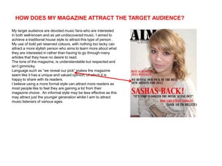
- The magazine was designed to attract devoted music fans interested in both mainstream and undiscovered music.
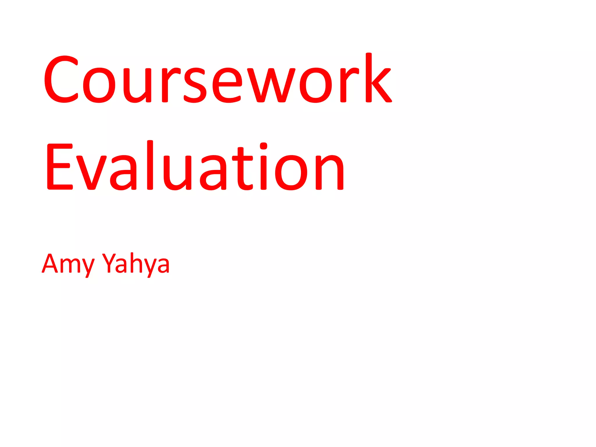
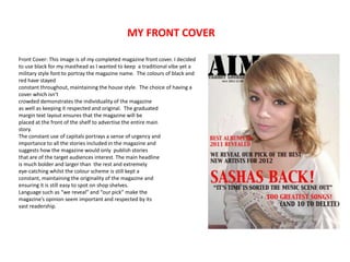
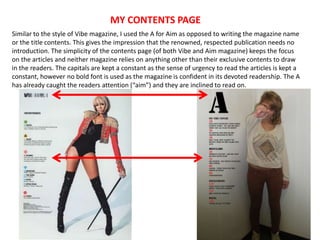
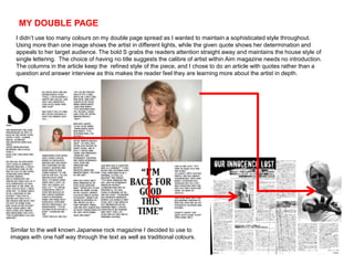
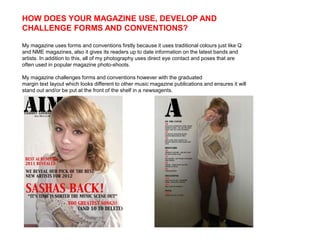
- Traditional magazine styles and conventions were used like bold colors and direct eye contact in photos, while also experimenting with techniques like graduated margin text.
- The student demonstrated new skills in photo editing software and creating a more polished final magazine compared to their preliminary work.