Generic Conventions
BY ELISHA DELANEY
Magazine
Front Cover
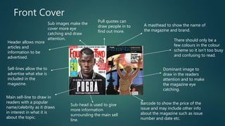
Dominant image to
draw in the readers
attention and to make
the magazine eye
catching.
A masthead to show the name of
the magazine and brand.
Barcode to show the price of the
issue and may include other info
about the magazine such as issue
number and date etc.
Main sell-line to draw in
readers with a popular
name/celebrity as it draws
in interest in what it is
about the topic.
Sub-head is used to give
more information
surrounding the main sell
line.
Sell-lines allow the to
advertise what else is
included in the
magazine.
Header allows more
articles and
information to be
advertised.
Sub images make the
cover more eye
catching and draw
attention.
Pull quotes can
draw people in to
find out more.
There should only be a
few colours in the colour
scheme so it isn’t too busy
and confusing to read.
Double Page Spread
An introduction
maybe included
into the
content to draw
in the readers
interest.
A dominant image will be
used to make the page
eye catching and
aesthetically pleasing.
Page numbers and other essential
information is commonly included for
links to get more content.
Titles are used to start off the
article and can be trivial to draw in
the readers attention.
Customised headers may be used
if the person(s) is important to
show the section is about them
alone.
A pull quote from the
content may be used
to grab the readers
attention.
Sub images are
used to make the
content media
rich and to draw
the attention of
readers with it
being
aesthetically
pleasing.
Drop caps are commonly used
to signal the start of the article.
By-lines and
other credits
are used to
give credit to
creators.
A small colour scheme should be
used so it is not too confusing to
read.
Contents Page
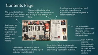
Subscription boxes to get people
interested in purchasing future issues
and build up a consistent audience.
The masthead is
sometimes included to
show and remind
readers of the name of
the publication.
An editors note is sometimes used
to introduce people to the
magazine and give the magazine a
personalised touch.
The contents itself is is
mostly split into sections for
the topic of the content.
Sub-images are
used to make
the contents
page more eye
catching and
visually
aesthetically
pleasing.
The contents list tends to have a
description to tell you what to expect
and draw you in to read it.
Page numbers,
essential
information etc.
are commonly
included for links
to get more
content.
There should only be a few
colours in the colour scheme so
it is easy to read and not too
busy.
Adverts
Bold and sometimes
colour fonts will be
used so that it
stands and can draw
in the attention of
the readers.
Information
concerning the name
and date etc. of the
event will be
displayed to give the
readers extra
information.
Links to websites and social media
etc. will be used to allow readers to
find out more about the
brand/person included in the
advert.
A dominant
image/sub image
will be included to
draw in the readers
attention as it is
visually interesting.
There should only be a
few colours in the
colour scheme so it is
simple to read and it
isn’t too busy.
Article
Side articles may be
used to give extra side
information about the
topic of the article.
Sub images can be
used to give a more
media rich look to the
article alongside
other images.
Page numbers and websites will
sometimes be included to give reader
extra information about the content.
A dominant image will be
used to bring a media rich
eye catching element to
the page.
A pull quote can be used
to draw people into the
content itself as they want
to know what the quote is
concerning.
A header is included
to signal what part of
the magazine it is
about.A title(s) is normally
included to give an
idea of what the
content is about.
The layout structure is
neat and it is
noticeable of the
direction of the article
in the way it should
be read.
Only a few colours
should be used so
that it can be easily
read and not
confusing.
Billboard
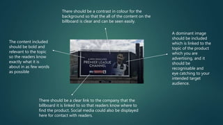
A dominant image
should be included
which is linked to the
topic of the product
which you are
advertising, and it
should be
recognisable and
eye catching to your
intended target
audience.
There should be a clear link to the company that the
billboard it is linked to so that readers know where to
find the product. Social media could also be displayed
here for contact with readers.
The content included
should be bold and
relevant to the topic
so the readers know
exactly what it is
about in as few words
as possible
There should be a contrast in colour for the
background so that the all of the content on the
billboard is clear and can be seen easily.
Website
It is important to include the
masthead of the magazine on
the website so that you create
a recognisable brand for
readers.
It is good to
have a social
media/
feedback
section to
stay
connected
with readers
and build a
fan base.
It is good to display side articles so fans know what
else they can read without having to search the
website which can become boring, and
accompanied with sub images to make the site eye
catching and media rich.
The main article on the page should have a
dominant image to accompany it so that it
stands out and draws attention with a
recognisable image for the readers.
If adverts are included it is
important that they are linked
and tailored to their target
audience.
It is good to have tab links so that
readers can find content across the
site easily to view the content and it is
in sections like in the magazine so
readers can find the topic they want
to view.

Generic conventions

  • 1.
  • 2.
  • 3.
    Front Cover Dominant imageto draw in the readers attention and to make the magazine eye catching. A masthead to show the name of the magazine and brand. Barcode to show the price of the issue and may include other info about the magazine such as issue number and date etc. Main sell-line to draw in readers with a popular name/celebrity as it draws in interest in what it is about the topic. Sub-head is used to give more information surrounding the main sell line. Sell-lines allow the to advertise what else is included in the magazine. Header allows more articles and information to be advertised. Sub images make the cover more eye catching and draw attention. Pull quotes can draw people in to find out more. There should only be a few colours in the colour scheme so it isn’t too busy and confusing to read.
  • 4.
    Double Page Spread Anintroduction maybe included into the content to draw in the readers interest. A dominant image will be used to make the page eye catching and aesthetically pleasing. Page numbers and other essential information is commonly included for links to get more content. Titles are used to start off the article and can be trivial to draw in the readers attention. Customised headers may be used if the person(s) is important to show the section is about them alone. A pull quote from the content may be used to grab the readers attention. Sub images are used to make the content media rich and to draw the attention of readers with it being aesthetically pleasing. Drop caps are commonly used to signal the start of the article. By-lines and other credits are used to give credit to creators. A small colour scheme should be used so it is not too confusing to read.
  • 5.
    Contents Page Subscription boxesto get people interested in purchasing future issues and build up a consistent audience. The masthead is sometimes included to show and remind readers of the name of the publication. An editors note is sometimes used to introduce people to the magazine and give the magazine a personalised touch. The contents itself is is mostly split into sections for the topic of the content. Sub-images are used to make the contents page more eye catching and visually aesthetically pleasing. The contents list tends to have a description to tell you what to expect and draw you in to read it. Page numbers, essential information etc. are commonly included for links to get more content. There should only be a few colours in the colour scheme so it is easy to read and not too busy.
  • 6.
    Adverts Bold and sometimes colourfonts will be used so that it stands and can draw in the attention of the readers. Information concerning the name and date etc. of the event will be displayed to give the readers extra information. Links to websites and social media etc. will be used to allow readers to find out more about the brand/person included in the advert. A dominant image/sub image will be included to draw in the readers attention as it is visually interesting. There should only be a few colours in the colour scheme so it is simple to read and it isn’t too busy.
  • 7.
    Article Side articles maybe used to give extra side information about the topic of the article. Sub images can be used to give a more media rich look to the article alongside other images. Page numbers and websites will sometimes be included to give reader extra information about the content. A dominant image will be used to bring a media rich eye catching element to the page. A pull quote can be used to draw people into the content itself as they want to know what the quote is concerning. A header is included to signal what part of the magazine it is about.A title(s) is normally included to give an idea of what the content is about. The layout structure is neat and it is noticeable of the direction of the article in the way it should be read. Only a few colours should be used so that it can be easily read and not confusing.
  • 8.
  • 9.
    A dominant image shouldbe included which is linked to the topic of the product which you are advertising, and it should be recognisable and eye catching to your intended target audience. There should be a clear link to the company that the billboard it is linked to so that readers know where to find the product. Social media could also be displayed here for contact with readers. The content included should be bold and relevant to the topic so the readers know exactly what it is about in as few words as possible There should be a contrast in colour for the background so that the all of the content on the billboard is clear and can be seen easily.
  • 10.
  • 11.
    It is importantto include the masthead of the magazine on the website so that you create a recognisable brand for readers. It is good to have a social media/ feedback section to stay connected with readers and build a fan base. It is good to display side articles so fans know what else they can read without having to search the website which can become boring, and accompanied with sub images to make the site eye catching and media rich. The main article on the page should have a dominant image to accompany it so that it stands out and draws attention with a recognisable image for the readers. If adverts are included it is important that they are linked and tailored to their target audience. It is good to have tab links so that readers can find content across the site easily to view the content and it is in sections like in the magazine so readers can find the topic they want to view.