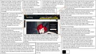
Magazine name/logo: 'Auxiliary magazine'.
Readers will recognise this logo from the
magazine, which shows that the website
is an extension of that product, and isn't
just an unrelated site. Information on the
site will be solely related to the magazine.
When clicked will take reader back to the
homepage.
Social media icons, are black and stand out
on the white background.
The use of these icons shows that the
company is up to date in using social media,
which will appeal to tech savvy customers.
Allows the company to directly engage with
it's audience, and receive feedback and
opinions etc. When clicked, the icons will
take the customer onto the relevant social
media page for the company.
Navigation tabs- are placed underneath the
header section of the website. The
typography is capitalised and black, which
makes it stand out on the white
background. These tabs have a similar
function to how contents page subheadings
work, they separate the information into
relevant sections/pages. When clicked,
each tab will navigate the user onto
a new page.
Arrows: allows consumers to pan through the 10 different
alternating slide/banners which highlight the main articles of interest
that are featured in the newest issue of the magazine. The sleek,
swiping motion of these slides changing is eye-catching and will grab
the consumers' attention. It also shows that the brand is cool, and
high-tech, which will appeal to younger technology using audience
members.
'New issue' is bolder than the
other menu tabs beside it. When
clicked it will directly take the
reader to a preview of the newest
issue of the magazine.
Search bar: allows consumer to search for a specific piece of
information, article, or magazine product. This will be helpful
to consumers who are struggling to find what they are looking
for immediately.
'SHOP' in black arrow, stands out in contrast next to the
white search bar, and is an imperative that will encourage
consumers to buy items on the website. The button, when clicked
will take customers to the page where they can purchase
both physical and digital copies of the magazine.
Subheading/menu tabs: allows readers to
access older issues digitally, to subscribe to
the magazine, to advertise on the website,
and to find out more on the
scheme 'Auxiliary insiders'
'Login' option, shows that readers can make their own individual
account with the company, which is likely to provide them with bonus
information and perks from the company. They are also
further engaged with the 'Auxiliary' brand, and the company can use
the sign in details (email) to market to and target a wider
audience. This also attracts younger target audience members who
frequently use technology.
Shopping basket: shows that readers can shop with Auxiliary on their
website, and the icon keeps a record of cost of the items the
customer intends to purchase, or it will show the number of items
that are in their basket.
Advertisement banner: shows that the company supports
other brands of a similar genre. It encourages readers to
check out a new album, this helps to fulfil the lifestyle and
culture elements of the magazine, as they are advertising
music products alongside their magazine. Reader's will
associate the two.
Colour scheme- mainly uses black and white
which is quite minimal, however it is easy to look
at and read, and isn't too distracting. It is a bleak
colour palette but this helps to represent the
gothic and dark themes of the magazine. Black
makes the website look more sophisticated and
chic too.
Main image: uses direct address to engage consumer. The model looks
gothic which conveys the dark and alternative themes of the magazine,
also relates to fashion and beauty element. Model's makeup fits with
colour scheme, however her red hair stand out making her look eye
catching.
'Sep Issue' relates to the season, which implies that the content
on the website may be tailored to that season, in terms of
weather and style etc. 'OUT NOW' creates a sense of urgency,
which will encourage the reader to look at the information as
soon as they see this, otherwise they are missing out? 'Read
more' button, encourages customers to find out more about
this area of the magazine, and when clicked takes readers onto a
page about the new winter issue.
Social media icons, are white and stand out on the black
background of the navigation bar strip. The use of these icons
shows that the company is up to date in using social media, which
will appeal to tech savvy customers. Allows the company to directly
engage with it's audience, and receive feedback and opinions etc.
When clicked, the icons will take the customer onto the relevant
social media page for the company.
Search icon: allows consumer to search for
a specific piece of information, article, or
magazine product. This will be helpful to
consumers who are struggling to find what
they are looking for immediately.
Magazine name/logo: ’Gothic&amazing'. Is
at the centre and top of the site, making it
a focal point. The black font also stands out
against the light background. Readers will
recognise this logo from the magazine,
which shows that the website is an
extension of that product, and isn't just an
unrelated site. Information on the site will
be solely related to the magazine. When
clicked will take reader back to the
homepage. The pink and black colours of
the logo co-ordinate with the masthead,
and the image of the rose could be
considered feminine implying that the
magazine is more aimed to a female
audience. The rose is black which
introduces an air of mystery and dark
beauty, which links to the gothic style
element of the magazine.
Tagline- ‘Gothic lifestyle magazine’ explains the nature of the
magazine and website, and gives readers an insight of what sort of
content they will be able to view, and the information that the
magazine will offer them. It will catered towards an alternative
audience that like gothic things, which is why it isn’t just a general
lifestyle magazine, the gothic element makes it niche and unusual.
Colour scheme- mainly uses black and white
which is quite minimal, however it is easy to look
at and read, and isn't too distracting. It is a bleak
colour palette but this helps to represent the
gothic and dark themes of the magazine. Black
makes the website look more sophisticated and
chic too.
Main image: uses direct address to engage consumer. The
model looks gothic which conveys the dark and alternative themes of
the magazine, also relates to fashion and beauty element. Model’s
hand is positioned near the caption which draws attention to it. The
main image uses an alternating slide/banner which highlights the
main articles of interest that are featured in the newest issue of the
magazine. The sleek, swiping motion of these slides changing is eye-
catching and will grab the consumers' attention. It also shows that
the brand is cool, and high-tech, which will appeal to
younger technology using audience members.
Caption: ‘Kat Robichauds misfit cabaret
presents grimm’ there is a related
caption that further explains the main
image. The caption also uses dark
themed language such as ‘misfit’ and
‘grimm’ which relates it further to the
gothic genre. READ NOW’ is an
imperative that is persuading readers to
act and buy the magazine.
Navigation tabs- are placed underneath the header section of the
website. ‘news, interview’ ‘music’ etc shows that the magazine is of the
lifestyle and entertainment/culture genre. The typography is capitalised
and white, which makes it stand out on the black strip background.
These tabs have a similar function to how contents page subheadings
work, they separate the information into relevant sections/pages. When
clicked, each tab will navigate the user onto a new page.
'Login & register' option, shows that readers can make their own
individual account with the company, which is likely to provide
them with bonus information and perks from the company. They
are also further engaged with the ‘Hertfordshire life' brand, and the
company can use the sign in details (email) to market to and target
a wider audience. This also attracts younger target audience
members who frequently use technology.
Search bar: allows consumer to search for a specific piece
of information, article, or magazine product. This will be
helpful to consumers who are struggling to find what they
are looking for immediately. Also gives the option for an
advanced search.
Navigation tabs- are placed
underneath the header section of
the website. ‘Garden’ ‘home’ etc
shows that the magazine is of the
lifestyle genre. The typography is
black, which makes it stand out on
the white background. These tabs
each have a different coloured
rectangle above each of the
headings, so it clearly
differentiates them, and makes
them eyecatching, it also implies
that the magazine is vibrant and
fun. The tabs have a similar
function to how contents page
subheadings work, they separate
the information into relevant
sections/pages. When clicked,
each tab will navigate the user
onto a new page.
Social media icons, are at the top of the website and
stand out on the white background.
The use of these icons shows that the company is up to
date in using social media, which will appeal to tech
savvy customers. Allows the company to directly engage
with it's audience, and receive feedback and opinions etc.
When clicked, the icons will take the customer onto the
relevant social media page for the company.
Magazine name/logo: Hertfordshire life'. Readers
will recognise this logo from the magazine, which
shows that the website is an extension of that
product, and isn't just an unrelated
site. Information on the site will be solely related
to the magazine. When clicked will take reader
back to the homepage.
Advertisement banner: shows that the company
supports and is sponsored by a local business, in this
case an installation company. It encourages readers to
check out this company service, and helps to fulfil the
lifestyle and culture elements of the magazine, as the
mag is advertising regional and local businesses. It also
shows that the magazine is aware of the vital services
and products that readers may be needing for practical
use in their homes etc.
Subscription offer: 6 issues for £6- the repetition of
6 is catchy and memorable, making readers
recognise the deal even more and be encourage to
purchase the magazine. This information is shown in
a pale yellow rectangle placed above the main
image board, and under the navigation tab making it
a focal point. It stands out against the white
background, and the bright pink arrows accent it,
and draw the readers attention. It is suggested that
reader’s should subscribe to the magazine ‘today’
adding a sense of urgency which would make them
buy it quicker. The ‘click here’ button will direct
readers onto a page where they can purchase and
take advantage of this offer.
Weather forecast- placed above the search bar, this gives
readers an insight of what the weather will be like based on
where hey live. This directly relates the website to the
regional magazine, and shows that the target audience is
mainly people who live in that regional area.
Main image board: shows alternating images of
people, animals, places etc, which relates to the
main article stories that would be relevant to
the newest issue of the magazine that was
released. The images change every few seconds
which would grab the reader’s attention, and
entice them to click it and read the following
article information based on the picture. Below
the pictures there is a related caption that
further explains the image, in this example
‘Hertfordshire dogs have their day at cruffs
show’.
Advert- shows a small image preview of
another lifestyle magazine ‘Digital homes
and interiors’ that is published by the same
company who publish Hertfordshire life
‘Archant’. Readers who like Hertfordshire life
are likely to also enjoy the other magazine
which will have a similar layout and style.
‘READ NOW’ is an imperative that is
persuading readers to act and buy the
magazine. The advertisement is also placed
on a green square which stands out from all
of the other colours on the site.

Website deconstructions

  • 1.
    Magazine name/logo: 'Auxiliarymagazine'. Readers will recognise this logo from the magazine, which shows that the website is an extension of that product, and isn't just an unrelated site. Information on the site will be solely related to the magazine. When clicked will take reader back to the homepage. Social media icons, are black and stand out on the white background. The use of these icons shows that the company is up to date in using social media, which will appeal to tech savvy customers. Allows the company to directly engage with it's audience, and receive feedback and opinions etc. When clicked, the icons will take the customer onto the relevant social media page for the company. Navigation tabs- are placed underneath the header section of the website. The typography is capitalised and black, which makes it stand out on the white background. These tabs have a similar function to how contents page subheadings work, they separate the information into relevant sections/pages. When clicked, each tab will navigate the user onto a new page. Arrows: allows consumers to pan through the 10 different alternating slide/banners which highlight the main articles of interest that are featured in the newest issue of the magazine. The sleek, swiping motion of these slides changing is eye-catching and will grab the consumers' attention. It also shows that the brand is cool, and high-tech, which will appeal to younger technology using audience members. 'New issue' is bolder than the other menu tabs beside it. When clicked it will directly take the reader to a preview of the newest issue of the magazine. Search bar: allows consumer to search for a specific piece of information, article, or magazine product. This will be helpful to consumers who are struggling to find what they are looking for immediately. 'SHOP' in black arrow, stands out in contrast next to the white search bar, and is an imperative that will encourage consumers to buy items on the website. The button, when clicked will take customers to the page where they can purchase both physical and digital copies of the magazine. Subheading/menu tabs: allows readers to access older issues digitally, to subscribe to the magazine, to advertise on the website, and to find out more on the scheme 'Auxiliary insiders' 'Login' option, shows that readers can make their own individual account with the company, which is likely to provide them with bonus information and perks from the company. They are also further engaged with the 'Auxiliary' brand, and the company can use the sign in details (email) to market to and target a wider audience. This also attracts younger target audience members who frequently use technology. Shopping basket: shows that readers can shop with Auxiliary on their website, and the icon keeps a record of cost of the items the customer intends to purchase, or it will show the number of items that are in their basket. Advertisement banner: shows that the company supports other brands of a similar genre. It encourages readers to check out a new album, this helps to fulfil the lifestyle and culture elements of the magazine, as they are advertising music products alongside their magazine. Reader's will associate the two. Colour scheme- mainly uses black and white which is quite minimal, however it is easy to look at and read, and isn't too distracting. It is a bleak colour palette but this helps to represent the gothic and dark themes of the magazine. Black makes the website look more sophisticated and chic too. Main image: uses direct address to engage consumer. The model looks gothic which conveys the dark and alternative themes of the magazine, also relates to fashion and beauty element. Model's makeup fits with colour scheme, however her red hair stand out making her look eye catching. 'Sep Issue' relates to the season, which implies that the content on the website may be tailored to that season, in terms of weather and style etc. 'OUT NOW' creates a sense of urgency, which will encourage the reader to look at the information as soon as they see this, otherwise they are missing out? 'Read more' button, encourages customers to find out more about this area of the magazine, and when clicked takes readers onto a page about the new winter issue.
  • 2.
    Social media icons,are white and stand out on the black background of the navigation bar strip. The use of these icons shows that the company is up to date in using social media, which will appeal to tech savvy customers. Allows the company to directly engage with it's audience, and receive feedback and opinions etc. When clicked, the icons will take the customer onto the relevant social media page for the company. Search icon: allows consumer to search for a specific piece of information, article, or magazine product. This will be helpful to consumers who are struggling to find what they are looking for immediately. Magazine name/logo: ’Gothic&amazing'. Is at the centre and top of the site, making it a focal point. The black font also stands out against the light background. Readers will recognise this logo from the magazine, which shows that the website is an extension of that product, and isn't just an unrelated site. Information on the site will be solely related to the magazine. When clicked will take reader back to the homepage. The pink and black colours of the logo co-ordinate with the masthead, and the image of the rose could be considered feminine implying that the magazine is more aimed to a female audience. The rose is black which introduces an air of mystery and dark beauty, which links to the gothic style element of the magazine. Tagline- ‘Gothic lifestyle magazine’ explains the nature of the magazine and website, and gives readers an insight of what sort of content they will be able to view, and the information that the magazine will offer them. It will catered towards an alternative audience that like gothic things, which is why it isn’t just a general lifestyle magazine, the gothic element makes it niche and unusual. Colour scheme- mainly uses black and white which is quite minimal, however it is easy to look at and read, and isn't too distracting. It is a bleak colour palette but this helps to represent the gothic and dark themes of the magazine. Black makes the website look more sophisticated and chic too. Main image: uses direct address to engage consumer. The model looks gothic which conveys the dark and alternative themes of the magazine, also relates to fashion and beauty element. Model’s hand is positioned near the caption which draws attention to it. The main image uses an alternating slide/banner which highlights the main articles of interest that are featured in the newest issue of the magazine. The sleek, swiping motion of these slides changing is eye- catching and will grab the consumers' attention. It also shows that the brand is cool, and high-tech, which will appeal to younger technology using audience members. Caption: ‘Kat Robichauds misfit cabaret presents grimm’ there is a related caption that further explains the main image. The caption also uses dark themed language such as ‘misfit’ and ‘grimm’ which relates it further to the gothic genre. READ NOW’ is an imperative that is persuading readers to act and buy the magazine. Navigation tabs- are placed underneath the header section of the website. ‘news, interview’ ‘music’ etc shows that the magazine is of the lifestyle and entertainment/culture genre. The typography is capitalised and white, which makes it stand out on the black strip background. These tabs have a similar function to how contents page subheadings work, they separate the information into relevant sections/pages. When clicked, each tab will navigate the user onto a new page.
  • 3.
    'Login & register'option, shows that readers can make their own individual account with the company, which is likely to provide them with bonus information and perks from the company. They are also further engaged with the ‘Hertfordshire life' brand, and the company can use the sign in details (email) to market to and target a wider audience. This also attracts younger target audience members who frequently use technology. Search bar: allows consumer to search for a specific piece of information, article, or magazine product. This will be helpful to consumers who are struggling to find what they are looking for immediately. Also gives the option for an advanced search. Navigation tabs- are placed underneath the header section of the website. ‘Garden’ ‘home’ etc shows that the magazine is of the lifestyle genre. The typography is black, which makes it stand out on the white background. These tabs each have a different coloured rectangle above each of the headings, so it clearly differentiates them, and makes them eyecatching, it also implies that the magazine is vibrant and fun. The tabs have a similar function to how contents page subheadings work, they separate the information into relevant sections/pages. When clicked, each tab will navigate the user onto a new page. Social media icons, are at the top of the website and stand out on the white background. The use of these icons shows that the company is up to date in using social media, which will appeal to tech savvy customers. Allows the company to directly engage with it's audience, and receive feedback and opinions etc. When clicked, the icons will take the customer onto the relevant social media page for the company. Magazine name/logo: Hertfordshire life'. Readers will recognise this logo from the magazine, which shows that the website is an extension of that product, and isn't just an unrelated site. Information on the site will be solely related to the magazine. When clicked will take reader back to the homepage. Advertisement banner: shows that the company supports and is sponsored by a local business, in this case an installation company. It encourages readers to check out this company service, and helps to fulfil the lifestyle and culture elements of the magazine, as the mag is advertising regional and local businesses. It also shows that the magazine is aware of the vital services and products that readers may be needing for practical use in their homes etc. Subscription offer: 6 issues for £6- the repetition of 6 is catchy and memorable, making readers recognise the deal even more and be encourage to purchase the magazine. This information is shown in a pale yellow rectangle placed above the main image board, and under the navigation tab making it a focal point. It stands out against the white background, and the bright pink arrows accent it, and draw the readers attention. It is suggested that reader’s should subscribe to the magazine ‘today’ adding a sense of urgency which would make them buy it quicker. The ‘click here’ button will direct readers onto a page where they can purchase and take advantage of this offer. Weather forecast- placed above the search bar, this gives readers an insight of what the weather will be like based on where hey live. This directly relates the website to the regional magazine, and shows that the target audience is mainly people who live in that regional area. Main image board: shows alternating images of people, animals, places etc, which relates to the main article stories that would be relevant to the newest issue of the magazine that was released. The images change every few seconds which would grab the reader’s attention, and entice them to click it and read the following article information based on the picture. Below the pictures there is a related caption that further explains the image, in this example ‘Hertfordshire dogs have their day at cruffs show’. Advert- shows a small image preview of another lifestyle magazine ‘Digital homes and interiors’ that is published by the same company who publish Hertfordshire life ‘Archant’. Readers who like Hertfordshire life are likely to also enjoy the other magazine which will have a similar layout and style. ‘READ NOW’ is an imperative that is persuading readers to act and buy the magazine. The advertisement is also placed on a green square which stands out from all of the other colours on the site.