This document discusses the layout and design conventions used in the media product of a magazine. It summarizes the successful conventions and areas for improvement on the front cover, contents page, and double page spread layouts.
The front cover uses a short, memorable masthead in the top left corner along with a large, dominant image to promote the main article. The bright, eye-catching color scheme is also successfully used. The contents page clearly lists the articles with a consistent color scheme and page numbers.
The double page spread features a large singular image covering both pages with the interview text fitting around it. Columns are used to break up the text for younger readers. Questions are highlighted in blue to stand out. Areas
The Impact of Artificial Intelligence on Modern Society.pdfssuser3e63fc
Just a game Assignment 3
1. What has made Louis Vuitton's business model successful in the Japanese luxury market?
2. What are the opportunities and challenges for Louis Vuitton in Japan?
3. What are the specifics of the Japanese fashion luxury market?
4. How did Louis Vuitton enter into the Japanese market originally? What were the other entry strategies it adopted later to strengthen its presence?
5. Will Louis Vuitton have any new challenges arise due to the global financial crisis? How does it overcome the new challenges?Assignment 3
1. What has made Louis Vuitton's business model successful in the Japanese luxury market?
2. What are the opportunities and challenges for Louis Vuitton in Japan?
3. What are the specifics of the Japanese fashion luxury market?
4. How did Louis Vuitton enter into the Japanese market originally? What were the other entry strategies it adopted later to strengthen its presence?
5. Will Louis Vuitton have any new challenges arise due to the global financial crisis? How does it overcome the new challenges?
New Explore Careers and College Majors 2024.pdfDr. Mary Askew
Explore Careers and College Majors is a new online, interactive, self-guided career, major and college planning system.
The career system works on all devices!
For more Information, go to https://bit.ly/3SW5w8W
This comprehensive program covers essential aspects of performance marketing, growth strategies, and tactics, such as search engine optimization (SEO), pay-per-click (PPC) advertising, content marketing, social media marketing, and more
Want to move your career forward? Looking to build your leadership skills while helping others learn, grow, and improve their skills? Seeking someone who can guide you in achieving these goals?
You can accomplish this through a mentoring partnership. Learn more about the PMISSC Mentoring Program, where you’ll discover the incredible benefits of becoming a mentor or mentee. This program is designed to foster professional growth, enhance skills, and build a strong network within the project management community. Whether you're looking to share your expertise or seeking guidance to advance your career, the PMI Mentoring Program offers valuable opportunities for personal and professional development.
Watch this to learn:
* Overview of the PMISSC Mentoring Program: Mission, vision, and objectives.
* Benefits for Volunteer Mentors: Professional development, networking, personal satisfaction, and recognition.
* Advantages for Mentees: Career advancement, skill development, networking, and confidence building.
* Program Structure and Expectations: Mentor-mentee matching process, program phases, and time commitment.
* Success Stories and Testimonials: Inspiring examples from past participants.
* How to Get Involved: Steps to participate and resources available for support throughout the program.
Learn how you can make a difference in the project management community and take the next step in your professional journey.
About Hector Del Castillo
Hector is VP of Professional Development at the PMI Silver Spring Chapter, and CEO of Bold PM. He's a mid-market growth product executive and changemaker. He works with mid-market product-driven software executives to solve their biggest growth problems. He scales product growth, optimizes ops and builds loyal customers. He has reduced customer churn 33%, and boosted sales 47% for clients. He makes a significant impact by building and launching world-changing AI-powered products. If you're looking for an engaging and inspiring speaker to spark creativity and innovation within your organization, set up an appointment to discuss your specific needs and identify a suitable topic to inspire your audience at your next corporate conference, symposium, executive summit, or planning retreat.
About PMI Silver Spring Chapter
We are a branch of the Project Management Institute. We offer a platform for project management professionals in Silver Spring, MD, and the DC/Baltimore metro area. Monthly meetings facilitate networking, knowledge sharing, and professional development. For event details, visit pmissc.org.
1. QUESTION
1
In what ways does your media product use, develop or
challenge forms and conventions of real media products?
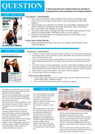
LAYOUT- FRONT COVER
SUCCESSFUL CONVENTIONS
I have used a short and memorable masthead. I have located it in the top left hand
corner. The icon is of a large size this makes it clear to my audience the title of the
magazine.
The main image is very dominant over the page, gives the audience a indication there
will be a main article regarding this band within the magazine. Both of the subject’s
faces can be clearly seen, including eye contact.
The colour scheme used is very bright and vibrant. The white on blue and blue on white
makes the text appear bolder. The bright text also is very eye catching
Used buzzwords which helps to focus peoples attention on specific subjects, also
emphasises certain phrases.
COULD HAVE DONE BETTER
Could of included thumb nails on the front cover to indicate other important articles
within the magazine.
LAYOUT- CONENTS SUCCESSFUL CONVENTIONS
‘Contents’ is located in the left top hand corner of the page. This will be the first feature that
my audience will see. This is also blue on white which makes the title stand out.The date of
issue is located just below title.
There is a section for the features in the magazine, this section is very clear to see as it has
been divided by lines and boxes. This helps to separate the text therefore looks like there is
less.
The colour scheme is consistent throughout.The colour scheme plays an important role when
producing a magazine or any media product, when the audience look at the magazine the first
thing they look at it the colour scheme. If the colour scheme is aesthetic it attracts customers.
Page numbers clearly giving reference to the articles within the magazine.
The font used is clear for my audience to read.
COULD HAVE DONE BETTER
On my contents page I only used one singular image, may have worked better if I had a
couple smaller images of different subjects.
May not be the most suitable font style for a multi-genre magazine.
LAYOUT- DPSI decided to use an interview on my double
page spread.Interviews generally are more
interactive with the audience.
I have used one singular image on the page
which covers the lower half of both pages.
The mise-en-scene links well with the genre
and content of the article.
However if I were to re-do this DPS I would
have included a couple of smaller images on
these pages to make the magazine more
realistic.
Like mentioned previously I have used a
continuous colourscheme over the two
pages.This helps to create the brand image
and make the magazine recognisable when
customers see these colours.
Some customers may prefer the double page
to include more features and be more
complex, however although the layout over
these two pages is simple. The text fitting
around the image it works well and is
aesthetically pleasing to look at.
.
Maybe could of enlarged the font size of the
questions to make it even more clear.
Should have included some more features, things
such as contact details for the editors, some pull
quotes located over the image, quotes about
articles on otherpages,highlighting some of the
important quotes in the article could have worked
well.
The title of the article includes the name of the
singers,this is much larger, bolder and vibrant will
be the first feature the audience will see.
Due to this magazine being aimed
at a youngeraudience the articles
are written in columns, this
breaks the text up so that it
appears as there is less text on the
page. Too much text may
discourage my audience to read
on.
Has an introduction to the article
on the left hand page, this gives
the audience an indication of
what the article will contain.
Questions in the interview are
highlighted in the bright blue on
the white background this makes
it helps to make it clear to
readers. If questions were same
colour it may confuse readers and
discourage them to read on and/or
buy.