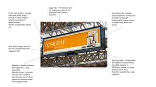
The document describes the design elements of a magazine advertisement, including its use of three main colors (orange, black, and white) that catch attention without overwhelming viewers. It also notes the serif font is easy to read and recognizable from the magazine title, while images on the website and app store logo make the magazine accessible on multiple platforms. The large title immediately gets the magazine's name in viewers' heads.