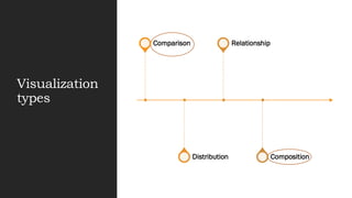
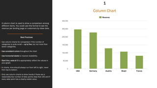
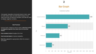
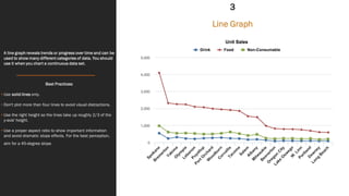
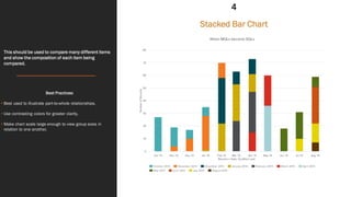
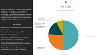
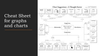
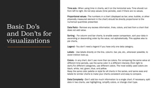
Visualization
made easy
Visualization
types
Comparison
Distribution
Relationship
Composition
A column chart is used to show a comparison among
different items. You could use this format to see the
revenue per landing page or customers by close date.
Best Practices:
• Use column charts for comparison if the number of
categories is quite small — up to five, but not more than
seven categories.
• Use consistent colors throughout the chart
• Use horizontal labels to improve readability.
• Start the y-axis at 0 to appropriately reflect the values in
your graph.
• In charts, time should always run from left to right, never
from top to bottom.
• Only use column charts to show trends if there are a
reasonably-low number of data points (less than 20) and if
every data point has a clearly-visible value.
Column Chart
1
A bar graph, basically a horizontal column chart, used
to avoid clutter when one data label is long or if you
have more than 10 items to compare. Can also be used
to display negative numbers.
Best Practices:
• Use bar charts, instead of column charts, when the number
of categories is greater than seven (but not more than
fifteen)
• Use consistent colors throughout the chart
• Use horizontal labels to improve readability.
• Start the y-axis at 0 to appropriately reflect the values in
your graph.
Bar Graph
2
A line graph reveals trends or progress over time and can be
used to show many different categories of data. You should
use it when you chart a continuous data set.
Best Practices:
• Use solid lines only.
• Don't plot more than four lines to avoid visual distractions.
• Use the right height so the lines take up roughly 2/3 of the
y-axis' height.
• Use a proper aspect ratio to show important information
and avoid dramatic slope effects. For the best perception,
aim for a 45-degree slope.
Line Graph
3
This should be used to compare many different items
and show the composition of each item being
compared.
Best Practices:
• Best used to illustrate part-to-whole relationships.
• Use contrasting colors for greater clarity.
• Make chart scale large enough to view group sizes in
relation to one another.
Stacked Bar Chart
4
A pie chart shows a static number and how categories
represent part of a whole -- the composition of
something. A pie chart represents numbers in
percentages, and the total sum of all segments needs
to equal 100%. Pie charts are not meant to compare
individual sections to each other or to represent exact
values (you should use a bar chart for that).
Best Practices:
• Don't illustrate too many categories to ensure differentiation
between slices.
• Ensure that the slice values add up to 100%.
• Order slices according to their size.
• Use pie charts only if you have less than six categories,
Ideally, there should be only two categories.
• Don’t use a pie chart if the category values are almost
identical or completely different. You could add labels, but
that’s a patch, not an improvement.
• Don’t use 3D or blow apart effects — they reduce
comprehension and show incorrect proportions.
Pie Chart
5
Cheat Sheet
for graphs
and charts
Basic Do’s
and Don’ts for
visualizations
Time axis - When using time in charts, set it on the horizontal axis. Time should run
from left to right. Do not skip values (time periods), even if there are no values.
Proportional values - The numbers in a chart (displayed as bar, area, bubble, or other
physically measured element in the chart) should be directly proportional to the
numerical quantities presented.
Data Ratio - Remove any excess information, lines, colors, and text from a chart that
does not add value.
Sorting - For column and bar charts, to enable easier comparison, sort your data in
ascending or descending order by the value, not alphabetically. This applies also to
pie charts.
Legend - You don’t need a legend if you have only one data category.
Labels - Use labels directly on the line, column, bar, pie, etc., whenever possible, to
avoid indirect look-up.
Colors - In any chart, don’t use more than six colors. For comparing the same value at
different time periods, use the same color in a different intensity (from light to
dark).For different categories, use different colors. The most widely used colors are
black, white, red, green, blue, and yellow.
Keep the same color palette or style for all charts in the series, and same axes and
labels for similar charts to make your charts consistent and easy to compare.
Data Complexity - Don’t add too much information to a single chart. If necessary, split
data in two charts, use highlighting, simplify colors, or change chart type.

Visualization made easy

  • 1.
  • 2.
  • 3.
    A column chartis used to show a comparison among different items. You could use this format to see the revenue per landing page or customers by close date. Best Practices: • Use column charts for comparison if the number of categories is quite small — up to five, but not more than seven categories. • Use consistent colors throughout the chart • Use horizontal labels to improve readability. • Start the y-axis at 0 to appropriately reflect the values in your graph. • In charts, time should always run from left to right, never from top to bottom. • Only use column charts to show trends if there are a reasonably-low number of data points (less than 20) and if every data point has a clearly-visible value. Column Chart 1
  • 4.
    A bar graph,basically a horizontal column chart, used to avoid clutter when one data label is long or if you have more than 10 items to compare. Can also be used to display negative numbers. Best Practices: • Use bar charts, instead of column charts, when the number of categories is greater than seven (but not more than fifteen) • Use consistent colors throughout the chart • Use horizontal labels to improve readability. • Start the y-axis at 0 to appropriately reflect the values in your graph. Bar Graph 2
  • 5.
    A line graphreveals trends or progress over time and can be used to show many different categories of data. You should use it when you chart a continuous data set. Best Practices: • Use solid lines only. • Don't plot more than four lines to avoid visual distractions. • Use the right height so the lines take up roughly 2/3 of the y-axis' height. • Use a proper aspect ratio to show important information and avoid dramatic slope effects. For the best perception, aim for a 45-degree slope. Line Graph 3
  • 6.
    This should beused to compare many different items and show the composition of each item being compared. Best Practices: • Best used to illustrate part-to-whole relationships. • Use contrasting colors for greater clarity. • Make chart scale large enough to view group sizes in relation to one another. Stacked Bar Chart 4
  • 7.
    A pie chartshows a static number and how categories represent part of a whole -- the composition of something. A pie chart represents numbers in percentages, and the total sum of all segments needs to equal 100%. Pie charts are not meant to compare individual sections to each other or to represent exact values (you should use a bar chart for that). Best Practices: • Don't illustrate too many categories to ensure differentiation between slices. • Ensure that the slice values add up to 100%. • Order slices according to their size. • Use pie charts only if you have less than six categories, Ideally, there should be only two categories. • Don’t use a pie chart if the category values are almost identical or completely different. You could add labels, but that’s a patch, not an improvement. • Don’t use 3D or blow apart effects — they reduce comprehension and show incorrect proportions. Pie Chart 5
  • 8.
  • 9.
    Basic Do’s and Don’tsfor visualizations Time axis - When using time in charts, set it on the horizontal axis. Time should run from left to right. Do not skip values (time periods), even if there are no values. Proportional values - The numbers in a chart (displayed as bar, area, bubble, or other physically measured element in the chart) should be directly proportional to the numerical quantities presented. Data Ratio - Remove any excess information, lines, colors, and text from a chart that does not add value. Sorting - For column and bar charts, to enable easier comparison, sort your data in ascending or descending order by the value, not alphabetically. This applies also to pie charts. Legend - You don’t need a legend if you have only one data category. Labels - Use labels directly on the line, column, bar, pie, etc., whenever possible, to avoid indirect look-up. Colors - In any chart, don’t use more than six colors. For comparing the same value at different time periods, use the same color in a different intensity (from light to dark).For different categories, use different colors. The most widely used colors are black, white, red, green, blue, and yellow. Keep the same color palette or style for all charts in the series, and same axes and labels for similar charts to make your charts consistent and easy to compare. Data Complexity - Don’t add too much information to a single chart. If necessary, split data in two charts, use highlighting, simplify colors, or change chart type.