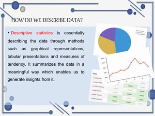
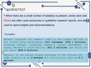
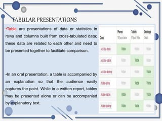
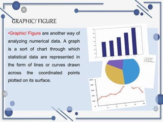
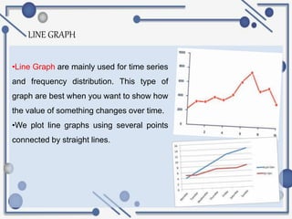
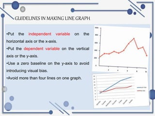
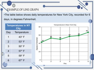
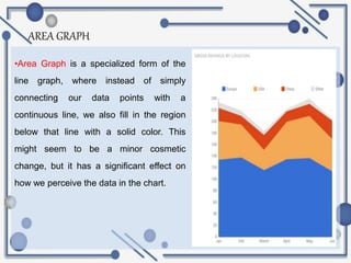
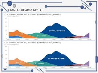
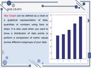
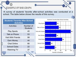
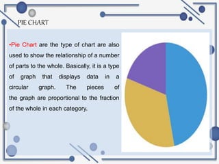
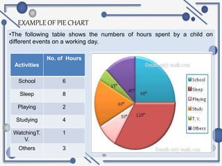
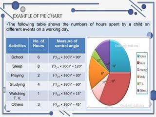
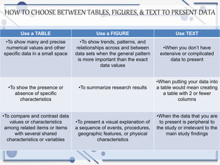
8.1 Tables, Figures and
Describing Data
Statistically
JEAN A. CAÑETE
HOW DO WE DESCRIBE DATA?
• Descriptive statistics is essentially
describing the data through methods
such as graphical representations,
tabular presentations and measures of
tendency. It summarizes the data in a
meaningful way which enables us to
generate insights from it.
WORDS/TEXT
• When there are a small number of statistics to present, words work well.
Words are often used exclusively in qualitative research reports, and also
used to report insights and recommendations.
Examples:
Walmart regained its number-1 rank in the Forbes 500 due to
its strong sales performance (11% increase; $351.1 billion).
Although Walmart surpassed number-2 ranked ExxonMobil in
sales, Walmart’s profitability ($11.2 billion) was below the
oil giant ($39.5 billion).
•Walmart is the second largest business in the Fortune 500
with revenues up by 6 percent but with profits down by 4.2
percent.
TABULAR PRESENTATIONS
•Table are presentations of data or statistics in
rows and columns built from cross-tabulated data;
these data are related to each other and need to
be presented together to facilitate comparison.
•In an oral presentation, a table is accompanied by
an explanation so that the audience easily
captures the point. While in a written report, tables
may be presented alone or can be accompanied
by explanatory text.
6 PARTS OF TABULAR PRESENTATION
•TABLE NUMBER- is the very first
item mentioned on the top of each
table for easy identification and
further reference.
•TABLE TITLE- it narrates about
the contents of the table so, it has
to be very clear, brief and carefully
worded.
6 PARTS OF TABULAR PRESENTATION
•COLUMN HEADER- at the top of
each column in a table, a column
designation/head is given to explain
figures of the column.
•ROW CLASSIFIER- it sorts out the
whole table into different parts.
6 PARTS OF TABULAR PRESENTATION
•BODY- It contains the numeric
information and reveals the whole
data of investigated facts.
•SOURCE NOTE- it is a brief
statement or phrase indicating the
source of data presented in the
table.
GRAPHIC/ FIGURE
•Graphic/ Figure are another way of
analyzing numerical data. A graph
is a sort of chart through which
statistical data are represented in
the form of lines or curves drawn
across the coordinated points
plotted on its surface.
LINE GRAPH
•Line Graph are mainly used for time series
and frequency distribution. This type of
graph are best when you want to show how
the value of something changes over time.
•We plot line graphs using several points
connected by straight lines.
GUIDELINES IN MAKING LINE GRAPH
•Put the independent variable on the
horizontal axis or the x-axis.
•Put the dependent variable on the vertical
axis or the y-axis.
•Use a zero baseline on the y-axis to avoid
introducing visual bias.
•Avoid more than four lines on one graph.
EXAMPLE OF LINE GRAPH
•The table below shows daily temperatures for New York City, recorded for 6
days, in degrees Fahrenheit.
Temperatures in NY
City
Day Temperature
1 43° F
2 53° F
3 50° F
4 57° F
5 59° F
6 67° F
AREA GRAPH
•Area Graph is a specialized form of the
line graph, where instead of simply
connecting our data points with a
continuous line, we also fill in the region
below that line with a solid color. This
might seem to be a minor cosmetic
change, but it has a significant effect on
how we perceive the data in the chart.
EXAMPLE OF AREA GRAPH
BAR GRAPH
•Bar Graph can be defined as a chart or
a graphical representation of data,
quantities or numbers using bars or
strips. It is also used when you want to
show a distribution of data points or
perform a comparison of metric values
across different subgroups of your data.
EXAMPLE OF BAR GRAPH
•A survey of students' favorite after-school activities was conducted at a
school. The table below shows the results of this survey.
Students' Favorite After-School
Activities
Activities Number of
Students
Play Sports 45
Talk on Phone 53
Visit With Friends 99
Earn Money 44
Chat Online 66
School Clubs 22
Watching TV 37
PIE CHART
•Pie Chart are the type of chart are also
used to show the relationship of a number
of parts to the whole. Basically, it is a type
of graph that displays data in a
circular graph. The pieces of
the graph are proportional to the fraction
of the whole in each category.
EXAMPLE OF PIE CHART
•The following table shows the numbers of hours spent by a child on
different events on a working day.
Activities
No. of Hours
School 6
Sleep 8
Playing 2
Studying 4
WatchingT.
V.
1
Others 3
EXAMPLE OF PIE CHART
•The following table shows the numbers of hours spent by a child on
different events on a working day.
Activities
No. of
Hours
Measure of
central angle
School 6 (6/24 × 360)° = 90°
Sleep 8 (8/24 × 360)° = 120°
Playing 2 (2/24 × 360)° = 30°
Studying 4 (4/24 × 360)° = 60°
Watching
T. V.
1 (1/24 × 360)° = 15°
Others 3 (3/24 × 360)° = 45°
HOW TO CHOOSE BETWEEN TABLES, FIGURES, & TEXT TO PRESENT DATA
Use a TABLE Use a FIGURE Use TEXT
•To show many and precise
numerical values and other
specific data in a small space
•To show trends, patterns, and
relationships across and between
data sets when the general pattern
is more important than the exact
data values
•When you don’t have
extensive or complicated
data to present
•To show the presence or
absence of specific
characteristics
•To summarize research results
•When putting your data into
a table would mean creating
a table with 2 or fewer
columns
•To compare and contrast data
values or characteristics
among related items or items
with several shared
characteristics or variables
•To present a visual explanation of
a sequence of events, procedures,
geographic features, or physical
characteristics
•When the data that you are
to present is peripheral to
the study or irrelevant to the
main study findings
THE
END!

Tables and-figures-business-research

  • 1.
    8.1 Tables, Figuresand Describing Data Statistically JEAN A. CAÑETE
  • 2.
    HOW DO WEDESCRIBE DATA? • Descriptive statistics is essentially describing the data through methods such as graphical representations, tabular presentations and measures of tendency. It summarizes the data in a meaningful way which enables us to generate insights from it.
  • 3.
    WORDS/TEXT • When thereare a small number of statistics to present, words work well. Words are often used exclusively in qualitative research reports, and also used to report insights and recommendations. Examples: Walmart regained its number-1 rank in the Forbes 500 due to its strong sales performance (11% increase; $351.1 billion). Although Walmart surpassed number-2 ranked ExxonMobil in sales, Walmart’s profitability ($11.2 billion) was below the oil giant ($39.5 billion). •Walmart is the second largest business in the Fortune 500 with revenues up by 6 percent but with profits down by 4.2 percent.
  • 4.
    TABULAR PRESENTATIONS •Table arepresentations of data or statistics in rows and columns built from cross-tabulated data; these data are related to each other and need to be presented together to facilitate comparison. •In an oral presentation, a table is accompanied by an explanation so that the audience easily captures the point. While in a written report, tables may be presented alone or can be accompanied by explanatory text.
  • 5.
    6 PARTS OFTABULAR PRESENTATION •TABLE NUMBER- is the very first item mentioned on the top of each table for easy identification and further reference. •TABLE TITLE- it narrates about the contents of the table so, it has to be very clear, brief and carefully worded.
  • 6.
    6 PARTS OFTABULAR PRESENTATION •COLUMN HEADER- at the top of each column in a table, a column designation/head is given to explain figures of the column. •ROW CLASSIFIER- it sorts out the whole table into different parts.
  • 7.
    6 PARTS OFTABULAR PRESENTATION •BODY- It contains the numeric information and reveals the whole data of investigated facts. •SOURCE NOTE- it is a brief statement or phrase indicating the source of data presented in the table.
  • 8.
    GRAPHIC/ FIGURE •Graphic/ Figureare another way of analyzing numerical data. A graph is a sort of chart through which statistical data are represented in the form of lines or curves drawn across the coordinated points plotted on its surface.
  • 9.
    LINE GRAPH •Line Graphare mainly used for time series and frequency distribution. This type of graph are best when you want to show how the value of something changes over time. •We plot line graphs using several points connected by straight lines.
  • 10.
    GUIDELINES IN MAKINGLINE GRAPH •Put the independent variable on the horizontal axis or the x-axis. •Put the dependent variable on the vertical axis or the y-axis. •Use a zero baseline on the y-axis to avoid introducing visual bias. •Avoid more than four lines on one graph.
  • 11.
    EXAMPLE OF LINEGRAPH •The table below shows daily temperatures for New York City, recorded for 6 days, in degrees Fahrenheit. Temperatures in NY City Day Temperature 1 43° F 2 53° F 3 50° F 4 57° F 5 59° F 6 67° F
  • 12.
    AREA GRAPH •Area Graphis a specialized form of the line graph, where instead of simply connecting our data points with a continuous line, we also fill in the region below that line with a solid color. This might seem to be a minor cosmetic change, but it has a significant effect on how we perceive the data in the chart.
  • 13.
  • 14.
    BAR GRAPH •Bar Graphcan be defined as a chart or a graphical representation of data, quantities or numbers using bars or strips. It is also used when you want to show a distribution of data points or perform a comparison of metric values across different subgroups of your data.
  • 15.
    EXAMPLE OF BARGRAPH •A survey of students' favorite after-school activities was conducted at a school. The table below shows the results of this survey. Students' Favorite After-School Activities Activities Number of Students Play Sports 45 Talk on Phone 53 Visit With Friends 99 Earn Money 44 Chat Online 66 School Clubs 22 Watching TV 37
  • 16.
    PIE CHART •Pie Chartare the type of chart are also used to show the relationship of a number of parts to the whole. Basically, it is a type of graph that displays data in a circular graph. The pieces of the graph are proportional to the fraction of the whole in each category.
  • 17.
    EXAMPLE OF PIECHART •The following table shows the numbers of hours spent by a child on different events on a working day. Activities No. of Hours School 6 Sleep 8 Playing 2 Studying 4 WatchingT. V. 1 Others 3
  • 18.
    EXAMPLE OF PIECHART •The following table shows the numbers of hours spent by a child on different events on a working day. Activities No. of Hours Measure of central angle School 6 (6/24 × 360)° = 90° Sleep 8 (8/24 × 360)° = 120° Playing 2 (2/24 × 360)° = 30° Studying 4 (4/24 × 360)° = 60° Watching T. V. 1 (1/24 × 360)° = 15° Others 3 (3/24 × 360)° = 45°
  • 19.
    HOW TO CHOOSEBETWEEN TABLES, FIGURES, & TEXT TO PRESENT DATA Use a TABLE Use a FIGURE Use TEXT •To show many and precise numerical values and other specific data in a small space •To show trends, patterns, and relationships across and between data sets when the general pattern is more important than the exact data values •When you don’t have extensive or complicated data to present •To show the presence or absence of specific characteristics •To summarize research results •When putting your data into a table would mean creating a table with 2 or fewer columns •To compare and contrast data values or characteristics among related items or items with several shared characteristics or variables •To present a visual explanation of a sequence of events, procedures, geographic features, or physical characteristics •When the data that you are to present is peripheral to the study or irrelevant to the main study findings
  • 20.