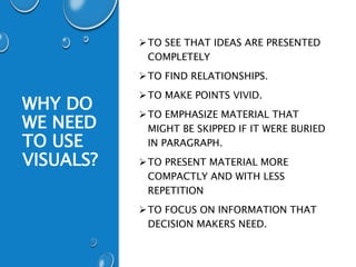
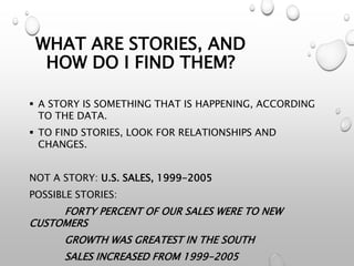
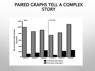
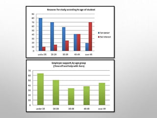
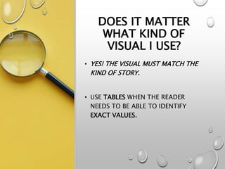
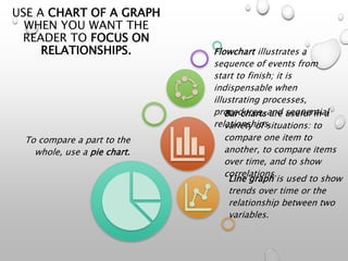
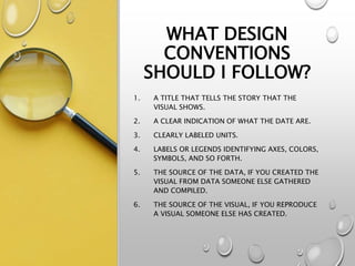
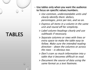
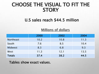
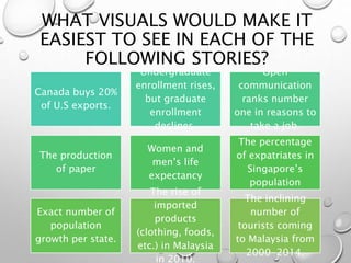
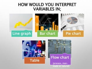
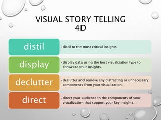
USING VISUALS
WEEK 6
WHY DO
WE NEED
TO USE
VISUALS?
TO SEE THAT IDEAS ARE PRESENTED
COMPLETELY
TO FIND RELATIONSHIPS.
TO MAKE POINTS VIVID.
TO EMPHASIZE MATERIAL THAT
MIGHT BE SKIPPED IF IT WERE BURIED
IN PARAGRAPH.
TO PRESENT MATERIAL MORE
COMPACTLY AND WITH LESS
REPETITION
TO FOCUS ON INFORMATION THAT
DECISION MAKERS NEED.
SELECT VISUALS FOR
STORIES.
WHAT ARE STORIES, AND
HOW DO I FIND THEM?
 A STORY IS SOMETHING THAT IS HAPPENING, ACCORDING
TO THE DATA.
 TO FIND STORIES, LOOK FOR RELATIONSHIPS AND
CHANGES.
NOT A STORY: U.S. SALES, 1999-2005
POSSIBLE STORIES:
FORTY PERCENT OF OUR SALES WERE TO NEW
CUSTOMERS
GROWTH WAS GREATEST IN THE SOUTH
SALES INCREASED FROM 1999-2005
TO FIND
STORIES
Focus on a topic
Simplify the data on that topic and convert
the numbers to simple, easy-to-
understand units.
Look for relationships and changes.
•E.g. Do men and women have the same attitudes?
•Look for changes over time.
•Look for items that can be seen as part of the
same group.
•For example, to find stories about TV ads, you
might group ads in the same product
category – ads for cars, for food, for beverages.
PAIRED GRAPHS TELL A COMPLEX
STORY
DOES IT MATTER
WHAT KIND OF
VISUAL I USE?
• YES! THE VISUAL MUST MATCH THE
KIND OF STORY.
• USE TABLES WHEN THE READER
NEEDS TO BE ABLE TO IDENTIFY
EXACT VALUES.
USE A CHART OF A GRAPH
WHEN YOU WANT THE
READER TO FOCUS ON
RELATIONSHIPS.
To compare a part to the
whole, use a pie chart.
Line graph is used to show
trends over time or the
relationship between two
variables.
Bar charts are useful in a
variety of situations: to
compare one item to
another, to compare items
over time, and to show
correlations.
Flowchart illustrates a
sequence of events from
start to finish; it is
indispensable when
illustrating processes,
procedures, and sequential
relationships.
WHAT DESIGN
CONVENTIONS
SHOULD I FOLLOW?
1. A TITLE THAT TELLS THE STORY THAT THE
VISUAL SHOWS.
2. A CLEAR INDICATION OF WHAT THE DATE ARE.
3. CLEARLY LABELED UNITS.
4. LABELS OR LEGENDS IDENTIFYING AXES, COLORS,
SYMBOLS, AND SO FORTH.
5. THE SOURCE OF THE DATA, IF YOU CREATED THE
VISUAL FROM DATA SOMEONE ELSE GATHERED
AND COMPILED.
6. THE SOURCE OF THE VISUAL, IF YOU REPRODUCE
A VISUAL SOMEONE ELSE HAS CREATED.
TABLES
- Use tables only when you want the audience
to focus on specific values/numbers.
 Use common, understandable units and
clearly identify them: dollars,
percentages, price per ton, and so on.
 Express all items in a column in the same
unit and round off for simplicity.
 Label column headings clearly and use
subheads if necessary.
 Separate columns or rows with lines or
extra space to make the table easy to
follow. Make sure the intended reading
direction – down the columns or across
the rows – is obvious too.
 Don’t cram so much information into a
table that it becomes difficult to read.
 Document the source of data using the
same format as a text footnote.
CHOOSE THE VISUAL TO FIT THE
STORY
2000 2002 2004
Northeast 10.2 10.8 11.3
South 7.6 8.5 10.4
Midwest 8.3 6.8 9.3
West 11.3 12.1 13.5
Totals 37.4 38.2 44.5
Millions of dollars
U.S sales reach $44.5 million
Tables show exact values.
LINE GRAPHS
• Are commonly used to show trends
over time or the relationship
between two variables.
• Label both horizontal and vertical
axes.
• When time is variable, put it on the
horizontal axes.
• Avoid using more than three
different lines on one graph. Even
three lines may be too many if they
cross each other.
• Avoid using perspective. Perspective
LINE CHARTS COMPARE ITEMS OVER TIME OR
SHOW DISTRIBUTION OR CORRELATION.
0%
20%
40%
60%
80%
100%
1995 1997 1999 2001 2003 2005
Sales increased from 1995 to 2005.
PIE CHARTS
• Use a pie chart only when you are
comparing one segment to the whole.
• Start at 12 o’clock with the largest
percentage or the percentage you want
to focus on. Go clockwise to each
smaller percentage or to each
percentage in some other logical order.
• Make the chart a perfect circle.
Perspective circles distort the data.
• Limit the number of segment to five or
seven. If you have more divisions,
combine the smallest or the least
important in a single category labeled
as ‘other’.
• Label the segment outside the circle.
PIE CHARTS COMPARE A COMPONENT TO THE
WHOLE.
Forty percent of our 2002 sales were to new
customers.
New Customers
Old Customers
Old
Custome
rs
60%
New Customers
40%
BAR CHARTS
• Are useful in a variety of situations: to
compare one item to another, to compare
items over time, and to show correlations.
• Order the bars in a logical in a logical or
chronological order.
• Put the bars close enough together to
make comparison easy.
• Label both horizontal and vertical axes.
• Put all the labels inside the bars or
outside them.
• Make all the bars the same width.
• Use different colors for different bars
only when their meanings are different.
• Avoid using perspective. Perspective
makes the values harder to read and
BAR CHARTS COMPARE ITEMS OR SHOW
DISTRIBUTION OR CORRELATION
0% 10% 20% 30% 40%
West
South
Midwest
Northeast 11%
38%
12%
19%
Growth was greatest in the South.
FLOWCHARTS AND
ORGANIZATION
CHARTS
• FLOWCHART ILLUSTRATES A SEQUENCE OF
EVENTS FROM START TO FINISH; IT IS
INDISPENSABLE WHEN ILLUSTRATING
PROCESSES, PROCEDURES, AND
SEQUENTIAL RELATIONSHIPS.
• ORGANIZATIONAL CHART ILLUSTRATES
THE POSITIONS, UNITS, OR FUNCTIONS IN
AN ORGANIZATION AND THE WAYS THEY
INTERRELATE.
CAN I USE CLIP ARTS?
• Use color carefully.
• Avoid decorative clip art in memos
and reports.
• Use no more than five colors when
colors have meanings.
• Be aware that colors on a computer
screen always look brighter than
same colors on paper.
WHAT ELSE DO I
NEED TO CHECK
FOR?
• Be sure that the visual is accurate
and ethical.
MATCHING
VISUALS WITH
STORIES
WHAT VISUALS WOULD MAKE IT
EASIEST TO SEE IN EACH OF THE
FOLLOWING STORIES?
Canada buys 20%
of U.S exports.
Undergraduate
enrollment rises,
but graduate
enrollment
declines.
Open
communication
ranks number
one in reasons to
take a job.
The production
of paper
Women and
men’s life
expectancy
The percentage
of expatriates in
Singapore’s
population
Exact number of
population
growth per state.
The rise of
imported
products
(clothing, foods,
etc.) in Malaysia
in 2010.
The inclining
number of
tourists coming
to Malaysia from
2000-2014.
HOW WOULD YOU INTERPRET
VARIABLES IN;
Line graph Bar chart Pie chart
Table
Flow chart
• (process, man-
made or natural)
VISUAL STORY TELLING
4D
•distil to the most critical insights
distil
•display data using the best visualization type to
showcase your insights.
display
•declutter and remove any distracting or unnecessary
components from your visualization.
declutter
•direct your audience to the components of your
visualization that support your key insights.
direct

LIB300 Using Visuals week 6

  • 1.
  • 2.
    WHY DO WE NEED TOUSE VISUALS? TO SEE THAT IDEAS ARE PRESENTED COMPLETELY TO FIND RELATIONSHIPS. TO MAKE POINTS VIVID. TO EMPHASIZE MATERIAL THAT MIGHT BE SKIPPED IF IT WERE BURIED IN PARAGRAPH. TO PRESENT MATERIAL MORE COMPACTLY AND WITH LESS REPETITION TO FOCUS ON INFORMATION THAT DECISION MAKERS NEED.
  • 3.
  • 4.
    WHAT ARE STORIES,AND HOW DO I FIND THEM?  A STORY IS SOMETHING THAT IS HAPPENING, ACCORDING TO THE DATA.  TO FIND STORIES, LOOK FOR RELATIONSHIPS AND CHANGES. NOT A STORY: U.S. SALES, 1999-2005 POSSIBLE STORIES: FORTY PERCENT OF OUR SALES WERE TO NEW CUSTOMERS GROWTH WAS GREATEST IN THE SOUTH SALES INCREASED FROM 1999-2005
  • 5.
    TO FIND STORIES Focus ona topic Simplify the data on that topic and convert the numbers to simple, easy-to- understand units. Look for relationships and changes. •E.g. Do men and women have the same attitudes? •Look for changes over time. •Look for items that can be seen as part of the same group. •For example, to find stories about TV ads, you might group ads in the same product category – ads for cars, for food, for beverages.
  • 6.
    PAIRED GRAPHS TELLA COMPLEX STORY
  • 8.
    DOES IT MATTER WHATKIND OF VISUAL I USE? • YES! THE VISUAL MUST MATCH THE KIND OF STORY. • USE TABLES WHEN THE READER NEEDS TO BE ABLE TO IDENTIFY EXACT VALUES.
  • 9.
    USE A CHARTOF A GRAPH WHEN YOU WANT THE READER TO FOCUS ON RELATIONSHIPS. To compare a part to the whole, use a pie chart. Line graph is used to show trends over time or the relationship between two variables. Bar charts are useful in a variety of situations: to compare one item to another, to compare items over time, and to show correlations. Flowchart illustrates a sequence of events from start to finish; it is indispensable when illustrating processes, procedures, and sequential relationships.
  • 10.
    WHAT DESIGN CONVENTIONS SHOULD IFOLLOW? 1. A TITLE THAT TELLS THE STORY THAT THE VISUAL SHOWS. 2. A CLEAR INDICATION OF WHAT THE DATE ARE. 3. CLEARLY LABELED UNITS. 4. LABELS OR LEGENDS IDENTIFYING AXES, COLORS, SYMBOLS, AND SO FORTH. 5. THE SOURCE OF THE DATA, IF YOU CREATED THE VISUAL FROM DATA SOMEONE ELSE GATHERED AND COMPILED. 6. THE SOURCE OF THE VISUAL, IF YOU REPRODUCE A VISUAL SOMEONE ELSE HAS CREATED.
  • 11.
    TABLES - Use tablesonly when you want the audience to focus on specific values/numbers.  Use common, understandable units and clearly identify them: dollars, percentages, price per ton, and so on.  Express all items in a column in the same unit and round off for simplicity.  Label column headings clearly and use subheads if necessary.  Separate columns or rows with lines or extra space to make the table easy to follow. Make sure the intended reading direction – down the columns or across the rows – is obvious too.  Don’t cram so much information into a table that it becomes difficult to read.  Document the source of data using the same format as a text footnote.
  • 12.
    CHOOSE THE VISUALTO FIT THE STORY 2000 2002 2004 Northeast 10.2 10.8 11.3 South 7.6 8.5 10.4 Midwest 8.3 6.8 9.3 West 11.3 12.1 13.5 Totals 37.4 38.2 44.5 Millions of dollars U.S sales reach $44.5 million Tables show exact values.
  • 13.
    LINE GRAPHS • Arecommonly used to show trends over time or the relationship between two variables. • Label both horizontal and vertical axes. • When time is variable, put it on the horizontal axes. • Avoid using more than three different lines on one graph. Even three lines may be too many if they cross each other. • Avoid using perspective. Perspective
  • 14.
    LINE CHARTS COMPAREITEMS OVER TIME OR SHOW DISTRIBUTION OR CORRELATION. 0% 20% 40% 60% 80% 100% 1995 1997 1999 2001 2003 2005 Sales increased from 1995 to 2005.
  • 15.
    PIE CHARTS • Usea pie chart only when you are comparing one segment to the whole. • Start at 12 o’clock with the largest percentage or the percentage you want to focus on. Go clockwise to each smaller percentage or to each percentage in some other logical order. • Make the chart a perfect circle. Perspective circles distort the data. • Limit the number of segment to five or seven. If you have more divisions, combine the smallest or the least important in a single category labeled as ‘other’. • Label the segment outside the circle.
  • 16.
    PIE CHARTS COMPAREA COMPONENT TO THE WHOLE. Forty percent of our 2002 sales were to new customers. New Customers Old Customers Old Custome rs 60% New Customers 40%
  • 17.
    BAR CHARTS • Areuseful in a variety of situations: to compare one item to another, to compare items over time, and to show correlations. • Order the bars in a logical in a logical or chronological order. • Put the bars close enough together to make comparison easy. • Label both horizontal and vertical axes. • Put all the labels inside the bars or outside them. • Make all the bars the same width. • Use different colors for different bars only when their meanings are different. • Avoid using perspective. Perspective makes the values harder to read and
  • 18.
    BAR CHARTS COMPAREITEMS OR SHOW DISTRIBUTION OR CORRELATION 0% 10% 20% 30% 40% West South Midwest Northeast 11% 38% 12% 19% Growth was greatest in the South.
  • 19.
    FLOWCHARTS AND ORGANIZATION CHARTS • FLOWCHARTILLUSTRATES A SEQUENCE OF EVENTS FROM START TO FINISH; IT IS INDISPENSABLE WHEN ILLUSTRATING PROCESSES, PROCEDURES, AND SEQUENTIAL RELATIONSHIPS. • ORGANIZATIONAL CHART ILLUSTRATES THE POSITIONS, UNITS, OR FUNCTIONS IN AN ORGANIZATION AND THE WAYS THEY INTERRELATE.
  • 20.
    CAN I USECLIP ARTS? • Use color carefully. • Avoid decorative clip art in memos and reports. • Use no more than five colors when colors have meanings. • Be aware that colors on a computer screen always look brighter than same colors on paper.
  • 21.
    WHAT ELSE DOI NEED TO CHECK FOR? • Be sure that the visual is accurate and ethical.
  • 22.
  • 23.
    WHAT VISUALS WOULDMAKE IT EASIEST TO SEE IN EACH OF THE FOLLOWING STORIES? Canada buys 20% of U.S exports. Undergraduate enrollment rises, but graduate enrollment declines. Open communication ranks number one in reasons to take a job. The production of paper Women and men’s life expectancy The percentage of expatriates in Singapore’s population Exact number of population growth per state. The rise of imported products (clothing, foods, etc.) in Malaysia in 2010. The inclining number of tourists coming to Malaysia from 2000-2014.
  • 24.
    HOW WOULD YOUINTERPRET VARIABLES IN; Line graph Bar chart Pie chart Table Flow chart • (process, man- made or natural)
  • 25.
    VISUAL STORY TELLING 4D •distilto the most critical insights distil •display data using the best visualization type to showcase your insights. display •declutter and remove any distracting or unnecessary components from your visualization. declutter •direct your audience to the components of your visualization that support your key insights. direct

Editor's Notes

  • #23 1. Pie chart 2. Line graph 3. Bar chart 4. Flow chart 5. Bar chart 6. Pie chart 7. Table 8. Line graph
  • #24 1. Pie chart 2. Line graph 3. Bar chart 4. Flow chart 5. Bar chart 6. Pie chart 7. Table 8. Line graph