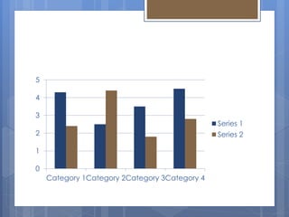
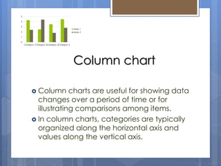
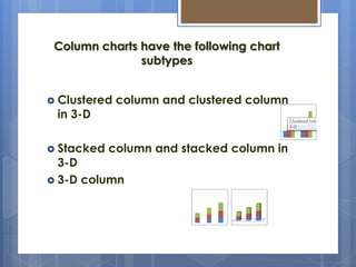
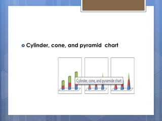
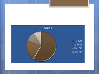
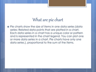
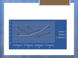
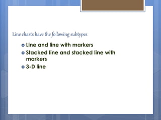
This document provides information about different types of charts used to display statistical data. It discusses pie charts, which show proportional data through slices of a circle. Column charts are used to illustrate comparisons over time by arranging categories horizontally and values vertically. Line charts display continuous data over time through connected data points and are ideal for showing trends. The document explains when each type of chart is most appropriate to use based on the characteristics of the data being visualized.