Download to read offline

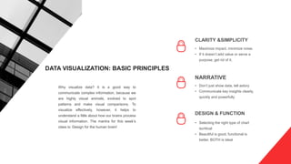

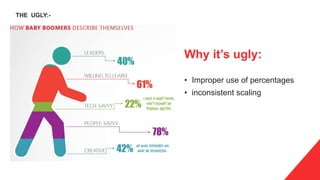
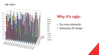
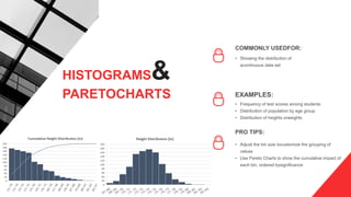
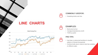
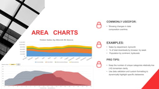
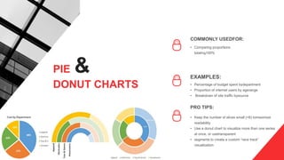
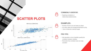
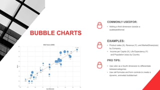
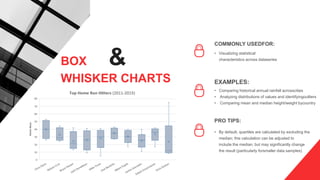
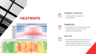


This document provides an overview of commonly used data visualization types and best practices for designing effective visualizations. It discusses chart types like bar charts, histograms, line charts, area charts, pie charts, scatter plots, bubble charts, box-and-whisker charts, and heatmaps. For each type, it provides examples of appropriate uses and tips on how to design the visualizations for clarity and to tell a story with the data. The document emphasizes selecting the right chart for the data and audience and designing for simplicity and functionality over just aesthetics.


![[DSC Europe 25] Raul Cruz Bonilla - Harnessing GEN AI in Fashion, Luxury and ...](https://cdn.slidesharecdn.com/ss_thumbnails/me7nvup5thwqzwzblbvw-raul-cruz-harnessing-ai-en-luxury-260123083019-32ac5a43-thumbnail.jpg?width=640&height=640&fit=bounds)
![[DSC Europe 25] Ekaterina Bubenko - Behind the Curtain: How Data Roles Collab...](https://cdn.slidesharecdn.com/ss_thumbnails/anmv6x8dstqbbzchoklr-ekaterina-bubenko-behind-the-curtain-how-data-roles-collaborate-in-the-ai-era-a-260123083019-4b252ec7-thumbnail.jpg?width=640&height=640&fit=bounds)


