Downloaded 3,314 times


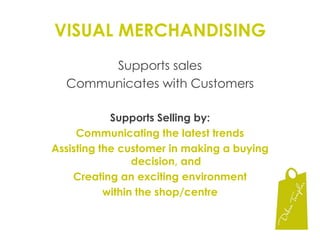
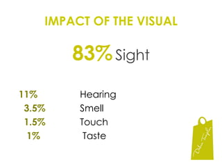


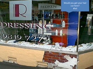
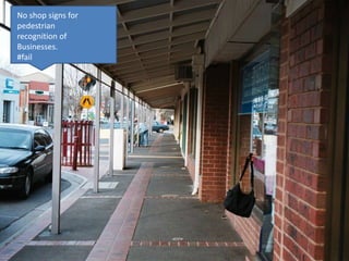
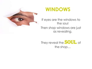
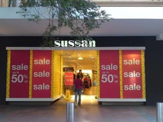
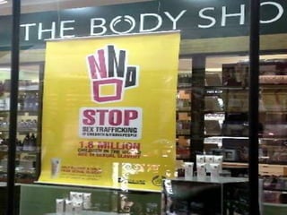
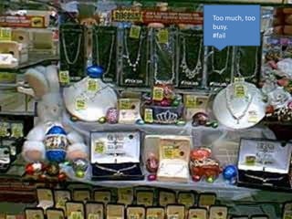
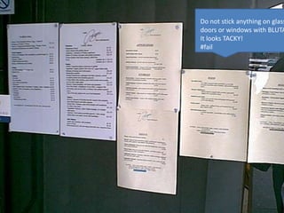


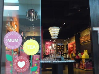
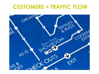


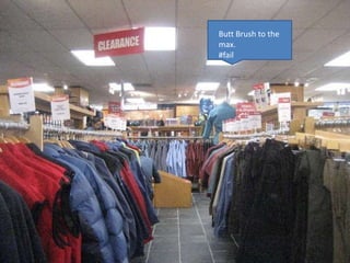
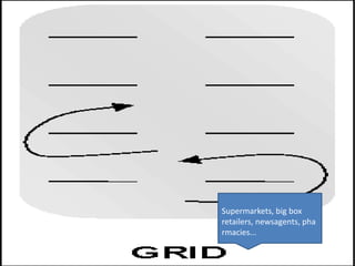

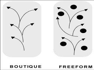
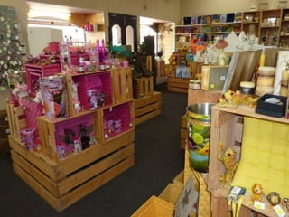
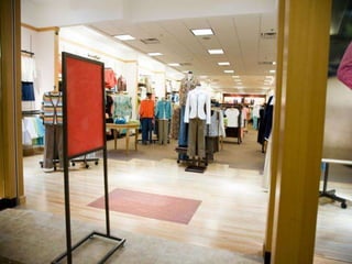
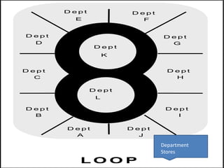
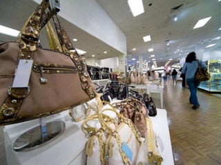
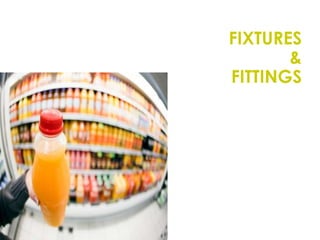


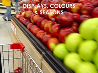
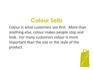
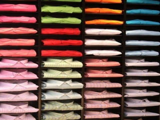

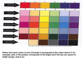
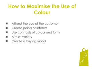
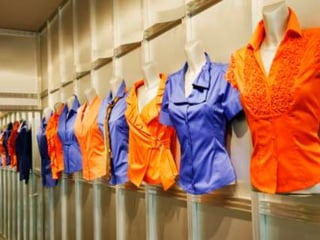
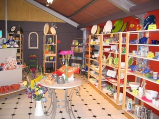
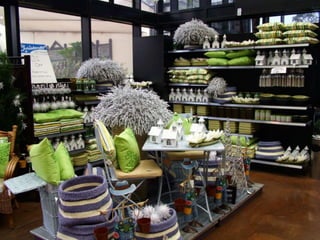
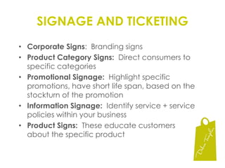
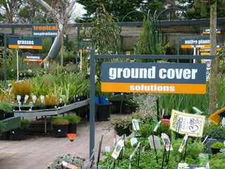
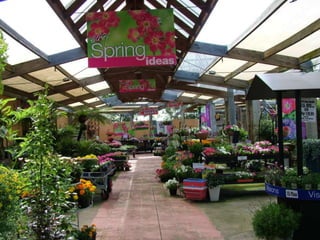
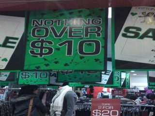
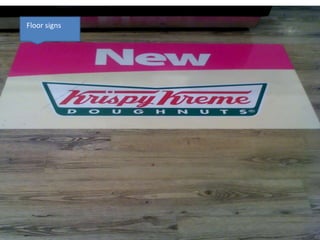

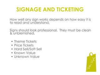


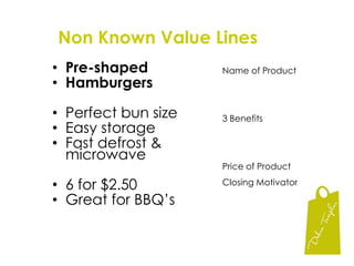
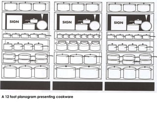
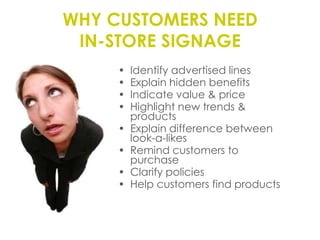

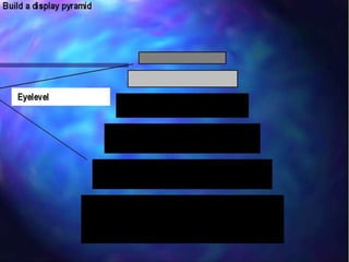
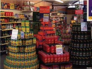

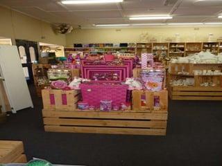
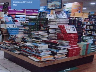
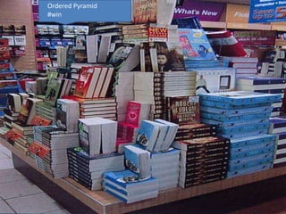
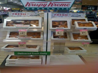


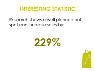

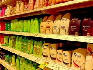
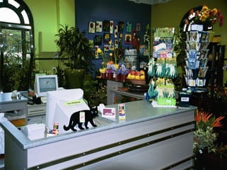
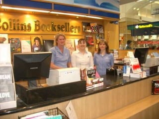
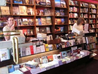


This document provides tips and best practices for visual merchandising and store layout to optimize sales. It discusses the importance of visual merchandising in communicating with customers and supporting sales. Specific recommendations include using signs, displays, fixtures and product placement strategically to guide customer flow and highlight key items. Hot spots and other high-traffic areas should feature impulse buys and promotions. Proper use of color, lighting and other visual elements can attract customers and influence purchasing decisions.


