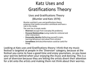
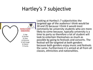
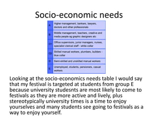
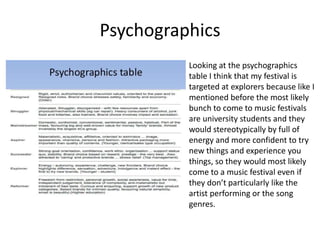
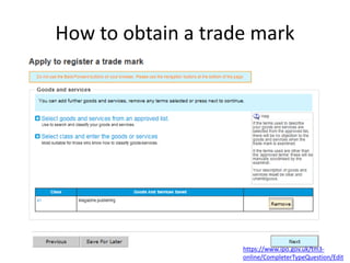
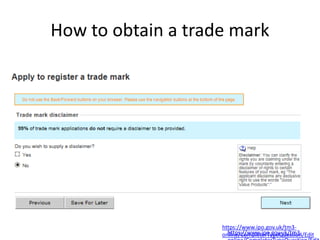
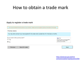
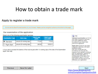
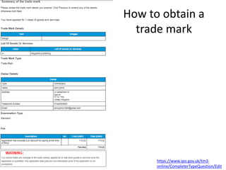
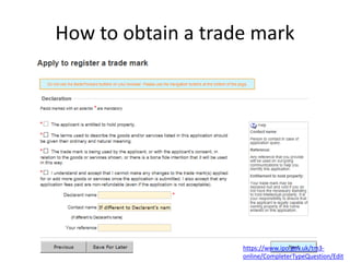
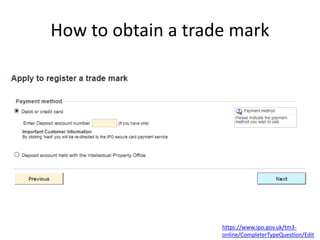
The document provides details for planning a music festival, including target audiences, mood boards, mind maps, draft designs, and production plans. Key aspects summarized include:
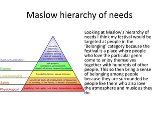
- The target audience is identified as university students aged 18-25 based on psychographic and socioeconomic analysis.
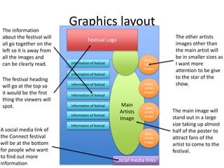
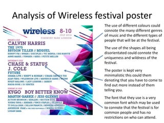
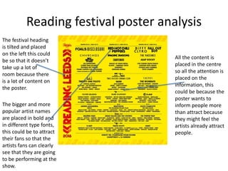
- Two draft poster designs are presented with analyses of inspiration posters from other music festivals.
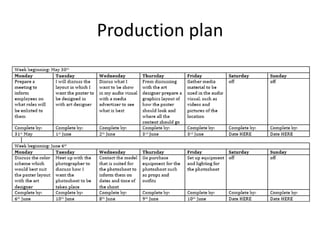
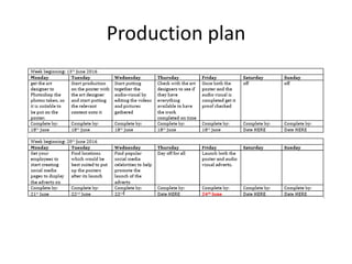
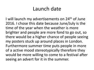
- Plans are outlined for a photoshoot, article, advertisements, and launching the campaign in June/July.
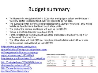
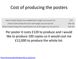
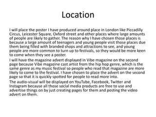
- Costs including photography, design work, advertising, and office space total around £2,000. Posters will be placed in busy London areas targeting young people.
This is a presentation of half my second questions their is upto question number 5 i have included in here and i will answer the next 2 questions in a prezzi.
Palestine last event orientationfvgnh .pptxRaedMohamed3
An EFL lesson about the current events in Palestine. It is intended to be for intermediate students who wish to increase their listening skills through a short lesson in power point.
This is a presentation by Dada Robert in a Your Skill Boost masterclass organised by the Excellence Foundation for South Sudan (EFSS) on Saturday, the 25th and Sunday, the 26th of May 2024.
He discussed the concept of quality improvement, emphasizing its applicability to various aspects of life, including personal, project, and program improvements. He defined quality as doing the right thing at the right time in the right way to achieve the best possible results and discussed the concept of the "gap" between what we know and what we do, and how this gap represents the areas we need to improve. He explained the scientific approach to quality improvement, which involves systematic performance analysis, testing and learning, and implementing change ideas. He also highlighted the importance of client focus and a team approach to quality improvement.
Operation “Blue Star” is the only event in the history of Independent India where the state went into war with its own people. Even after about 40 years it is not clear if it was culmination of states anger over people of the region, a political game of power or start of dictatorial chapter in the democratic setup.
The people of Punjab felt alienated from main stream due to denial of their just demands during a long democratic struggle since independence. As it happen all over the word, it led to militant struggle with great loss of lives of military, police and civilian personnel. Killing of Indira Gandhi and massacre of innocent Sikhs in Delhi and other India cities was also associated with this movement.
Read| The latest issue of The Challenger is here! We are thrilled to announce that our school paper has qualified for the NATIONAL SCHOOLS PRESS CONFERENCE (NSPC) 2024. Thank you for your unwavering support and trust. Dive into the stories that made us stand out!
How to Split Bills in the Odoo 17 POS ModuleCeline George
Bills have a main role in point of sale procedure. It will help to track sales, handling payments and giving receipts to customers. Bill splitting also has an important role in POS. For example, If some friends come together for dinner and if they want to divide the bill then it is possible by POS bill splitting. This slide will show how to split bills in odoo 17 POS.
Synthetic Fiber Construction in lab .pptxPavel ( NSTU)
Synthetic fiber production is a fascinating and complex field that blends chemistry, engineering, and environmental science. By understanding these aspects, students can gain a comprehensive view of synthetic fiber production, its impact on society and the environment, and the potential for future innovations. Synthetic fibers play a crucial role in modern society, impacting various aspects of daily life, industry, and the environment. ynthetic fibers are integral to modern life, offering a range of benefits from cost-effectiveness and versatility to innovative applications and performance characteristics. While they pose environmental challenges, ongoing research and development aim to create more sustainable and eco-friendly alternatives. Understanding the importance of synthetic fibers helps in appreciating their role in the economy, industry, and daily life, while also emphasizing the need for sustainable practices and innovation.
2. Contents page1 – LO4 intro
2 - contents page
3 – environment of pitch
4 – proposal
6-9 – target audience
10-11 – mood board 1
12 – mind map 1
13 – hand drawn draft analysis 1
14 – graphics layout analysis 1
15 – Wireless poster analysis
16 – mood board 2
17 – mind map 2
18 – hand drawn draft analysis 2
19 – graphics layout analysis 2
20 – Reading poster analysis
21 – fonts
22 – house style
23 – campaign message linked with
advertisement
24-25 – photo shoot plan
26-27 – production plan
28 – launch date
29 – risk assessment
30 – location recce
31 – potential hazards
32 – draft article
33-35 – budget and costs
36 – location
37-44 – legal and ethical
requirements
45-62 – how to obtain a trade mark
63 – Connect poster design
64 – Connect magazine advert design
65-69 – survey monkey results
70-71 – witness statement
72 – LO conclusion
3. Environment of the pitch
For my pitch I will be using a Apple Mac computer, a projector, a clicker
and a smart board, which are all displayed in the images below. The
layout of the room is shown in image 3. looking at image 3 you can see
that the room is fairly large, this is why I needed a smart board to and
projector to display my Prezi on so everybody could see it clearly. I
used the clicker so that I could move around the room while doing the
pitch so people could see both me and and Prezi, but also so that I
could use the laser on it to point at key bits I wanted to elaborate on
from a distance.
5. Maslow hierarchy of needs
Looking at Maslow's hierarchy of
needs I think my festival would be
targeted at people in the
‘Belonging’ category because the
festival is a place where people
who love the particular genre
come to enjoy themselves
together with hundreds of other
people. This so then bring a sense
of belonging among people
because they are surrounded be
people like them who also love
the atmosphere and music as they
do.
6. Katz Uses and
Gratifications Theory
Looking at Katz uses and Gratifications theory I think that my music
festival is targeted at people in the ‘Diversion’ category, because at the
festival you come to have a good time and enjoy yourselves, so you leave
your worries behind when your enjoying the music and dancing. This is a
sort of diversion because they are letting the artists divert their attention
for a bit onto the artists and making them not think about their worries.
7. Hartley’s 7 subjective
Looking at Hartley’s 7 subjectivities the
targeted age of the audience I think would be
18 and 25 because I think it would most
commonly be university students who are more
likely to come because, typically university is a
time to party so therefore a lot of student will
look to entertain themselves as much as
possible by going to festivals and concerts. The
festival will be targeted at both genders
because both genders enjoy music and festivals
the same. Furthermore it is aimed at all from all
classes, ethnicities and nationalities.
8. Socio-economic needs
Looking at the socio-economics needs table I would say
that my festival is targeted at students from group E
because university studesnts are most likely to come to
festivals as they are more active and lively, plus
stereotypically university times is a time to enjoy
yourselves and many students see going to festivals as a
way to enjoy yourself.
9. Psychographics
Looking at the psychographics
table I think that my festival is
targeted at explorers because like I
mentioned before the most likely
bunch to come to music festivals
are university students and they
would stereotypically by full of
energy and more confident to try
new things and experience you
things, so they would most likely
come to a music festival even if
they don’t particularly like the
artist performing or the song
genres.
11. Mood board conclusion
From the mood board I have decided that I will
keep the heading of my poster large and bold so it
is easily noticed, I will also have it a bright colour so
that it stands out and catches peoples eye first. I
will keep the background 1 colour when creating
my own poster because the poster ideas I gathered
have only 1 colour for their background and I think
this is a really effective way to show of the content
more and have more focus on the content, rather
than thing around it or in the background .
12. Mind Map 1
Connect
Festival
I will be using ‘Rockwell’ font
for my poster because my
poster of inspiration uses the
same font and I think it’s an
effective style to use as it
looks professional.
I want to follow the similar
layout as the Wireless
poster because I think it is
very simplistic but also very
unique and visually
pleasing. Which is why I
will be using triangular
shapes in my poster,
however unlike the
Wireless I will include
images within the shapes
of artists and people.
I will be using a plain white
background and for the font I
will be using a navy blue.
I will be placing images of
musicians, using some of my
own and some of actual
artists.
I want to keep the Connect
poster very minimalistic
and straight to the point
like my poster of
inspiration
13. Hand drawn draft 1
Masthead
in a large
font at the
top so it
can be
easily seen
to bring
brand
awareness
Content is
in different
size fonts
to denote
which parts
are more
important.
Main image of
the artist takes
up half of the
page to show of
the artist and
attract their fans
to come to the
festival
Social media link
at the bottom
for people who
want further
information of
the festival.
14. Graphics layout
Social media links
Information of festival
Main
Artists
Image
Festival Logo
Other
artists
images
Other
artists
images
Other
artists
images
Other
artists
images
The information
about the festival will
all go together on the
left so it is away from
all the images and
can be clearly read.
The other artists
images other than
the main artist will
be in smaller sizes as
I want more
attention to be give
to the star of the
show.
The festival heading
will go at the top so
it would be the first
thing the viewers will
spot.
The main image will
stand out in a large
size taking up almost
half of the poster to
attract fans of the
artist to come to the
festival.
A social media link of
the Connect festival
will be at the bottom
for people who want
to find out more
information
15. Analysis of Wireless festival poster
The use of different colours could
connote the many different genres
of music and the different types of
people that will be at the festival.
The use of the shapes all being
disorientated could connote the
uniqueness and wildness of the
festival.
The poster is kept very
minimalistic this could them
denoting that you have to come to
find out more instead of them
telling you.
The font that they use is a very
common font which may be used
to connote that the festival is for
common people and has no
restrictions on who can attend.
17. Mind Map 2
Freedom
Festival
I will be using ‘Linkin Park’
font from dafont.com as I
think it is bold, clear to spot,
has a music style them to it
and is unique so will catch
peoples eye.
I want to follow the similar layout
as the Wireless poster because I
think it is very simplistic but also
very unique and visually pleasing.
Which is why I will be using
triangular shapes in my poster,
however unlike the Wireless I will
include images within the shapes
of artists and people.
I will have a very pail navy
color as my backgrounds and
use sharp blue and pink colors
for objects and fonts.
I will place 1 large image of
the main artist at on side and
the other artists performing
images on the right side in
smaller sizes.
I want the Freedom festivals layout
to be very colorful but use light
colors because my target audience
is Diversions (Katz’s uses and
gratifications) and light colors
connote peace and freedom.
18. Hand drawn draft 2
Masthead is tilted
on its side to
connote the
festival being a bit
different, but also
to give more space
for the content and
make the content
look more neatly
organized.
The content is
placed in the
center of the main
image and the
masthead so that if
the viewer is
caught by the
masthead or the
main image first
their eyes will most
likely lead to the
content next
because it is in the
middle of both.
The social media
link is placed at the
top so it can be
easily spotted for
people who want
further
information.
Main image is
enlarged to almost
half the page so it
is clearly seen and
catches viewers
attention.
19. Graphics layout 2
Social media links
Information of festival
Main
Artists
Image
FestivalLogo
Information of festival
The festival heading
will go on the left
like wirelesses
poster so all the
content can fit
neatly.
The content will go
in the middle so its
clear to read and in
the centre of
everything.
The main image will
go on the right so
the artist stands out
and can be easily
recognised by fans.
A social media link
of the festival will
go at eh top so it
can be spotted
easily for people
who want more
information of the
festival.
20. Reading festival poster analysis
The festival heading
is tilted and placed
on the left this could
be so that it doesn’t
take up a lot of
room because there
is a lot of content on
the poster.
The bigger and more
popular artist names
are placed in bold and
in different type fonts,
this could be to attract
their fans so that the
artists fans can clearly
see that they are going
to be performing at the
show.
All the content is
placed in the centre
so all the attention is
placed on the
information, this
could be because the
poster wants to
inform people more
than attract because
they might feel the
artists already attract
people.
21. Fonts
I think the ‘Binary Waters’ font from
dafont.com would be a suitable font to use for
WorldShare because it looks as if pieces are
coming together to make the name, connoting
to people connecting with each other.
http://www.dafont.com/binarywaters.font?tex
t=WorldShare&back=theme
http://www.dafont.com/disolve.font?text=Con
nect&back=theme
http://www.dafont.com/linkinpark-
chase.font?text=CONNECT
I think the ‘Linkin Patk’ font from dafont.com would suit the tittle for
the Connect festival because the font is unique and stretches
beyond the font size, this might connote to the audience the festival
is something different that will go beyond peoples expectations.
I think the ‘Disolve’ font from dafont.com would suit the tittle for
the Connect festival because the font looks like it is incomplete so it
might connote to the audience that it needs them to finish of the
rest and connect everyone together.
22. House style
The house style of my poster consists mainly
of light and dark purple, blue, navy and pink.
The masthead is in navy because I took
inspiration form the Wireless festivals logo
which is also navy and I think the navy stands
out very well from the white background.
The content which I use to attract people
such as the artist name and location is put in
dark purple so it is more clearly visible than
the other other content which is in lighter
colour, connoting the relevance of each
content.
23. Campaign message linked with
advertisement
Connect festivals slogan is ‘Get connected’ and I
think that my advertisements denote this well
because they contain social media and website
links, which help get people connected and
talking.
The campaign message for my advertisements is
the same as Wirelesses which is for the public to
trust in the artists to bring the great
performance, which is why on the magazine
advert the majority of content is just artist names
who will be performing at the festival. I intend to
draw in the artists fans by using their names on
the poster, so when people see my poster and
see the big names on it they will immediately
want to come see them.
28. Launch date
I will launch my advertisements on 24th of June
2016. I chose this date because June/July is the
time of the year when the weather is more
brighter and people are more fond to go out, so
there would be a higher chance of people seeing
my posters stuck up around places in London.
Furthermore summer time puts people in more
of a active mood stereotypically therefore they
would be more willing to come to a festival after
seeing an advert for it in the summer.
31. Potential hazards
The photoshoot took place in my house so I had
control over majority of things such as lighting,
space and props. However some of the hazards
was that I had to move objects out of the way
such as chairs and lamps which could have lead
to injuries occurring from tripping up over the
objects, there might be a chance of getting
electrocuted if the lamp wires aren’t handled
safely.
32. Draft article
For my draft article I have stuck with
similar layout as the Wireless festival
because I like how it is straight to the
point and just tells you the important
information. Also I will stick to the
similar font which is Rockwell font
from Microsoft, because I think the
font looks both professional and
simple at the same time, which I think
the audience will be attracted too.
34. Budget summary
• To advertise in a magazine it costs £1,155 for a full page in colour and because I
want my poster to clearly stand out I will need it to be full page.
• The average pay for a professional photographer is £200 per hour and I only intend
to take an hour because I will only need a few shots.
• The cost of the camera and tripod will sum up to £163.99.
• To hire a graphics designer would cost £120
• For the Photoshop work I will just use a free trial because I will only need it for
only a week of production.
• The office place will cost £349 per month so this calculates to £4,188 for a year.
• So the overall cost will total up to £1987.99
http://www.sheengate.co.uk/a
dvertising/advertising-rates/
http://petapixel.com/2016/02/26/much-
photographers-charge-2016/
http://www.graphicdesigner2b.co.uk/prices
https://www.gumtree.com/p/desk-
space/flexible-office-space-cheap-desk-space-
with-registered-office-and-company-
registration-service/1175933645
35. Cost of producing the posters
Per poster it costs £120 to produce and I would
like to produce 100 copies so it would cost me
£12,000 to produce the whole lot.
http://www.graphicdesigner2b.co.uk/prices
36. Location
I will place the poster I have produced around place in London like Piccadilly
Circus, Leicester Square, Oxford street and other places where large amounts
of people are likely to gather. The reason why I have chosen those places is
because a large amount of teenagers and young people visit those places due
them being filled with branded shops and attractions to see, and young
people are more common to turn up to festivals, so they would be more keen
to come when they see a poster.
I will have the magazine advert displayed in Vibe magazine on the second
page because Vibe magazine cast artist from the hip hop genre, which is the
same genre as my music festival so people who read that magazine are more
likely to come to the festival. I have chosen to place the advert on the second
page so that it is quickly spotted for people to read more into.
The audio-visual will be displayed on YouTube, Facebook, Twitter and
Instagram because all those social media products are free to use and
advertise things on by just creating pages for them and posting the video
advert on them.
37. Regulatory codes of conduct
When creating my advertisements I need to make sure I follow the
regulatory codes of conducts such as section 3 stating that I shouldn’t
put any misleading advertisements on the poster, such as if I have put
the price of the tickets on the poster I have to make sure that it is the
right price as the tickets. If any of the regulatory codes are broken my
advertisement can be removed till the amendments needed have been
done.
https://www.cap.org.uk/Advertising-
Codes/Non-Broadcast.aspx
38. Copyright
I will make sure that I have a copyright stamp on
my poster so that I have copyright protection
over the poster. I will be taking and using my
own images and content therefore I will not be
breaking any copyright laws. For other contents
such as fonts I will gain permission before using
them so I make sure no one can attack my
magazine afterwards saying something of theirs
was used in my advert without their consent.
39. Royalties
Royalty is a sum paid to a patentee for the use
of a patent content or product for each copy
their content or product used. I will not need to
worry about this as all of my content produced
will be of my own, all images will be taken by us
and all needed material and props will be off
ours.
http://legal-
dictionary.thefreedictionary.com/royalties
40. Libel/slander
Libel is when a false statement which negatively
affects a person’s reputation, which is usually in
written form. My poster could be affected by
this because the lead artists names are written
in a larger font size than the other artist. This
might make them feel as if the poster is
defaming them by putting their names in
smaller fonts.
41. Intellectual property
Intellectual property is a intangible property which you
have invented from your head. The best way to protect
your property intellectual property is by getting a patent
or copyrights. A patent is a legal document which states
that no one else can use intellectual property for their
own use without your consent. This will mean that all the
content on the adverts will be protected and others will
not be able to use anything on there without either
gaining your consent or paying a sum of money for the
use of your content. If someone were to break this and
use your intellectual property without your consent you
are then eligible to take legal action against them.
42. Offensive language
I need to make sure that the content I have in my
advert doesn’t offend anyone. It is very important
that I make sure no violent or offensive language is
contained on my adverts because they will be
publically displayed so there are high chances of
children seeing them and it is not appropriate to
advertise violent or offensive language in front of
children.
Furthermore I wouldn’t want to offend anyone
because this might lead in people being repelled by
the adverts to come to the festival than attracted.
43. Public interest
I need to make the advertisement appeal to the
general publics interest and welfare, so that they
will bring up a good reputation to my festival. I
think that my adverts will appeal to the publics
interest and welfare because my adverts don’t
contain any violent or offensive language, and
the adverts are very minimal and full of colour
which means it would appeal to most people
and is less likely to offend anyone.
44. Regulatory Bodies
The ASA (Advertising Standard Authority) is the UK’s
independent regulatory of advertising across all media, they
apply the advertising codes written by the Committees of
Advertising Practice. Their work includes acting on complaints
and proactively checking the media to take action against
misleading, harmful or offensive advertising. This means that
if any complaints are sent to them about anything in the
media they will act upon it, they also monitor social media
regularly to prevent harmful, misleading or offensive material
from being produced. Furthermore if the ASA see anything
wrong with any advertising such as if anything on the Connect
festivals poster breaches any of the codes, ASA have the
authority to take actions against them and make Connect
withdraw the advertisement till amendments are made to it.
https://www.asa.org.uk/About-ASA.aspx
45. How to obtain a trade mark
https://www.ipo.gov.uk/tm3-
online/CompleterTypeQuestion/Edit
46. How to obtain a trade mark
https://www.ipo.gov.uk/tm3-
online/CompleterTypeQuestion/Edit
47. How to obtain a trade mark
https://www.ipo.gov.uk/tm3-
online/CompleterTypeQuestion/Edit
48. How to obtain a trade mark
https://www.ipo.gov.uk/tm3-
online/CompleterTypeQuestion/Edit
49. How to obtain a trade mark
https://www.ipo.gov.uk/tm3-
online/CompleterTypeQuestion/Edit
50. How to obtain a trade mark
https://www.ipo.gov.uk/tm3-
online/CompleterTypeQuestion/Edit
51. How to obtain a trade mark
https://www.ipo.gov.uk/tm3-
online/CompleterTypeQuestion/Edit
52. How to obtain a trade mark
https://www.ipo.gov.uk/tm3-
online/CompleterTypeQuestion/Edit
53. How to obtain a trade mark
https://www.ipo.gov.uk/tm3-
online/CompleterTypeQuestion/Edit
54. How to obtain a trade mark
https://www.ipo.gov.uk/tm3-
online/CompleterTypeQuestion/Edit
55. How to obtain a trade mark
https://www.ipo.gov.uk/tm3-
online/CompleterTypeQuestion/Edit
56. How to obtain a trade mark
https://www.ipo.gov.uk/tm3-
online/CompleterTypeQuestion/Edithttps://www.ipo.gov.uk/tm3-
57. How to obtain a trade mark
https://www.ipo.gov.uk/tm3-
online/CompleterTypeQuestion/Edit
58. How to obtain a trade mark
https://www.ipo.gov.uk/tm3-
online/CompleterTypeQuestion/Edit
59. How to obtain a trade mark
https://www.ipo.gov.uk/tm3-
online/CompleterTypeQuestion/Edit
60. How to obtain a
trade mark
https://www.ipo.gov.uk/tm3-
online/CompleterTypeQuestion/Edit
61. How to obtain a trade mark
https://www.ipo.gov.uk/tm3-
online/CompleterTypeQuestion/Edit
62. How to obtain a trade mark
https://www.ipo.gov.uk/tm3-
online/CompleterTypeQuestion/Edit
66. Survey monkey results
In my survey monkey questionnaire I asked people if my pitch
covered enough information and all the results I got were positives
and said that I did cover enough information in my pitch and that my
pitch was “very detailed”.
67. Survey monkey results
In my survey monkey questionnaire I asked people what their overall
opinions on my pitch was and all the replies I got was positive and
most said that my poster Photoshop work was very great and
“highlighted a clear campaign message”.
68. Survey monkey results
In my survey monkey questionnaire I asked people if there was
anything I could have improved in my pitch and the majority of
comments suggested me not to stare at the board to much and to
prevent this they stated that I could have used a script.
69. Survey monkey results
In my survey monkey questionnaire I asked people if after listening
to my pitch would they chose to come to my festival and 100% of
the people who completed my survey said they would come to my
festival. This means that my pitch covered enough detailed
information for people to get a good understanding about my
festival.
72. Conclusion
In this LO I discussed all the legal requirement
which my adverts needed to follow to make sure
it was no breaking the law or coming out as
offensive towards anyone. I also talked about
who I was specifically targeting my
advertisements at and also included all the
design ideas that lead up to the creation of my
poster. I also clearly illustrated the steps to
getting a trademark, showing all the things you
need to fill out as you go through the process.