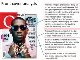
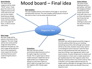
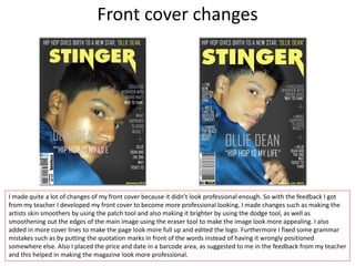
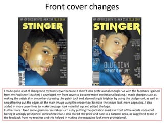
This document provides information about the UK magazine Q, which focuses on hip hop music, and is published 12 times a year. Some key details:
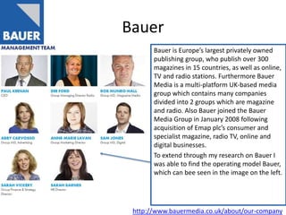
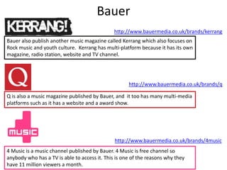
- Q magazine is owned and published by Bauer Media Group, a large European media company.
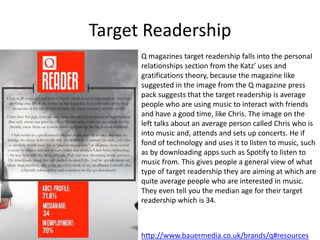
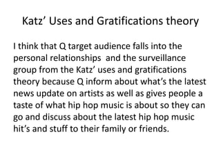
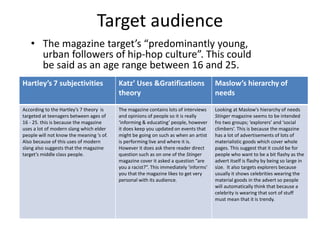
- The target readership for Q falls into the personal relationships category of uses and gratifications theory, as the magazine aims to provide content about music to interact with friends over.
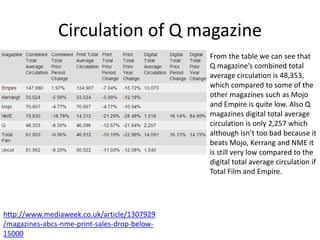
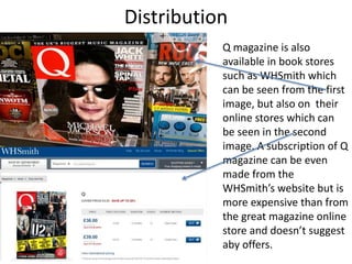
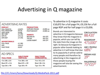
- Q has a circulation of around 48,000 copies combined print and digital. This is lower than some other music magazines.
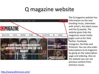
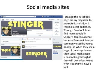
- In addition to the print magazine, Q has a website, social media presence, and hosts an annual music awards show to engage its target audience.