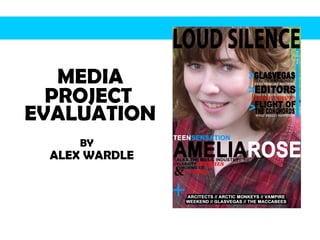
MEDIA BY  PROJECT  EVALUATION  ALEX WARDLE
In what ways does your media product use, develop or On the front cover of my media product, the rule of thirds is used; the top section shows the title, the middle section has the image of the ‘artist’ and their name and the bottom section has other articles included in the magazine. The title spans the top of the page, which is a common convention of real media products. The name of the ‘artist’ also spans across the middle area of the page, to catch the audience’s eye. The front cover challenges conventions because my main image has a background, rather then it being white and having been taken with a screen behind it. However I feel the media product suited a background, instead of it being just plain. The front cover doesn’t include a barcode, which is common if not necessary on most music magazines. However for the layout I wanted on my front cover it didn’t have room for a barcode; therefore I decided it would be placed on the plastic wrapping that the magazine would come in. On the contents page of my media product, the title of the magazine and the page title are both included, this is very common amongst music magazines. The contents of the magazine are lined along the left side, they are titled and a small piece of information about the article is given. This is the most used convention for contents pages, as it makes the page much neater and allows the reader to easily find their preferred article. Also on my contents page I have included the regulars which will be in every issue of the music magazine, this is a convention that all music magazines have, whether they called it their regulars or not. The contents page challenges conventions because it doesn’t include many images, where as most music magazines do. Mine only includes one big image of the main feature in the magazine which is what NME does. On the double page spread of my media product, I have included the title of the magazine on the top left of the double page. This is a common convention within music magazines that they tend to put the magazine title on every one of their pages bar adverts. On the DPS there is a tracks section where it includes tracks from the ‘artist’s’ album; this is a less so convention of music magazines, to include a review of the artists album or a few of their songs. As well as that I also put the text in three columns across the first page, using the rule of three once again is a convention for music magazines. challenge   forms and conventions of real media products?
How does your media product represent particular My music magazine represents a range of social groups, because my magazine has an average age range of 16-25, therefore there is social groups such as college students, university students, first-time workers. I think my magazine represents these types of people as it is not a childish magazine or a magazine aimed for the older generation. This is shown from the fonts used, they aren’t too plain or considered boring like Tahoma which would be suitable for an older audience, however they aren’t messy and all over the place like Kristen ITC which would be suitable for a younger audience. As well as fonts I have used appropriate colors in my magazine, ones which would apply to that age range. The images I have used have connotations to them be because I used a model of the age of 18, therefore she fits into the age range of the magazine. I wanted my audience to look at the magazine and be able to relate to it. In the images I had my model wear clothes which I thought would also relate to the readers as it is of “Indie” genre, so they would be able to know the type of music my music magazine will be talking about. Checked shirt and converses are very popular within social groups such as ones who enjoy Indie music. social groups?
What kind of media institution might distribute your media product and why? I think the following institutions are most likely to distribute my music magazine: Newsagents/convenient stores Music stores Digital publishers Social networking sites Gigs and festivals Newsagents/convenient stores are the most popular source of magazines and it would be effective if my music magazine were to be distributed there. Music stores such as HMV also distribute music magazines; I think it would be suitable there as it could target my particular target market better. Digital publishers could also be used to distribute my product as they are becoming more popular as more magazines are now available online. Social networking sites such as Facebook and Myspace are a good use of distribution because they are worldwide and would allow for a distribution on a larger scale. Gigs and festivals are also a good way of targeting my social group of “Indies” as they could be distributed in the appropriate gig or festival, which contains Indie music.
Who would be the audience for your media product? The target audience for my music magazine is teenagers and young adults both male and female aged from 16-25. I have chosen this age group as my target audience as they are at the age that they would buy music magazines, as well as be interested in Indie music. I have targeted the magazine to both genders as I wanted to target a wider audience, however because the main image is of a female, that may sway the female audience more. When choosing my target audience, I did research to find out if there was a gap in the market of music magazines. I found that there wasn’t a known music magazine aimed at “Indies” of both genders. How did you attract/address your audience? I have attracted my audience with a large close-up image on the front cover as it will catch their eye; also included on the front page I have used a large font for the title. The colors used on the front cover and throughout the magazine help to attract the audience because they are bright, eye-catching as well as following music magazine conventions. The layout of the front cover attracts the audience because it is different to most music magazines. On the DPS I have attracted the audience with the bright yellow highlighter, as well as the use of text on the first page, because I changed fonts and sizes throughout.
What have you learnt about technologies from the process   of constructing this product? While constructing my music magazine I have learnt more about correctly using the layers and tools on Adobe Photoshop Elements. The tools which I didn’t know how to use properly were the ‘Spot Healing Tool’ and the ‘Magnetic Lasso Tool.’ Which I now know how to use. I have also learnt how to use eblogger which was very helpful through the production of my media product. Even though I am good at ICT, I found this project helped me to heighten my skills. Looking back at your preliminary task, what do you feel you have learnt in the progression from it to the full product? Since making my preliminary task I have learned a lot about the technological side of this project, like using Photoshop and eblogger. I feel I have learnt more about the conventions of music magazines, and how to apply them to my own work. As well as the media concept of this project I have learnt about my own skills in this area from beginning with my preliminary task to the full product.

Media presentation

  • 1.
    MEDIA BY PROJECT EVALUATION ALEX WARDLE
  • 2.
    In what waysdoes your media product use, develop or On the front cover of my media product, the rule of thirds is used; the top section shows the title, the middle section has the image of the ‘artist’ and their name and the bottom section has other articles included in the magazine. The title spans the top of the page, which is a common convention of real media products. The name of the ‘artist’ also spans across the middle area of the page, to catch the audience’s eye. The front cover challenges conventions because my main image has a background, rather then it being white and having been taken with a screen behind it. However I feel the media product suited a background, instead of it being just plain. The front cover doesn’t include a barcode, which is common if not necessary on most music magazines. However for the layout I wanted on my front cover it didn’t have room for a barcode; therefore I decided it would be placed on the plastic wrapping that the magazine would come in. On the contents page of my media product, the title of the magazine and the page title are both included, this is very common amongst music magazines. The contents of the magazine are lined along the left side, they are titled and a small piece of information about the article is given. This is the most used convention for contents pages, as it makes the page much neater and allows the reader to easily find their preferred article. Also on my contents page I have included the regulars which will be in every issue of the music magazine, this is a convention that all music magazines have, whether they called it their regulars or not. The contents page challenges conventions because it doesn’t include many images, where as most music magazines do. Mine only includes one big image of the main feature in the magazine which is what NME does. On the double page spread of my media product, I have included the title of the magazine on the top left of the double page. This is a common convention within music magazines that they tend to put the magazine title on every one of their pages bar adverts. On the DPS there is a tracks section where it includes tracks from the ‘artist’s’ album; this is a less so convention of music magazines, to include a review of the artists album or a few of their songs. As well as that I also put the text in three columns across the first page, using the rule of three once again is a convention for music magazines. challenge forms and conventions of real media products?
  • 3.
    How does yourmedia product represent particular My music magazine represents a range of social groups, because my magazine has an average age range of 16-25, therefore there is social groups such as college students, university students, first-time workers. I think my magazine represents these types of people as it is not a childish magazine or a magazine aimed for the older generation. This is shown from the fonts used, they aren’t too plain or considered boring like Tahoma which would be suitable for an older audience, however they aren’t messy and all over the place like Kristen ITC which would be suitable for a younger audience. As well as fonts I have used appropriate colors in my magazine, ones which would apply to that age range. The images I have used have connotations to them be because I used a model of the age of 18, therefore she fits into the age range of the magazine. I wanted my audience to look at the magazine and be able to relate to it. In the images I had my model wear clothes which I thought would also relate to the readers as it is of “Indie” genre, so they would be able to know the type of music my music magazine will be talking about. Checked shirt and converses are very popular within social groups such as ones who enjoy Indie music. social groups?
  • 4.
    What kind ofmedia institution might distribute your media product and why? I think the following institutions are most likely to distribute my music magazine: Newsagents/convenient stores Music stores Digital publishers Social networking sites Gigs and festivals Newsagents/convenient stores are the most popular source of magazines and it would be effective if my music magazine were to be distributed there. Music stores such as HMV also distribute music magazines; I think it would be suitable there as it could target my particular target market better. Digital publishers could also be used to distribute my product as they are becoming more popular as more magazines are now available online. Social networking sites such as Facebook and Myspace are a good use of distribution because they are worldwide and would allow for a distribution on a larger scale. Gigs and festivals are also a good way of targeting my social group of “Indies” as they could be distributed in the appropriate gig or festival, which contains Indie music.
  • 5.
    Who would bethe audience for your media product? The target audience for my music magazine is teenagers and young adults both male and female aged from 16-25. I have chosen this age group as my target audience as they are at the age that they would buy music magazines, as well as be interested in Indie music. I have targeted the magazine to both genders as I wanted to target a wider audience, however because the main image is of a female, that may sway the female audience more. When choosing my target audience, I did research to find out if there was a gap in the market of music magazines. I found that there wasn’t a known music magazine aimed at “Indies” of both genders. How did you attract/address your audience? I have attracted my audience with a large close-up image on the front cover as it will catch their eye; also included on the front page I have used a large font for the title. The colors used on the front cover and throughout the magazine help to attract the audience because they are bright, eye-catching as well as following music magazine conventions. The layout of the front cover attracts the audience because it is different to most music magazines. On the DPS I have attracted the audience with the bright yellow highlighter, as well as the use of text on the first page, because I changed fonts and sizes throughout.
  • 6.
    What have youlearnt about technologies from the process of constructing this product? While constructing my music magazine I have learnt more about correctly using the layers and tools on Adobe Photoshop Elements. The tools which I didn’t know how to use properly were the ‘Spot Healing Tool’ and the ‘Magnetic Lasso Tool.’ Which I now know how to use. I have also learnt how to use eblogger which was very helpful through the production of my media product. Even though I am good at ICT, I found this project helped me to heighten my skills. Looking back at your preliminary task, what do you feel you have learnt in the progression from it to the full product? Since making my preliminary task I have learned a lot about the technological side of this project, like using Photoshop and eblogger. I feel I have learnt more about the conventions of music magazines, and how to apply them to my own work. As well as the media concept of this project I have learnt about my own skills in this area from beginning with my preliminary task to the full product.