The document discusses the effectiveness of combining the main product (a music album) with ancillary texts (additional promotional materials).
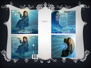
To ensure continuity across products, the author established a consistent color scheme, font, camera shots, and logo. This unified branding allows the target audience to easily recognize and associate all of the artist's products.
Specific design elements like costumes, camera angles, and rule of thirds composition techniques were used intentionally to portray the artist as confident, glamorous, and independent in a way that would appeal to the target demographic.
Some props from the music video were deliberately excluded from other materials to generate intrigue and encourage audiences to watch the full video. Overall, the interlinking iconic elements