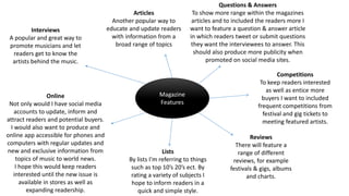
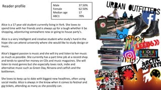
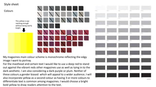
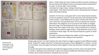
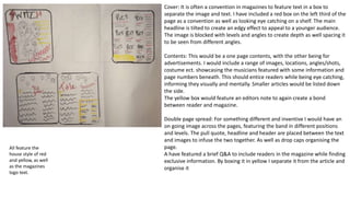
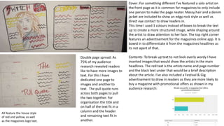
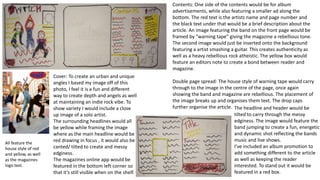
Pitch and Planning
My music magazine pitch.
The working title of my magazine is “Switch”. My music magazine will focus
on the Rock, Indie and Alternative genres. I hope to promote popular artists
and bands as well as the up and coming musicians of these genres. I will
publish my magazine monthly, pricing it at £5. My main target audience age is
between 16-25 but I hope that my magazine will appeal to anyone with
interest and knowledge of my chosen music genre. To appeal to my target
audience I want my magazine to be fun, edgy and laid back tying into the
style of music the magazine will promote as well as appearing level and
connect with the readers. I will primarily use dark colours as a house style
which links into the connotations and general image of the genre of music the
magazine will promote. As it is a monthly magazine I will included 140 pages
in each issue as this is number a general convention in monthly magazines.
Magazine
Features
Interviews
A popular and great way to
promote musicians and let
readers get to know the
artists behind the music.
Questions & Answers
To show more range within the magazines
articles and to included the readers more I
want to feature a question & answer article
in which readers tweet or submit questions
they want the interviewees to answer. This
should also produce more publicity when
promoted on social media sites.
Online
Not only would I have social media
accounts to update, inform and
attract readers and potential buyers.
I would also want to produce and
online app accessible for phones and
computers with regular updates and
new and exclusive information from
topics of music to world news.
I hope this would keep readers
interested until the new issue is
available in stores as well as
expanding readership.
Reviews
There will feature a
range of different
reviews, for example
festivals & gigs, albums
and charts.
Competitions
To keep readers interested
as well as entice more
buyers I want to included
frequent competitions from
festival and gig tickets to
meeting featured artists.
Articles
Another popular way to
educate and update readers
with information from a
broad range of topics
Lists
By lists I’m referring to things
such as top 10’s 20’s ect. By
rating a variety of subjects I
hope to inform readers in a
quick and simple style.
Alice is a 17 year old student currently living in York. She loves to
spend time with her friends and is always up for a laugh whether it be
shopping, adventuring somewhere new or going to house party's.
Alice is a very intelligent and creative student who study's hard in the
hope she can attend university where she would like to study design or
music.
Alice’s biggest passion is music and she will try and listen to her music
as much as possible. She currently has a part time job at a record shop
and tends to spend her money on CDs and music magazines. She will
listen to most genres but she especially loves rock, indie and
alternative music such as Green Day, Nirvana and catfish and the
bottlemen.
She loves to keep up to date with biggest new headlines, often using
social media. Alice is always in the know when it comes to festival and
gig tickets, attending as many as she possibly can.
Reader profile Male
Female
Median age
ABC1
37.50%
62.50%
17
78%
Colours
Style sheet
My magazines main colour scheme is monochrome reflecting the edgy
image I want to portray.
For the masthead and certain text I would like to use a deep red to stand
out against the vibrant reds other magazines use as well as tying in to the
dark aesthetic. I am also considering a dark purple or plum. Neither of
these colours a gender biased which will appeal to a wider audience. I will
also incorporate yellow as a second colour as having 3 or more colours to
differentiate text is common among magazines. I would choose a bright
bold yellow to draw readers attention to the text.
This yellow is eye
catching enough
without being overly
bright.
Fonts
Style sheet
I picked this due to the broken
glass effect at the bottom
conveying the idea of loud and
powerful music like the genre
I'm featuring in my magazine. I
have not chosen it has my final
design because I'm not keen
on the pop arty font. It also is
too similar to Kerrangs! Style.
I feel this font is too messy
looking more like its been
scribbled out rather than a
cracked glass effect. The ‘S’ is
also to distant.
This font is too formal and
basic for my laid back and edgy
music magazine.
This font is too thin. I want a
bold or unique font style that
will catch a readers eye and
stand out against other music
magazines .
This font reminds me too
much of a women's or fashion
magazine type font rather than
a rebellious music magazine.
This is too urban rather
than rock, which could
possibly send out the
wrong message to
potential buyers.
This is much like the other
font I have chosen but I
think this version of it is
more basic and less eye
catching.
I like this one as the style of the
letter ‘S’ looks similar to a lighting
bolt which is associated with
electricity and power much like a
switch, as well as having
connotations to high energy,
boldness and power which reflects
the music's sound while also
creating a rebellious image. The
messy and different style designs for
each letter portray a ‘do it yourself’
vibe, looking as though it’s a scrap
collage which will relate to the
readers as well as presenting the
magazine as down to earth.
This font might be good due to it
looking quite messy reflecting a
laidback attitude much like the
target audience readers. It also
looks quite arty by looking like
brush strokes, tying into the
audience research responses
describing themselves as
“creative”
This font isn't eye catching
enough nor does it reflect the
magazines edgy house style.
I like this as its subtle but
edgy. The glitching reflects the
idea of being a glitch in
society forming a rebellious
and unique image. The glitch
could also represent heavy
and loud music
This font might be better
suited for the front cover
headlines and text rather
than the brands logo.
Style sheet
Photo inspiration
For my photos I want to mix edgy and indie photos with more relaxed and fun images to reflect my magazines style of interesting and exclusive
information but with a down to earth and laid back approach.
I want my photos to be on location rather than in a studio to show case urban and gritty locations that will appeal to my audience making the
magazine and featured artists appear down to earth and level with readers.
For my double page spread I want to use an all girl indie rock band that should appeal to both male and female readers so as not to have a gender
biased magazine. By doing this I will attracted a wider audience which should pull in more money.
To make the band fit my magazines image and style I want to included relevant uses of costume in the mise en scene for example: Over sized
jumpers, edgy and baggy clothes, dark colours, sunglasses, basic patterns/colours/coordination, messy hair and make up ect.
I’d also like to have a rage of angles and levels throughout the magazines images to once again show diversity and to not bore the reader with
similar shots.
For the interview in my double page spread I want it to appear as if the interview is for an up and coming band so to inforce this idea I want to
have induvial shots of each member, as a “Get to know each member of the band”. I think these should be mid-shots on a plain background to
fully focus on each person. I would also like them to be less serious and posy and reflect a more natural and inviting image to translate each
members individuality/ personality.
For the contents I would like a range of different photos from studio, location and festivals to show diversity in what the magazine offers. I think
that having pictures in the contents entices the reader using visuals without having to give too much information away in the text. My audience
research also showed that 75% of the test subjects would prefer more images in a magazine.
For the front page my main image will be a group shot of the band that will be featured in my double page spread. I want a sense of depth with
the image so as to draw the reader in as well as keep to common conventions of magazine covers. To do this I want to include things such as eye
contact, levels and blocking as well as a dark or plain background to make the band stand out more.
I want to include a second image to structure the page more and break up the text. I would like with image to either feature a solo artist in
medium close up or multiple people in a medium shot. I would also like to have this image with a plain background.
Cover: I tried to keep this cover simple and well structured, breaking up
the text clearly with different colours and shaped outlines boxing them
in/ apart. In the top right I have included
I also kept the image simple, relying on blocking and eye contact to
create depth. I have draw the band to have a varying look but sticking to
urban and trendy clothing.
Contents: For this one a have gone with a more textual based contents
as from my audience research I found many were well educated and fall
under the abc1. I have followed on my colour scheme from the front
cover, while also incorporating a blue. This is to separate the contents
information into categorise so as its easier for the reader to navigate.
My main image is the band featured on the front page reinforcing that
they are the main subject of the issue. They are featured on a location
setting to show a diverse range of shots. I have featured a close up and
a mid-shot to show range. The mid-shot also features a guitar to create
authenticity.
To create a connection between the readers and the magazine I've
included an editors note, making it more personal.
Double page spread: I’ve tried to balance the ratio of text to images to appeal to what different readers
prefer. To grab the readers attention I’ve featured a pull quote, clearly highlighted in a red box. I’ve also
run the header across the page to bring the article together. Drop caps have been included to organise
the page.
To connect the band to the audience and make the magazine look as if we’re close to the band I’d like
to include a “Getting to know the band” to give some exclusive additional information about each
member, which would also feature individual close up shots.
All feature the
house style of red
and yellow, as well
as the magazines
logo text.
Cover: It is often a convention in magazines to feature text in a box to
separate the image and text. I have included a red box on the left third of the
page as a convention as well as looking eye catching on a shelf. The main
headline is tilted to create an edgy effect to appeal to a younger audience.
The image is blocked with levels and angles to create depth as well spacing it
to be seen from different angles.
Contents: This would be a one page contents, with the other being for
advertisements. I would include a range of images, locations, angles/shots,
costume ect. showcasing the musicians featured with some information and
page numbers beneath. This should entice readers while being eye catching,
informing they visually and mentally. Smaller articles would be listed down
the side.
The yellow box would feature an editors note to again create a bond
between reader and magazine.
Double page spread: For something different and inventive I would have an
on going image across the pages, featuring the band in different positions
and levels. The pull quote, headline and header are placed between the text
and images to infuse the two together. As well as drop caps organising the
page.
A have featured a brief Q&A to include readers in the magazine while finding
exclusive information. By boxing it in yellow I separate it from the article and
organise it
All feature the
house style of red
and yellow, as well
as the magazines
logo text.
Cover: For something different I’ve featured a solo artist on
the front page as it is common for magazines to only include
one person to make the page neater. Messy hair and a denim
jacket are included to show an edgy rock style as well as
direct eye contact to draw readers in.
This time I used 3 colours instead of boxes to break the text
up to create a more structured image, while shaping around
the artist to draw attention to her face. The top right corner
features an advertisement for the magazines online app. It is
boxed in to differentiate it from the magazines headlines as
its not apart of that.
Contents: To break up text to not look overly wordy I have
inserted images that would show the artists in the main
headlines. The red text is the artists name and page number
and the black text under that would be a brief description
about the article. I’ve also included a Festival & Gig
advertisement to draw in readers as they are more likely to
buy a magazine with promotional offers as shown in my
audience research:
All feature the house style
of red and yellow, as well
as the magazines logo text.
Double page spread: As
75% of my audience
research revealed readers
like to have more images to
text. For this I have
dedicated one page to
images and another to
text. The pull quote runs
across both pages to pull
the two together. For
organisation the title and
on half of the text fit in a
column and the header
and remaining text fit in
another.
All feature the
house style of red
and yellow, as well
as the magazines
logo text.
Cover: To create an urban and unique
angles I based my image off of this
photo, I feel it is a fun and different
way to create depth and angels as well
at maintaining an indie rock vibe. To
show variety I would include a close
up image of a solo artist.
The surrounding headlines would all
be yellow while framing the image
where as the main headline would be
red drawing in focus , it would also be
canted/ tilted to create and messy
edginess.
The magazines online app would be
featured in the bottom left corner so
that it’s still visible when on the shelf.
Contents: One side of the contents would be for album
advertisements, while also featuring a smaller ad along the
bottom. The red text is the artists name and page number and
the black text under that would be a brief description about the
article. An image featuring the band on the front page would be
framed by “warning tape” giving the magazine a rebellious tone.
The second image would just be inserted onto the background
featuring a artist smashing a guitar. This creates authenticity as
well as a heavy rebellious rock atheistic. The yellow box would
feature an editors note to create a bond between reader and
magazine.
Double page spread: The house style of warning tape would carry
through to the image in the centre of the page, once again
showing the band and magazine are rebellious. The placement of
the image breaks up and organises them text. The drop caps
further organise the article. The headline and header would be
tilted to carry through the messy
edginess. The image would feature the
band jumping to create a fun, energetic
and dynamic shot reflecting the bands
music and live shows.
I’ve included an album promotion to
add something different to the article
as well as keeping the reader
interested. To stand out it would be
featured in a red box.
All feature the
house style of red
and yellow, as well
as the magazines
logo text.
This was another idea for a
front cover, inspired by this
image. Creating depth in a
diverse way and appearing as
though they are reading the
magazine headlines. The
reader may be encouraged to
read the headlines due to
following their eye line.
For this the headlines would be
in colour (red and yellow) with
additional text about the article
underneath pealing the
audience interest to find out
more from the inside.
A canted headline causes it to
stand out against the others
drawing focus to it, as well as
giving a relaxed edgy feel.

Pitch and planning

  • 1.
  • 2.
    My music magazinepitch. The working title of my magazine is “Switch”. My music magazine will focus on the Rock, Indie and Alternative genres. I hope to promote popular artists and bands as well as the up and coming musicians of these genres. I will publish my magazine monthly, pricing it at £5. My main target audience age is between 16-25 but I hope that my magazine will appeal to anyone with interest and knowledge of my chosen music genre. To appeal to my target audience I want my magazine to be fun, edgy and laid back tying into the style of music the magazine will promote as well as appearing level and connect with the readers. I will primarily use dark colours as a house style which links into the connotations and general image of the genre of music the magazine will promote. As it is a monthly magazine I will included 140 pages in each issue as this is number a general convention in monthly magazines.
  • 3.
    Magazine Features Interviews A popular andgreat way to promote musicians and let readers get to know the artists behind the music. Questions & Answers To show more range within the magazines articles and to included the readers more I want to feature a question & answer article in which readers tweet or submit questions they want the interviewees to answer. This should also produce more publicity when promoted on social media sites. Online Not only would I have social media accounts to update, inform and attract readers and potential buyers. I would also want to produce and online app accessible for phones and computers with regular updates and new and exclusive information from topics of music to world news. I hope this would keep readers interested until the new issue is available in stores as well as expanding readership. Reviews There will feature a range of different reviews, for example festivals & gigs, albums and charts. Competitions To keep readers interested as well as entice more buyers I want to included frequent competitions from festival and gig tickets to meeting featured artists. Articles Another popular way to educate and update readers with information from a broad range of topics Lists By lists I’m referring to things such as top 10’s 20’s ect. By rating a variety of subjects I hope to inform readers in a quick and simple style.
  • 4.
    Alice is a17 year old student currently living in York. She loves to spend time with her friends and is always up for a laugh whether it be shopping, adventuring somewhere new or going to house party's. Alice is a very intelligent and creative student who study's hard in the hope she can attend university where she would like to study design or music. Alice’s biggest passion is music and she will try and listen to her music as much as possible. She currently has a part time job at a record shop and tends to spend her money on CDs and music magazines. She will listen to most genres but she especially loves rock, indie and alternative music such as Green Day, Nirvana and catfish and the bottlemen. She loves to keep up to date with biggest new headlines, often using social media. Alice is always in the know when it comes to festival and gig tickets, attending as many as she possibly can. Reader profile Male Female Median age ABC1 37.50% 62.50% 17 78%
  • 5.
    Colours Style sheet My magazinesmain colour scheme is monochrome reflecting the edgy image I want to portray. For the masthead and certain text I would like to use a deep red to stand out against the vibrant reds other magazines use as well as tying in to the dark aesthetic. I am also considering a dark purple or plum. Neither of these colours a gender biased which will appeal to a wider audience. I will also incorporate yellow as a second colour as having 3 or more colours to differentiate text is common among magazines. I would choose a bright bold yellow to draw readers attention to the text. This yellow is eye catching enough without being overly bright.
  • 6.
    Fonts Style sheet I pickedthis due to the broken glass effect at the bottom conveying the idea of loud and powerful music like the genre I'm featuring in my magazine. I have not chosen it has my final design because I'm not keen on the pop arty font. It also is too similar to Kerrangs! Style. I feel this font is too messy looking more like its been scribbled out rather than a cracked glass effect. The ‘S’ is also to distant. This font is too formal and basic for my laid back and edgy music magazine. This font is too thin. I want a bold or unique font style that will catch a readers eye and stand out against other music magazines . This font reminds me too much of a women's or fashion magazine type font rather than a rebellious music magazine. This is too urban rather than rock, which could possibly send out the wrong message to potential buyers. This is much like the other font I have chosen but I think this version of it is more basic and less eye catching. I like this one as the style of the letter ‘S’ looks similar to a lighting bolt which is associated with electricity and power much like a switch, as well as having connotations to high energy, boldness and power which reflects the music's sound while also creating a rebellious image. The messy and different style designs for each letter portray a ‘do it yourself’ vibe, looking as though it’s a scrap collage which will relate to the readers as well as presenting the magazine as down to earth. This font might be good due to it looking quite messy reflecting a laidback attitude much like the target audience readers. It also looks quite arty by looking like brush strokes, tying into the audience research responses describing themselves as “creative” This font isn't eye catching enough nor does it reflect the magazines edgy house style. I like this as its subtle but edgy. The glitching reflects the idea of being a glitch in society forming a rebellious and unique image. The glitch could also represent heavy and loud music This font might be better suited for the front cover headlines and text rather than the brands logo.
  • 7.
  • 10.
    For my photosI want to mix edgy and indie photos with more relaxed and fun images to reflect my magazines style of interesting and exclusive information but with a down to earth and laid back approach. I want my photos to be on location rather than in a studio to show case urban and gritty locations that will appeal to my audience making the magazine and featured artists appear down to earth and level with readers. For my double page spread I want to use an all girl indie rock band that should appeal to both male and female readers so as not to have a gender biased magazine. By doing this I will attracted a wider audience which should pull in more money. To make the band fit my magazines image and style I want to included relevant uses of costume in the mise en scene for example: Over sized jumpers, edgy and baggy clothes, dark colours, sunglasses, basic patterns/colours/coordination, messy hair and make up ect. I’d also like to have a rage of angles and levels throughout the magazines images to once again show diversity and to not bore the reader with similar shots. For the interview in my double page spread I want it to appear as if the interview is for an up and coming band so to inforce this idea I want to have induvial shots of each member, as a “Get to know each member of the band”. I think these should be mid-shots on a plain background to fully focus on each person. I would also like them to be less serious and posy and reflect a more natural and inviting image to translate each members individuality/ personality. For the contents I would like a range of different photos from studio, location and festivals to show diversity in what the magazine offers. I think that having pictures in the contents entices the reader using visuals without having to give too much information away in the text. My audience research also showed that 75% of the test subjects would prefer more images in a magazine. For the front page my main image will be a group shot of the band that will be featured in my double page spread. I want a sense of depth with the image so as to draw the reader in as well as keep to common conventions of magazine covers. To do this I want to include things such as eye contact, levels and blocking as well as a dark or plain background to make the band stand out more. I want to include a second image to structure the page more and break up the text. I would like with image to either feature a solo artist in medium close up or multiple people in a medium shot. I would also like to have this image with a plain background.
  • 11.
    Cover: I triedto keep this cover simple and well structured, breaking up the text clearly with different colours and shaped outlines boxing them in/ apart. In the top right I have included I also kept the image simple, relying on blocking and eye contact to create depth. I have draw the band to have a varying look but sticking to urban and trendy clothing. Contents: For this one a have gone with a more textual based contents as from my audience research I found many were well educated and fall under the abc1. I have followed on my colour scheme from the front cover, while also incorporating a blue. This is to separate the contents information into categorise so as its easier for the reader to navigate. My main image is the band featured on the front page reinforcing that they are the main subject of the issue. They are featured on a location setting to show a diverse range of shots. I have featured a close up and a mid-shot to show range. The mid-shot also features a guitar to create authenticity. To create a connection between the readers and the magazine I've included an editors note, making it more personal. Double page spread: I’ve tried to balance the ratio of text to images to appeal to what different readers prefer. To grab the readers attention I’ve featured a pull quote, clearly highlighted in a red box. I’ve also run the header across the page to bring the article together. Drop caps have been included to organise the page. To connect the band to the audience and make the magazine look as if we’re close to the band I’d like to include a “Getting to know the band” to give some exclusive additional information about each member, which would also feature individual close up shots. All feature the house style of red and yellow, as well as the magazines logo text.
  • 12.
    Cover: It isoften a convention in magazines to feature text in a box to separate the image and text. I have included a red box on the left third of the page as a convention as well as looking eye catching on a shelf. The main headline is tilted to create an edgy effect to appeal to a younger audience. The image is blocked with levels and angles to create depth as well spacing it to be seen from different angles. Contents: This would be a one page contents, with the other being for advertisements. I would include a range of images, locations, angles/shots, costume ect. showcasing the musicians featured with some information and page numbers beneath. This should entice readers while being eye catching, informing they visually and mentally. Smaller articles would be listed down the side. The yellow box would feature an editors note to again create a bond between reader and magazine. Double page spread: For something different and inventive I would have an on going image across the pages, featuring the band in different positions and levels. The pull quote, headline and header are placed between the text and images to infuse the two together. As well as drop caps organising the page. A have featured a brief Q&A to include readers in the magazine while finding exclusive information. By boxing it in yellow I separate it from the article and organise it All feature the house style of red and yellow, as well as the magazines logo text.
  • 13.
    Cover: For somethingdifferent I’ve featured a solo artist on the front page as it is common for magazines to only include one person to make the page neater. Messy hair and a denim jacket are included to show an edgy rock style as well as direct eye contact to draw readers in. This time I used 3 colours instead of boxes to break the text up to create a more structured image, while shaping around the artist to draw attention to her face. The top right corner features an advertisement for the magazines online app. It is boxed in to differentiate it from the magazines headlines as its not apart of that. Contents: To break up text to not look overly wordy I have inserted images that would show the artists in the main headlines. The red text is the artists name and page number and the black text under that would be a brief description about the article. I’ve also included a Festival & Gig advertisement to draw in readers as they are more likely to buy a magazine with promotional offers as shown in my audience research: All feature the house style of red and yellow, as well as the magazines logo text. Double page spread: As 75% of my audience research revealed readers like to have more images to text. For this I have dedicated one page to images and another to text. The pull quote runs across both pages to pull the two together. For organisation the title and on half of the text fit in a column and the header and remaining text fit in another.
  • 14.
    All feature the housestyle of red and yellow, as well as the magazines logo text. Cover: To create an urban and unique angles I based my image off of this photo, I feel it is a fun and different way to create depth and angels as well at maintaining an indie rock vibe. To show variety I would include a close up image of a solo artist. The surrounding headlines would all be yellow while framing the image where as the main headline would be red drawing in focus , it would also be canted/ tilted to create and messy edginess. The magazines online app would be featured in the bottom left corner so that it’s still visible when on the shelf. Contents: One side of the contents would be for album advertisements, while also featuring a smaller ad along the bottom. The red text is the artists name and page number and the black text under that would be a brief description about the article. An image featuring the band on the front page would be framed by “warning tape” giving the magazine a rebellious tone. The second image would just be inserted onto the background featuring a artist smashing a guitar. This creates authenticity as well as a heavy rebellious rock atheistic. The yellow box would feature an editors note to create a bond between reader and magazine. Double page spread: The house style of warning tape would carry through to the image in the centre of the page, once again showing the band and magazine are rebellious. The placement of the image breaks up and organises them text. The drop caps further organise the article. The headline and header would be tilted to carry through the messy edginess. The image would feature the band jumping to create a fun, energetic and dynamic shot reflecting the bands music and live shows. I’ve included an album promotion to add something different to the article as well as keeping the reader interested. To stand out it would be featured in a red box.
  • 15.
    All feature the housestyle of red and yellow, as well as the magazines logo text. This was another idea for a front cover, inspired by this image. Creating depth in a diverse way and appearing as though they are reading the magazine headlines. The reader may be encouraged to read the headlines due to following their eye line. For this the headlines would be in colour (red and yellow) with additional text about the article underneath pealing the audience interest to find out more from the inside. A canted headline causes it to stand out against the others drawing focus to it, as well as giving a relaxed edgy feel.