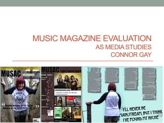
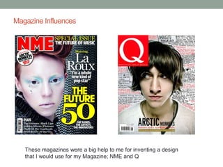
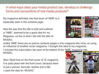
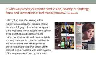
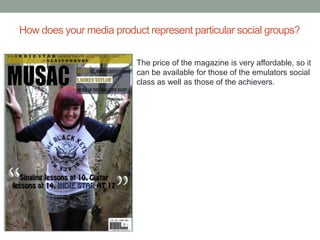
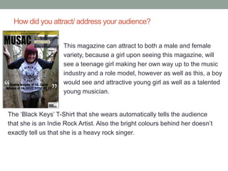
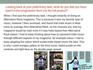
MUSIC MAGAZINE EVALUATION
             AS MEDIA STUDIES
                 CONNOR GAY
Magazine Influences


   These magazines were a big help to me for inventing a design
   that I would use for my Magazine; NME and Q
In what ways does your media product use, develop or challenge
  forms and conventions of real media products?

My magazine definitely has that touch of ‘NME’ to it,
especially seen in the contents page:

Also the way that the title is bold and outlined
in ‘NME’, seemed to be a good idea for my
Magazine, so this is what I did with the title for
MUSAC.
Unlike ‘NME’ there are no picture contents pages in this magazine like mine, so using
an influence of another music magazine, I brought this idea to my magazine.
I included the subscription tab seen at the bottom of the ‘NME’ magazine into
MUSAC.

Also I liked how on the front cover of ‘Q’ magazine,
It is quite plane with the front cover, because there
is just a picture, barcode, skyline and a title.
I used this idea for ‘MUSAC’.
In what ways does your media product use, develop or challenge
forms and conventions of real media products? (continued)

I also got an idea after looking at this
magazine contents page, because of how
there is a dull gray colour in the back ground
of the magazine, which actually in my opinion
gives a sophisticated approach to the
magazine, which works well, because Adele
is a very mature artist. I wanted to take this
into consideration with my magazine so I
chose the dark purple/brown colour which
followed a colour scheme with other features
of the magazine as shown by the arrows.
How does your media product represent particular social groups?

                          The price of the magazine is very affordable, so it
                          can be available for those of the emulators social
                          class as well as those of the achievers.
What kind of media institution might distribute your media product
and why?


The media institution that I would use, would be ‘ICP
Media’, for the reason that they can link to all kinds of
music, so it would be fairly easy to get into, in comparison
to other Media Institutions who do not link to all music
types. Also they are a very huge Media Institution, so the
publicity would be very useful to draw in an audience.
Who would be the audience for your media product?


For my audience, I would try to range for a big audience, because
although my Music Magazine is an Indie based magazine, I would
include artists like Mumford and Sons, or Adele, where lots of different
people like them even though these artist may not specialize in the
music genre that their fans would usually go for. Both males and
females of around 14-19 should be interested in my magazine. Indie is
a very neutral band genre, so for this reason many people would enjoy
Indie music of some sort, whether it be Indie or Indie Rock.
Furthermore, after recent surveying, 36 people were asked what their
favorite artist’s genres were. 82% of them said Indie. Because lots of
people like Indie music, they would be more likely to subscribe to my
Magazine rather than a different style magazine.
How did you attract/ address your audience?


                    This magazine can attract to both a male and female
                    variety, because a girl upon seeing this magazine, will
                    see a teenage girl making her own way up to the music
                    industry and a role model, however as well as this, a boy
                    would see and attractive young girl as well as a talented
                    young musician.


The ‘Black Keys’ T-Shirt that she wears automatically tells the audience
that she is an Indie Rock Artist. Also the bright colours behind her doesn’t
exactly tell us that she is a heavy rock singer.
What have you learnt about technologies from the process of
constructing this product?

Photoshop was obviously a huge part towards my end product.
Photoshop was were I edited all my images, created backgrounds,
wrote my text and put it all together. Using Photoshop was a struggle at
some points, because although I have used it many times before, it
brought me to a new level of understanding of it. For example, I
explored the ‘Liquify’ tool, which was very new to me, but I soon
adapted to it and used it in various ways like taking in the body shapes
and curves of my chosen music artists.
Looking back at your preliminary task, what do you feel you have
 learnt in the progression from it to the full product?
When I first saw the preliminary task, I thought instantly of doing an
Alternative Rock magazine. This is because it was my favorite type of
music, however I then surveyed, and found that Indie music is liked
more on average then Alternative Rock, so the chances are, that my
magazine would be read more if it was Indie based then Alternative
Rock based. I had to keep thinking about how to represent Indie music
through different aspects of my magazine, for example colour. I had to
keep adapting the colour which suited Indie styled music the best. This
is why I used orangey yellow on the front cover, faded purple on the
contents and light blue on the double page spread.

Media mag eval

  • 1.
    MUSIC MAGAZINE EVALUATION AS MEDIA STUDIES CONNOR GAY
  • 2.
    Magazine Influences These magazines were a big help to me for inventing a design that I would use for my Magazine; NME and Q
  • 3.
    In what waysdoes your media product use, develop or challenge forms and conventions of real media products? My magazine definitely has that touch of ‘NME’ to it, especially seen in the contents page: Also the way that the title is bold and outlined in ‘NME’, seemed to be a good idea for my Magazine, so this is what I did with the title for MUSAC. Unlike ‘NME’ there are no picture contents pages in this magazine like mine, so using an influence of another music magazine, I brought this idea to my magazine. I included the subscription tab seen at the bottom of the ‘NME’ magazine into MUSAC. Also I liked how on the front cover of ‘Q’ magazine, It is quite plane with the front cover, because there is just a picture, barcode, skyline and a title. I used this idea for ‘MUSAC’.
  • 4.
    In what waysdoes your media product use, develop or challenge forms and conventions of real media products? (continued) I also got an idea after looking at this magazine contents page, because of how there is a dull gray colour in the back ground of the magazine, which actually in my opinion gives a sophisticated approach to the magazine, which works well, because Adele is a very mature artist. I wanted to take this into consideration with my magazine so I chose the dark purple/brown colour which followed a colour scheme with other features of the magazine as shown by the arrows.
  • 5.
    How does yourmedia product represent particular social groups? The price of the magazine is very affordable, so it can be available for those of the emulators social class as well as those of the achievers.
  • 6.
    What kind ofmedia institution might distribute your media product and why? The media institution that I would use, would be ‘ICP Media’, for the reason that they can link to all kinds of music, so it would be fairly easy to get into, in comparison to other Media Institutions who do not link to all music types. Also they are a very huge Media Institution, so the publicity would be very useful to draw in an audience.
  • 7.
    Who would bethe audience for your media product? For my audience, I would try to range for a big audience, because although my Music Magazine is an Indie based magazine, I would include artists like Mumford and Sons, or Adele, where lots of different people like them even though these artist may not specialize in the music genre that their fans would usually go for. Both males and females of around 14-19 should be interested in my magazine. Indie is a very neutral band genre, so for this reason many people would enjoy Indie music of some sort, whether it be Indie or Indie Rock. Furthermore, after recent surveying, 36 people were asked what their favorite artist’s genres were. 82% of them said Indie. Because lots of people like Indie music, they would be more likely to subscribe to my Magazine rather than a different style magazine.
  • 8.
    How did youattract/ address your audience? This magazine can attract to both a male and female variety, because a girl upon seeing this magazine, will see a teenage girl making her own way up to the music industry and a role model, however as well as this, a boy would see and attractive young girl as well as a talented young musician. The ‘Black Keys’ T-Shirt that she wears automatically tells the audience that she is an Indie Rock Artist. Also the bright colours behind her doesn’t exactly tell us that she is a heavy rock singer.
  • 9.
    What have youlearnt about technologies from the process of constructing this product? Photoshop was obviously a huge part towards my end product. Photoshop was were I edited all my images, created backgrounds, wrote my text and put it all together. Using Photoshop was a struggle at some points, because although I have used it many times before, it brought me to a new level of understanding of it. For example, I explored the ‘Liquify’ tool, which was very new to me, but I soon adapted to it and used it in various ways like taking in the body shapes and curves of my chosen music artists.
  • 10.
    Looking back atyour preliminary task, what do you feel you have learnt in the progression from it to the full product? When I first saw the preliminary task, I thought instantly of doing an Alternative Rock magazine. This is because it was my favorite type of music, however I then surveyed, and found that Indie music is liked more on average then Alternative Rock, so the chances are, that my magazine would be read more if it was Indie based then Alternative Rock based. I had to keep thinking about how to represent Indie music through different aspects of my magazine, for example colour. I had to keep adapting the colour which suited Indie styled music the best. This is why I used orangey yellow on the front cover, faded purple on the contents and light blue on the double page spread.