TX History Ch 1.3
•Download as PPT, PDF•
3 likes•1,025 views

This document discusses different types of graphs, charts, and tables that can be used to visually present statistical information. It provides examples of four largest Texas cities in 2000 and their populations in a bar graph. It then defines different types of visual aids like bar graphs, line graphs, pie charts, tables, timelines, flow charts, and causation charts. It provides examples of each and explains their purpose and usefulness in organizing and comparing information.
Report
Share
Report
Share
![[object Object],[object Object],[object Object],[object Object]](data:image/gif;base64,R0lGODlhAQABAIAAAAAAAP///yH5BAEAAAAALAAAAAABAAEAAAIBRAA7)
Recommended
TX History Ch 1.2
The document discusses different types of maps and their components. It explains that maps show relative location by showing places in relation to each other, and absolute location by using latitude and longitude to pinpoint exact spots. It also describes common map elements like grids, scales, legends, and compass roses that help interpret maps. Different types of maps convey various themes or topics through the use of projections to represent the spherical Earth on a flat surface.
Texas history 1.1
The six essential elements of geography are:
1. The world in spatial terms - how geography studies location
2. Places and regions - the physical and human characteristics that define different areas
3. Physical systems - the atmosphere, land, water, and life that make up the natural environment
4. Human systems - how people distribute and interact across locations
5. Environment and society - the relationship between humans and their surroundings
6. Uses of geography - how geography is applied to fields like resource management and history
TX History Ch 1.1
The six essential elements of geography are:
1. Places and regions - how physical and human characteristics define different locations
2. Physical systems - the atmosphere, land, water, and living things and how they interact
3. Human systems - population distribution, growth, movement, urbanization
4. Environment and society - how humans interact with and are impacted by the environment
5. Uses of geography - applications like resource management, history, and conservation
6. The spatial nature of geography - how location and spatial thinking are fundamental concepts
TX History Ch 11.4
The document summarizes the Convention of 1836 in which Texas declared its independence from Mexico. 59 delegates met in March in a small, unfurnished building in muddy conditions. They voted to declare independence and drafted the Texas Declaration of Independence, listing Texans' complaints against Mexico. They also drafted the Constitution of 1836, modeling it after the U.S. Constitution and establishing the branches of government and a bill of rights. David G. Burnet was named the first president of independent Texas.
TX History Ch 18.4
The document summarizes the effects of the Civil War on the Texas home front. It discusses how the wartime economy caused shortages of goods and how Texans adapted by growing more crops like corn and wheat. Slaveholders from other Confederate states sent their slaves to Texas. The Confederate government enacted a draft that was unpopular. Unionists in Texas faced persecution, with some violently attacked or lynched for opposing the war or draft. Life became difficult for civilians as martial law was imposed in some Unionist areas.
TX History Ch 11.2
The Consultation of 1835 was a meeting called by William H. Wharton to discuss Texas' future within Mexico. At the meeting, Branch T. Archer was elected president. Delegates debated between declaring immediate independence from Mexico or remaining loyal in hopes Mexico would restore the Constitution of 1824. The Consultation ultimately created a provisional government and pledged loyalty to Mexico while warning of independence if reforms did not occur. Sam Houston was named commander-in-chief of the Texas army.
Manifest destiny land territories
1) Manifest Destiny is the belief that the United States had the right and duty to expand across North America to the Pacific Ocean.
2) From 1783 to 1853, the United States expanded its territory through several treaties and annexations, including the Louisiana Purchase, Florida Cession, Texas Annexation, Oregon Country agreement, Mexican Cession, and Gadsden Purchase.
3) This westward expansion allowed the United States to acquire new lands and fulfill the doctrine of Manifest Destiny.
Life in Colonial America
The document summarizes life in the three main regions of colonial America: New England, Middle, and Southern colonies. It describes the reasons for settlement, including religious freedom, economic opportunities, and land ownership. The New England colonies attracted those seeking religious freedom and consisted of small family farms and fishing. The Middle colonies had a mix of religious and economic motivations and included farming, factories, and trade. The Southern colonies were founded primarily for economic reasons, centered around large plantations that relied on slave labor to grow cash crops like tobacco.
American Revolutionary War
The document summarizes key events of the American Revolutionary War between Britain and the colonies:
1) Growing tensions over new taxes like the Stamp Act and Townshend Acts led to protests like the Boston Tea Party and Intolerable Acts in response.
2) The First Continental Congress united the colonies in opposition to Britain and the Second Continental Congress established the Continental Army under George Washington.
3) A major turning point was the American victory over British forces at the Battle of Saratoga in 1777, which led France to form an alliance with the Americans against Britain.
Manifest Destiny
The document discusses the various motivations and factors that drove United States expansion westward in the 19th century. Key reasons included the spread of American beliefs and civilization through missionary work; the need for access to ports on the Pacific Ocean and Gulf of Mexico for trade; the beginnings of the Industrial Revolution creating demand for resources and farmland; and a belief in "Manifest Destiny" that America was destined to expand across the continent. Critics argued that this expansion displaced Native Americans and was often justified through racist ideologies.
TX History Ch 18.5
1) The war draws to a close as Union forces gain victories over Confederate forces under Lee and Grant takes command of the Union army.
2) Sherman's march through Georgia and the Carolinas helps turn the tide further against the Confederacy.
3) Lee surrenders to Grant at Appomattox, but fighting continues in Texas until the last battle at Palmito Ranch in May after word of the surrender spreads.
The Age of Jackson
Andrew Jackson's presidency influenced the spread of American democracy in several ways:
1) Jackson expanded voting rights and portrayed himself as a champion of the common man, though voting was still limited to white men.
2) He implemented the "spoils system" of replacing government workers with his political supporters.
3) Jackson aggressively pursued the forced removal of Native American tribes, most notoriously the Cherokee Trail of Tears, to open more land for white settlement.
TX History Ch 14.1
The document discusses Texas establishing diplomatic relations with other nations after gaining independence from Mexico in 1836. It notes that Texas wanted recognition from Mexico the most to help with issues like immigration, trade, and loans. While the US initially had doubts about Texas due to its small population and debt, it was the first to recognize Texas in 1837. Texas then sent diplomats to Europe and gained recognition from France, Britain, Belgium, and the Netherlands later that year, though Mexico still refused to recognize Texas' independence.
Plymouth
The document summarizes the journey and founding of Plymouth colony by the Pilgrims in 1620. It describes how the Pilgrims faced religious persecution in England and sought religious freedom, so they traveled on the Mayflower to settle in Virginia but ended up landing much further north in Massachusetts due to storms. They survived a difficult first winter with help from the Native Americans Squanto and Samoset and held a harvest celebration that became Thanksgiving.
TX History Ch 12.2
Sam Houston was elected the first president of the Republic of Texas in 1835. His goals were to maintain peace with American Indian tribes, keep Mexico at bay, and seek annexation by the United States. He reduced the size of the unrestful Texas army and relied on the Texas Rangers for frontier defense. Houston also negotiated treaties with American Indian tribes to maintain peace and assigned land to tribes, but many Texans still viewed the tribes as obstacles.
Chapter 6 The American Revolution
The document summarizes key events and battles of the American Revolutionary War, including initial fighting in New England, the Second Continental Congress sending the Olive Branch Petition, the Battle of Bunker Hill, the publication of Common Sense, the Declaration of Independence, battles in the middle colonies like Long Island and Trenton, Saratoga turning the tide of the war, Valley Forge, women and African Americans contributing to the Patriot cause, battles in the South like Cowpens and Yorktown, and ultimately Britain recognizing American independence after their surrender at Yorktown. Key figures discussed include Ethan Allen, Thomas Paine, George Washington, and others.
TX History Ch 5.1
Christopher Columbus sailed from Spain in 1492 hoping to find a western route to Asia but instead landed in the Caribbean, establishing the first European presence in the Americas. Spanish conquistadors then sought to expand Spain's control and wealth by conquering native populations, with Hernan Cortes conquering the powerful Aztec Empire after forming alliances with neighboring tribes and defeating the Aztecs in 1521. The Spanish conquest had major impacts through the spread of Christianity, introduction of new technologies and livestock, and the establishment of Mexico City.
The Colonies Develop
The document summarizes the development of the three colonial regions in America - New England, the Middle Colonies, and the Southern Colonies. It describes how each region's economy, society, and system of labor developed based on its natural resources and environment. In New England, small family farms, fishing, lumber, and trade were important. The Middle Colonies had fertile soil and grew grain as a cash crop. The Southern Colonies relied on large plantations that grew cash crops like tobacco and rice, and eventually came to depend heavily on slave labor as the plantation economy expanded.
The french and indian war
The document summarizes key events of the French and Indian War, including disputes over land between the French and British that sparked the war, early battles like those at Fort Necessity and those led by General Braddock where George Washington distinguished himself, and the eventual British victory with the Treaty of Paris in 1763 that ceded French territory east of the Mississippi to Britain.
TX History Ch 11.1
The document summarizes key events in the Texas Revolution that led to the capture of San Antonio in 1835. Tensions rose between Texans and the Mexican government as Santa Anna became president and abolished the 1824 constitution. At Gonzales, Texans refused to hand over a cannon to Mexican officials, raising their flag with the words "Come and Take It". They later defeated Mexican forces at Goliad. The Texans then marched on San Antonio led by Stephen F. Austin and laid siege to the city, but were forced to withdraw after being attacked. They later captured San Antonio on December 9th after Benjamin Milam led 300 rebels in an assault on the city.
The American Civil War
The American Civil War was fought between the Northern and Southern states from 1861 to 1865. Some key events included the First Battle of Bull Run, the Emancipation Proclamation, the battles of Gettysburg and Vicksburg in 1863, Sherman's March to the Sea in 1864, and Lee's surrender at Appomattox Courthouse in 1865, effectively ending the war. The war was devastating, resulting in high casualties before the South ultimately lost and slavery was abolished.
TX History Ch 6.3
1) The Spanish missions in East Texas originally failed in the early 1700s, causing the Spanish to ignore Texas for over 20 years.
2) In 1713, a French trader named Louis Juchereau de St. Denis traveled through East Texas, alarming the Spanish and causing them to fear French influence in the region.
3) In 1716, the Spanish led a new expedition to East Texas to establish missions, with St. Denis serving as a guide. They successfully established the Mission San Francisco de los Tejas and five other missions.
TX History Ch 10.2
Tensions grew between Mexican troops and Texas settlers in the 1830s. In 1831, Colonel Juan Bradburn arrested several settlers in Anahuac, including William Travis, angering Texans. Settlers demanded the prisoners' release, but Bradburn refused. John Austin organized settlers and marched on Anahuac with a cannon, though they withdrew when Bradburn agreed to release prisoners. This led to the Turtle Bayou Resolutions where settlers declared they were not in rebellion against Mexico but defending their rights. Conflict continued until Colonel Piedras removed Bradburn from his post and released the prisoners.
TX History Ch 18.1
The document discusses Texas and the events leading up to its secession from the Union and joining the Confederacy during the Civil War era. It describes growing divisions between the North and South over issues like slavery, states' rights, and tariffs. Key people and events mentioned include the Dred Scott decision, John Brown's raid, the election of Abraham Lincoln, other southern states seceding, and Sam Houston's opposition to secession and removal from office for refusing to swear allegiance to the Confederacy.
TX History Ch 14.2
Texas faced ongoing conflicts with Mexico during this period. Mexico contested Texas' claim that the Rio Grande was its southern border. In 1841, Lamar sent 320 Texans on the Santa Fe Expedition to expand Texas' control, but they were captured by Mexican forces and imprisoned. In 1842, Mexican general Rafael Vasquez attacked several Texas towns in what became known as the Archives War. Later that year, 300 rebellious Texas troops invaded Mexico on the ill-fated Mier Expedition, where 100 Mexicans and 30 Texans were killed in battle and the Texan survivors were executed or imprisoned by Santa Anna's order.
The War Of 1812
The War of 1812 was caused by American grievances against Britain related to impressment and attacks on American ships. Known as the War Hawks, a group in Congress pushed for war. They were opposed by Native American leader Tecumseh, who sought an alliance with Britain. Though the U.S. military was unprepared, battles were fought in Canada and at sea. In 1814, British forces burned Washington D.C., but American forces later won a key victory at the Battle of New Orleans under General Andrew Jackson after the war had ended. The war was concluded in 1815 with the signing of the Treaty of Ghent.
Westward expansion
Westward expansion from 1865 to 1914 led to significant changes across the United States. The discovery of gold in California in 1849 sparked the Gold Rush, drawing thousands of prospectors West in search of wealth. This period also saw the expansion of the cattle industry, growth of the railroad system, and an influx of homesteaders and immigrants seeking land and opportunity. However, westward settlement increasingly came into conflict with Native American tribes, leading to broken treaties, warfare, and the eventual confinement of most tribes to reservations by the late 19th century.
The Civil War
The Civil War began in 1861 following several decades of increasing tensions between northern and southern states over the issues of states' rights and slavery. Key events and compromises failed to stop the spread of slavery and preserve the Union, culminating in southern states seceding to form the Confederate States of America. The war was fought for control of territories and to determine whether slavery would be permitted to expand. Major battles like Antietam, Gettysburg, and Vicksburg were turning points, and Lincoln's Emancipation Proclamation aimed to weaken the South by freeing slaves. Ultimately, the Union prevailed after General Lee surrendered in 1865, but Lincoln was assassinated shortly after.
Introduction to Statistics information.pptx
It helps to you understand about statistics and helps in acquiring knowledge and helps to analysing the answers , and in the present generation helps to study about statistics
Organizing And Presenting Data.pptx
This PowerPoint presentation is about organizing and presenting data. It will show you which types of graphs to use when presenting your data. Feel free to save and share it! Please do like my PPT THANKS!!
All pictures and descriptions are from Google (I can't find the links).
note: this presentation doesn't have complete information about organizing and presenting data and only shows important pieces of information about organizing and presenting data and the common graphs that are used in data presentation.
More Related Content
What's hot
American Revolutionary War
The document summarizes key events of the American Revolutionary War between Britain and the colonies:
1) Growing tensions over new taxes like the Stamp Act and Townshend Acts led to protests like the Boston Tea Party and Intolerable Acts in response.
2) The First Continental Congress united the colonies in opposition to Britain and the Second Continental Congress established the Continental Army under George Washington.
3) A major turning point was the American victory over British forces at the Battle of Saratoga in 1777, which led France to form an alliance with the Americans against Britain.
Manifest Destiny
The document discusses the various motivations and factors that drove United States expansion westward in the 19th century. Key reasons included the spread of American beliefs and civilization through missionary work; the need for access to ports on the Pacific Ocean and Gulf of Mexico for trade; the beginnings of the Industrial Revolution creating demand for resources and farmland; and a belief in "Manifest Destiny" that America was destined to expand across the continent. Critics argued that this expansion displaced Native Americans and was often justified through racist ideologies.
TX History Ch 18.5
1) The war draws to a close as Union forces gain victories over Confederate forces under Lee and Grant takes command of the Union army.
2) Sherman's march through Georgia and the Carolinas helps turn the tide further against the Confederacy.
3) Lee surrenders to Grant at Appomattox, but fighting continues in Texas until the last battle at Palmito Ranch in May after word of the surrender spreads.
The Age of Jackson
Andrew Jackson's presidency influenced the spread of American democracy in several ways:
1) Jackson expanded voting rights and portrayed himself as a champion of the common man, though voting was still limited to white men.
2) He implemented the "spoils system" of replacing government workers with his political supporters.
3) Jackson aggressively pursued the forced removal of Native American tribes, most notoriously the Cherokee Trail of Tears, to open more land for white settlement.
TX History Ch 14.1
The document discusses Texas establishing diplomatic relations with other nations after gaining independence from Mexico in 1836. It notes that Texas wanted recognition from Mexico the most to help with issues like immigration, trade, and loans. While the US initially had doubts about Texas due to its small population and debt, it was the first to recognize Texas in 1837. Texas then sent diplomats to Europe and gained recognition from France, Britain, Belgium, and the Netherlands later that year, though Mexico still refused to recognize Texas' independence.
Plymouth
The document summarizes the journey and founding of Plymouth colony by the Pilgrims in 1620. It describes how the Pilgrims faced religious persecution in England and sought religious freedom, so they traveled on the Mayflower to settle in Virginia but ended up landing much further north in Massachusetts due to storms. They survived a difficult first winter with help from the Native Americans Squanto and Samoset and held a harvest celebration that became Thanksgiving.
TX History Ch 12.2
Sam Houston was elected the first president of the Republic of Texas in 1835. His goals were to maintain peace with American Indian tribes, keep Mexico at bay, and seek annexation by the United States. He reduced the size of the unrestful Texas army and relied on the Texas Rangers for frontier defense. Houston also negotiated treaties with American Indian tribes to maintain peace and assigned land to tribes, but many Texans still viewed the tribes as obstacles.
Chapter 6 The American Revolution
The document summarizes key events and battles of the American Revolutionary War, including initial fighting in New England, the Second Continental Congress sending the Olive Branch Petition, the Battle of Bunker Hill, the publication of Common Sense, the Declaration of Independence, battles in the middle colonies like Long Island and Trenton, Saratoga turning the tide of the war, Valley Forge, women and African Americans contributing to the Patriot cause, battles in the South like Cowpens and Yorktown, and ultimately Britain recognizing American independence after their surrender at Yorktown. Key figures discussed include Ethan Allen, Thomas Paine, George Washington, and others.
TX History Ch 5.1
Christopher Columbus sailed from Spain in 1492 hoping to find a western route to Asia but instead landed in the Caribbean, establishing the first European presence in the Americas. Spanish conquistadors then sought to expand Spain's control and wealth by conquering native populations, with Hernan Cortes conquering the powerful Aztec Empire after forming alliances with neighboring tribes and defeating the Aztecs in 1521. The Spanish conquest had major impacts through the spread of Christianity, introduction of new technologies and livestock, and the establishment of Mexico City.
The Colonies Develop
The document summarizes the development of the three colonial regions in America - New England, the Middle Colonies, and the Southern Colonies. It describes how each region's economy, society, and system of labor developed based on its natural resources and environment. In New England, small family farms, fishing, lumber, and trade were important. The Middle Colonies had fertile soil and grew grain as a cash crop. The Southern Colonies relied on large plantations that grew cash crops like tobacco and rice, and eventually came to depend heavily on slave labor as the plantation economy expanded.
The french and indian war
The document summarizes key events of the French and Indian War, including disputes over land between the French and British that sparked the war, early battles like those at Fort Necessity and those led by General Braddock where George Washington distinguished himself, and the eventual British victory with the Treaty of Paris in 1763 that ceded French territory east of the Mississippi to Britain.
TX History Ch 11.1
The document summarizes key events in the Texas Revolution that led to the capture of San Antonio in 1835. Tensions rose between Texans and the Mexican government as Santa Anna became president and abolished the 1824 constitution. At Gonzales, Texans refused to hand over a cannon to Mexican officials, raising their flag with the words "Come and Take It". They later defeated Mexican forces at Goliad. The Texans then marched on San Antonio led by Stephen F. Austin and laid siege to the city, but were forced to withdraw after being attacked. They later captured San Antonio on December 9th after Benjamin Milam led 300 rebels in an assault on the city.
The American Civil War
The American Civil War was fought between the Northern and Southern states from 1861 to 1865. Some key events included the First Battle of Bull Run, the Emancipation Proclamation, the battles of Gettysburg and Vicksburg in 1863, Sherman's March to the Sea in 1864, and Lee's surrender at Appomattox Courthouse in 1865, effectively ending the war. The war was devastating, resulting in high casualties before the South ultimately lost and slavery was abolished.
TX History Ch 6.3
1) The Spanish missions in East Texas originally failed in the early 1700s, causing the Spanish to ignore Texas for over 20 years.
2) In 1713, a French trader named Louis Juchereau de St. Denis traveled through East Texas, alarming the Spanish and causing them to fear French influence in the region.
3) In 1716, the Spanish led a new expedition to East Texas to establish missions, with St. Denis serving as a guide. They successfully established the Mission San Francisco de los Tejas and five other missions.
TX History Ch 10.2
Tensions grew between Mexican troops and Texas settlers in the 1830s. In 1831, Colonel Juan Bradburn arrested several settlers in Anahuac, including William Travis, angering Texans. Settlers demanded the prisoners' release, but Bradburn refused. John Austin organized settlers and marched on Anahuac with a cannon, though they withdrew when Bradburn agreed to release prisoners. This led to the Turtle Bayou Resolutions where settlers declared they were not in rebellion against Mexico but defending their rights. Conflict continued until Colonel Piedras removed Bradburn from his post and released the prisoners.
TX History Ch 18.1
The document discusses Texas and the events leading up to its secession from the Union and joining the Confederacy during the Civil War era. It describes growing divisions between the North and South over issues like slavery, states' rights, and tariffs. Key people and events mentioned include the Dred Scott decision, John Brown's raid, the election of Abraham Lincoln, other southern states seceding, and Sam Houston's opposition to secession and removal from office for refusing to swear allegiance to the Confederacy.
TX History Ch 14.2
Texas faced ongoing conflicts with Mexico during this period. Mexico contested Texas' claim that the Rio Grande was its southern border. In 1841, Lamar sent 320 Texans on the Santa Fe Expedition to expand Texas' control, but they were captured by Mexican forces and imprisoned. In 1842, Mexican general Rafael Vasquez attacked several Texas towns in what became known as the Archives War. Later that year, 300 rebellious Texas troops invaded Mexico on the ill-fated Mier Expedition, where 100 Mexicans and 30 Texans were killed in battle and the Texan survivors were executed or imprisoned by Santa Anna's order.
The War Of 1812
The War of 1812 was caused by American grievances against Britain related to impressment and attacks on American ships. Known as the War Hawks, a group in Congress pushed for war. They were opposed by Native American leader Tecumseh, who sought an alliance with Britain. Though the U.S. military was unprepared, battles were fought in Canada and at sea. In 1814, British forces burned Washington D.C., but American forces later won a key victory at the Battle of New Orleans under General Andrew Jackson after the war had ended. The war was concluded in 1815 with the signing of the Treaty of Ghent.
Westward expansion
Westward expansion from 1865 to 1914 led to significant changes across the United States. The discovery of gold in California in 1849 sparked the Gold Rush, drawing thousands of prospectors West in search of wealth. This period also saw the expansion of the cattle industry, growth of the railroad system, and an influx of homesteaders and immigrants seeking land and opportunity. However, westward settlement increasingly came into conflict with Native American tribes, leading to broken treaties, warfare, and the eventual confinement of most tribes to reservations by the late 19th century.
The Civil War
The Civil War began in 1861 following several decades of increasing tensions between northern and southern states over the issues of states' rights and slavery. Key events and compromises failed to stop the spread of slavery and preserve the Union, culminating in southern states seceding to form the Confederate States of America. The war was fought for control of territories and to determine whether slavery would be permitted to expand. Major battles like Antietam, Gettysburg, and Vicksburg were turning points, and Lincoln's Emancipation Proclamation aimed to weaken the South by freeing slaves. Ultimately, the Union prevailed after General Lee surrendered in 1865, but Lincoln was assassinated shortly after.
What's hot (20)
Similar to TX History Ch 1.3
Introduction to Statistics information.pptx
It helps to you understand about statistics and helps in acquiring knowledge and helps to analysing the answers , and in the present generation helps to study about statistics
Organizing And Presenting Data.pptx
This PowerPoint presentation is about organizing and presenting data. It will show you which types of graphs to use when presenting your data. Feel free to save and share it! Please do like my PPT THANKS!!
All pictures and descriptions are from Google (I can't find the links).
note: this presentation doesn't have complete information about organizing and presenting data and only shows important pieces of information about organizing and presenting data and the common graphs that are used in data presentation.
Organizing And Presenting Data.pptx
This PowerPoint presentation is about organizing and presenting data. It will show you which types of graphs to use when presenting your data. Feel free to save and share it! Please do like my PPT THANKS!!
All pictures and descriptions are from Google (I can't find the links).
Data handling
This document discusses different types of graphs used to represent data. It outlines eight main types of graphs: bar graphs, pie charts, tally charts, area graphs, pictographs, waterfall graphs, line graphs, and polar graphs. Each graph type is briefly described, including details about bar graphs having two axes (X and Y), pie charts showing proportional sectors, and waterfall charts representing cumulative positive or negative values. Pictographs use pictures to represent data, while line graphs connect data points with straight lines. The document provides a high-level overview of common graph types used for data visualization.
Gis Mapping Examples
The document discusses different types of maps and charts that can be used to visualize data based on the message, data, audience, and context. It lists common map types like choropleth, graduated symbol, dot density, and 3D maps. It also lists different chart types useful for different purposes, such as bar charts for comparing values, area charts for showing total values, line charts for trends over time, and scatter plots for revealing patterns. The document provides guidance on selecting the most appropriate visual based on the characteristics of the data and the goals of the analysis or communication.
Types of Microsoft Chart.docx
Microsoft charts can be used to visualize data and maximize impact on an audience. There are various types of charts including column, line, pie, doughnut, bar, area, scatter, bubble, map, stock, surface, radar, treemap, sunburst, histogram, box and whisker, waterfall, and funnel charts. Combo charts combine two or more chart types to make widely varied data easier to understand.
Graphs
A graph is a visual representation of data using symbols to show relationships between sets of numbers or measurements. Common types of graphs include bar charts, line charts, pie charts, and histograms. A bar chart uses bars to compare categorical data along two axes. A line chart connects data points over time to show changes in an asset's price. A pie chart divides a circle into slices proportional to the quantities in different categories. A histogram bins data values into intervals and counts the number of values within each interval.
lesson26presentingandinterpretingdataintabularandgraphicalfroms-181008231028 ...
These free internet facility were placed in Barangay Camp 7 Minglanilla, Cebu to enable government workers, teachers, students, and the rest of the population to harness the advantages brought about by digitalization. To students who are travelling on a tight budget can benefit tremendously from it. After all, the internet connection has become more or less a part of the basic amenities, especially to that of a student. A free WiFI service can naturally benefit us asa a student more than anything.
We are one step closer to strengthening internet connectivity and access. During these challenging times where access to the internet has become one of the most valuable resources. Filipinos in every part of the country will be given the chance to participate and thrive in the ever-advancing digital world.
Lesson 26 presenting and interpreting data in tabular and graphical froms
This document discusses different methods for presenting data visually, including tabular, textual, and graphical forms. Tabular presentation organizes data in a table with clear headings and structure. Textual presentation describes data using words and numbers. Common graphical methods are line graphs to show trends over time, bar graphs to compare categories, and pie charts to illustrate proportions of a whole. Together, these visualization techniques help communicate findings from research studies.
Types of Charts
The document discusses different types of charts used to organize and present information visually, including tree charts, flow charts, timelines, bar charts, and pie charts. It explains that tree charts are used to represent hierarchical relationships or growth, flow charts show processes and systematic arrangements, timelines indicate chronological sequences of events, and bar and pie charts enable comparisons through varying slice or bar sizes. The document also mentions mind maps, wall charts, calendar charts, and collage charts as other visual formats for organizing and displaying data.
Charts And Graphs
This document discusses different types of charts and graphs that can be used to visually represent data. It provides examples of pie charts, bar charts, column charts, line charts, area charts, and scatter plots. Reasons for creating charts include making trends easily recognizable, allowing quick perception of information, and aiding data interpretation. Charts can be incorporated into business reports, web pages, posters, and other documents. Proper selection of charts is important to illustrate different types of data, such as time series data displayed in line graphs or comparisons shown in bar charts.
Different Diagrams & Charts in Modern Education (Educational Technology)
A quick view on the different diagrams and charts used in the educational program & teaching of the modern 20th century.
GRAPHS-FOR-QUALITATIVE-DATA.pptx
The document discusses different types of graphs that can be used to present qualitative data, including bar graphs, line graphs, histograms, pie charts, picture graphs, scatter plots, and Pareto charts. It explains the characteristics and appropriate uses of each graph type. The intended learning outcomes are for participants to be able to explain and construct different graphs for qualitative data.
Analysing charts and graphics
Analysing charts and graphics workshop, Information literacy, Erasmus+ project New Literacy Set, 2015-2017
Visual Information.pptx
This document discusses different types of visuals that can be used in academic writing, including maps, line graphs, bar charts, tables, process/flow charts, and pie charts. It provides descriptions of each type of visual and how to describe trends shown in graphs, charts, and tables. Key points include:
- Maps show shapes and positions of countries/features and can show changes in settlements over time.
- Line graphs and bar charts can show upward, downward, or fluctuating trends over time or among categories using lines, columns, and axes.
- Tables organize facts and numbers in rows/columns and can show trends by examining rows over time.
- When describing visuals, examine things like rise/
Use of Maps and Charts in Research
Paper presented in the research methodology workshop. The error if any is regretted and suggestions most welcome. Good for students and researchers alike, enjoy.
Simple graph types
Simple graph types include line charts, area charts, column charts, bar charts, segmented bar/column charts, pie charts, and doughnut charts. Line charts show changes over time and compare variables. Area charts show changes in volume over time. Column charts compare data at specific times or between nominal categories. Bar charts emphasize comparisons. Segmented charts show proportional relationships and sub-elements over time. Pie charts compare parts to a whole. Doughnut charts are like pie charts but can show multiple data series.
Line & Bar Graphs 97
This document provides information about line graphs and bar graphs, including their purposes, types of data they can represent, and how to properly construct them. It explains that line graphs are useful for showing trends over time while bar graphs compare categorical data values. It also includes examples of correctly and incorrectly constructed line plots and provides homework for more graphing worksheets.
Educational technology
Visual symbols like drawings, cartoons, diagrams and graphs are effective teaching tools. Drawings directly represent real things to illustrate lectures. Cartoons convey messages metaphorically without captions. Strip drawings educate and entertain through comics. Diagrams show relationships and organization through various types including affinity, tree, fishbone, flowcharts and organizational charts. Charts also depict relationships over time through time charts, tree charts, flowcharts and organizational charts. Graphs visualize data through circle graphs, bar graphs and picture graphs. Maps represent different features through relief maps, physical maps, economic maps and political maps using symbols, color, grids and map language.
Common Uses of Textbook Graphics
The document discusses common types of textbook graphics and how to interpret them, including tables for raw data, bar charts for comparing quantitative data over time, line charts for illustrating trends, pie charts for showing distributions, maps for geographic information, photographs for emphasizing ideas, illustrations for explaining parts, and flow charts or diagrams for processes. When viewing these graphics, the reader is advised to consider what data points stand out, how changes may occur, and how elements are distributed, connected, or compared.
Similar to TX History Ch 1.3 (20)
lesson26presentingandinterpretingdataintabularandgraphicalfroms-181008231028 ...
lesson26presentingandinterpretingdataintabularandgraphicalfroms-181008231028 ...
Lesson 26 presenting and interpreting data in tabular and graphical froms
Lesson 26 presenting and interpreting data in tabular and graphical froms
Different Diagrams & Charts in Modern Education (Educational Technology)
Different Diagrams & Charts in Modern Education (Educational Technology)
More from txaggieteacher
TX History Ch 23.3
The oil boom of the late 19th/early 20th century led to the rapid growth of boomtowns as thousands of people moved to new oil fields. This dramatically increased the populations of places like Beaumont and Sour Lake. The automobile industry grew successful using gasoline from oil in internal combustion engines. Petrochemical industries also emerged producing rubber, plastics, and carbon black from oil. Texas passed laws regulating the oil industry and collecting taxes on oil to support education. The permanent university fund was established using land designated for education, supported by oil royalties and philanthropy which continues to benefit the University of Texas and Texas A&M systems.
TX History Ch 23.2
The document summarizes the growth of the oil industry in Texas in the early 1900s. Wildcatters, or independent explorers, searched for new oil fields through risky drilling ventures. Many went bankrupt but key discoveries were made, including the large East Texas oil field in the 1930s. As the industry grew, companies integrated vertically by controlling each step of production, and horizontally by acquiring other businesses in the oil sector. Natural gas was also discovered but initially had little value since transport and distribution infrastructure did not yet exist.
TX History Ch 23.1
The document summarizes the birth of the oil industry in Texas. It details early attempts at drilling for oil in the 1860s and successful strikes in the 1880s and 1890s. On January 10, 1901, a major strike occurred at Spindletop Hill near Beaumont, Texas, where the Lucas Gusher erupted and shot 70,000 barrels of oil per day for 9 days, launching the modern oil industry. However, increased production from Spindletop caused oil prices to plummet, leading to an economic boom and bust around the new oil fields.
TX History Ch 22.1
The document discusses the growth of railroads in Texas in the late 19th century. Railroads helped accelerate Texas' economic development by providing a more reliable and cheaper way to ship goods compared to rivers and roads. To encourage railroad expansion, the state enacted land grant laws that gave railroad companies land to sell in order to finance new track construction. This led to over 30 million acres of public land and 6,000 miles of new track being laid between 1876-1889, connecting more cities and regions across Texas.
US History Ch 19.4
The document discusses life during the American Civil War. It describes Lincoln's issuing of the Emancipation Proclamation in 1863 that freed slaves in Confederate states and encouraged slaves to escape to Union lines. Over 180,000 African Americans served in the Union army, though they received less pay and served under white officers. Both the North and South struggled with problems during the war such as shortages, inflation, and medical issues.
US History Ch 19.3
The document discusses life during the American Civil War. It describes Lincoln's issuing of the Emancipation Proclamation in 1863 that freed slaves in Confederate states and encouraged slaves to escape to Union lines. Over 180,000 African Americans served in the Union army, though they received less pay and served under white officers. Both the North and South struggled with problems during the war such as shortages, inflation, and medical issues.
US History Ch 19.2
The document summarizes key battles and events in the Eastern theater of the American Civil War between 1861-1862. It describes the First Battle of Bull Run in July 1861, where Confederate troops halted the Union advance. In November 1861, George McClellan took command of the Union army. The document then outlines several battles in Virginia in 1862, including the Seven Days Battle where Robert E. Lee forced McClellan to retreat from Richmond. It also discusses the bloody Battle of Antietam in Maryland in September 1862, which halted the Confederate invasion of the North. Finally, it briefly summarizes the naval war, including the famous duel between the C.S.S. Virginia and U.S.S. Monitor at Hampton Roads in
US History Ch 19.1
The document summarizes key events at the beginning of the American Civil War. It describes Lincoln facing crisis as southern states seceded. When the Confederate army bombarded Fort Sumter in South Carolina for 34 hours, it marked the start of the Civil War. In response, Lincoln called for 75,000 volunteers to join the Union army, further dividing families as brothers fought on opposing sides. The summaries compares the advantages and strategies of the North and South as the war began.
TX History Ch 21.4
The document discusses the closing of the open range in the American West. It describes how barbed wire, invented by Joseph Glidden in the 1870s, made large-scale fencing inexpensive and easy, allowing farmers and ranchers to fence off their land. This led to the disappearance of the open range cattle kingdom as lands became enclosed by fences. It also caused conflicts known as range wars between small landowners and large cattle outfits over issues like blocked roads and fenced water sources. By the 1880s, many states had passed laws against fence cutting and regulating fencing rights in an attempt to resolve range disputes. Overgrazing, expanded farming and ranching, railroads, and other factors also contributed to the end of
TX History Ch 21.3
The document discusses the history of ranching in South Texas and the Panhandle region. It describes important ranches like the King Ranch, located in Kennedy County, which at its largest encompassed over 1 million acres. It also discusses pioneers of ranching in the Panhandle such as John Adair and Charles Goodnight who established the huge JA Ranch. The document also notes the role of African American trail drivers like Bose Ikard and how the cowboy lifestyle was popularized through dime novels.
TX History Ch 21.1
Early cattle ranching in Texas began with Spanish settlers in the 1500s who established ranches in Mexico and moved cattle northward into the Rio Grande and San Antonio River Valleys. Spanish ranchers used brands to identify cattle ownership and drove cattle to market in New Orleans and to supply Spanish outposts, facing problems of rustling, low demand, and limited access to markets. Texas longhorns thrived on native grasses, weathered hot and cold temperatures, could eat prickly pear, and were resistant to Texas Fever, with their large horns providing protection.
TX History Ch 20.3
The document summarizes key battles between Plains Indians and the US Army in the Red River War of 1874. It describes the Battle of Adobe Walls in June 1874, where 700 Indians attacked a trading post but were defeated by 30 whites. It also discusses the Battle of Palo Duro Canyon in September 1874, where Colonel Ranald Mackenzie launched a surprise attack against Comanche villages, killing three Comanche and destroying their supplies, villages, and 1400 horses. The Battle of Palo Duro Canyon was a decisive victory that forced the Plains Indians to accept life on reservations.
TX History Ch 20.2
The document summarizes events surrounding the Salt Creek Raid in 1871, in which Kiowa and Comanche tribes attacked a wagon train near Salt Creek, killing 7 men. In response, General Sherman had three tribal leaders arrested. Though one was killed resisting arrest, the others were convicted of murder but later had their death sentences commuted to life in prison by the governor. The Salt Creek Raid convinced the war department that Indians needed to be forced onto reservations, leading to increased raids by Colonel Mackenzie on the Comanche and other tribes to force their surrender and movement to reservations.
TX History Ch 20.4
The document discusses the end of the Indian Wars in Texas in the late 1800s. It describes the Apache leader Victorio who raided across the Rio Grande after being forced to move to a reservation in New Mexico. The U.S. Army chased Victorio for two years with regiments including African American "Buffalo Soldier" troops. Victorio's raids stopped when he died in 1880 after Mexican troops became involved in the conflict. It also discusses the difficulties Indians faced on reservations, including being forced to farm with little experience or adequate land and having religious practices banned.
TX History Ch 20.1
During the 1860s, American Indian raids increased as soldiers were occupied in the Civil War. This pushed the frontier line in Texas further east at times. In 1865, the Treaty of Little Arkansas was negotiated but the promised reservation was never created. The Treaty of Medicine Lodge in 1867 required Plains Indians to move to a reservation in Indian Territory in exchange for supplies, but some Indians refused to accept reservation life. The Peace Policy of 1869 aimed to prevent war by appointing Quakers as Indian agents, but reservation life was difficult due to poor soil and insufficient supplies from the government.
US History Ch 18.4
John Brown led a raid on the federal arsenal in Harper's Ferry in 1859 hoping to arm slaves and start an uprising. He was captured, convicted of treason, and hanged. His actions increased tensions between northern abolitionists and southern slaveholders. In 1860, Abraham Lincoln was elected president, despite not being on the ballot in many southern states. As southern states increasingly feared the potential end of slavery, seven states seceded from the United States and formed the Confederate States of America, with Jefferson Davis as its president.
US History 18.1
The document summarizes key events around the expansion of slavery and passage of the Compromise of 1850. It discusses the debates over whether new territories gained from Mexico would allow slavery. The Compromise of 1850 admitted California as a free state while establishing popular sovereignty in Utah and New Mexico. It also included a stronger Fugitive Slave Act, which faced opposition from abolitionists and led to incidents like the failed rescue of Anthony Burns.
US History 18.2
The document summarizes events in Kansas Territory in the 1850s surrounding the issue of slavery. It discusses the Kansas-Nebraska Act of 1854, which allowed popular sovereignty to determine slavery in the territories and repealed the Missouri Compromise banning slavery north of 36°30'. This led northern abolitionists and southern pro-slavery groups to rush into Kansas to influence elections, resulting in violence known as "Bleeding Kansas" between the factions. Key events included the Sack of Lawrence and Pottawatomie Massacre by John Brown, and the beating of Senator Charles Sumner by Congressman Preston Brooks in response to a speech criticizing slavery.
US History 18.3
The document summarizes key political divisions and events in the 1850s leading up to the Civil War. It discusses the formation of the Republican Party in opposition to the expansion of slavery. It outlines the impact of the Kansas-Nebraska Act and the Dred Scott decision, which ruled that African Americans could not be citizens and Congress could not regulate slavery in federal territories. The debates between Abraham Lincoln and Stephen Douglas on the issues of slavery and territorial expansion are also summarized.
TX History Ch 19.3
During the administration of Governor Edmund J. Davis, a Republican, Texas underwent Reconstruction from 1869-1873. Davis established a state police force to curb violence by the KKK against African Americans and created the state's first public school system. The Republican legislature also improved transportation infrastructure and raised taxes to fund these initiatives. However, opposition grew from Democrats and white Southerners, who derided the new laws and government. In 1873, Davis lost re-election to Richard Coke as Democrats regained control of the legislature, bringing Reconstruction in Texas to an end.
More from txaggieteacher (20)
Recently uploaded
HCL Notes und Domino Lizenzkostenreduzierung in der Welt von DLAU
Webinar Recording: https://www.panagenda.com/webinars/hcl-notes-und-domino-lizenzkostenreduzierung-in-der-welt-von-dlau/
DLAU und die Lizenzen nach dem CCB- und CCX-Modell sind für viele in der HCL-Community seit letztem Jahr ein heißes Thema. Als Notes- oder Domino-Kunde haben Sie vielleicht mit unerwartet hohen Benutzerzahlen und Lizenzgebühren zu kämpfen. Sie fragen sich vielleicht, wie diese neue Art der Lizenzierung funktioniert und welchen Nutzen sie Ihnen bringt. Vor allem wollen Sie sicherlich Ihr Budget einhalten und Kosten sparen, wo immer möglich. Das verstehen wir und wir möchten Ihnen dabei helfen!
Wir erklären Ihnen, wie Sie häufige Konfigurationsprobleme lösen können, die dazu führen können, dass mehr Benutzer gezählt werden als nötig, und wie Sie überflüssige oder ungenutzte Konten identifizieren und entfernen können, um Geld zu sparen. Es gibt auch einige Ansätze, die zu unnötigen Ausgaben führen können, z. B. wenn ein Personendokument anstelle eines Mail-Ins für geteilte Mailboxen verwendet wird. Wir zeigen Ihnen solche Fälle und deren Lösungen. Und natürlich erklären wir Ihnen das neue Lizenzmodell.
Nehmen Sie an diesem Webinar teil, bei dem HCL-Ambassador Marc Thomas und Gastredner Franz Walder Ihnen diese neue Welt näherbringen. Es vermittelt Ihnen die Tools und das Know-how, um den Überblick zu bewahren. Sie werden in der Lage sein, Ihre Kosten durch eine optimierte Domino-Konfiguration zu reduzieren und auch in Zukunft gering zu halten.
Diese Themen werden behandelt
- Reduzierung der Lizenzkosten durch Auffinden und Beheben von Fehlkonfigurationen und überflüssigen Konten
- Wie funktionieren CCB- und CCX-Lizenzen wirklich?
- Verstehen des DLAU-Tools und wie man es am besten nutzt
- Tipps für häufige Problembereiche, wie z. B. Team-Postfächer, Funktions-/Testbenutzer usw.
- Praxisbeispiele und Best Practices zum sofortigen Umsetzen
Finale of the Year: Apply for Next One!
Presentation for the event called "Finale of the Year: Apply for Next One!" organized by GDSC PJATK
Artificial Intelligence for XMLDevelopment
In the rapidly evolving landscape of technologies, XML continues to play a vital role in structuring, storing, and transporting data across diverse systems. The recent advancements in artificial intelligence (AI) present new methodologies for enhancing XML development workflows, introducing efficiency, automation, and intelligent capabilities. This presentation will outline the scope and perspective of utilizing AI in XML development. The potential benefits and the possible pitfalls will be highlighted, providing a balanced view of the subject.
We will explore the capabilities of AI in understanding XML markup languages and autonomously creating structured XML content. Additionally, we will examine the capacity of AI to enrich plain text with appropriate XML markup. Practical examples and methodological guidelines will be provided to elucidate how AI can be effectively prompted to interpret and generate accurate XML markup.
Further emphasis will be placed on the role of AI in developing XSLT, or schemas such as XSD and Schematron. We will address the techniques and strategies adopted to create prompts for generating code, explaining code, or refactoring the code, and the results achieved.
The discussion will extend to how AI can be used to transform XML content. In particular, the focus will be on the use of AI XPath extension functions in XSLT, Schematron, Schematron Quick Fixes, or for XML content refactoring.
The presentation aims to deliver a comprehensive overview of AI usage in XML development, providing attendees with the necessary knowledge to make informed decisions. Whether you’re at the early stages of adopting AI or considering integrating it in advanced XML development, this presentation will cover all levels of expertise.
By highlighting the potential advantages and challenges of integrating AI with XML development tools and languages, the presentation seeks to inspire thoughtful conversation around the future of XML development. We’ll not only delve into the technical aspects of AI-powered XML development but also discuss practical implications and possible future directions.
TrustArc Webinar - 2024 Global Privacy Survey
How does your privacy program stack up against your peers? What challenges are privacy teams tackling and prioritizing in 2024?
In the fifth annual Global Privacy Benchmarks Survey, we asked over 1,800 global privacy professionals and business executives to share their perspectives on the current state of privacy inside and outside of their organizations. This year’s report focused on emerging areas of importance for privacy and compliance professionals, including considerations and implications of Artificial Intelligence (AI) technologies, building brand trust, and different approaches for achieving higher privacy competence scores.
See how organizational priorities and strategic approaches to data security and privacy are evolving around the globe.
This webinar will review:
- The top 10 privacy insights from the fifth annual Global Privacy Benchmarks Survey
- The top challenges for privacy leaders, practitioners, and organizations in 2024
- Key themes to consider in developing and maintaining your privacy program
AWS Cloud Cost Optimization Presentation.pptx
This presentation provides valuable insights into effective cost-saving techniques on AWS. Learn how to optimize your AWS resources by rightsizing, increasing elasticity, picking the right storage class, and choosing the best pricing model. Additionally, discover essential governance mechanisms to ensure continuous cost efficiency. Whether you are new to AWS or an experienced user, this presentation provides clear and practical tips to help you reduce your cloud costs and get the most out of your budget.
Building Production Ready Search Pipelines with Spark and Milvus
Spark is the widely used ETL tool for processing, indexing and ingesting data to serving stack for search. Milvus is the production-ready open-source vector database. In this talk we will show how to use Spark to process unstructured data to extract vector representations, and push the vectors to Milvus vector database for search serving.
Salesforce Integration for Bonterra Impact Management (fka Social Solutions A...
Sidekick Solutions uses Bonterra Impact Management (fka Social Solutions Apricot) and automation solutions to integrate data for business workflows.
We believe integration and automation are essential to user experience and the promise of efficient work through technology. Automation is the critical ingredient to realizing that full vision. We develop integration products and services for Bonterra Case Management software to support the deployment of automations for a variety of use cases.
This video focuses on integration of Salesforce with Bonterra Impact Management.
Interested in deploying an integration with Salesforce for Bonterra Impact Management? Contact us at sales@sidekicksolutionsllc.com to discuss next steps.
Nunit vs XUnit vs MSTest Differences Between These Unit Testing Frameworks.pdf
When it comes to unit testing in the .NET ecosystem, developers have a wide range of options available. Among the most popular choices are NUnit, XUnit, and MSTest. These unit testing frameworks provide essential tools and features to help ensure the quality and reliability of code. However, understanding the differences between these frameworks is crucial for selecting the most suitable one for your projects.
Let's Integrate MuleSoft RPA, COMPOSER, APM with AWS IDP along with Slack
Discover the seamless integration of RPA (Robotic Process Automation), COMPOSER, and APM with AWS IDP enhanced with Slack notifications. Explore how these technologies converge to streamline workflows, optimize performance, and ensure secure access, all while leveraging the power of AWS IDP and real-time communication via Slack notifications.
Introduction of Cybersecurity with OSS at Code Europe 2024
I develop the Ruby programming language, RubyGems, and Bundler, which are package managers for Ruby. Today, I will introduce how to enhance the security of your application using open-source software (OSS) examples from Ruby and RubyGems.
The first topic is CVE (Common Vulnerabilities and Exposures). I have published CVEs many times. But what exactly is a CVE? I'll provide a basic understanding of CVEs and explain how to detect and handle vulnerabilities in OSS.
Next, let's discuss package managers. Package managers play a critical role in the OSS ecosystem. I'll explain how to manage library dependencies in your application.
I'll share insights into how the Ruby and RubyGems core team works to keep our ecosystem safe. By the end of this talk, you'll have a better understanding of how to safeguard your code.
June Patch Tuesday
Ivanti’s Patch Tuesday breakdown goes beyond patching your applications and brings you the intelligence and guidance needed to prioritize where to focus your attention first. Catch early analysis on our Ivanti blog, then join industry expert Chris Goettl for the Patch Tuesday Webinar Event. There we’ll do a deep dive into each of the bulletins and give guidance on the risks associated with the newly-identified vulnerabilities.
dbms calicut university B. sc Cs 4th sem.pdf
Its a seminar ppt on database management system using sql
Ocean lotus Threat actors project by John Sitima 2024 (1).pptx
Ocean Lotus cyber threat actors represent a sophisticated, persistent, and politically motivated group that poses a significant risk to organizations and individuals in the Southeast Asian region. Their continuous evolution and adaptability underscore the need for robust cybersecurity measures and international cooperation to identify and mitigate the threats posed by such advanced persistent threat groups.
Skybuffer SAM4U tool for SAP license adoption
Manage and optimize your license adoption and consumption with SAM4U, an SAP free customer software asset management tool.
SAM4U, an SAP complimentary software asset management tool for customers, delivers a detailed and well-structured overview of license inventory and usage with a user-friendly interface. We offer a hosted, cost-effective, and performance-optimized SAM4U setup in the Skybuffer Cloud environment. You retain ownership of the system and data, while we manage the ABAP 7.58 infrastructure, ensuring fixed Total Cost of Ownership (TCO) and exceptional services through the SAP Fiori interface.
How to Interpret Trends in the Kalyan Rajdhani Mix Chart.pdf
A Mix Chart displays historical data of numbers in a graphical or tabular form. The Kalyan Rajdhani Mix Chart specifically shows the results of a sequence of numbers over different periods.
Trusted Execution Environment for Decentralized Process Mining
Presentation of the paper "Trusted Execution Environment for Decentralized Process Mining" given during the CAiSE 2024 Conference in Cyprus on June 7, 2024.
Unlock the Future of Search with MongoDB Atlas_ Vector Search Unleashed.pdf
Discover how MongoDB Atlas and vector search technology can revolutionize your application's search capabilities. This comprehensive presentation covers:
* What is Vector Search?
* Importance and benefits of vector search
* Practical use cases across various industries
* Step-by-step implementation guide
* Live demos with code snippets
* Enhancing LLM capabilities with vector search
* Best practices and optimization strategies
Perfect for developers, AI enthusiasts, and tech leaders. Learn how to leverage MongoDB Atlas to deliver highly relevant, context-aware search results, transforming your data retrieval process. Stay ahead in tech innovation and maximize the potential of your applications.
#MongoDB #VectorSearch #AI #SemanticSearch #TechInnovation #DataScience #LLM #MachineLearning #SearchTechnology
Recently uploaded (20)
HCL Notes und Domino Lizenzkostenreduzierung in der Welt von DLAU
HCL Notes und Domino Lizenzkostenreduzierung in der Welt von DLAU
Nordic Marketo Engage User Group_June 13_ 2024.pptx
Nordic Marketo Engage User Group_June 13_ 2024.pptx
Building Production Ready Search Pipelines with Spark and Milvus
Building Production Ready Search Pipelines with Spark and Milvus
Salesforce Integration for Bonterra Impact Management (fka Social Solutions A...
Salesforce Integration for Bonterra Impact Management (fka Social Solutions A...
Nunit vs XUnit vs MSTest Differences Between These Unit Testing Frameworks.pdf
Nunit vs XUnit vs MSTest Differences Between These Unit Testing Frameworks.pdf
Let's Integrate MuleSoft RPA, COMPOSER, APM with AWS IDP along with Slack
Let's Integrate MuleSoft RPA, COMPOSER, APM with AWS IDP along with Slack
Introduction of Cybersecurity with OSS at Code Europe 2024
Introduction of Cybersecurity with OSS at Code Europe 2024
Ocean lotus Threat actors project by John Sitima 2024 (1).pptx
Ocean lotus Threat actors project by John Sitima 2024 (1).pptx
Deep Dive: AI-Powered Marketing to Get More Leads and Customers with HyperGro...
Deep Dive: AI-Powered Marketing to Get More Leads and Customers with HyperGro...
How to Interpret Trends in the Kalyan Rajdhani Mix Chart.pdf
How to Interpret Trends in the Kalyan Rajdhani Mix Chart.pdf
Trusted Execution Environment for Decentralized Process Mining
Trusted Execution Environment for Decentralized Process Mining
Unlock the Future of Search with MongoDB Atlas_ Vector Search Unleashed.pdf
Unlock the Future of Search with MongoDB Atlas_ Vector Search Unleashed.pdf
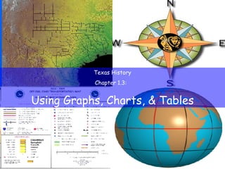
TX History Ch 1.3
- 1. Texas History Chapter 1.3: Using Graphs, Charts, & Tables
- 3. Four Largest Texas Cities, 2000
- 4. Why are we studying this? Lists of names, facts, and statistics are often clearest when presented visually. Understanding charts and graphs is an essential skill.
- 8. Using Graphs Vertical Axis Horizontal Axis
- 10. Using Charts & Tables Pie chart —chart showing how parts of a whole are divided
- 14. Causation Chart Flow Chart Time Line Table Pie Chart Line Graph Bar Graph Usefulness or purpose Item
- 15. To show the cause and effect of an event or situation Causation Chart to show steps or a series of activities Flow Chart to show the sequence of a series of events Time Line to organize and categorize descriptive and/or statistical information Table to show how the parts of a whole are divided Pie Chart to show a trend or pattern Line Graph to compare data about different places or time periods Bar Graph Usefulness or purpose Item