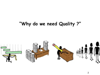
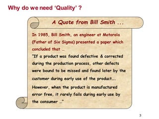
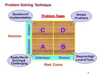
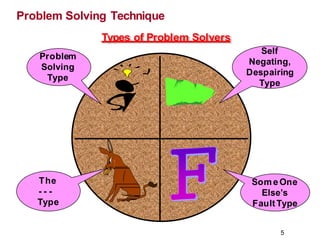
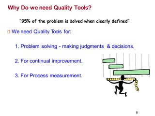
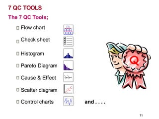
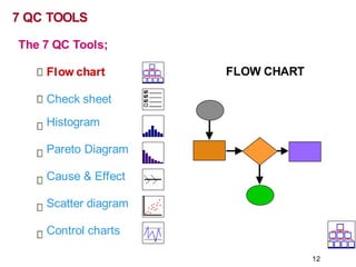
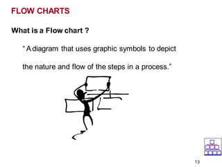
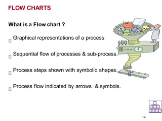
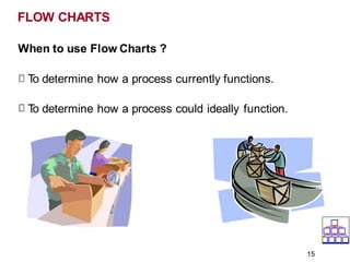
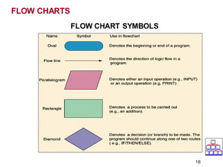
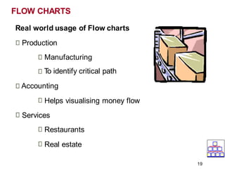
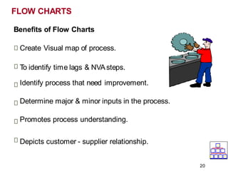
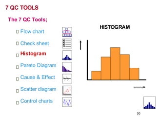
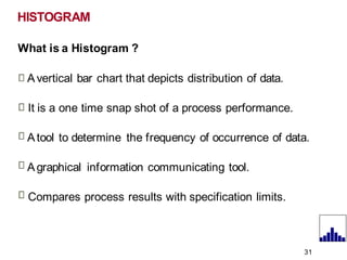
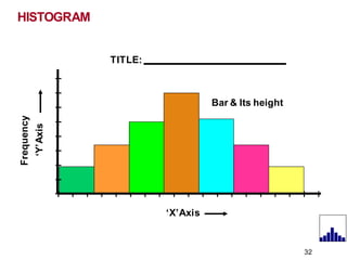
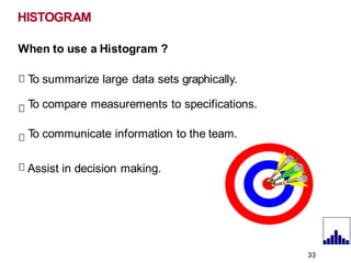
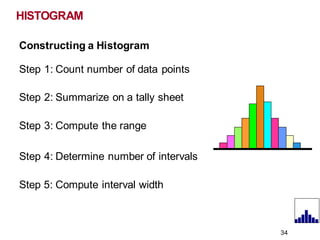
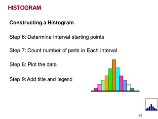
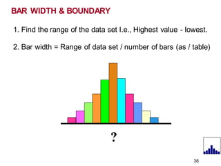
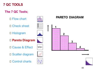
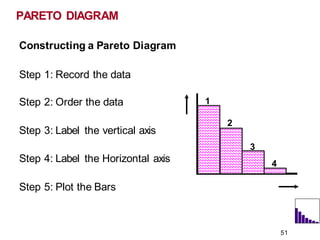
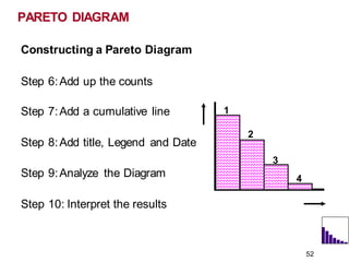
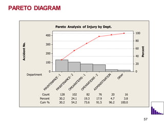
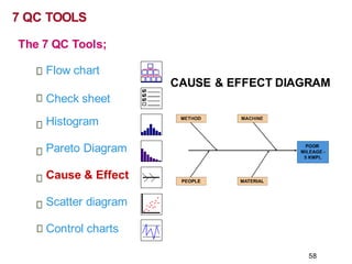
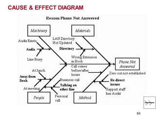
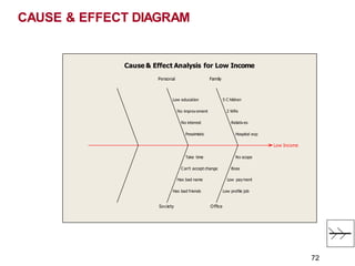
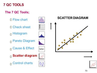
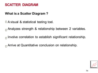
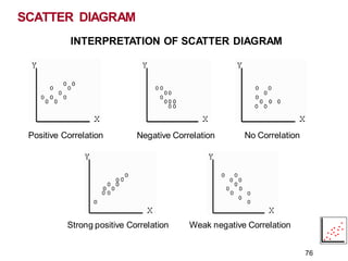
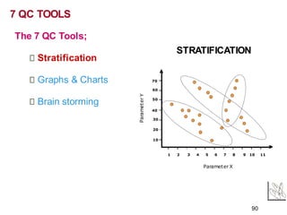
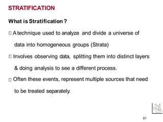
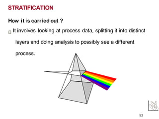
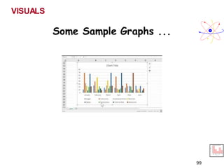
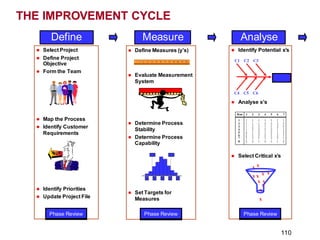
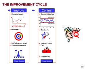
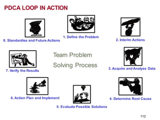
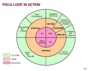
The document discusses various quality tools used for problem solving and continuous improvement. It begins by explaining why quality is important and introduces 7 fundamental quality tools - flow chart, check sheet, histogram, Pareto diagram, cause and effect diagram, scatter diagram, and control charts. For each tool, it provides a definition, discusses when and how to use the tool, and the benefits. It emphasizes that these 7 tools can solve 95% of quality problems in a factory. The document then dives deeper into each individual tool, providing examples and steps for constructing and interpreting the different charts.

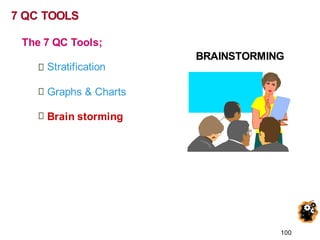
![T o t a l
A 1 3 1 1 6
B 3 4 4 2 1 3
C 2 1 3 3 9
D 4 2 2 4 1 2
N G T
Brainstorming
EFFEC
T
Cause Cause
Cause Cause
Cause
P r o ble m
S ta te m e nt
O perational
D efinitions
Define the Team
Team Members
Name Role
John Team Leader
Mary Coach
Bob Teacher
Susan Custodian
Bill Secretary
Jane Driver
Wayne Student
P u r p o se & Vi si o n
_ _ _ _ _ _ _ _ _ _ _ _ __ _ _ __ _ _ __ _ __
Lower Control Limit [LCL]
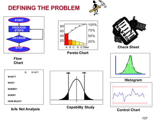
CONTROL CHART
_ _ _ _ _ _ _ _ _ _
U
_
p_
p
_
er_
C
_
on_
t_
ro
_
l L
_
i
m
__
i
t_
[U
_
C
_
L
]_
Average
Time
Measurement
Average
RUN CHART
Time
Measuremen
t
Rest ra in
Fo
D riving
Fo r ces
FO RC E FI E LD ANALY SI S
INTERRELATIONSHIP
Cause
Cause Cause
Cause
Cause
Cause
C HECKLIST
Date Total
Category 1 Data Data
Category 2 Data Data
Category 3 Data Data
Category 4 Data Data
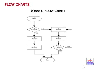
D ec is ion
Proc es s
St ep
St op
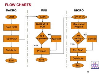
St art
FLOWCH
ART
The Plan-Do-Study-Act [PDSA] Cycle
Plan
Do
Act
Study
Delighted
Customers
Systems Progress Pilot Project Five Whys?
Why?
Why? Why?
Why?
Why?
BAR CHART
Category
Survey Results In Percent
COLUMN CHA RT
Number
SURVEY
1.xxxxxxxxxx
2.xxxxxxxxxx
3.xxxxxxxxxx
Project Bulletin Board
RED ITEMS REQUIRE ACTION WITHIN 30 DAYS.
1.
2.
3.
1.
2.
3.
YELLOW ITEMS ARE SCHEDULED TO MOVE INTO RED.
1.
2.
3.
GREEN ITEMS CAPTURE ALL IMPROVEM
ENT S
UGGESTIONS.
Completed Items move to the
Succes s ful Projects Board.
Items mus t be organized into s egments
capable of being addres s ed within 30 days .
Items move into yellow as space permits.
0
1
2
3
CORRELATION CHART
Factor
1
No Correlation
100 %
90 %
80 %
70 %
ETC.
Consensogram
Pie Chart
Frequency
HIST OGRAM
Time
M
easurement
A Alone
B Alone
Stratification
A and B Combined
Imagineer ing
Flow T ree
Knowledge
Understanding
Application
Analysis
Capacity Matrix
Aim or Capacity Breakdown
Res ult
Parking
Lot
+
What is go
ingw
ell
?
.
What needs im
p
rov
em
e
n
t
? I/O
What ques t
iondoy
ouha
ve
? W
ha
t aretheissues o
r ob
s e
rv
atio
ns.
A ffinity Diagram
PR
OJECT
STEPS
1.
2.
3.
4.
5.
Time
GannttChart
Present Org
an
izatio
n
1.
2.
3.
4.
Future Org
an
izati
o
n
1.
2.
3.
4.
Positiv eFo
rces T
hatCreat
e G
rowth
1.
2.
3.
4.
5.
6.
+
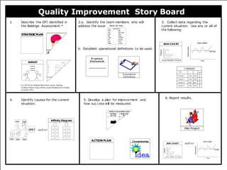
Quality Improvemen t Story Board
b. Establ i shoperat
i on
al defi
ni
ti
onsto b
e used.
1. D escr
i b
e the O
FIi
denti
fi
edi nthe 2.
a. Ident
i f
y t
he t
eamm
em
bersw
ho w
i
l l 3.Col l
ectdat
a r
egardi
Bal dri ge Assess
ment
. address the i ss
ue. current si t
uati
on.
5. D
eve
how
4. Identi fycausesf
orthecurr
ent
si tuati on.
ACTION PLAN
STRATEGICPLAN
A Quality Tool Belt](https://image.slidesharecdn.com/7qctoolsforproblemsolvingpresentation-221223003046-75bd2006/85/7-QC-Tools-For-Problem-Solving-Presentation-pdf-108-320.jpg)


![7 qc tools[1] to print](https://cdn.slidesharecdn.com/ss_thumbnails/7qctools1toprint-191017092858-thumbnail.jpg?width=640&height=640&fit=bounds)


