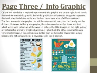
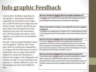
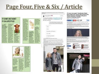
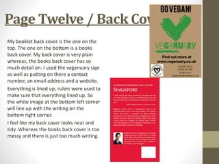
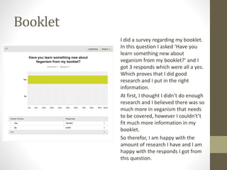
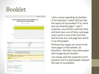
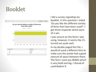
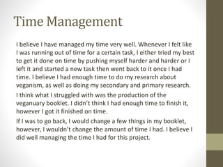
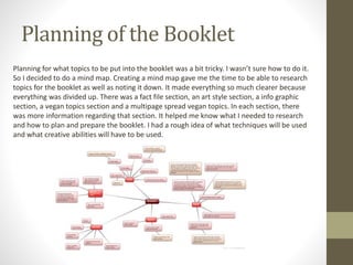
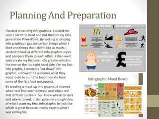
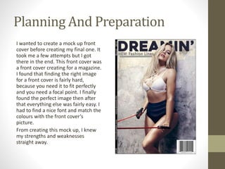
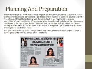
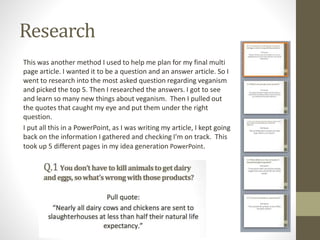
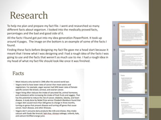
The document is a booklet evaluation by Swara Sawirs that summarizes and compares pages from their Veganuary booklet to other publications. It analyzes aspects like layout, design, use of images, fonts, and colors on pages like the cover, info graphics, articles, recipes, and a sign up page. Feedback was generally positive, praising the clear information and organization, though some improvements were suggested like adding more images or changing fonts and colors in some places.
Eleanor Mason completed work on her AS media studies coursework over several months. This included creating a WordPress site and magazine called Virtuoso focused on music. She developed pages like the front cover and contents page, adding conventions and editing images. Her main task was a double page interview with Ariana Grande that involved research, designing the layout, and incorporating her edited photos. To finish, Eleanor evaluated her magazine pages and design process, gathering audience feedback to include in her evaluation.
Emma Davie created a music magazine called St. Paul's as part of her media studies coursework. She provided step-by-step details of creating the front cover and contents page, including adding lines, images, text, and logos. Emma used Billboard magazine as inspiration and researched its genre, target audience, and publisher. Her goal was to apply proper conventions to attract readers and follow her school's brief of including convergence elements.
Manvir created a magazine for college students ages 16-18. He received feedback on his magazine cover and contents page. Respondents liked the large background photo and use of two pictures on the cover. They suggested including more information about article topics to attract more readers. Manvir was happy with the feedback but felt he could improve it by adding more color and information. He researched other magazine covers and contents pages before designing his own using Publisher. The strengths of his photos were that they were at shoulder length as instructed and showed variety. Respondents suggested his photos could be clearer and include more surroundings.
Overall, the author feels they learned a lot from the mistakes made in their first college magazine that helped them improve their second music magazine. Key areas of improvement included font size and selection, limited and coordinated color schemes, tightly planned layouts without empty spaces, inclusion of important details, and following the flat plan design. Continuity of branding elements like fonts and colors across pages also strengthened the second magazine. The process allowed the author to gain experience with design software and elements that make magazines more professional and appealing to audiences.
Overall, the author feels they learned a lot from the mistakes made in their preliminary college magazine that helped them improve their music magazine. Some key lessons learned included using more professional fonts, limited and coordinated color schemes, tightly packed layouts with no empty spaces, inclusion of important details, and following the flat plan design. The improved magazine had a more cohesive brand identity through consistent fonts, colors, and design elements.
The student created a magazine for a school project. They conducted research by analyzing existing magazines, distributing a questionnaire, and editing photos for their magazine. Their influences were Kerrang and NME magazines. They designed a logo and edited photos to have a consistent bright style. Feedback was positive overall but suggested improving images and clarifying the target audience. The student felt they best executed their research presentations and double page spread, though time management was a weakness.
The document describes the design choices for a simple black and white magazine, with red used sparingly for highlights. Key elements include a varsity font, minimal text allowing images to stand out, a bold contents page with quotes and keywords in red, and filling all space on pages with images and red page numbers to draw the eye. Red text and band images and taglines are used on another page, with varsity font tying the magazine together visually.
This document outlines the schedule and work completed by a student over several months in creating a magazine as part of a media studies course. It details planning, research, design, and production tasks such as analyzing example magazines, selecting fonts, creating a cover design in Photoshop, laying out pages in InDesign, taking photographs, and completing a final blog post evaluating the project. The student worked on planning, layout, editing images, and finalizing different elements of the magazine at various stages to complete the coursework assignment.
The document describes the process of creating a double page magazine spread interviewing an artist named Cory Harper. Key steps included:
1) Choosing photos of the artist to include and editing the main photo.
2) Creating a layout with columns and adding a banner with the artist's name.
3) Including fan questions in bold with answers in normal text.
4) Writing a quote and story text about the artist in a consistent color scheme.
5) Realizing more space was needed and adding a third page with continued text, a quote, and photo while maintaining consistency.
In what ways does your media product useemmathornlees
This document discusses the design choices made for a media product based on research of magazine layouts. Key points include:
- At least one page of information/interview about the artist and two pictures throughout were included based on researching double page spreads.
- Contents pages used short titles to attract readers and included around three images to encourage buying the magazine.
- Large title of band name on a double page spread was deemed excessive and took away from the story. A large picture covering one side with a polaroid style photo in the bottom left corner related to the story.
The document summarizes a student's magazine design project on Adele. The student researched Billboard magazine for inspiration and chose to focus their magazine on music. They created mind maps and a mood board during planning. For their design, the student made a magazine cover featuring Adele and a double page article spread. According to peer feedback, aspects like the font and color scheme were well done, but edits to Adele's face could be improved and adding more images to the spread would help. The student agrees more feedback would have helped them improve further.
The student intended their magazine to challenge conventions by featuring a white female model on the cover stereotypically associated with black R&B singers. They conducted research that found black to be the most popular color choice for magazines. Throughout the magazine, they used purple and white text on a black background to maintain a consistent color theme. The layout and design elements, such as the placement of images, text formatting, and use of different font sizes, were inspired by and similar to the example 'Vibe' magazine pages.
The document is a presentation for a crime magazine final major project (FMP). It discusses the background research and process for creating a magazine focused on two crimes - a religious cult preparing for the apocalypse and a gruesome murder that inspired the films Psycho and The Texas Chainsaw Massacre. It provides details on the target demographic, references used, influences on design choices, production schedule, feedback received, and reflections on successes and areas for improvement. The presentation demonstrates planning and research into real crime magazines as well as a professional approach to designing, laying out, and producing the FMP crime magazine.
Front cover, DPS and contents page annotationsYenpopo
The document is a description of the design process for the front cover of a music magazine. Key points:
- The background was made brighter using Photoshop tools to make it more eye-catching.
- Autocontrast and auto-color tools were used to make the image pop more.
- The masthead was placed at the top as is conventional. Drop shadows were added to make it more legible.
- Additional elements like the positioning statement, date, website, artist name, plus section, cover lines, barcode, and price were all positioned following magazine design conventions.
In what ways does your media product use, develop or challenge forms and con...Cheyanne Ntangu
For the studio shoots I had a friend help me
assist, she helped me with changing outfits,
holding reflectors and checking shots on the
camera. For the location shoot I went alone but
had someone with me to hold the reflector to
bounce light back onto her face.
Cesca Haig conducted research for a magazine design project by distributing a questionnaire to gather information on preferences. Results showed people were more likely to buy magazines that offered free items and had more photos than text. For her product, Cesca compared magazine covers and elements like cover lines, title formatting, double page spreads, and contents pages. She designed a magazine targeted at ages 14-35 featuring different film genres. Cesca created designs for the cover, contents page, and a double page interview spread, and gathered feedback through an online survey.
1) The front cover differed from the draft plan in some ways, including keeping the masthead words at the same level instead of differentiating them, and decreasing the size of the word "lows" next to the large school logo.
2) Images were added to the front cover pin board to emphasize positive impacts of the school, and film strips were used to advertise articles inside.
3) The contents page was easier to complete than the front cover. Images and article names were arranged to highlight the school's food, communication between students, smart uniforms, and values.
The document provides an evaluation of a magazine cover and contents created by Emily Shufflebottom. It summarizes how the design elements make the magazine conventional overall. The cover features a large central image with surrounding text, similar to real magazines. The contents page also mirrors conventions with its layout and consistent fonts/colors. The double-page spread follows conventions by including a large main image on one page with text in columns on the other.
The document provides an evaluation of a magazine contents page layout. It discusses what worked well, including the gutter width and effective lead image. It also notes that consistency in style between the cover and contents helped create a unified house style. Areas for improvement include the placement and prominence of the page numbers. Creating the house style and choosing images was easy, while picking concise titles and distinguishing regulars from features was more difficult. The evaluator learned about elements like gutters and professional page design.
Beth Geldard planned and created a vegan booklet. In the planning process, she conducted secondary research to determine topics to include. She created surveys that showed younger audiences knew little about veganism. She decided to include a factfile on vegan celebrities to attract younger readers. During production, she scheduled her work, received feedback, and made improvements. For example, she reworked a page on the rise of veganism by adding pull quotes and images. Her final booklet aimed to educate audiences aged 16-30 on veganism and related topics through engaging design and celebrity topics.
Once in Photoshop, the creator made a title for the contents page with a drop shadow, bevel, and emboss to match the front cover. Boxes were used for the list of contents to link it to the front cover and fit the magazine genre. Page numbers were added in a darker red to stand out. Images were included to break up the text and give readers a visual preview of the issue's contents. A subscribe advert was also added based on examples from other magazines.
From creating a preliminary magazine task to a completed magazine, the student learned to:
1) Make the front cover more eye-catching with elements like a masthead, strap line, and varied fonts and colors.
2) Include more information on the contents page in different shapes and styles to draw readers in.
3) Develop double page spreads with one page of text and one of images to show a range and engage readers.
The student improved skills with Photoshop tools, understanding magazine design conventions like consistency and variety, and incorporating relevant music knowledge into the magazine theme. The completed magazine shows more advanced planning, layout, and use of design features than the preliminary task.
The document summarizes how the student's media magazine product uses and develops conventions of real magazines. It discusses using a 3 color palette, rule of thirds layout, and mise en scene elements from researched magazines. The student aimed to replicate the layout, colors, and styles of an existing indie/rock magazine to create their own magazine in that genre. Specific elements discussed include the front cover design using rule of thirds, costume and color palette choices to fit the genre, replicating a professional contents page layout, and using a double page spread with a model's gaze and article quotes like magazines do. Font styles were chosen intentionally to match the magazine's genre and give importance to different elements.
Powerpoint recording the stages of what i did.osmithas
This document summarizes the process of creating the second page of a newspaper mock-up. Key details include:
1) The author copies an article from the first page and adds a box noting it continues from page one.
2) They write a new article on Stephen Fry to link the two pages.
3) Contact details, a slogan, and QR code are added.
4) Articles on cultural events and a local band are created, with photos and formatting adjustments made to fit the page.
The document summarizes the process of designing a magazine mockup. It describes how the designer used templates from other magazines as inspiration, decided on layouts and designs for the cover, contents page, and article pages. The designer experimented with fonts, images, and color schemes to create a cohesive design package and make different elements visually distinctive yet related. The final design included a band name and images to establish a style and give insights into the band members.
The document summarizes what the author learned from their preliminary college magazine task to their final product. In the prelim, the author created a basic front cover and contents page but it lacked organization and professional design. Through research, the author improved layout, use of images, mastheads, headings, color scheme and more. The final product had a more cohesive design that followed magazine conventions and better conveyed information to the audience. The progression showed the author gaining valuable experience in magazine design and production.
The document provides details on the costs and planning associated with starting a magazine business. Key points include:
- Total start-up equipment costs are estimated at £38,884 including office space, computers, cameras, and furniture.
- Total annual staff salaries are estimated at £270,000 including positions like publisher, editor, journalists, and designers.
- Producing 15,000 copies of a 40-page inaugural issue is estimated to cost £6,983, or 38p per copy.
- Advertising options and rates are presented from a sample media kit to help generate revenue.
- Steps taken to design the magazine's cover and double page spread interview are summarized. Proper planning
The document describes several improvements made to a double page magazine spread. First, the magazine title was placed on the right page and main article title on the left, with a quote and artist name. The background was light pink. Second, the article was placed in the middle with questions in pink and answers in black, and the page number at bottom right. A skyline, writer, and website were also included. Third, the main image was placed on the left with the article next to it, as in the magazine. The main title was centered to link the pages. Finally, the image background was made transparent to contrast with the page background, the image was placed over the skyline at the bottom, and text was enlarged
This document outlines a plan to create an online dental health database and community in Iran with the goals of increasing dental awareness, restoring patients to clinics, and creating a large database of Iranian dental records. The plan involves several phases including increasing membership, expanding to more clinics and universities, and conducting various promotional campaigns. Key aspects include developing a website, mobile app, and paper booklets to track individuals' dental histories and connect them to dentists. The document discusses investment needs, revenue sharing models, and hiring various roles to execute the plan.
BIONIC University provides state-of-the-art education for the IT industry in Ukraine. It offers short programs to develop technical, soft, and entrepreneurial skills for future IT professionals. Its goal is to prepare talented youth for careers in IT companies and to provide qualified employees for those companies. BIONIC University is located within BIONIC Hill Innovation Park and works closely with IT companies to develop educational programs aligned with industry needs. It aims to reduce brain drain and support Ukraine's transition to an innovation-based economy.
Veganuary is a non-profit organization that encourages people to try a vegan diet during the month of January each year. Their booklet provides information on the health, environmental and ethical benefits of a plant-based diet as well as recipes and tips to make going vegan easier. It aims to inspire people to adopt a compassionate vegan lifestyle.
Dreamtime Creative is an Aboriginal-owned communications company based in South Australia that has specialized in culturally appropriate communications for Aboriginal and Torres Strait Islander audiences since 2002. It prides itself on engaging with clients to incorporate their organizational needs and values into communications that resonate with target audiences. The company recognizes that communities differ and researches factors like culture, images, education levels, age, and language suitability before designing projects. Dreamtime Creative employs a diverse team including Aboriginal people and those with disabilities, and has expertise in branding, design, writing, websites, marketing campaigns, and community engagement.
An identity for a family of brands that aims to promote well-being & healthy living to an elite audience. Using one logo emblem in various colours signifies how the brands harmoniously work for one mission. The implementation of the identity on the print & digital collaterals depicts the brand's mission.
The document provides several creative reunion ideas for classes to consider, including holding events like a Saturday night dinner with local restaurant food, a Saturday cocktail reception at an art museum, and a Friday movie night on the school green. It also suggests activities like making personalized nametags, taking photos of attendees as they arrive to post near the registration, and providing goodie bags for classmates with items like mugs and bookmarks. The document recommends other ideas such as live updates on a class Facebook page, encouraging attendance through "virtual elfing", holding a common read lecture or back-to-class session, and using bagpipes during a memorial service.
This document introduces various concepts related to motion including frame of reference, speed, velocity, acceleration, momentum, and the law of conservation of momentum. It defines frame of reference as the background point used for comparison when describing motion, with Earth being the most common example. Formulas are provided for calculating speed, acceleration, and momentum. It also notes that momentum remains constant for a system unless an outside force acts upon it.
The document lists various final pieces needed for a project including posters, logos, examples of merchandise, and own designed merchandise. It also includes a badge and provides a link to a questioner to gather feedback.
This document contains ideas for three different mood boards focused on domestic violence awareness and prevention.
The first idea is a campaign targeting child abuse, using bright colors and children's fonts to attract attention while conveying the message that abuse is not the child's fault through images and short phrases.
The second idea targets adult domestic violence, using darker colors and readable adult fonts with a central image surrounded by text to show abuse is not the victim's fault and they should seek help.
The third idea aims to stop abusers by using unpleasant red or dark colors in posters of role-reversed abuse or a man transforming into a monster, or a video of a man becoming angry at his wife to get abusers to reflect
Swara Sawirs created posters and merchandise to raise awareness of domestic violence. Their original intention was to create plain posters that conveyed their message through images rather than words. They believe they achieved this goal, as their final posters featured simple silhouettes and images depicting domestic abuse without much text. They used photography to capture images of models for the posters and merchandise, and Photoshop to edit the images. Based on feedback, the materials effectively communicated their message and were deemed appropriate for their target audience of women over 20 who may be experiencing domestic abuse.
This document provides information about the bags, booklets, and other materials produced for the 2003 AIGA National Design Conference in Vancouver. It details the sustainable and environmentally-friendly materials used, including:
- Bags made from Ingeo fiber, a biodegradable polyester made from cornstarch
- Screen printing inks that are PVC-free
- Booklets printed on 100% post-consumer recycled paper with soy-based inks
- Detailed schedules and budgets showing how the items were produced within tight timelines and on budget.
The document emphasizes using renewable, non-toxic resources and minimizing environmental impact in producing the conference materials.
The document provides information about AIESEC, a global student organization established after World War 2. It discusses AIESEC's history beginning with students from 9 universities in 6 countries coming together in 1946 to rebuild their countries and prevent future wars. Today, AIESEC has a presence in over 124 countries and empowers over 86,000 members through international internships, leadership opportunities, and conferences. The document outlines AIESEC's vision of peace and empowering youth, as well as its core values and programs like the Team Member Programme and Youth Development department which provides international community projects.
This document provides an overview of mobile payments security in Europe, comparing Western and Central/Eastern regions. In Western Europe, highly developed banking infrastructure has become reliant on outdated legacy systems, slowing adoption of new technologies. Central/Eastern Europe has fewer banking systems, but institutions can more easily adopt new technologies. Both regions see increasing mobile payments, but security of these systems remains inadequate. The document profiles key mobile banking trends in several European countries.
The document provides information about Strategic Doing, which is a method for forming action-oriented collaborations through measurable outcomes and adjustments. It discusses what Strategic Doing is, how it works, why it works, and who uses it. It then provides case studies of Strategic Doing being used to address workforce issues in Indiana, rebuild neighborhoods in Flint, launch a clean energy cluster in Florida, and fill manufacturing skills gaps. It also discusses the Strategic Doing university network and available training options.
Egemen Çelik's portfolio summarizes his education, experience, skills, projects, and engineering work. He has a M.Sc. in Naval Architecture from Istanbul Technical University and has worked on ship and yacht design projects. His portfolio highlights design projects for vessels including a 47m fishing vessel and spoiler design for a 24m motor yacht. Engineering projects involve 3D modeling, structural analysis, and production drawings.
Swara Sawirs has researched the target audience, market, and production considerations for a new fashion magazine. The target audience will be women ages 18-40 from middle and working class backgrounds (ABC1 and C2DE social groups). Most readers will be educated and the magazine should be available both in print and online. In terms of the market, the magazine will follow standard layouts and include celebrity interviews and affordable fashion. It will be released seasonally to keep up with trends. Production will require a photography studio, editing team, journalists to gather stories, and assistants to coordinate with celebrities.
Dublin Port Company required a twin-screw work barge/pontoon to be built for Harbor and
Coastal work including the Irish Sea. The vessel which we design complies with Bureau
Veritas requirements for workboats. Its duties include bed leveling, towing, buoy and quay
maintenance and an oil recovery option with ½ day „bolt on‟ facility. We can also count
diving support, anchor handling, supply, survey, mooring, pollution control, etc. for its duties.
Requested main specifications are:
L.O.A. 20 meters approx.
Beam O.A. 8 meters approx.
Depth midships. 2.7 meters approx.
Displacement 170-ton approx.
Leveling depth 16 meters approx
Fuel oil capacity 25,000 liters approx.
F.W. capacity 10,000 liters approx.
The hull, propeller, shaft, main and auxiliary engines, rudder and steering gear are selected by
taking into account Classification Society regulations. All trade names mentioned in the
specifications describe the desired quality of equipment and not intended to exclude other
makes of similar quality.
This document provides an evaluation of Nicole Tunningley's work for the Veganuary project. It includes summaries of feedback received on different pieces, comparisons to existing professional works, and reflections on planning, preparation, creative choices, and technical skills. The infographic was well-received but could provide more details on alternatives. Preparation through research and mind-mapping proved useful. Formats and themes were generally consistent, though the factfile was an exception. Technical skills are demonstrated throughout with layout, formatting, and creative elements like icons. Lessons learned include focusing design elements and improving dull text sections with images.
This document provides an analysis of the layout, design, and content of several issues of the 'i' newspaper by a media student.
The student examines multiple front pages and inside pages, noting the use of color, images, text size and placement, and overall layout. They find the front pages to be too "claustrophobic" with many large images and articles crammed together. Inside pages also have a "cluttered" feel despite clear column structure.
While some elements are praised, like bold masthead colors and labeling of article topics, the student ultimately finds the layouts inconsistent between issues and not always effective at guiding the reader's eye or breaking up dense blocks of text. The content seems
This document provides an analysis of the layout, design, and content of several issues of the 'i' newspaper by a media student. Some key points made:
1) The student critiques the cluttered layout of the front pages, noting too many articles and images leave the pages feeling crowded. Inside pages also have a cluttered feel due to extensive use of text.
2) Color schemes and structural elements like column lines and article separators help provide continuity across issues, but the student sees inconsistencies in layouts between issues.
3) Political content and images of politicians indicate the newspaper targets an older, politically engaged audience. However, the student feels not enough images are used to break up dense blocks of
Front and inside cover deconstruction for newspaperRebecca Black
This document provides an analysis of the layout, design, and content of the 'i' newspaper.
The analysis summarizes that the front page layout is cluttered with many large images and articles crammed together. While this grabs attention, it feels overcrowded. The inside pages also have a cluttered feel despite an organized column structure. The color palette uses bold red, black, and other tones. The content focuses on politics, appealing to an older audience. Overall, the reviewer finds the design could be improved by reducing clutter and balancing text and images better.
- The document summarizes feedback received on a vegan lifestyle booklet created by the author.
- Feedback was positive about the visually appealing front cover with large title and images. Some suggested including more social media photos.
- Infographics using social media logos and images were seen as effective at engaging a younger audience.
- Suggestions for improvement included addressing hyphenated words and making the first article page more visually interesting.
- The author incorporated feedback in revisions and learned new design skills in the process.
- The document summarizes feedback received on a vegan lifestyle booklet created by the author.
- Feedback was positive about the visually appealing front cover with large title and images. Some suggested including more social media photos.
- Infographics using social media logos and images were seen as effective at engaging a younger audience.
- Suggestions for improvement included addressing hyphenated words and making the first article page more visually interesting.
- The author analyzed feedback and believes their color scheme, content, and readability were generally effective despite some dissenting opinions.
The document discusses the design and layout of children's recipe cards. It provides feedback on the fonts, images, layout, and readability used for the cards. The reviewer likes the quirky font used for tips, but notes the method text is difficult to read against the background color. They suggest using the ingredient color for the method instead. Overall, the cards are seen as suitable for children and meeting the brief of featuring vegetarian recipes.
Manvir created a magazine for college students ages 16-18. He received feedback that students liked the large background photo behind the text on the cover and the use of two photos. However, they suggested including more information about the magazine's content to attract more readers. Based on this, Manvir plans to add more details and color to his magazine to improve it.
Media studies deconstruction newspaper for websiteRebecca Black
This document analyzes and summarizes the layout, design, and content of various pages on the Daily Mail website. It discusses the use of color, images, text, and advertisements on the homepage, news pages, and TV/entertainment section. The author likes how the website uses blue and pink colors consistently but feels some pages have too many ads. While images are used appealingly, the author finds some pages too text-heavy. Overall, the document evaluates design elements to inform the author's own planned online product.
This document summarizes a student's process of designing their magazine from initial concepts to the final product. It shows early experiments with layouts and designs for the front cover, contents page, and double page article spread. Feedback was gathered to refine the designs. The final front cover incorporated a preferred photo and layout. The contents page included more photos within two facing pages. The double page spread featured text molded around the background photo while maintaining the color scheme. Screenshots demonstrate the layers and fonts used to create the magazine.
Media studies deconstruction newspaper websiteRebecca Black
The document summarizes and analyzes the layout, design, and content of various pages on the Daily Mail website. It notes the use of consistent colors, large images and text to attract readers, and a cluttered composition. It praises the clear masthead and organization of main stories but criticizes the overuse of ads. The analysis finds the TV and showbiz page uses pink effectively to target female audiences and medium shots for a personal feel. While layout is conventional, too many ads give a false impression and the search bar should be higher.
The document analyzes and summarizes the layout, design, and content of several pages on the Daily Mail website. For the home page, it notes the consistent color palette, cluttered composition, and placement of main stories and search bar. It praises the masthead placement but criticizes the "femail" section. For news pages, it observes the increased advertisements and text-heavy layout. The TV and showbiz page uses pink colors and varied celebrity shots to appeal to female audiences. Overall, the document examines design elements like images, colors, and layouts across Daily Mail pages.
The document provides an evaluation by Emily Pinder where she compares her designed infographic, recipe, factfile, shopping list, and sign up sheet for a vegan booklet to existing professional examples of these types of designs. For each part of her booklet design, she analyzes similarities and differences to the existing examples she found. She discusses design choices like use of color, images, fonts, layout, and style. She also shares feedback received on her designs from peers which highlighted strengths like the color palette, but also areas for improvement such as adding more images to break up blocks of text. Overall, the document reflects on how Emily designed different elements of a vegan information booklet and how her designs compared to professional examples
The document discusses three page layout experiments by the author for a fashion magazine.
In the first layout, a 3x3 grid is used with the main image on the left and header above it. Text wraps around the image. A second image of Kate Moss is also used. Drop caps are used to indicate sentence starts.
The second layout experiments more by centering the main image and writing the header vertically. Three columns are used but overlap and use difficult to read fonts.
The third layout uses a black background with a 4x4 grid. The main header is on the left with subheadings horizontally. Colors and images are balanced throughout the sections.
This document discusses three page layout experiments by the author for a fashion magazine.
In the first layout, a 3x3 grid is used with the main image on the left and header above it. Text wraps around the image. The second layout places the main image in the center and experiments with overlapping columns and unusual fonts. The third layout uses a black background with a 4x4 grid, main header on the left, and pink and white colors to match the boohoo.com website. Diagonal images are balanced with equal text.
The document summarizes different sections of a Veganuary booklet created by the author.
1) The front cover uses orange as the main color inspired by the Veganuary website. It includes text and icons on a textured background for visual appeal.
2) The multipage article uses the same simple design of text and images on alternating sides for consistency. Feedback noted the bright colors hurt eyes and images could be more varied.
3) The info graphic uses few images and facts and lacks creativity. Feedback suggested adding more detailed, higher quality images and facts.
Jordan Bohill evaluates their Veganuary booklet design project. For the front cover, Jordan aimed to catch people's eye with bright colors and soft illustrations. Feedback was positive about the front cover. The multipage article had an informal, chatty style but design elements were confusing and could be improved. The infographic design did not follow conventions well and would benefit from a simpler, more organized design. The welcome pack pages had strong design elements but could be improved by changing fonts and filling empty spaces better. Overall, Jordan gained skills in design, layout, and receiving feedback to incorporate on future projects.
The document discusses the extent to which the author's intentions for their fanzine were realized. It analyzes specific elements like articles, layout, and design choices. For articles, the author's topics were followed except one was adjusted for easier research. The layout stayed similar to the plan to be artistic but realistic. Color schemes mostly matched intentions but some pages used different colors. Overall, the author found their original ideas were largely realized in the finished fanzine.
Alice analyzed existing magazines to gather ideas for her final product. She looked at magazines about nature, cooking, and outdoors/photography. This research helped her understand themes, layouts, and sections to include. Alice was happy with her analysis but could have done more if given more time. She created mind maps using an online tool to plan her product ideas about nature and women's fashion. Alice analyzed a mood board she created but could have included more details. She felt time-limited on the project but managed her time well to complete her work. Alice was happy with how her final magazine product represented nature but could have improved the text colors. Her magazine cover and layouts were aesthetically pleasing while also appealing to her intended audience
The document discusses changes the author made in response to preliminary feedback on a magazine design project. Some key changes included: limiting fonts on the front cover; emphasizing text hierarchy through size and bolding; sticking to a strict font and color scheme on the contents page; ensuring text contrasted well with backgrounds; and developing a detailed shooting script when photographing models. The author focused on emphasizing text importance, improving readability, and avoiding overcrowding based on the previous feedback.
Swara Sawirs summarizes her experience finding a client and creating marketing materials for Harriet's Clothing. She contacted multiple businesses before agreeing to work with Harriet's. Creating the materials was challenging, especially drawing the model's face, but she improved with feedback. Her client was pleased with her posters and communication throughout the process. Managing her time well allowed her to complete photography, editing, and multiple design iterations on schedule. Overall, the project helped Swara gain new skills and confidence in her abilities.
The document discusses potential ideas for designing a poster and flyers to promote a charity fashion show. Four ideas are presented: 1) Photographing a model on a runway and editing the images, 2) Drawing a model and editing it to look like a painting, 3) Taking close-up photos of a model's face or body and editing it with filters or to look like a cartoon, 4) Creating a die-cut flyer with information inside that is revealed by opening the flyer. For each idea, the document evaluates whether it matches the client's needs, if the designer can deliver it on time, and if the necessary resources are available.
This document outlines a marketing pitch for a client called YOUNGOLDER that includes taking photos of a model, editing the images, designing layouts, and creating flyers and posters to promote the client's products. It details the personnel, budget, resources, and schedule needed which involves multiple photo shoots and design sessions over 3 weeks to select and edit images, experiment with layouts, add content, and finalize the materials for delivery by the deadline.
The document discusses different types of briefs that can be used between media companies and clients. It defines contractual, formal, informal, co-operative, negotiated, commission, tender, competition, and my brief structures. For a my brief, the client will likely use a mixture of formal and informal structures. There will be some elements of an informal verbal agreement but also some written emails outlining expectations, though no formal contract. This benefits the freelancer by allowing flexibility but also providing some documentation of the project scope.
This document discusses different methods of sourcing images and their advantages and disadvantages. It examines sourcing images from books, Google Images, stock image libraries, and taking your own photos. For each method, it provides examples of potential advantages such as finding unique personal experiences from books or the ease of Google Images. Disadvantages include things like lack of copyright free images or the time it takes to find the right book. The document also covers processing images through cropping, scaling to different sizes, adjusting resolution, and manipulating images with tools like Dodge and adjusting contrast/levels.
This document appears to be about a task that was completed by someone named Swara Sawirs. No other details are provided about the nature of the task or what it entailed. The brevity of the document leaves little that can be summarized beyond stating the author and topic in a very general sense.
This document discusses different grid layouts for print and web design including 3 column newspapers, 5 column double spreads for magazines, and 8 column websites. It provides examples of common grid structures used in print and digital publishing. The grids can help organize content and ensure consistent formatting across pages or screens.
This document defines key terminology used in print layout and design, including columns, cut-outs, straplines, baselines, blobs and stars, drop capitals, reverse type, white space, optical balance, type styles, fonts, text orientation, margins, grids, headlines, crossheads, rules, and pull quotes. It also notes the individual portrait page orientation and overall landscape spread orientation for the print layout.
The document discusses primary and secondary research conducted on veganism. Through surveys on Facebook, the author found that very few people (1 in 36) identified as vegan, and most people said they would struggle to give up meat and animal products. However, some respondents thought a vegan diet could be healthy. The author researched veganism on Wikipedia, finding there are different types, and read about the health benefits on Jamie Oliver's website. Testimonials from vegans on YouTube and blogs suggested it takes commitment but can be healthy. The documentary Vegucated and book Eating Animals provided graphic details about slaughterhouses that convinced some to become vegan. Celebrities like Mike Tyson and Ellen DeGeneres
The document provides information on why one should be vegan, noting that vegans have lower risks of heart attacks and that it takes much less land and water to produce plant-based foods compared to meat. It addresses common concerns about being vegan, such as where to get protein or whether it is safe for children, and provides alternatives to animal products. The document aims to educate people on the health, environmental, and ethical benefits of adopting a vegan lifestyle.
This document analyzes the fonts and visual design elements used in several documents, including a Batman instruction manual, a student revision guide, a water conservation leaflet, and a news article about Justin Bieber on the TMZ website. Key points made include that different fonts are used effectively to distinguish different types of text, diagrams are clear and informative, and color and images are used purposefully to draw attention and convey meaning. The document provides detailed observations about the fonts, layouts, and visual rhetoric of the materials.
This 11-page vegan booklet discusses the benefits of a plant-based diet through 10 pages of content and provides a link on the back cover to an online survey about veganism. The booklet is authored by Swara Sawirs and contains pages numbered sequentially from one through eleven, ending with a back cover that includes a link to a survey on vegan diets.
Swara Sawirs outlines a 5-week campaign plan and lists the planning, resources, and schedule needed to execute a campaign called CHANGE aimed at raising awareness of domestic abuse. The document details the equipment, software, facilities, and personnel needed which include a camera, tripod, makeup artist, model, photography room, and computer. It also includes draft logos, posters, advertisements, and proposed merchandise like bags, phone cases, and clothes branded with the campaign.
The document provides feedback on how to improve the website for a local York newspaper. It suggests that the website front page should only feature the newspaper's exclusive stories rather than too many stories. It also recommends breaking up the different types of stories that are next to each other. The document also advises using bolder fonts for headlines and adding color and sections to break up content. It further suggests creating a mobile app to reach younger audiences and drive traffic to the website and newspaper.
Swara Sawirs outlines a 5-week campaign plan and lists the planning, resources, and schedule needed to execute a campaign called CHANGE. The campaign aims to raise awareness of domestic abuse through photography, posters, and merchandise. Key resources include a camera, tripod, model, makeup artist, photography room, and design software. Sample logos, posters, and merchandise ideas are provided to showcase the campaign's visual identity and message. The document provides a thorough plan for the CHANGE campaign.
NoMore is a campaign created in 2013 to raise awareness about ending domestic violence and sexual assault. It is supported by hundreds of organizations worldwide including advocacy groups, service providers, corporations, universities and communities. The campaign aims to decrease violence and sexual assault rates by ensuring people know help is available regardless of gender, age or location. NoMore has reached over 700 million viewers across 160 countries through media channels like MTV, BET and VH1. It does not accept donations and funds prevention and advocacy efforts through partnerships with other organizations.
This document contains ideas for three different mood boards focused on domestic violence awareness and prevention.
The first idea is a campaign targeting child abuse, using bright colors and children's fonts to attract attention while conveying the message that abuse is not the child's fault through images and short phrases.
The second idea targets adult domestic violence, using darker colors and readable adult fonts with a central image surrounded by text to show abuse is not the victim's fault and they should seek help.
The third idea aims to stop abusers by using unpleasant red or dark colors in posters of role-reversed abuse or a man transforming into a monster, or a video of a man becoming angry at his wife to get abusers to reflect
This document summarizes information about several fashion magazines and their target audiences. Vogue magazine targets young adults aged 18-30, primarily women, in the UK and US. Its readers tend to be highly educated professionals. Glamour magazine aims to empower women and please its primarily female audience. ELLE magazine's readership is mostly women aged 25-49, and it includes topics around sex and relationships. Voir fashion magazine promotes diversity and inclusion by featuring models of various cultures and backgrounds.
The magazine will be called "Lovin'" and will focus on fashion and beauty. It will be released quarterly to correspond with the seasons. Each issue will include celebrity interviews and reviews, as well as advertisements for fashion and beauty products. Free samples may also be included. The magazine aims to be similar in style to popular publications like Vogue, Elle, and Love. The target audience is females aged 18-30 who are interested in fashion, education, and finding their personal style. Production will require a print company, software, office space, and staff including journalists, editors, photographers, and makeup/styling artists. Market research will help design each issue to attract the target readership.
LOVIN' Fashion Magazine is a new magazine presented by Swara Sawirs. The magazine will feature fashion and style content. Its target audience is young women interested in fashion trends. Sawirs was inspired by Vogue and ELLE magazines in creating LOVIN' Fashion Magazine. Her presentation covered the magazine's purpose, audience, inspiration, layout designs for the cover and double pages, and script. In reviewing her presentation, Sawirs felt it went well as she included all main points and received only two questions from the interested and happy audience.
LAND USE LAND COVER AND NDVI OF MIRZAPUR DISTRICT, UPRAHUL
This Dissertation explores the particular circumstances of Mirzapur, a region located in the
core of India. Mirzapur, with its varied terrains and abundant biodiversity, offers an optimal
environment for investigating the changes in vegetation cover dynamics. Our study utilizes
advanced technologies such as GIS (Geographic Information Systems) and Remote sensing to
analyze the transformations that have taken place over the course of a decade.
The complex relationship between human activities and the environment has been the focus
of extensive research and worry. As the global community grapples with swift urbanization,
population expansion, and economic progress, the effects on natural ecosystems are becoming
more evident. A crucial element of this impact is the alteration of vegetation cover, which plays a
significant role in maintaining the ecological equilibrium of our planet.Land serves as the foundation for all human activities and provides the necessary materials for
these activities. As the most crucial natural resource, its utilization by humans results in different
'Land uses,' which are determined by both human activities and the physical characteristics of the
land.
The utilization of land is impacted by human needs and environmental factors. In countries
like India, rapid population growth and the emphasis on extensive resource exploitation can lead
to significant land degradation, adversely affecting the region's land cover.
Therefore, human intervention has significantly influenced land use patterns over many
centuries, evolving its structure over time and space. In the present era, these changes have
accelerated due to factors such as agriculture and urbanization. Information regarding land use and
cover is essential for various planning and management tasks related to the Earth's surface,
providing crucial environmental data for scientific, resource management, policy purposes, and
diverse human activities.
Accurate understanding of land use and cover is imperative for the development planning
of any area. Consequently, a wide range of professionals, including earth system scientists, land
and water managers, and urban planners, are interested in obtaining data on land use and cover
changes, conversion trends, and other related patterns. The spatial dimensions of land use and
cover support policymakers and scientists in making well-informed decisions, as alterations in
these patterns indicate shifts in economic and social conditions. Monitoring such changes with the
help of Advanced technologies like Remote Sensing and Geographic Information Systems is
crucial for coordinated efforts across different administrative levels. Advanced technologies like
Remote Sensing and Geographic Information Systems
9
Changes in vegetation cover refer to variations in the distribution, composition, and overall
structure of plant communities across different temporal and spatial scales. These changes can
occur natural.
it describes the bony anatomy including the femoral head , acetabulum, labrum . also discusses the capsule , ligaments . muscle that act on the hip joint and the range of motion are outlined. factors affecting hip joint stability and weight transmission through the joint are summarized.
How to Make a Field Mandatory in Odoo 17Celine George
In Odoo, making a field required can be done through both Python code and XML views. When you set the required attribute to True in Python code, it makes the field required across all views where it's used. Conversely, when you set the required attribute in XML views, it makes the field required only in the context of that particular view.
Walmart Business+ and Spark Good for Nonprofits.pdfTechSoup
"Learn about all the ways Walmart supports nonprofit organizations.
You will hear from Liz Willett, the Head of Nonprofits, and hear about what Walmart is doing to help nonprofits, including Walmart Business and Spark Good. Walmart Business+ is a new offer for nonprofits that offers discounts and also streamlines nonprofits order and expense tracking, saving time and money.
The webinar may also give some examples on how nonprofits can best leverage Walmart Business+.
The event will cover the following::
Walmart Business + (https://business.walmart.com/plus) is a new shopping experience for nonprofits, schools, and local business customers that connects an exclusive online shopping experience to stores. Benefits include free delivery and shipping, a 'Spend Analytics” feature, special discounts, deals and tax-exempt shopping.
Special TechSoup offer for a free 180 days membership, and up to $150 in discounts on eligible orders.
Spark Good (walmart.com/sparkgood) is a charitable platform that enables nonprofits to receive donations directly from customers and associates.
Answers about how you can do more with Walmart!"
Communicating effectively and consistently with students can help them feel at ease during their learning experience and provide the instructor with a communication trail to track the course's progress. This workshop will take you through constructing an engaging course container to facilitate effective communication.
ISO/IEC 27001, ISO/IEC 42001, and GDPR: Best Practices for Implementation and...PECB
Denis is a dynamic and results-driven Chief Information Officer (CIO) with a distinguished career spanning information systems analysis and technical project management. With a proven track record of spearheading the design and delivery of cutting-edge Information Management solutions, he has consistently elevated business operations, streamlined reporting functions, and maximized process efficiency.
Certified as an ISO/IEC 27001: Information Security Management Systems (ISMS) Lead Implementer, Data Protection Officer, and Cyber Risks Analyst, Denis brings a heightened focus on data security, privacy, and cyber resilience to every endeavor.
His expertise extends across a diverse spectrum of reporting, database, and web development applications, underpinned by an exceptional grasp of data storage and virtualization technologies. His proficiency in application testing, database administration, and data cleansing ensures seamless execution of complex projects.
What sets Denis apart is his comprehensive understanding of Business and Systems Analysis technologies, honed through involvement in all phases of the Software Development Lifecycle (SDLC). From meticulous requirements gathering to precise analysis, innovative design, rigorous development, thorough testing, and successful implementation, he has consistently delivered exceptional results.
Throughout his career, he has taken on multifaceted roles, from leading technical project management teams to owning solutions that drive operational excellence. His conscientious and proactive approach is unwavering, whether he is working independently or collaboratively within a team. His ability to connect with colleagues on a personal level underscores his commitment to fostering a harmonious and productive workplace environment.
Date: May 29, 2024
Tags: Information Security, ISO/IEC 27001, ISO/IEC 42001, Artificial Intelligence, GDPR
-------------------------------------------------------------------------------
Find out more about ISO training and certification services
Training: ISO/IEC 27001 Information Security Management System - EN | PECB
ISO/IEC 42001 Artificial Intelligence Management System - EN | PECB
General Data Protection Regulation (GDPR) - Training Courses - EN | PECB
Webinars: https://pecb.com/webinars
Article: https://pecb.com/article
-------------------------------------------------------------------------------
For more information about PECB:
Website: https://pecb.com/
LinkedIn: https://www.linkedin.com/company/pecb/
Facebook: https://www.facebook.com/PECBInternational/
Slideshare: http://www.slideshare.net/PECBCERTIFICATION
Beyond Degrees - Empowering the Workforce in the Context of Skills-First.pptxEduSkills OECD
Iván Bornacelly, Policy Analyst at the OECD Centre for Skills, OECD, presents at the webinar 'Tackling job market gaps with a skills-first approach' on 12 June 2024
Philippine Edukasyong Pantahanan at Pangkabuhayan (EPP) CurriculumMJDuyan
(𝐓𝐋𝐄 𝟏𝟎𝟎) (𝐋𝐞𝐬𝐬𝐨𝐧 𝟏)-𝐏𝐫𝐞𝐥𝐢𝐦𝐬
𝐃𝐢𝐬𝐜𝐮𝐬𝐬 𝐭𝐡𝐞 𝐄𝐏𝐏 𝐂𝐮𝐫𝐫𝐢𝐜𝐮𝐥𝐮𝐦 𝐢𝐧 𝐭𝐡𝐞 𝐏𝐡𝐢𝐥𝐢𝐩𝐩𝐢𝐧𝐞𝐬:
- Understand the goals and objectives of the Edukasyong Pantahanan at Pangkabuhayan (EPP) curriculum, recognizing its importance in fostering practical life skills and values among students. Students will also be able to identify the key components and subjects covered, such as agriculture, home economics, industrial arts, and information and communication technology.
𝐄𝐱𝐩𝐥𝐚𝐢𝐧 𝐭𝐡𝐞 𝐍𝐚𝐭𝐮𝐫𝐞 𝐚𝐧𝐝 𝐒𝐜𝐨𝐩𝐞 𝐨𝐟 𝐚𝐧 𝐄𝐧𝐭𝐫𝐞𝐩𝐫𝐞𝐧𝐞𝐮𝐫:
-Define entrepreneurship, distinguishing it from general business activities by emphasizing its focus on innovation, risk-taking, and value creation. Students will describe the characteristics and traits of successful entrepreneurs, including their roles and responsibilities, and discuss the broader economic and social impacts of entrepreneurial activities on both local and global scales.
2. Page one / Cover Page
The front cover on the left hand side is my front cover. My front cover is very plain, has very little
detail but you still know what my booklet is about from the image and the title. The Attitude front
cover is the same, it has hardly any writing on but from looking at it, you know Gary Barlow is
being featured which means a quite a few pages will be about him and their will be exclusive
information about him. He is the focal point. We have both used white and black writing and both
of our titles are in white. The aim of my booklet is to show everyone a different way of living, I
made that clear by saying ‘Showing you the truth’. The magazine’s aim is to entertain, they are
using a good looking male to grab the girls attention. Their writing is more central where as my
writing is all either right or left sided. I didn’t want to put any writing in the center of the image
because I didn’t want anything over the food.
3. Page Two / Info Graphic
On the left hand side is my veganuary info graphic. I used 4 different facts and created images to go
along side the context. I didn’t want to use many facts because it’s only a A5 paper, it would of looked
unprofessional and there would have been too much information on one small piece of paper. The info
graphic on the right hand side is regarding obesity issues. In their info graphic there is over 20 facts,
however they are using a A4 paper. Their info graphic looks a bit too crowded and overfilled with
information. Their used constant colours which were red, white, black and blue, whereas I used more
than just four colours.
Both of our backgrounds are blue and some of our writing is in black. Both info graphics have used very
simple images to go alongside the information on the info graphic. We have both used different font
sizes and different fonts to the title.
4. Page Three / Info Graphic
On the left hand side is my food replacement info graphic and on the right hand side is
the food we waste info graphic. Both info graphics use illustrated images to represent
the food, they both have a title and both of them have a lot of different colours.
The food we waste info graphic has visible columns and rows, you can clearly see the
dividers. However, with my info graphic, there is a no columns but there are lines
which were used to line up all the words. I believe the little images on the right side of
my infographic are fairly creative but simple. I also think the other infographic uses
very simple images. I think simple are better than well detailed illustrations simply
because it's not a magazine or a newspaper, it's just a booklet.
5. Info graphic Feedback
I had positive feedback regarding my
info graphic. I had positive feedback
regarding my illustrations and images
you could tell what each image was and
where it went. Another thing that was
good about my info graphic was how
organized and clear the information
was. All the background colours went
together very well and it all completed
each other.
Overall, I had very good feedback about
my info graphic. I believe that I have
done well on creating the infographics.
I'm happy with the techniques I used on
photoshop such as magic wand which
helped me create the illustrations. I
believe the images in the infographic are
creative enough. If I was to go back and
improve it, I would a different colour for
the background and a third different
font.
7. Page Four, Five & Six / Article
My article is on the left hand side and the daily mail's article is on the right
hand side. My article is on paper whereas theirs is on the internet. I have a
background colour and theirs is just simple white. All their writing is in black
and they use very small paragraph and big images. Clearly they are targeting
an audience which just wants gossip and a young audience. The young
audience usually don’t want to read a lot, so they put bigger images and
smaller paragraphs. Whereas, there are only 3 small images on my article and
the rest is just writing. I'm targeting an audience that wants to know the truth
behind veganism and are willing to read as well as look at images.
Both pieces are articles, they are trying to inform the audience of their stories.
Both articles have a headline as well as two different fonts. My article was
created on InDesign whereas theirs would have been created on a different
software.
There isn't much creativity in my article simply because I wanted to just make
sure people knew that veganism is not bad. I used rulers and boxes to make
sure the writing and the pictures lined up together perfectly.
8. Multi Page Article Feedback
Overall, there was positive feedback
regarding my multi page article. The
information that I put in was great
and helpful, a few people liked the
style of the questions and answers. I
got good comments on the layout,
even though the layout was simple,
it was better like that because of
how much information there was.
I got good feedback on the last
question of the article which was
about veganism and children.
If I was to do the article again, I
think I would add more images as
well as my own illustrations so the
article can match the style of my file
fact and infographics. I would also
make sure that on the last page, at
the end of the third column to fill
that empty bit where the article
finishes.
9. Page Seven / Fact File
The one on the left hand side is one of my fact files about things to know about
the vegan lifestyle and the one of the right hand side is a fact file about 29 things
young designers need to know. Both fact files show you the truth behind the two
different subjects. Both fact files use central align text which is great because it
puts the facts right in the middle and you can see it clearly. In the young designers
fact file, they have got 29 in capitals, so straight away you know there is 29 facts.
Looking at their fact file, I should of put as my title ’10 Things to know about a
vegan lifestyle’ because then the readers would of known straight away how many
facts there is.
10. Page Eight & Nine / Fact File
The top one is my fact file and the
bottom one is a facts about ants. I prefer
my fact file to the ants one. Simply
because I think mine looks neat where as
the ants one looks like it’s used the
wrong colours and font. I used rulers to
make sure all my writing lined up. I
organized my page using rows and rulers,
so in each row there was two facts. I
used left and right align text but never
used central align text because it didn’t
look very neat. I used gaussian blur to
blur out the fruit in the background.
Both facts files use different colours and
they both use black font.
The ant file has a red and black ants
going to the hole, the text is surrounded
by ants which suggests that they used
central align text.
11. Fact File Feedback
Overall, I got positive feedback
regarding my fact file. I got good
feedback regarding my facts, which
means I have done well at
researching veganism facts. I also
got good feedback regarding my
background, the background helps
my text stand out which is great
because that’s exactly what I was
aiming for.
If I was to go back and re-do my fact
file, I would use a different font for
the facts. So the first row would
have a different font to the second
row but it would still have the same
font as the third row. So the first
and third row would have the same
font then the second and fourth
row would have the same font.
12. Page Ten / Recipe
The recipe on the left hand side is my recipe and the one on the right hand side is a recipe
off the BBC food website. The recipes are different, so the seaweed has a longer method
and ingredient list so therefor it takes up to two pages. Both recipes include a ingredient
column and a method column. They also both have a picture at the top of the recipe which
shows roughly what the food should look like once you’re done. Both recipes used different
box for each piece of ingredient. My recipe is for a booklet whereas BBC’s recipe is on their
website. I like my recipe because I believe it looks professional enough to be displayed in a
booklet or online. I like the colours and fonts I have used. I used central align text for the
ingredients and I use right align text for the methods.
13. Food Recipe Feedback
I only got one comment regarding my recipe which is displayed on this page. This
individual liked the idea, however, they thought I should have a more simple recipe
which will appeal to more people and will be cheap for those who are just turning
into vegans.
I agree with this individual, the recipe I used is slightly expensive and not everyone
will find it appealing. If I was to go back and choose a new recipe, I would do deep
research into the best and the cheapest recipe. I would also change the
background colour because I think it’s too dark compared to the rest of my booklet.
Throughout the whole booklet, I used pastel colours apart from the recipe page.
14. Page Eleven / Sign Up
The top one is my sign up page and the bottom
up is Google Mail’s sign up page online. Their
sign up area is very small and will probably take
the same amount as mine to fill in.
Their sign up page is very plain, there are only
three colours which is grey, black and blue. I
used three colours as well but mine are bright
colours and I have a background colour. I’m
trying to catch the viewers attention to sign up
that’s why I used green.
In Google Mail’s page, they used left align text.
In my page, I used central align text in the circles
then used left align text for the details.
I tried to be creative by using colours and
shapes. I also used the V sign in a heart to
represent Veganuary.
15. Page Eleven / Sign Up
I only got one comment regarding my sign up page. Which was to change the font
for the title of the page which said ‘Sign up here’. Personally, I like the font, it
seems casual and it’s not in your face. You don’t want to scare new people who
are trying to turn into vegans by using big dark bold letters. It will look like it’s too
much and as if you are trying to push them to sign up.
The only thing I would change about the sign up page is the colours. I would
change the pink circle to maybe yellow so it goes with the green circle better.
16. Page Twelve / Back Cover
My booklet back cover is the one on the
top. The one on the bottom is a books
back cover. My back cover is very plain
whereas, the books back cover has so
much detail on. I used the veganuary sign
as well as putting on there a contact
number, an email address and a website.
Everything is lined up, rulers were used to
make sure that everything lined up. So
the white image at the bottom left corner
will line up with the writing on the
bottom right corner.
I feel like my back cover looks neat and
tidy. Whereas the books back cover is too
messy and there is just too much writing.
17. Booklet
I did a survey regarding my booklet.
In this question I asked ‘Have you
learn something new about
veganism from my booklet?’ and I
got 3 responds which were all a yes.
Which proves that I did good
research and I put in the right
information.
At first, I thought I didn’t do enough
research and I believed there was so
much more in veganism that needs
to be covered, however I couldn't’t
fit much more information in my
booklet.
So therefor, I am happy with the
amount of research I have and I am
happy with the responds I got from
this question.
18. Booklet
I did a survey regarding my booklet.
In this question I asked ‘Did you like
the layout of my booklet? If so, what
was you favorite page?’. I got 3
responds, one of them said the front
and back over, one of them said page
seven which is one of the fact files
and the last one said page two which
is my info graphic.
All those four pages are some of the
main pages in this booklet. So
therefore, I feel like I have done good
with designing the booklet.
I am happy with the responds to this
question and I’m glad people enjoyed
the look of my booklet.
19. Booklet
I did a survey regarding my
booklet. In this question I asked
‘Do you like the different variety
of fonts that have been used?’. I
got three responds which were
all a yes.
I was unsure on the fonts I was
using, however, it seems like it’s
turned out quite well.
In my double paged fact file, I
would of used a different font to
make sure the words had a good
amount of space between them.
The font I used was BEBAS which
is very bold and big. I should of
used Bodoni X.
20. Booklet Improvement
I did a survey regarding my booklet. There are two
different questions on this page, one asks ‘what
could be improved?’ and I got 3 responds saying
how I should of just picked one colour to go on all
the pages background. I did think of that, however I
wanted the booklet to be more colorful. Another
answer was to change the background for my info
graphic, which I partly agree with. I was going to
change the info graphic’s background colour,
however it went nicely along side the page next to
it. The last answer said that I should have more
detailed images which I don’t agree with. I wanted
my illustrations and drawings to be simple.
The other question asked ‘What other helpful
information could I add to the booklet?’. I got two
answers saying nothing, which is good because it
shows I have covered a lot of the main areas of
veganism. The other answer said to create a page
with a contact line/email which will be able to help
those people who are unsure on what to do. This
would have been a good idea, I wouldn’t of done a
whole page for it but I could of put it on the back
cover.
21. Time Management
I believe I have managed my time very well. Whenever I felt like
I was running out of time for a certain task, I either tried my best
to get it done on time by pushing myself harder and harder or I
left it and started a new task then went back to it once I had
time. I believe I had enough time to do my research about
veganism, as well as doing my secondary and primary research.
I think what I struggled with was the production of the
veganuary booklet. I didn’t think I had enough time to finish it,
however I got it finished on time.
If I was to go back, I would change a few things in my booklet,
however, I wouldn’t change the amount of time I had. I believe I
did well managing the time I had for this project.
22. Planning of the Booklet
Planning for what topics to be put into the booklet was a bit tricky. I wasn’t sure how to do it.
So I decided to do a mind map. Creating a mind map gave me the time to be able to research
topics for the booklet as well as noting it down. It made everything so much clearer because
everything was divided up. There was a fact file section, an art style section, a info graphic
section, a vegan topics section and a multipage spread vegan topics. In each section, there
was more information regarding that section. It helped me know what I needed to research
and how to plan and prepare the booklet. I had a rough idea of what techniques will be used
and what creative abilities will have to be used.
23. Planning And Preparation
I looked at existing info graphics, I picked the
ones I liked the most and put them in my idea
generation PowerPoint. By looking at existing
info graphics, I got see certain things which I
liked and things that I didn’t like as much. I
started to look at different info graphics styles
and compare them to each other. I then went
onto create my first ever info graphic which is
the one on the top right hand side. For my first
info graphic, I created a ‘cut down’ info
graphic. I showed the audience what they
need to do to burn the food they ate from
some of the fast food restaurants.
By creating a mock up info graphic, it showed
what I will find easy to create and what I will
find difficult to create. So I knew where to start
and where to end. It also gave me a rough idea
of what I want my final info graphic to look like
which is great because I knew exactly what I
was aiming for.
24. Planning And Preparation
I wanted to create a mock up front
cover before creating my final one. It
took me a few attempts but I got
there in the end. This front cover was
a front cover creating for a magazine.
I found that finding the right image
for a front cover is fairly hard,
because you need it to fit perfectly
and you need a focal point. I finally
found the perfect image then after
that everything else was fairly easy. I
had to find a nice font and match the
colours with the front cover’s
picture.
From creating this mock up, I knew
my strengths and weaknesses
straight away.
25. Planning And Preparation
The bottom image is a mock up of a multi page article which was about the Kardashians. It was
the first time I ever used InDesign and I got to see what it was like to use it for an article. For the
first attempt, I thoughts I did pretty well. However, I got to see how hard it is to place
everything, it’s not complicated, it’s just trying to get the right look and placing the columns and
the images in the right places. I got to use some new techniques such as the pull quote and
resizing the first letter of the first word of the article. It was great, I got to see how newspaper
and magazines create their work.
This gave me a heads up, I had a rough idea of how I wanted my final article to look. I knew it
wasn’t going to be easy but I knew what I had to do.
26. Research
This was another method I used to help me plan for my final multi
page article. I wanted it to be a question and an answer article. So I
went to research into the most asked question regarding veganism
and picked the top 5. Then I researched the answers. I got to see
and learn so many new things about veganism. Then I pulled out
the quotes that caught my eye and put them under the right
question.
I put all this in a PowerPoint, as I was writing my article, I kept going
back on the information I gathered and checking I'm on track. This
took up 5 different pages in my idea generation PowerPoint.
27. Research
To help me plan and prepare my fact file. I went and researched so many
different facts about veganism. I looked into the medically proved facts,
percentages and the bad and good side of it.
All the facts I found got put into my idea generation PowerPoint. It took up
around 4 pages. The image on the bottom is an example of some of the facts I
found.
Finding these facts before designing my fact file gave me a head start because it
meant that I knew what I was designing and I had a rough idea of the facts I was
going to use and the facts that weren't as much use to me. I had a rough idea in
my head of what my fact file should look like once it was finished.
28. Drafts
Once I gathered enough information to my article, I went to do a first
draft where I wrote everything that I researched the first time. Once I
was happy with the information that’s in the first draft, I went onto to
do my second draft. That’s where I went onto do more research and
then add in little pieces of information.
This helped because I got to see the difference between how I first
started and how the article actually ended up. I believe I gathered
enough information to interest the reader. Interesting the reader is
important I have to make sure the reader doesn’t get bored or fed up
of what they are reading.