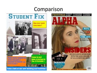
SlideShare a Scribd company logo
Looking back at your preliminary
task, what do you feel you have
learnt in the progression from it
being a full product?
Evaluation Question 7
Comparison
Overall
Overall I feel I have made a much better magazine with my music magazine than with
my college magazine, as I learnt so much and made a lot of mistakes with my college
magazine that I did not make with my music magazine as I learned from them.
I feel I have improved with my font size, fonts used, colours used, layout and general
details.
In my college magazine I did not include the important information such as the date,
price and barcode etc which was a big mistake as it meant my magazine looked very
unrealistic.
Spelling was also something I made a mistake on with my college magazine as I
accidently wrote “come to out” rather than “come to our”. On my music magazine I
made a conscious effort to get my spelling perfect and I proof read my work to make
sure I did not make any further mistakes.
Colour Scheme
In my student/college magazine I used a variety of different bright colours paired with a
very subtle background, also some of my images were half black and white/half colour or
distorted colours. The mix of all these colours left my student magazine looking quite
messy and unorganised, which was a disadvantage. I feel the magazine looked very childish
with all the different colours. I picked colours that related to the colours of the college in
my preliminary task, but I feel this just made my magazine look to garish and overrun with
unnecessary colours, especially seen as the colours used were very bright.
Therefore, in my music magazine I chose to use a very limited amount colours, to make my
magazine look more professional. I mainly used red and gold through out my magazine
(alongside black and white) but for the front cover I chose to also use a pop of blue for the
cover lines and puff. I felt this would make my magazine just that little bit more interesting
and make it stand out more.
I kept the majority of the descriptive writing black as it is easy to read and also stands out
from the coloured background.
Font and Font Size
When I created my college magazine I was unaware of websites such as DaFont.com which allow
you to download custom fonts to use with in Photoshop, therefore the fonts on my college
magazine were quite basic as they were ones that were prebuilt into Photoshop. I also used all
of the same font and font size on the cover of my student magazine (except for the masthead),
which again made it look unrealistic and unprofessional.
In my music magazine I downloaded the font ‘Human Error’ from DaFont.com which gave me a
unique looking masthead which stood out, and looked professional as it was not a font from
PowerPoint. For the masthead on my music magazine I chose to have it only cover half of the
front cover as it was too large and did not look right when it covered the whole top of the
magazine as I also had a banner above it. This was different to my student magazine as I made
the masthead fit the whole top of the cover, I did not feel this worked very well though as the
masthead was still quite small.
For my cover lines and main sell line I used a variety of different font sizes as I wanted some
parts to be more eye catching than others. This worked better than on my college magazine as
on the cover of my college magazine no parts really stood out as the same font and font size was
used throughout.
Layout
I did not really stick to the flat plan for my college magazine as I
changed the layout of where the images were place and some
of the text. This was not a good idea as it meant I had no guide
to follow when creating my magazine. Therefore, I made sure to
follow the flat plan accurately when creating my music
magazine and I feel this made my magazine more successful.
In my college magazine there was a lot of
blank spaces as I did not place the images
in good places, which made my magazine
look quite barren. Also the cover lines did
not fit in the coloured boxes well and there
was a lot of empty space.
To improve this in my music magazine I
created tightly packed flat plans which
made sure there was no empty spaces.
Comparison
Layout and Content
The layout was one of the things I was most unhappy with in my college magazine as feel it
looks very unprofessional and does not resemble any magazine I have seen before. Having
the images above the features column did not work well so on my music magazine I made
sure to have them at the side rather than above.
In my music magazine I also added a lot more features as in my college magazine I only had
five listed, which is not very many for a magazine. I also did not include the word ‘page’
before the page number in my music magazine as I felt it was unnecessary as my target
audience would understand what the numbers meant.
I included social media links in my music magazine as I know my target audiences are
regular social media uses and I felt it was important to let them engage with the magazine
on different media platforms such as Twitter, Facebook and Instagram.
Continuity
There isn't much continuity in my student magazine as I used bright and bold colours
on my cover but then more muted and pastel colours for my contents page. This
makes it look more like the cover and contents are from two different magazines. I
also did not use the same text for both pages, the only text I kept was the text from
the masthead as I used it for the word ‘contents’ . The masthead was not included on
my contents page and so I felt continuity was something I really lacked with my
student magazine and wanted to have with my music magazine.
In my music magazine I used the same colour scheme throughout, although I did not
include the colour blue on my contents page or DPS (but this was as the blue was
simply to attract my target audiences attention). I used the same base font
throughout, whilst adding other fonts in some places so that my magazine did not only
use one font. I feel by keeping these aspects the same throughout my music magazine
I have been able to create a brand identity and people will now associate the colours
used/fonts used/my masthead with my magazine.
Details
When creatign my student magazine I wasn’t really sure what small details to include
in my contents page therefore I just created soemthing quite basic which was not very
realistic.
I tried to add in lots of little details to my music magazine’s contents page which I had
noticed in other magazines such as a website, social media links, image captions and
page numbers. I feel this makes my magazine look genuine as I have included all of the
little things which other magazines also include.
Reflection
I feel as though I have learned a lot from creating my two magazines, and I feel my music
magazine would not be as successful if I had not made the mistakes that I did with my student
magazine as I really learned new things from them.
Since my prelim task I have became more able with Photoshop and I am now able to edit images
to a higher quality and I have also learned what makes a magazine more successful through trial
and error.

More Related Content

What's hot

Evaluation q7
Evaluation q7Evaluation q7
Evaluation q7
Daisy Raine-Ellerker
 
Evaluation q 1
Evaluation q 1Evaluation q 1
Evaluation q 1caitlinp
 
Evaluation- Question Seven
Evaluation- Question Seven Evaluation- Question Seven
Evaluation- Question Seven emannac
 
Evaluation Question 7
Evaluation Question 7Evaluation Question 7
Evaluation Question 7
HollyRosa98
 
Evaluation powerpoint
Evaluation powerpointEvaluation powerpoint
Evaluation powerpointAnya Clayton
 
Audience Feedback[1]
Audience Feedback[1]Audience Feedback[1]
Audience Feedback[1]guestba61e7
 
Media Studies - In what ways does your media product use, develop or challeng...
Media Studies - In what ways does your media product use, develop or challeng...Media Studies - In what ways does your media product use, develop or challeng...
Media Studies - In what ways does your media product use, develop or challeng...Sana Khurshid
 
College Magazine evaluation power point
College Magazine evaluation power pointCollege Magazine evaluation power point
College Magazine evaluation power point
rachelhubbard7
 
Question 1
Question 1Question 1
Question 1
JelanisBlog
 
How did you attract and address your audience new
How did you attract  and address your audience newHow did you attract  and address your audience new
How did you attract and address your audience newLareesa Warner
 
Masthead decisions
Masthead decisionsMasthead decisions
Masthead decisions
kendra20003
 
Looking back at your preliminary task, what
Looking back at your preliminary task, whatLooking back at your preliminary task, what
Looking back at your preliminary task, what
Georgiesphs
 
Q1 Media Magazine Evaluation:In what ways does your media product use , devel...
Q1 Media Magazine Evaluation:In what ways does your media product use , devel...Q1 Media Magazine Evaluation:In what ways does your media product use , devel...
Q1 Media Magazine Evaluation:In what ways does your media product use , devel...
klaudia666
 

What's hot (20)

Powerpoint
PowerpointPowerpoint
Powerpoint
 
Analasys
AnalasysAnalasys
Analasys
 
Evaluation (4)
Evaluation (4)Evaluation (4)
Evaluation (4)
 
Question 7
Question 7Question 7
Question 7
 
Evaluation q7
Evaluation q7Evaluation q7
Evaluation q7
 
Evaluation q 1
Evaluation q 1Evaluation q 1
Evaluation q 1
 
Evaluation- Question Seven
Evaluation- Question Seven Evaluation- Question Seven
Evaluation- Question Seven
 
Media presentation
Media presentationMedia presentation
Media presentation
 
Evaluation Question 7
Evaluation Question 7Evaluation Question 7
Evaluation Question 7
 
Evaluation powerpoint
Evaluation powerpointEvaluation powerpoint
Evaluation powerpoint
 
Audience Feedback[1]
Audience Feedback[1]Audience Feedback[1]
Audience Feedback[1]
 
Media Studies - In what ways does your media product use, develop or challeng...
Media Studies - In what ways does your media product use, develop or challeng...Media Studies - In what ways does your media product use, develop or challeng...
Media Studies - In what ways does your media product use, develop or challeng...
 
College Magazine evaluation power point
College Magazine evaluation power pointCollege Magazine evaluation power point
College Magazine evaluation power point
 
Question 1
Question 1Question 1
Question 1
 
How did you attract and address your audience new
How did you attract  and address your audience newHow did you attract  and address your audience new
How did you attract and address your audience new
 
QUESTION 1
QUESTION 1QUESTION 1
QUESTION 1
 
Masthead decisions
Masthead decisionsMasthead decisions
Masthead decisions
 
Q1 evaluation
Q1 evaluationQ1 evaluation
Q1 evaluation
 
Looking back at your preliminary task, what
Looking back at your preliminary task, whatLooking back at your preliminary task, what
Looking back at your preliminary task, what
 
Q1 Media Magazine Evaluation:In what ways does your media product use , devel...
Q1 Media Magazine Evaluation:In what ways does your media product use , devel...Q1 Media Magazine Evaluation:In what ways does your media product use , devel...
Q1 Media Magazine Evaluation:In what ways does your media product use , devel...
 

Viewers also liked

Evaluation question 2 2
Evaluation question 2 2Evaluation question 2 2
Evaluation question 2 2
rebeccawild2212
 
Evaluation question 2
Evaluation question 2Evaluation question 2
Evaluation question 2
rebeccawild2212
 
In what ways does your media product use
In what ways does your media product useIn what ways does your media product use
In what ways does your media product use
rebeccawild2212
 
Images media
Images mediaImages media
Images media
rebeccawild2212
 
Evaluation question 2
Evaluation question 2 Evaluation question 2
Evaluation question 2
rebeccawild2212
 
Looking back at your preliminary task, what
Looking back at your preliminary task, whatLooking back at your preliminary task, what
Looking back at your preliminary task, what
rebeccawild2212
 

Viewers also liked (13)

Evaluation question 2 2
Evaluation question 2 2Evaluation question 2 2
Evaluation question 2 2
 
Mood board
Mood boardMood board
Mood board
 
Schedule
Schedule Schedule
Schedule
 
Location scout
Location scoutLocation scout
Location scout
 
Location scout
Location scoutLocation scout
Location scout
 
Evaluation question 2
Evaluation question 2Evaluation question 2
Evaluation question 2
 
In what ways does your media product use
In what ways does your media product useIn what ways does your media product use
In what ways does your media product use
 
Analisis vegetasi
Analisis vegetasiAnalisis vegetasi
Analisis vegetasi
 
Reader profile
Reader profile Reader profile
Reader profile
 
Images media
Images mediaImages media
Images media
 
Evaluation question 2
Evaluation question 2 Evaluation question 2
Evaluation question 2
 
Looking back at your preliminary task, what
Looking back at your preliminary task, whatLooking back at your preliminary task, what
Looking back at your preliminary task, what
 
Location scout
Location scoutLocation scout
Location scout
 

Similar to Evaluation Question 7

Evaluation Question Seven
Evaluation Question Seven Evaluation Question Seven
Evaluation Question Seven
felicityputman
 
Question 7
Question 7Question 7
Question 7trup17
 
Evaluation question 7
Evaluation  question 7Evaluation  question 7
Evaluation question 7Anitahoxha
 
Evaluation Question 7
Evaluation Question 7Evaluation Question 7
Evaluation Question 7bymckee
 
Presentation1
Presentation1Presentation1
Presentation1eliroddy
 
Looking back at your preliminary task, what
Looking back at your preliminary task, whatLooking back at your preliminary task, what
Looking back at your preliminary task, what014207
 
Media evaluation question 1
Media evaluation question 1Media evaluation question 1
Media evaluation question 1
carolinelilyc
 
Looking back at your preliminary task, what
Looking back at your preliminary task, whatLooking back at your preliminary task, what
Looking back at your preliminary task, what014207
 
Looking back at
Looking back atLooking back at
Looking back atKalise
 
Evaluation 7 f
Evaluation 7 fEvaluation 7 f
Evaluation 7 f
robertdunndunndunnnn
 
Evaluation of main task
Evaluation of main taskEvaluation of main task
Evaluation of main taskeliroddy
 
Media evaluation
Media evaluationMedia evaluation
Media evaluation
paige moorby
 
Presentation2
Presentation2Presentation2
Presentation2Nicholaou
 
Question 7 of evaluation
Question 7 of evaluationQuestion 7 of evaluation
Question 7 of evaluation
aatiqa rehman
 
Evaluation question 1
Evaluation question 1Evaluation question 1
Evaluation question 1
dannyking1997
 
Evaluation question 1
Evaluation question 1Evaluation question 1
Evaluation question 1
dannyking1997
 
Bethanyr Evaluation
Bethanyr EvaluationBethanyr Evaluation
Bethanyr Evaluationguesta3f059
 

Similar to Evaluation Question 7 (20)

Evaluation Question Seven
Evaluation Question Seven Evaluation Question Seven
Evaluation Question Seven
 
Question 7
Question 7Question 7
Question 7
 
Evaluation question 7
Evaluation  question 7Evaluation  question 7
Evaluation question 7
 
Question 7
Question 7Question 7
Question 7
 
Evaluation Question 7
Evaluation Question 7Evaluation Question 7
Evaluation Question 7
 
Final evaluation
Final evaluationFinal evaluation
Final evaluation
 
Presentation1
Presentation1Presentation1
Presentation1
 
Looking back at your preliminary task, what
Looking back at your preliminary task, whatLooking back at your preliminary task, what
Looking back at your preliminary task, what
 
Media evaluation question 1
Media evaluation question 1Media evaluation question 1
Media evaluation question 1
 
Looking back at your preliminary task, what
Looking back at your preliminary task, whatLooking back at your preliminary task, what
Looking back at your preliminary task, what
 
Looking back at
Looking back atLooking back at
Looking back at
 
Evaluation 7 f
Evaluation 7 fEvaluation 7 f
Evaluation 7 f
 
Evaluation of main task
Evaluation of main taskEvaluation of main task
Evaluation of main task
 
Media evaluation
Media evaluationMedia evaluation
Media evaluation
 
Presentation2
Presentation2Presentation2
Presentation2
 
Question 7 of evaluation
Question 7 of evaluationQuestion 7 of evaluation
Question 7 of evaluation
 
Evaluation question 1
Evaluation question 1Evaluation question 1
Evaluation question 1
 
Evaluation question 1
Evaluation question 1Evaluation question 1
Evaluation question 1
 
Evaluation
EvaluationEvaluation
Evaluation
 
Bethanyr Evaluation
Bethanyr EvaluationBethanyr Evaluation
Bethanyr Evaluation
 

More from rebeccawild2212

Evaluation question 2 2
Evaluation question 2 2Evaluation question 2 2
Evaluation question 2 2
rebeccawild2212
 
Mood Board of Magazines
Mood Board of MagazinesMood Board of Magazines
Mood Board of Magazines
rebeccawild2212
 
Media questionnaire
Media questionnaireMedia questionnaire
Media questionnaire
rebeccawild2212
 
Media questionnaire
Media questionnaireMedia questionnaire
Media questionnaire
rebeccawild2212
 
Media questionnaire
Media questionnaireMedia questionnaire
Media questionnaire
rebeccawild2212
 
Deconstructed contents page
Deconstructed contents pageDeconstructed contents page
Deconstructed contents page
rebeccawild2212
 
Deconstruction of a contents page
Deconstruction of a contents pageDeconstruction of a contents page
Deconstruction of a contents page
rebeccawild2212
 
Media Mood Board
Media Mood BoardMedia Mood Board
Media Mood Board
rebeccawild2212
 

More from rebeccawild2212 (12)

Evaluation question 2 2
Evaluation question 2 2Evaluation question 2 2
Evaluation question 2 2
 
My reader profile 1
My reader profile 1My reader profile 1
My reader profile 1
 
Mood Board of Magazines
Mood Board of MagazinesMood Board of Magazines
Mood Board of Magazines
 
Reader profile
Reader profile Reader profile
Reader profile
 
Reader profile
Reader profileReader profile
Reader profile
 
Media questionnaire
Media questionnaireMedia questionnaire
Media questionnaire
 
Media questionnaire
Media questionnaireMedia questionnaire
Media questionnaire
 
Media questionnaire
Media questionnaireMedia questionnaire
Media questionnaire
 
Media mood board
Media mood boardMedia mood board
Media mood board
 
Deconstructed contents page
Deconstructed contents pageDeconstructed contents page
Deconstructed contents page
 
Deconstruction of a contents page
Deconstruction of a contents pageDeconstruction of a contents page
Deconstruction of a contents page
 
Media Mood Board
Media Mood BoardMedia Mood Board
Media Mood Board
 

Evaluation Question 7

  • 1. Looking back at your preliminary task, what do you feel you have learnt in the progression from it being a full product? Evaluation Question 7
  • 3. Overall Overall I feel I have made a much better magazine with my music magazine than with my college magazine, as I learnt so much and made a lot of mistakes with my college magazine that I did not make with my music magazine as I learned from them. I feel I have improved with my font size, fonts used, colours used, layout and general details. In my college magazine I did not include the important information such as the date, price and barcode etc which was a big mistake as it meant my magazine looked very unrealistic. Spelling was also something I made a mistake on with my college magazine as I accidently wrote “come to out” rather than “come to our”. On my music magazine I made a conscious effort to get my spelling perfect and I proof read my work to make sure I did not make any further mistakes.
  • 4. Colour Scheme In my student/college magazine I used a variety of different bright colours paired with a very subtle background, also some of my images were half black and white/half colour or distorted colours. The mix of all these colours left my student magazine looking quite messy and unorganised, which was a disadvantage. I feel the magazine looked very childish with all the different colours. I picked colours that related to the colours of the college in my preliminary task, but I feel this just made my magazine look to garish and overrun with unnecessary colours, especially seen as the colours used were very bright. Therefore, in my music magazine I chose to use a very limited amount colours, to make my magazine look more professional. I mainly used red and gold through out my magazine (alongside black and white) but for the front cover I chose to also use a pop of blue for the cover lines and puff. I felt this would make my magazine just that little bit more interesting and make it stand out more. I kept the majority of the descriptive writing black as it is easy to read and also stands out from the coloured background.
  • 5. Font and Font Size When I created my college magazine I was unaware of websites such as DaFont.com which allow you to download custom fonts to use with in Photoshop, therefore the fonts on my college magazine were quite basic as they were ones that were prebuilt into Photoshop. I also used all of the same font and font size on the cover of my student magazine (except for the masthead), which again made it look unrealistic and unprofessional. In my music magazine I downloaded the font ‘Human Error’ from DaFont.com which gave me a unique looking masthead which stood out, and looked professional as it was not a font from PowerPoint. For the masthead on my music magazine I chose to have it only cover half of the front cover as it was too large and did not look right when it covered the whole top of the magazine as I also had a banner above it. This was different to my student magazine as I made the masthead fit the whole top of the cover, I did not feel this worked very well though as the masthead was still quite small. For my cover lines and main sell line I used a variety of different font sizes as I wanted some parts to be more eye catching than others. This worked better than on my college magazine as on the cover of my college magazine no parts really stood out as the same font and font size was used throughout.
  • 6. Layout I did not really stick to the flat plan for my college magazine as I changed the layout of where the images were place and some of the text. This was not a good idea as it meant I had no guide to follow when creating my magazine. Therefore, I made sure to follow the flat plan accurately when creating my music magazine and I feel this made my magazine more successful. In my college magazine there was a lot of blank spaces as I did not place the images in good places, which made my magazine look quite barren. Also the cover lines did not fit in the coloured boxes well and there was a lot of empty space. To improve this in my music magazine I created tightly packed flat plans which made sure there was no empty spaces.
  • 8. Layout and Content The layout was one of the things I was most unhappy with in my college magazine as feel it looks very unprofessional and does not resemble any magazine I have seen before. Having the images above the features column did not work well so on my music magazine I made sure to have them at the side rather than above. In my music magazine I also added a lot more features as in my college magazine I only had five listed, which is not very many for a magazine. I also did not include the word ‘page’ before the page number in my music magazine as I felt it was unnecessary as my target audience would understand what the numbers meant. I included social media links in my music magazine as I know my target audiences are regular social media uses and I felt it was important to let them engage with the magazine on different media platforms such as Twitter, Facebook and Instagram.
  • 9. Continuity There isn't much continuity in my student magazine as I used bright and bold colours on my cover but then more muted and pastel colours for my contents page. This makes it look more like the cover and contents are from two different magazines. I also did not use the same text for both pages, the only text I kept was the text from the masthead as I used it for the word ‘contents’ . The masthead was not included on my contents page and so I felt continuity was something I really lacked with my student magazine and wanted to have with my music magazine. In my music magazine I used the same colour scheme throughout, although I did not include the colour blue on my contents page or DPS (but this was as the blue was simply to attract my target audiences attention). I used the same base font throughout, whilst adding other fonts in some places so that my magazine did not only use one font. I feel by keeping these aspects the same throughout my music magazine I have been able to create a brand identity and people will now associate the colours used/fonts used/my masthead with my magazine.
  • 10. Details When creatign my student magazine I wasn’t really sure what small details to include in my contents page therefore I just created soemthing quite basic which was not very realistic. I tried to add in lots of little details to my music magazine’s contents page which I had noticed in other magazines such as a website, social media links, image captions and page numbers. I feel this makes my magazine look genuine as I have included all of the little things which other magazines also include.
  • 11. Reflection I feel as though I have learned a lot from creating my two magazines, and I feel my music magazine would not be as successful if I had not made the mistakes that I did with my student magazine as I really learned new things from them. Since my prelim task I have became more able with Photoshop and I am now able to edit images to a higher quality and I have also learned what makes a magazine more successful through trial and error.