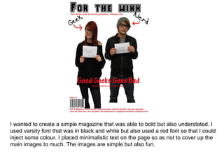
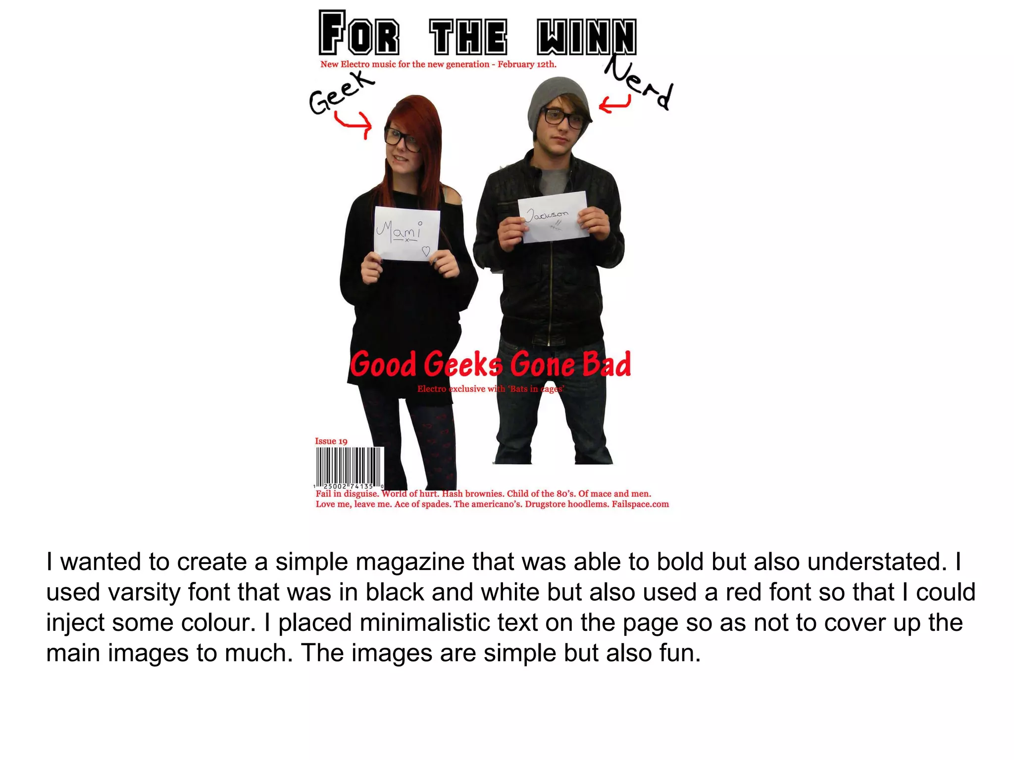
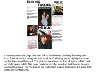
The document describes the design choices for a simple black and white magazine, with red used sparingly for highlights. Key elements include a varsity font, minimal text allowing images to stand out, a bold contents page with quotes and keywords in red, and filling all space on pages with images and red page numbers to draw the eye. Red text and band images and taglines are used on another page, with varsity font tying the magazine together visually.