1. The first improvement that I had made to my double page spread was that I had the title of the
magazine placed on the right side of the magazine and then I had the main title of the double
page placed on the left side of the page. Underneath the main title you find a quote of what the
article will be about and at the top of the main title is the name of artist so it shows you who the
article is going to be about. Also you find that the background of the page is light pink so it
contrasts with the colour theme.
Another improvement that I had made was that I had placed the article of the double page
spread in the middle and I had a quote of what the artist has said when answering the question. I
had the article fitting in with the colour theme as the questions are in pink and the answers are
in black. You find that the page number is included in pink at the bottom right side of the page.
Also you find that the skyline has been placed at the bottom of the page with the writer of the
article and the website of the magazine.
Another improvement that I had made to the double page was that I has included the main
image and has it placed on the left side of the page. The reason why I had chosen to place the
image on the right is because by looking at the magazine it showed me that one of the pages is
just of the artist with the article next to it. I had chosen to do my image similarly is because of
how it is more likely to fit into the pop genre. Also you can see that the main title has been
placed in the middle so you are able to see it more and it links both of the pages together.
Another improvement that I had chosen to do was to remove the background of the image. As
you can see from the print screen it shows you how the background has been removed by
making it transparent so it contrasts with the background.
You can see from the print screen above It shows you how to make the image transparent and
by doing that it allows the image background to fit into the background of the page. This print
screen shows you how it looks like when you have made the image transparent by clicking on
the grey background.
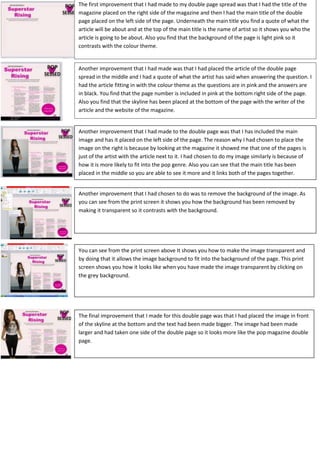
The final improvement that I made for this double page was that I had placed the image in front
of the skyline at the bottom and the text had been made bigger. The image had been made
larger and had taken one side of the double page so it looks more like the pop magazine double
page.