Evaluation
Beth Geldard
Planning
When starting the vegan project I was having to create a booklet. So to get information I was having to
a lot of secondary research. I was having to find out what veganism is to animal testing. By doing this it
allowed me to have a verity of subjects to chose from to fill so I was able to write about them. Another
thing is it gave me ideas on what I want my info graphics and fact file to be like. I believed this helped
me as I was able to identify what I would like my booklet to contain and it gave me ideas for the
pictures I will be choosing to the type of fonts that will suit them .
I then started to create a survey, which allowed me to specify who knows about veganism and what
their opinion on it. By doing this it showed me how people from the ages 17+20 did not know much
about it. so to intrigue a younger audience to attack them I decided to do a factfile on celebrities; this
will be a selling point to where people may be influenced by them
When looking for my research I was looking on vegan pages which gave me inspiration for instance
Veganuary. It gave me ideas on how I want my article to look like and the ways I will intrigue my
audience in. I was learning how colours attract you in, they were using natural colours like blue green
yellow orange keeping it simple but stylish. Another thing in which I did was look at magazine design in
see how much space they used, as well as to see the type of fonts and shapes. Doing this gave me
ideas on how I was going to create my ‘vegan Celebrities’ page, as I saw a magazine using triangles and
place images in them.
When planning to do my infographics I began to look at food infographics, and this gave me idea on
how I want the style to look like as well as the images and text. so first of all I saw how most
infographics are filled with colours, bright and bold so I decided to use a orange back ground creating a
warm and positive outlook. I then decided to to chose quite a thick font so its clear for my readers and
maybe I can use this font to make others stand out more to show that its more important. When
creating my infographics I design one within the first week and I ended up not using it in my booklet.
The reason for this was because I did not like the way it looked I felt it didn't’t look like a proper
inforgraphic and the design I did I felt that it was all squashed together, which was making it unclear on
what the products were. So further in to the production I decided to recreate and add some off the
things in a factfile. By doing this I would my skill have develop because I decided to use the food in a
circle resembling it as a plate to show the type of food vegans eat then placed text next it. so what I
have done it changed the style, colour, text and images.
Preparation
For my preparation, by doing the secondary research I was then having
to chose subjects I wanted to included within my booklet and I decided
on doing the culture of being a vegan, vegan diet, fur farm, cosmetics
and the rise of veganism. When coming to improvements I handed in my
first one, so it could get marked I was having to redo it to a professional
standard, so I was having to change my grammar, spellings and making
sure it made sense. When I had written all this I had to have a budget of
only using 700 words, I was then having to cut down most of my work to
fit to this mark. So in the end I was only doing ‘what is veganism’, ‘the
rise of veganism’ and ‘the vegan diet’. But by having to cut down my
work it now has a theme about it, instead of it going off track on to fur
farms and cosmetics. This makes my booklet have a flow and it links in
with each other.
When doing preparation, I began to create a mood board which I was
able to gather images, fonts and colours that I would like to included in
my article. It gave me idea on the style I was going for and helped me
throughout my production as I had something to fall back on if I needed
ideas. For instance I found something on the internet that I really liked
the style of for my front cover, so I decided to design what I would like
my front cover to look like. By doing this it gave me areas of
improvement and I had something to base my colours on. When coming
to create my design I did the same in my preparation, I just changed
some of the colours, fonts and rotoscoped the images instead, so it isn't
not copyrighted it to make it my own.
The reason why I decided to go for warm colours like oranges red was
because it creates a positive outlook, it’s natural linking that in with the
food around the master head. The background I carried on using this
colour through out some of the background in my pages to it has a link
and isn't just a random colour.
When creating my infographics and factfile I began to collect research
from the secondary research I found and place them in word document.
I did this so I when it came to making them I wouldn’t have to be collect
the information there and then. The content I did for my factfile was
vegan celebrities and healthy food. For infographic I was having to do it
on veganuary so I decided to do it on chickens and peoples weight.
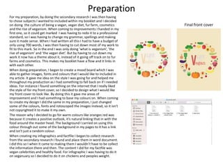
Final front cover
ProductionTime Management
Throughout the project I have been on schedule. Applying work to my blog so it is ready to be market so
when coming to the production of creating my vegan booklet I was ready to start. Within the production
weeks I scheduled each week on what I will be doing. Each week I was doing something new, so even if I
had not of finished something at least I was starting something else. But through each week I was up to
schedule, so if needed so I went back and redid some of my work.
One of my pages that needed adjustments to reach to professional standard that it requires was a
double page spread about ‘The rise to veganism’. What I didn’t like about this page is I felt it was quite
messy and unpleasant to look at because when looking at pages you want it to be satisfying to look at,
making it unique from other. So what I did was look at other magazine layouts and I saw they placed a
letter behind the text and this draws you in to the page. So I Placed a ‘V’ in the middle of the page as it’s
the first thing you see and adds colour to the page. I don’t think it worked for my booklet was because I
didn’t have any images within the page and the page next to so I felt I needed to fill the page. Another
thing in which I didn't’t like was how the two text columns, they are uneven.
So what I did to change the outlook of this page was bring out more pull quotes, filling up more of the
image giving the reader an insight of what is within the text. I used the colour blue to show contrast
against the black and linking it back to the page ‘what is veganism’ I wanted to do this; it shows how the
pages have resemblance together. I also added a rhetorical question at the end of the narrative to make
my audience question on what they have just read. Placed it in a circle to show that its important to
read. I also decided to create three columns and when maybe changing subject I section each
paragraph with a full out quote. I prefer this page because I think the structure looks neat, I like the pull
out quotes all in a diagonal line.
If I had room for progress, when I got feedback one of my weakness were that I did not include a lot of
image’ so what I think I would do to this page is maybe add a picture a picture to the bottom right and
get a picture of Euan so the readers have an idea of who I am walking about.
Reviewing work in progress
when I had finish my booklet, I was going back over it and reviewing what I could do to improve it, and
decided just to add a pull out quote at the bottom of my first page. But if I had time I think I would redo
the whole of this page for instance adding images to make it more bold which wont make it look so plain
and dull.
When doing my evaluation I decided to go back and change it. the adjustments that I did to this page
was the text of the little, I made it different from the other pages I did. I over lapped them and did them
both in different colours to show that what I am talking about is veganism. I did this to show contrast
within the words. i used the colour black for veganism because it is prominent and clear to read.
Another thing in with I did was a large pull out quote, to make it clear what veganism is, highlighting
words that are powerful and will stick in peoples minds. For instance like the word ‘cruelty’ ‘Don’t’
‘Don’t eat meat’ shows that these words are used a lot through out the veganism year.
The reason why I used the colour blue to grab the readers attention was to illustrate nature and
veganism is people using natural sources to live in everyday life.
I places three small images at the bottom of the page to show to the readers that these are the animals
that you are saving or killing. This also might make the audience question them selves in is this right
what they are doing eating meat.
Final product
My intentions have been made through out the booklet, I wanted to audience to understand what veganism is and what
what comes with it and I feel like have made this clear through out the article. The purpose of my booklet it there to
entertain them as well as them learning. I wanted my booklet to entice them to pick it up and I believe I have chosen the
right subjects to talk about and the right colours for it to stand out to them.
The type of audience I was aiming for I think is based between 16-30, both genders. I based it around this age group
because I did a survey and asked my audience ‘what do you know about veganism?’ and they replied saying ‘they don’t eat
meat’, but what they don’t know is the reasons why. So to intrigue a young audience to learn about veganism I included
subjects that may intrigue them to read about it. I talked about celebrities which is using celebrity endorsement, I think this
is a good selling point because people may be influenced by the type of celebs I have chosen. Another thing I talked about
was what it is, I included a persons experience about becoming vegan and the type of food thy eat.
The content within my booklet has got a clear flow linking all together. I am glad I have gone for the basic subjects on what
veganism is about because this may encourage them to look up more about what the following things are done to these
animals, for instance how they are treated before they are killed. Through out the booklet I would say it is quite positive
not showing any signs of negativity except one infographic. I have done this to show that veganism is here to help animals
and by showing some experience maybe people will take it on them selves. Another thing in what I learnt from my survey
is how many people didn’t not know what type of products these eat and how it is very little to chose from. But my
booklet shows how they eat the same things as we do just made out of different substances and this may entice people to
try them out.
The style of my booklet has a clear theme through out, using both warm and cool colours, shapes and typography. The
reason why I did this was because It shows a professional look. For the type of style I was looking at double pages of
magazines, I was looking at where they placed the text and images to see I can can portray a similar look. This helped me
structure on where I want to place my work and influenced me more to use shapes because if it placed within text or an
image the designer is wanting you to pay attention to it.
The skills I have used were in Photoshop I used rotoscoping, I used this for the front cover of my magazine by going over
fruit and vegetables. I have used this before so I thought this is something I could incorporate within my booklet and the
tool I used was the magic lasso tool, this allowed me to have a clear cut of the object I was going round to make a perfect
resemblance. Another tool I used when editing my pictures was the filter gallery, this allowed me to edit the look of the
image giving it texture and different tones to make it my own.
My skills have develop through the booklet because I know what I am capable of producing, I am able to do rotoscoping
and the filter gallery as these are a easy form of editing my work. So maybe next time I should try something more
challenging to develop on my skill like working shaped around an image instead this creating the same outcome as
rotoscoping but done in a different way.
I do believe that there are areas of improvements, I found this out from feed back sheets and a survey money question air I
created. What I found out on the feedback sheets was that there ‘was not enough design element In it’. So next time I
would do more rotoscoping so it would be constant through out the pages and what it does to the readers is give them
something to look at to intrigue them to read what the booklet is talking about. I agree with this because this make people
want to read what I have wrote and providing to much information might put them of.
Another thing I found from my survey money, is I could include more websites on veganism. I placed this in the back page
by just putting one web link is just giving them one location to look at. What I would do is add information where I found
this information and if my readers want more of an insight I could provide them information about cosmetics, fur and food
which is different from what my booklet is showing you.
To create my fact file, I was inspired by an infographic because I like the
creative style they have used. For stance the food pyramid placing the type
of food what vegans eat. so Instead of just copping it I decided to put it on a
plate, showing my readers that these are the types of foods vegans eat which
creates a clear understanding. I also saw that they placed information at the
side of it. so I decided to place facts about what the dairy, grains, protein and
vegetables do to the human body so it gives them an insight or how vegan
products are better for you. Another thing I did was talk about how they are
less lightly to get disease compared to someone that each meat. Why I did
this was because it will give my audience the understanding of how the food
they eat is increasing the chases of them to becoming ill.
Also another thing I wanted to portray was the use of colours I saw how the
colour were not harsh. So I types in colour charts and I started to base my
colour scheme around primary colours, as they are light, relaxing and natural
not to in you face which is linking back to natural courses.
When creating my infographic I became influenced by the image next to it
because I like the shapes that were used and how text was added in to them.
I though this was neat and a clear understand of subject change. So I though I
would create the same but use to as a bar chart instead which I think looks
different and unique. To create this I had to combine two shapes together to
get the shape I wanted and I am happy with the outcome. Another thing in
which I liked about this was how it give a clear direction the the subject next
to it. it telling the reader to carry on reader showing the there is a link
between subjects.
I decided to create a webpage in the end, which shows a cleat indication of
advertisement because I had got all my information from the veganuary
webpage so if people wanted to look up more they know where to get it
from.
Also because of this infographic I decided to included a back ground within
most of my pages
If I had time maybe what I could of done, is taken the photo my self and
placed my hand on the key board

Evaluation

  • 1.
  • 2.
    Planning When starting thevegan project I was having to create a booklet. So to get information I was having to a lot of secondary research. I was having to find out what veganism is to animal testing. By doing this it allowed me to have a verity of subjects to chose from to fill so I was able to write about them. Another thing is it gave me ideas on what I want my info graphics and fact file to be like. I believed this helped me as I was able to identify what I would like my booklet to contain and it gave me ideas for the pictures I will be choosing to the type of fonts that will suit them . I then started to create a survey, which allowed me to specify who knows about veganism and what their opinion on it. By doing this it showed me how people from the ages 17+20 did not know much about it. so to intrigue a younger audience to attack them I decided to do a factfile on celebrities; this will be a selling point to where people may be influenced by them When looking for my research I was looking on vegan pages which gave me inspiration for instance Veganuary. It gave me ideas on how I want my article to look like and the ways I will intrigue my audience in. I was learning how colours attract you in, they were using natural colours like blue green yellow orange keeping it simple but stylish. Another thing in which I did was look at magazine design in see how much space they used, as well as to see the type of fonts and shapes. Doing this gave me ideas on how I was going to create my ‘vegan Celebrities’ page, as I saw a magazine using triangles and place images in them. When planning to do my infographics I began to look at food infographics, and this gave me idea on how I want the style to look like as well as the images and text. so first of all I saw how most infographics are filled with colours, bright and bold so I decided to use a orange back ground creating a warm and positive outlook. I then decided to to chose quite a thick font so its clear for my readers and maybe I can use this font to make others stand out more to show that its more important. When creating my infographics I design one within the first week and I ended up not using it in my booklet. The reason for this was because I did not like the way it looked I felt it didn't’t look like a proper inforgraphic and the design I did I felt that it was all squashed together, which was making it unclear on what the products were. So further in to the production I decided to recreate and add some off the things in a factfile. By doing this I would my skill have develop because I decided to use the food in a circle resembling it as a plate to show the type of food vegans eat then placed text next it. so what I have done it changed the style, colour, text and images.
  • 3.
    Preparation For my preparation,by doing the secondary research I was then having to chose subjects I wanted to included within my booklet and I decided on doing the culture of being a vegan, vegan diet, fur farm, cosmetics and the rise of veganism. When coming to improvements I handed in my first one, so it could get marked I was having to redo it to a professional standard, so I was having to change my grammar, spellings and making sure it made sense. When I had written all this I had to have a budget of only using 700 words, I was then having to cut down most of my work to fit to this mark. So in the end I was only doing ‘what is veganism’, ‘the rise of veganism’ and ‘the vegan diet’. But by having to cut down my work it now has a theme about it, instead of it going off track on to fur farms and cosmetics. This makes my booklet have a flow and it links in with each other. When doing preparation, I began to create a mood board which I was able to gather images, fonts and colours that I would like to included in my article. It gave me idea on the style I was going for and helped me throughout my production as I had something to fall back on if I needed ideas. For instance I found something on the internet that I really liked the style of for my front cover, so I decided to design what I would like my front cover to look like. By doing this it gave me areas of improvement and I had something to base my colours on. When coming to create my design I did the same in my preparation, I just changed some of the colours, fonts and rotoscoped the images instead, so it isn't not copyrighted it to make it my own. The reason why I decided to go for warm colours like oranges red was because it creates a positive outlook, it’s natural linking that in with the food around the master head. The background I carried on using this colour through out some of the background in my pages to it has a link and isn't just a random colour. When creating my infographics and factfile I began to collect research from the secondary research I found and place them in word document. I did this so I when it came to making them I wouldn’t have to be collect the information there and then. The content I did for my factfile was vegan celebrities and healthy food. For infographic I was having to do it on veganuary so I decided to do it on chickens and peoples weight. Final front cover
  • 4.
    ProductionTime Management Throughout theproject I have been on schedule. Applying work to my blog so it is ready to be market so when coming to the production of creating my vegan booklet I was ready to start. Within the production weeks I scheduled each week on what I will be doing. Each week I was doing something new, so even if I had not of finished something at least I was starting something else. But through each week I was up to schedule, so if needed so I went back and redid some of my work. One of my pages that needed adjustments to reach to professional standard that it requires was a double page spread about ‘The rise to veganism’. What I didn’t like about this page is I felt it was quite messy and unpleasant to look at because when looking at pages you want it to be satisfying to look at, making it unique from other. So what I did was look at other magazine layouts and I saw they placed a letter behind the text and this draws you in to the page. So I Placed a ‘V’ in the middle of the page as it’s the first thing you see and adds colour to the page. I don’t think it worked for my booklet was because I didn’t have any images within the page and the page next to so I felt I needed to fill the page. Another thing in which I didn't’t like was how the two text columns, they are uneven. So what I did to change the outlook of this page was bring out more pull quotes, filling up more of the image giving the reader an insight of what is within the text. I used the colour blue to show contrast against the black and linking it back to the page ‘what is veganism’ I wanted to do this; it shows how the pages have resemblance together. I also added a rhetorical question at the end of the narrative to make my audience question on what they have just read. Placed it in a circle to show that its important to read. I also decided to create three columns and when maybe changing subject I section each paragraph with a full out quote. I prefer this page because I think the structure looks neat, I like the pull out quotes all in a diagonal line. If I had room for progress, when I got feedback one of my weakness were that I did not include a lot of image’ so what I think I would do to this page is maybe add a picture a picture to the bottom right and get a picture of Euan so the readers have an idea of who I am walking about. Reviewing work in progress when I had finish my booklet, I was going back over it and reviewing what I could do to improve it, and decided just to add a pull out quote at the bottom of my first page. But if I had time I think I would redo the whole of this page for instance adding images to make it more bold which wont make it look so plain and dull. When doing my evaluation I decided to go back and change it. the adjustments that I did to this page was the text of the little, I made it different from the other pages I did. I over lapped them and did them both in different colours to show that what I am talking about is veganism. I did this to show contrast within the words. i used the colour black for veganism because it is prominent and clear to read. Another thing in with I did was a large pull out quote, to make it clear what veganism is, highlighting words that are powerful and will stick in peoples minds. For instance like the word ‘cruelty’ ‘Don’t’ ‘Don’t eat meat’ shows that these words are used a lot through out the veganism year. The reason why I used the colour blue to grab the readers attention was to illustrate nature and veganism is people using natural sources to live in everyday life. I places three small images at the bottom of the page to show to the readers that these are the animals that you are saving or killing. This also might make the audience question them selves in is this right what they are doing eating meat.
  • 5.
    Final product My intentionshave been made through out the booklet, I wanted to audience to understand what veganism is and what what comes with it and I feel like have made this clear through out the article. The purpose of my booklet it there to entertain them as well as them learning. I wanted my booklet to entice them to pick it up and I believe I have chosen the right subjects to talk about and the right colours for it to stand out to them. The type of audience I was aiming for I think is based between 16-30, both genders. I based it around this age group because I did a survey and asked my audience ‘what do you know about veganism?’ and they replied saying ‘they don’t eat meat’, but what they don’t know is the reasons why. So to intrigue a young audience to learn about veganism I included subjects that may intrigue them to read about it. I talked about celebrities which is using celebrity endorsement, I think this is a good selling point because people may be influenced by the type of celebs I have chosen. Another thing I talked about was what it is, I included a persons experience about becoming vegan and the type of food thy eat. The content within my booklet has got a clear flow linking all together. I am glad I have gone for the basic subjects on what veganism is about because this may encourage them to look up more about what the following things are done to these animals, for instance how they are treated before they are killed. Through out the booklet I would say it is quite positive not showing any signs of negativity except one infographic. I have done this to show that veganism is here to help animals and by showing some experience maybe people will take it on them selves. Another thing in what I learnt from my survey is how many people didn’t not know what type of products these eat and how it is very little to chose from. But my booklet shows how they eat the same things as we do just made out of different substances and this may entice people to try them out. The style of my booklet has a clear theme through out, using both warm and cool colours, shapes and typography. The reason why I did this was because It shows a professional look. For the type of style I was looking at double pages of magazines, I was looking at where they placed the text and images to see I can can portray a similar look. This helped me structure on where I want to place my work and influenced me more to use shapes because if it placed within text or an image the designer is wanting you to pay attention to it. The skills I have used were in Photoshop I used rotoscoping, I used this for the front cover of my magazine by going over fruit and vegetables. I have used this before so I thought this is something I could incorporate within my booklet and the tool I used was the magic lasso tool, this allowed me to have a clear cut of the object I was going round to make a perfect resemblance. Another tool I used when editing my pictures was the filter gallery, this allowed me to edit the look of the image giving it texture and different tones to make it my own. My skills have develop through the booklet because I know what I am capable of producing, I am able to do rotoscoping and the filter gallery as these are a easy form of editing my work. So maybe next time I should try something more challenging to develop on my skill like working shaped around an image instead this creating the same outcome as rotoscoping but done in a different way. I do believe that there are areas of improvements, I found this out from feed back sheets and a survey money question air I created. What I found out on the feedback sheets was that there ‘was not enough design element In it’. So next time I would do more rotoscoping so it would be constant through out the pages and what it does to the readers is give them something to look at to intrigue them to read what the booklet is talking about. I agree with this because this make people want to read what I have wrote and providing to much information might put them of. Another thing I found from my survey money, is I could include more websites on veganism. I placed this in the back page by just putting one web link is just giving them one location to look at. What I would do is add information where I found this information and if my readers want more of an insight I could provide them information about cosmetics, fur and food which is different from what my booklet is showing you.
  • 6.
    To create myfact file, I was inspired by an infographic because I like the creative style they have used. For stance the food pyramid placing the type of food what vegans eat. so Instead of just copping it I decided to put it on a plate, showing my readers that these are the types of foods vegans eat which creates a clear understanding. I also saw that they placed information at the side of it. so I decided to place facts about what the dairy, grains, protein and vegetables do to the human body so it gives them an insight or how vegan products are better for you. Another thing I did was talk about how they are less lightly to get disease compared to someone that each meat. Why I did this was because it will give my audience the understanding of how the food they eat is increasing the chases of them to becoming ill. Also another thing I wanted to portray was the use of colours I saw how the colour were not harsh. So I types in colour charts and I started to base my colour scheme around primary colours, as they are light, relaxing and natural not to in you face which is linking back to natural courses. When creating my infographic I became influenced by the image next to it because I like the shapes that were used and how text was added in to them. I though this was neat and a clear understand of subject change. So I though I would create the same but use to as a bar chart instead which I think looks different and unique. To create this I had to combine two shapes together to get the shape I wanted and I am happy with the outcome. Another thing in which I liked about this was how it give a clear direction the the subject next to it. it telling the reader to carry on reader showing the there is a link between subjects. I decided to create a webpage in the end, which shows a cleat indication of advertisement because I had got all my information from the veganuary webpage so if people wanted to look up more they know where to get it from. Also because of this infographic I decided to included a back ground within most of my pages If I had time maybe what I could of done, is taken the photo my self and placed my hand on the key board