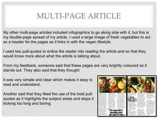
- The document summarizes feedback received on a vegan lifestyle booklet created by the author.
- Feedback was positive about the visually appealing front cover with large title and images. Some suggested including more social media photos.
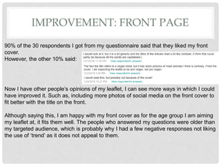
- Infographics using social media logos and images were seen as effective at engaging a younger audience.
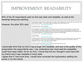
- Suggestions for improvement included addressing hyphenated words and making the first article page more visually interesting.
- The author incorporated feedback in revisions and learned new design skills in the process.


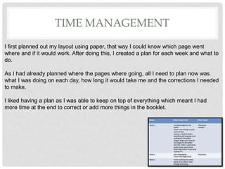
![FRONT COVER
I received three versions of people’s feedback evaluation on my booklet, and I’m going to
compare their opinions with my own evaluation on it.
They said that my strongest design in my booklet was my front cover, which I agree with as in my
opinion, the front cover needs to be the most visually appealing aspect of a booklet due to it being
the first thing a reader would see to make them want to read it. One comment from my feedback
said that the images and large title was my strongest part of the front cover. Another thought it
was nicely designed and I had made it clear on what the booklet was about, as well as having a
consistent theme that fits well together.
I had made another front cover beforehand, [image
on the left] but I felt as though it didn’t stand out as
much and it wasn’t colourful enough, which is why I
decided to change it.
I feel like I made the right decision from the feedback
I got, as well as my own opinion on it.](https://image.slidesharecdn.com/task6evaluationfinished2-170125155350/85/Task-6-evaluation-finished2-4-320.jpg)