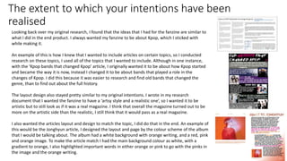
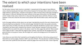
SlideShare a Scribd company logo
Evaluation
Sophie Husteden
The extent to which your intentions have been
realised
Looking back over my original research, I found that the ideas that I had for the fanzine are similar to
what I did in the end product. I always wanted my fanzine to be about Kpop, which I sticked with
while making it.
An example of this is how I knew that I wanted to include articles on certain topics, so I conducted
research on these topics, I used all of the topics that I wanted to include. Although in one instance,
with the ‘Kpop bands that changed Kpop’ article, I originally wanted it to be about how Kpop started
and became the way it is now, instead I changed it to be about bands that played a role in the
changes of Kpop. I did this because it was easier to research and find old bands that changed the
genre, than to find out about the full history.
The layout design also stayed pretty similar to my original intentions. I wrote in my research
document that I wanted the fanzine to have a ‘artsy style and a realistic one’, so I wanted it to be
artistic but to still look as if it was a real magazine. I think that overall the magazine turned out to be
more on the artistic side than the realistic, I still think that it would pass as a real magazine.
I also wanted the articles layout and design to match the topic, I did do that in the end. An example of
this would be the Jonghyun article, I designed the layout and page by the colour scheme of the album
that I would be talking about. The album had a white background with orange writing, and a red, pink
and orange image. To make the article match I had the main background colour as white, with a
gradient to orange, I also highlighted important words in either orange or pink to go with the pinks in
the image and the orange writing.
The extent to which your intentions have been
realised
For the colour scheme I both stuck to it and didn’t. I wanted each of the pages to have different
colour schemes based upon the topic of the article, however for the base colour scheme or for the
pages without a specific topic, I wanted it to be greys or other minimal colours with pops of bright or
neon colours. In the end I did base the colour scheme on the topic of the article. For the Holland
article I made an idea colour scheme for it, they were like pastel colours with bits of blues or pinks.
However in the end I chose for the article to be colored more like the album cover, which was dark
blues.
As for the pages without articles about one set topic I decided did not go for the color schemes that I
chose during the pre production. For the contents page I decided the color's be purples and pinks,
with a base colour of white, this does not match what I originally decided for my base colour scheme.
I decided to use these colors instead of the scheme I chose, because I wanted it to be very artistic
looking and for it to match the colors in the photo I used. For other pages like with the ‘Most viewed
music videos of 2017’ I went with the original colour scheme, and chose for the background to be
grey and there to be pops of colour, like the bright red I used as the background of the headline for
the article.
I also chose out some fonts that I wanted to use throughout the fanzine, I did end up using some of
these fonts on various pages, however I didn’t use most of them. This was because I ended up finding
other fonts that I preferred that also better suited the pages than most of the ones I chose originally.
The extent to which your intentions have been
realised
When doing pre production I decided on how I wanted my front cover to
look. I wanted it to be very artistic, also I did not come up with a name for
the fanzine because of this reason, and because I felt that it did not need
a name. In the plan I said that I wanted ‘. I have a couple ideas for what I
want my front cover to be like, one is that I will have bands names in
Hangul and have it going over a page’, I did this in the end with the front
cover as it has hangul writing going across the front, however I decided
the back should have the same words that were written on the front to
be on the back but in English. Another one of my original ideas was to
have a photo of an idol with writing going across the page, this was
inspired by an Off White advert and a different magazine cover that I
found. I did this idea in the end, but I put the two ideas together to come
up with the final design. I then decided that the back cover should be the
reverse of the front by having the writing in English and the image has
glitches in it.
The content/ The skills you have used
The front/back cover:
For the front and back cover I wanted them to be very artistic and abstract, this was to make it stand
out and to look different from everyone else's work. To create the base cover I chose an image of an idol
that I liked, I chose one of Irene from the band Red Velvet, I decided on this image because she is
looking straight at the camera which gives direct eye contact, also she has her hand doing a symbol this
makes the image look a bit more abstract. Another reason I chose this image is because just as I started
to create the covers, the band released these images which meant that they were new and relevant to
the time of creation.
For the back cover I used the same image as on the front but I made it look as if it was glitched, I did this
because I wanted the back cover to look like a reverse of the front. I created this by creating an overlay
that I added noise to then motion blurred it, this made it look grainy with rainbow parts in it, I then set
it as a blending mask on overlay.
To get the words across the images I used spray paint, I first printed off the images on A3 paper so that
it would be big enough for there to be lots of words across the page. I then cut out stencils of bands
names in hangul and repeated this in English using the same band names, I did this so that the paint
would be in specific places and would make up the words correctly. I then spray painted over the
stencils while moving the paint close and further away from the page, this was to create an uneven
coverage and make it look not so neat and like it had been messily done. Once it had dried I used some
sand paper to scratch the page to make it look more worn down and as if it was old. Next I scanned it in
so that it was in the computer, then I sized it down so it would fit the fanzine pages.
After I had sized the pages down, I decided to change how the covers looked using editing, I started by
changing the hue and saturation so that the image was darker and had a higher saturation. I then
changed the contrast so that it had a higher contrast, which made the red writing stand out more.
Contents page/page 2 & 3
The contents page I wanted to be quite simple and the layout to be a picture on the left and a list of
the page numbers to the right. I chose the image of the girl because she is doing a dance move that
accentuates the 3D technique that I put onto it, also because she is from a popular K-pop band. I
used a purple to pink gradient because I thought it looked good behind the colors used in the
image, also it goes with the colors I used to create the 3D image. I made the image go over onto the
3rd page as it made the pages look a bit more interesting, and it fills some of the space on the page
which makes it look less empty. For the font I used for the contents list, I used the one that was
used with most of the other pages. Also I made some of the writing pink to go with the color
scheme of the page and because it highlighted the important words.
To create the 3D image I started by cutting the girls body off of the background. Then I duplicated
the layer twice, so there was a total of 3 layers. The first layer I changed the hue to red, the second
one I changed to blue, but left the 3rd one. I then changed the opacity of the red and blue layers to
around 40%. After I moved the red layer to the left slightly, and the blue layer to the right a little,
this created the effect that the image is 3D. I chose to do a 3D image on this page because it makes
it look more interesting than if I had just used a normal picture of the girl.
I also made a small cartoon that I placed above the list for the contents page, I wanted this cartoon
to be the girl in the image I used. I made the cartoon by using shapes, I did this by placing a shape
then using the warp tool to change the shape of the pieces so that they looked the way I wanted
them to. To create the look of the hair being Ombre, I used a gradient going from blonde to pink. I
then made the top bit show some roots by having a gradient going from brown to blonde.
Jonghyun article/page 4 & 5
For the Jonghyun article there was a lot of writing so I had to layout the page accordingly, so
on the first page I put the main photo as I would have more room on the second page for the
text. On the first page the text is mainly about the artist, where as the second is more about
the album that was released. I chose to have the colours to be mainly white but with a
gradient to orange/pink, this was because it was meant to go with the album that the article is
about. Some of the words are in pink or orange, this was for important words in the text that I
wanted to stand out, and I picked pink and orange to match the overall colour scheme. On the
second page the text boxes are in a pattern where the second one is slightly more to the right
of the first, then the third is even further, this creates a waterfall effect. I also put an image of
the album on the bottom of the second page, this was because the text was about that
particular album and I wanted it to be shown on the page.
To make the smoke image, I started by finding an image of Jonghyun that I liked and was on a
side so I would be able to make one side of it Smokey. I cut him out of the background, then
duplicated that layer so I had two of Jonghyun. I then used the liquidfy tool on one of the
layers, I froze the front of his face and to his neck, then I stretched out the layer so that it
would be really big. One I did that I next added a vector mask while holding alt, then using a
smoke brush I painted in some smoke parts of the liquified layer back in. I next added some
extra smoke brush marks in pinks or oranges, to make it match the rest of the articles colour
scheme.
For the title of the article I wanted it to match the smoke picture of Jonghyun, so I made it
look slightly Smokey. I did this by rasterizing the layer type, so that it was no longer a font,
then I erased parts of the text using a smoke brush. I also added some smoke up to the text
from the image so it looks like it is coming from the image. I also made the colour of the
headline orange so that it matched the colour used at the bottom of the gradient.
BTS article/Page 6 & 7
For this article I wanted it to be themed on the band, and they do
mainly hip-hop music, so I chose to use the navy background, I also
wanted it to look like the night sky because the band are known as
‘stars’. I made the text wrap around the headline because I wanted
it look interesting and make all the text fit onto the left page. On
the right page I wanted to include a fact file on all of the members
of the band because it adds more context towards the article, also
it is for people that may not know the band very well. The pictures I
used for the band members is from their most recent promotional
images, I tried to choose the images where you could see the
members faces clearly. I also added a white stroke to each of the
images so they would stand out more against the background.
The text is in white because it stands out against the background.
Also the main font used is the same as the rest of the fanzine,
except for the fact file section of the page which had to be a
different font since there is hangul included. The headline for the
article is pink because it stood out against the background, and the
font is rounded pointed text I chose this because I thought it looked
best for the title.
For the Hollywood sign I made this by rotascoping an actual image
of the sign. I chose there to be the Hollywood sign in the bottom
right corner because the article is about them taking over America,
and Hollywood is known as the centre of America for celebrities.
Most viewed MV 2017/ Page 8 & 9
Since there was no specific band that this article was about I got to decide exactly how
it would be coloured or laid out. I chose the background to be quite minimal and have
it grey, then the headline is backed in red. For the headline I wanted most of the text
the be backed on red and be the colour of the background to create the effect of it
being cut out. The 2017 is coloured the same red as the background of the rest of the
headline, I did this because I wanted it to stand out from the rest of the headline. I put
the headline onto the second page because I wanted to make it look interesting, since
it makes it look different from all the rest of the pages. I put the tagline/opening
sentence of the article on the left page above the grid, I did this because it would be
the first thing that someone would read. The rest of the text wraps around the
headline box, this is so that it will fit into that space and not interfere with the grid.
I chose to layout the music video list as a grid, this is because it is a good looking and
interesting way of laying out a list. I started the grid with a white coloured box with
black writing then every other one was opposite the this. I did this because when I
tried to colour it according to the song it made the page look too busy, so I changed it
to match the minimal style of the rest of the page. For each section of the grid I put
the thumbnail of the music video, I added a black stroke and added a drop shadow to
make it look more 3D. I then wrote the name of the music video and the artist
underneath the picture, I had these in a font that is the font or similar to the font used
on the albums for each of these songs. Then underneath all that I put the number that
the music video was at in red and the same font used for the writing, I then added a
drop shadow and a contour onto each number to make it stand out more against the
rest of the text.
Holland article/page 10 & 11
For this page I wanted the colour scheme to match the one used for the album cover that the
article is about, this is different types of blues. When printed I found that the gradient was a
lot darker than it appeared in the digital copy. I wanted the font to match the style of the one
used for the album, this was a thin and curly styled font, I decided to go with a thin font but
when I tried to have it be curly it made the text difficult to read. On the left page the font is in
white, this is due to the background being too dark for it to be in black, however it was in
black on the right page since the colour is too light for white font to be used. I did however
change the page number to be opposite to the main colour of the font on that page, so on the
left it is in black where as the main text is in white, this is to make it stand out from the rest of
the font.
I made a scene out of the film ‘Peter Pan’ out of shapes and placed it mainly on the left page,
but had it over lapping to the right. I chose to make this scene because it is very famous, also
the album that the article is based on is all about neverland, so I chose to link the page to the
film. I made the Peter pan silhouette by rotoscoping an image of him then making it the same
grey colour as the building. I wanted the building to overlap onto the right page because it
helped to link the pages together and make them look as if they're part of the same article. I
put the name of the article on the building, because I wanted it to stand out and be in a place
that looked different and more interesting than if it was just at the top of the page. I also
added glitter behind some of the clocktower, this was to add something different to the
background of the image, I made this by getting an image of glitter and cutting out most of the
background, then changing the blending settings so it blended with the background better.
On the right page I made a collage of photos from the artist or from the music video, this was
to add a bit more on the artist and make it look like it was about him and not Peter pan. This
was put next to a small fact file on the artist, I chose this as it showed him along side the
information about him.
Most viewed MV of all time/page 12 & 13
When making this page I wanted it to match the style of the ‘Most
viewed Music videos of 2017’ article, due to them having similar
topics. This is why I chose to have a red black and white colour
scheme, and use the grids to display the information.
With the grids I decided to have a similar style to the 2017 article
but have them be the main part of the article instead of there being
some text as well, I also made the grids colours go opposite to the
ones in the 2017 article so it started with white where the other
one started with black. Similarly to the 2017 article I chose to use
different fonts for each of the different songs, that matched the one
used for the songs album, this was used so that the style did not get
too repetitive and so that it would show case more of the songs
style. I used the thumbnail of the song, I added a red stroke and a
drop shadow to make it stand out, also to match the red stroke I
added to all of the boxes of the grid.
For the main headline I wanted it to be backed on red, this was to
match the 2017 article, also as it would match with the colour
scheme. I chose to use the same font that was used for most of the
articles. The small description of the article is wrapped around the
text, this was to make it fit into the space, also be cause I liked the
way that it looked.
Old and new artists/page 14 & 15
These actually two different articles, however I made them to be similar since they
have a similar topic. On the left is the Old artists article, this was made first and I
decided to use grids similar to the most viewed music video articles, however I
wanted them to be vertical so that they looked different from those grids. For each
separate grid I chose a background colour that was used for the band or one of their
albums, for instance with the band H.O.T. I chose the background to be navy to
white, because this was the colours used for most of their albums and backgrounds. I
also chose an image of the band, and put it on opposing sides every other box, so for
the first one the picture is on the right then the next it is on the left, the same is with
the name of the band. For the fonts used I chose to use the same font as the overall
font of the fanzine, however for each of the bands names I used the font of their
albums. When printed some of the colours of the boxes were too dark so they just
appear as black, which is something I would change if I were to reprint the fanzine.
The new artists page has the same layout as the old artists page, I did this because I
wanted them to match, but be opposite to each other so I made the old artists one
dark themed and the new artists one more light themed, I did this by making the
headline box black on the old page and white on the new page, also I tried to choose
lighter colours for the new bands and darker ones for the old page.
One thing I noticed after having printed the fanzine out is that I put the wrong page
numbers on the pages, this is because I made these pages first and then made the
rest, and I later had to add 4 extra pages into the fanzine, so I never got around to
changing the numbers. This is another thing I would change if I were to reprint it.
The style
My fanzine is in a very artistic style, I wanted to have it like this because it
meant that I would have more freedom on how I could lay it out or make it
look. Also because the topic of the fanzine is quite niche meaning that I could
be more artistic with the style of the whole thing.
I chose to not plan the style of the layout and articles so much because I wanted
to do it based upon the topics of each article. I chose to do this because I
wanted it to fit the styles of the artists that I wrote about instead of it being
only one specific way, I did this because it meant that I had more freedom to
make each page different and more artistic than if I had one set theme.
I styled the front and back cover so that it would be very artistic while also
being kind of minimalistic. It is minimal in the sense that there is little to no
actual writing on them, such as a title or blurb or anything, there is only writing
that is meant to be artistic.
On other articles I chose for them to look more realistic to how an actual article
would look, such as the Jonghyun article. This article does have parts of it that
are very artistic such as the smoke picture, however it has a similar layout to
what a real magazine would have. Like how there is lots of text that is laid out in
a way that it would be in a real magazine.
The appropriateness of your work for the
audience
There is no specific audience for my fanzine, the only thing that made someone the audience for
my magazine was that they liked Kpop, this meant that my fanzine had to be appropriate for
people of any age. To make sure that it was age appropriate I had to make sure that the topics I
used for the articles all were appropriate, I chose topics that were relevant to what was happening
in the community at the time when I was conducting the research for the fanzine, for instance I
chose the topic of the most viewed music videos of 2017 because when I was researching for
topics of the fanzine it had just turned 2018 so it was quite relevant to that time. I also chose
other topics for bigger articles that I knew would be interesting for the audience to read about.
I made the fanzine in English, which means that the audience has to be based in English speaking
countries. Doing this meant that I could write about certain topics that are disapproved of in other
countries. For instance with the Holland article it was about a gay man, this is not a spoken about
topic in South Korea, so having it for English speaking people meant that I could write about that
and that it would have been seen as in appropriate.
Another article that is a sensitive topic to have written about was the Jonghyun article, this is
because it is a tribute article towards an artist that committed suicide, this is an another topic that
is seen as taboo to talk about in South Korea. So the fanzine being aimed towards English speaking
countries means that I was able to write about him as it would be seen as inappropriate if it were
aimed towards Koreans.
How your skills have developed
I chose as one of my pieces of work to compare with was some pages out of
my children's book from the first year. I made the book based on the story of
the princess and the pea but used foxes instead of humans.
On the page with the fox laying on the bed, I made that page by rotascoping a
picture of a bed frame, I used the same technique when I made the
Hollywood sign on the BTS article, I also used the same technique when I
made the flowers on the wedding page. If you look at how I made the bed
frame you can see that it was not done very well, and that it looks quite
choppy and blurry at certain points. If this is compared to the Hollywood sign
you can see that it has been done much better and looks less choppy, there is
also more detail included in certain points such as the grids behind some of
the letters, this shows how I am now able to create more detailed rotascopes
that look more accurate.
The book pages also show how I have improved with being able to place
writing onto a page. For instance with the bad page of the book the text looks
so awkward and is difficult to read, whereas on the BTS article page I have laid
out the writing so that it wraps around the headline which creates a cool
layout and design. This shows how I have improved the way that I place text
and make it fit onto a page.
Areas for improvement.
Overall I like the way that the fanzine turned and there are not many
things I would change or improve. One thing however is that when I
first printed out the fanzine I set the resolution of the pages too low
which caused them to all look blurry, I then reprinted it but changed
the resolution so that they wouldn’t be blurry, however I did not
change the covers, which meant that they were printed too blurry
again. So if I were to remake the fanzine I would set the resolution of
the cover to be higher.
Another thing I would change is that on the old artist page and new
artist page there is the wrong page number used, I would change this
so that it is correct. I would also change the color on some of the
boxes on these pages because they are too dark so when they are
printed they show up as black, I would just make them a bit lighter so
that would not happen.
Other than those things I don’t think there is anything else I would
change, because as I said I am happy with how the rest of the pages
turned out.

More Related Content

What's hot

Music magazine construction
Music magazine constructionMusic magazine construction
Music magazine constructionbenjichandra
 
Response to feedback
Response to feedbackResponse to feedback
Response to feedback
Tom Jenkins
 
Lili brewin development pro forma
Lili brewin development pro forma Lili brewin development pro forma
Lili brewin development pro forma
Lili_Brewin
 
Development pro forma rich b
Development pro forma rich bDevelopment pro forma rich b
Development pro forma rich b
richard barber
 
Fmp planning (final)
Fmp planning (final)Fmp planning (final)
Fmp planning (final)
HarrietSmith35
 
Factual Writing Evaluation
Factual Writing EvaluationFactual Writing Evaluation
Factual Writing Evaluation
cloestead
 
Question 1
Question 1Question 1
Question 1
Anya Wagstaff
 
production experiments for magazine
production experiments for magazineproduction experiments for magazine
production experiments for magazine
DanMorland
 
Final plans for music magazine
Final plans for music magazineFinal plans for music magazine
Final plans for music magazine
SuzyQuinn13
 
Factual Writing Evaluation (improved)
Factual Writing Evaluation (improved)Factual Writing Evaluation (improved)
Factual Writing Evaluation (improved)
cloestead
 
Improvements fmp production
Improvements fmp productionImprovements fmp production
Improvements fmp production
Libby Whitehorn
 
Focus Group
Focus GroupFocus Group
Focus Group
Molly Turner
 
Development pro forma
Development pro formaDevelopment pro forma
Development pro forma
Cameron Barnes
 
Digital graphics evaluation pro forma
Digital graphics evaluation pro formaDigital graphics evaluation pro forma
Digital graphics evaluation pro forma
Tom-Brett
 
Development pro forma(3)
Development pro forma(3)Development pro forma(3)
Development pro forma(3)
Richard Acaster
 

What's hot (17)

Music magazine construction
Music magazine constructionMusic magazine construction
Music magazine construction
 
Response to feedback
Response to feedbackResponse to feedback
Response to feedback
 
Lili brewin development pro forma
Lili brewin development pro forma Lili brewin development pro forma
Lili brewin development pro forma
 
Development pro forma rich b
Development pro forma rich bDevelopment pro forma rich b
Development pro forma rich b
 
Fmp planning (final)
Fmp planning (final)Fmp planning (final)
Fmp planning (final)
 
Factual Writing Evaluation
Factual Writing EvaluationFactual Writing Evaluation
Factual Writing Evaluation
 
Question 1
Question 1Question 1
Question 1
 
production experiments for magazine
production experiments for magazineproduction experiments for magazine
production experiments for magazine
 
Presentation1
Presentation1Presentation1
Presentation1
 
Final plans for music magazine
Final plans for music magazineFinal plans for music magazine
Final plans for music magazine
 
Factual Writing Evaluation (improved)
Factual Writing Evaluation (improved)Factual Writing Evaluation (improved)
Factual Writing Evaluation (improved)
 
Improvements fmp production
Improvements fmp productionImprovements fmp production
Improvements fmp production
 
Focus Group
Focus GroupFocus Group
Focus Group
 
Q1
Q1Q1
Q1
 
Development pro forma
Development pro formaDevelopment pro forma
Development pro forma
 
Digital graphics evaluation pro forma
Digital graphics evaluation pro formaDigital graphics evaluation pro forma
Digital graphics evaluation pro forma
 
Development pro forma(3)
Development pro forma(3)Development pro forma(3)
Development pro forma(3)
 

Similar to Evaluation

Construction Of Diverse 2
Construction Of Diverse 2Construction Of Diverse 2
Construction Of Diverse 2mediaanie
 
Construction process
Construction processConstruction process
Construction processNatalie
 
Evaluation
Evaluation Evaluation
Evaluation
Simran Jabbal
 
Evaluation
Evaluation Evaluation
Evaluation
Simran Jabbal
 
6. fmp production reflection
6. fmp production reflection6. fmp production reflection
6. fmp production reflection
chrislaw34
 
Front cover (2)
Front cover (2)Front cover (2)
Front cover (2)nailapb
 
Final%20 magazine%20–%20double%20page%20spread[2]
Final%20 magazine%20–%20double%20page%20spread[2]Final%20 magazine%20–%20double%20page%20spread[2]
Final%20 magazine%20–%20double%20page%20spread[2]stephanieallmark64
 
Evaluation
EvaluationEvaluation
Evaluationmediafan
 
Planning, creating my magazine
Planning, creating my magazinePlanning, creating my magazine
Planning, creating my magazineFrancoisAli
 
Evaluation powerpoint
Evaluation powerpointEvaluation powerpoint
Evaluation powerpointAnya Clayton
 
Evaluation
EvaluationEvaluation
Evaluation
gbrownchs
 
Question 2 Evaluation.
Question 2 Evaluation.Question 2 Evaluation.
Question 2 Evaluation.
Lisa_heseltine
 
Question 2 - Evaluation.
Question 2 - Evaluation.Question 2 - Evaluation.
Question 2 - Evaluation.
Lisa_heseltine
 
Question 1
Question 1Question 1
Question 1
s1500165
 
Question 1 evaluation
Question 1 evaluationQuestion 1 evaluation
Question 1 evaluation
emmajaneswannx
 
Question 1 evaluation
Question 1 evaluationQuestion 1 evaluation
Question 1 evaluation
emmajaneswannx
 
Daily Reflections
Daily ReflectionsDaily Reflections
Daily Reflections
Leticia Pozze
 
Production Process
Production ProcessProduction Process
Production Process
RachelOConnell20
 
Contents page layout
Contents page layoutContents page layout
Contents page layout
Maleeha17
 

Similar to Evaluation (20)

Construction Of Diverse 2
Construction Of Diverse 2Construction Of Diverse 2
Construction Of Diverse 2
 
Construction process
Construction processConstruction process
Construction process
 
Evaluation
Evaluation Evaluation
Evaluation
 
Evaluation
Evaluation Evaluation
Evaluation
 
6. fmp production reflection
6. fmp production reflection6. fmp production reflection
6. fmp production reflection
 
Front cover (2)
Front cover (2)Front cover (2)
Front cover (2)
 
Final%20 magazine%20–%20double%20page%20spread[2]
Final%20 magazine%20–%20double%20page%20spread[2]Final%20 magazine%20–%20double%20page%20spread[2]
Final%20 magazine%20–%20double%20page%20spread[2]
 
Evaluation
EvaluationEvaluation
Evaluation
 
Planning, creating my magazine
Planning, creating my magazinePlanning, creating my magazine
Planning, creating my magazine
 
Evaluation powerpoint
Evaluation powerpointEvaluation powerpoint
Evaluation powerpoint
 
Evaluation
EvaluationEvaluation
Evaluation
 
Question 2 Evaluation.
Question 2 Evaluation.Question 2 Evaluation.
Question 2 Evaluation.
 
Question 2 - Evaluation.
Question 2 - Evaluation.Question 2 - Evaluation.
Question 2 - Evaluation.
 
Question 1
Question 1Question 1
Question 1
 
Evaluation text
Evaluation textEvaluation text
Evaluation text
 
Question 1 evaluation
Question 1 evaluationQuestion 1 evaluation
Question 1 evaluation
 
Question 1 evaluation
Question 1 evaluationQuestion 1 evaluation
Question 1 evaluation
 
Daily Reflections
Daily ReflectionsDaily Reflections
Daily Reflections
 
Production Process
Production ProcessProduction Process
Production Process
 
Contents page layout
Contents page layoutContents page layout
Contents page layout
 

More from Sophie Husteden (20)

Presentation
PresentationPresentation
Presentation
 
Assets
AssetsAssets
Assets
 
Poster production
Poster productionPoster production
Poster production
 
Initial ideas and research
Initial ideas and researchInitial ideas and research
Initial ideas and research
 
The brief
The briefThe brief
The brief
 
Team work
Team work Team work
Team work
 
Premier pro
Premier proPremier pro
Premier pro
 
Sound
SoundSound
Sound
 
Green screen
Green screenGreen screen
Green screen
 
3d printing
3d printing3d printing
3d printing
 
Psychigeography
PsychigeographyPsychigeography
Psychigeography
 
Arduino
ArduinoArduino
Arduino
 
Rapid prototyping
Rapid prototypingRapid prototyping
Rapid prototyping
 
Research mosi
Research mosi Research mosi
Research mosi
 
Research
Research Research
Research
 
Egg drop
Egg dropEgg drop
Egg drop
 
Trilogies
TrilogiesTrilogies
Trilogies
 
Evaluation
EvaluationEvaluation
Evaluation
 
Idea development pro forma
Idea development pro formaIdea development pro forma
Idea development pro forma
 
Task 2 criticle approaches 2
Task 2 criticle approaches 2Task 2 criticle approaches 2
Task 2 criticle approaches 2
 

Recently uploaded

How to create an effective K-POC tutorial
How to create an effective K-POC tutorialHow to create an effective K-POC tutorial
How to create an effective K-POC tutorial
vencislavkaaa
 
How Mentoring Elevates Your PM Career | PMI Silver Spring Chapter
How Mentoring Elevates Your PM Career | PMI Silver Spring ChapterHow Mentoring Elevates Your PM Career | PMI Silver Spring Chapter
How Mentoring Elevates Your PM Career | PMI Silver Spring Chapter
Hector Del Castillo, CPM, CPMM
 
原版制作(RMIT毕业证书)墨尔本皇家理工大学毕业证在读证明一模一样
原版制作(RMIT毕业证书)墨尔本皇家理工大学毕业证在读证明一模一样原版制作(RMIT毕业证书)墨尔本皇家理工大学毕业证在读证明一模一样
原版制作(RMIT毕业证书)墨尔本皇家理工大学毕业证在读证明一模一样
atwvhyhm
 
DIGITAL MARKETING COURSE IN CHENNAI.pptx
DIGITAL MARKETING COURSE IN CHENNAI.pptxDIGITAL MARKETING COURSE IN CHENNAI.pptx
DIGITAL MARKETING COURSE IN CHENNAI.pptx
FarzanaRbcomcs
 
Brand Identity For A Sportscaster Project and Portfolio I
Brand Identity For A Sportscaster Project and Portfolio IBrand Identity For A Sportscaster Project and Portfolio I
Brand Identity For A Sportscaster Project and Portfolio I
thomasaolson2000
 
135. Reviewer Certificate in Journal of Engineering
135. Reviewer Certificate in Journal of Engineering135. Reviewer Certificate in Journal of Engineering
135. Reviewer Certificate in Journal of Engineering
Manu Mitra
 
Operating system. short answes and Interview questions .pdf
Operating system. short answes and Interview questions .pdfOperating system. short answes and Interview questions .pdf
Operating system. short answes and Interview questions .pdf
harikrishnahari6276
 
How to Master LinkedIn for Career and Business
How to Master LinkedIn for Career and BusinessHow to Master LinkedIn for Career and Business
How to Master LinkedIn for Career and Business
ideatoipo
 
Full Sail_Morales_Michael_SMM_2024-05.pptx
Full Sail_Morales_Michael_SMM_2024-05.pptxFull Sail_Morales_Michael_SMM_2024-05.pptx
Full Sail_Morales_Michael_SMM_2024-05.pptx
mmorales2173
 
欧洲杯买球平台-欧洲杯买球平台推荐-欧洲杯买球平台| 立即访问【ac123.net】
欧洲杯买球平台-欧洲杯买球平台推荐-欧洲杯买球平台| 立即访问【ac123.net】欧洲杯买球平台-欧洲杯买球平台推荐-欧洲杯买球平台| 立即访问【ac123.net】
欧洲杯买球平台-欧洲杯买球平台推荐-欧洲杯买球平台| 立即访问【ac123.net】
foismail170
 
一比一原版(UVic毕业证)维多利亚大学毕业证如何办理
一比一原版(UVic毕业证)维多利亚大学毕业证如何办理一比一原版(UVic毕业证)维多利亚大学毕业证如何办理
一比一原版(UVic毕业证)维多利亚大学毕业证如何办理
pxyhy
 
Andrea Kate Portfolio Presentation.pdf
Andrea Kate  Portfolio  Presentation.pdfAndrea Kate  Portfolio  Presentation.pdf
Andrea Kate Portfolio Presentation.pdf
andreakaterasco
 
The Impact of Artificial Intelligence on Modern Society.pdf
The Impact of Artificial Intelligence on Modern Society.pdfThe Impact of Artificial Intelligence on Modern Society.pdf
The Impact of Artificial Intelligence on Modern Society.pdf
ssuser3e63fc
 
han han widi kembar tapi beda han han dan widi kembar tapi sama
han han widi kembar tapi beda han han dan widi kembar tapi samahan han widi kembar tapi beda han han dan widi kembar tapi sama
han han widi kembar tapi beda han han dan widi kembar tapi sama
IrlanMalik
 
Digital Marketing Training In Bangalore
Digital  Marketing Training In BangaloreDigital  Marketing Training In Bangalore
Digital Marketing Training In Bangalore
nidm599
 
Heidi Livengood Resume Senior Technical Recruiter / HR Generalist
Heidi Livengood Resume Senior Technical Recruiter / HR GeneralistHeidi Livengood Resume Senior Technical Recruiter / HR Generalist
Heidi Livengood Resume Senior Technical Recruiter / HR Generalist
HeidiLivengood
 
Exploring Career Paths in Cybersecurity for Technical Communicators
Exploring Career Paths in Cybersecurity for Technical CommunicatorsExploring Career Paths in Cybersecurity for Technical Communicators
Exploring Career Paths in Cybersecurity for Technical Communicators
Ben Woelk, CISSP, CPTC
 
一比一原版(YU毕业证)约克大学毕业证如何办理
一比一原版(YU毕业证)约克大学毕业证如何办理一比一原版(YU毕业证)约克大学毕业证如何办理
一比一原版(YU毕业证)约克大学毕业证如何办理
yuhofha
 
DOC-20240602-WA0001..pdf DOC-20240602-WA0001..pdf
DOC-20240602-WA0001..pdf DOC-20240602-WA0001..pdfDOC-20240602-WA0001..pdf DOC-20240602-WA0001..pdf
DOC-20240602-WA0001..pdf DOC-20240602-WA0001..pdf
Pushpendra Kumar
 
欧洲杯投注网站-欧洲杯投注网站推荐-欧洲杯投注网站| 立即访问【ac123.net】
欧洲杯投注网站-欧洲杯投注网站推荐-欧洲杯投注网站| 立即访问【ac123.net】欧洲杯投注网站-欧洲杯投注网站推荐-欧洲杯投注网站| 立即访问【ac123.net】
欧洲杯投注网站-欧洲杯投注网站推荐-欧洲杯投注网站| 立即访问【ac123.net】
foismail170
 

Recently uploaded (20)

How to create an effective K-POC tutorial
How to create an effective K-POC tutorialHow to create an effective K-POC tutorial
How to create an effective K-POC tutorial
 
How Mentoring Elevates Your PM Career | PMI Silver Spring Chapter
How Mentoring Elevates Your PM Career | PMI Silver Spring ChapterHow Mentoring Elevates Your PM Career | PMI Silver Spring Chapter
How Mentoring Elevates Your PM Career | PMI Silver Spring Chapter
 
原版制作(RMIT毕业证书)墨尔本皇家理工大学毕业证在读证明一模一样
原版制作(RMIT毕业证书)墨尔本皇家理工大学毕业证在读证明一模一样原版制作(RMIT毕业证书)墨尔本皇家理工大学毕业证在读证明一模一样
原版制作(RMIT毕业证书)墨尔本皇家理工大学毕业证在读证明一模一样
 
DIGITAL MARKETING COURSE IN CHENNAI.pptx
DIGITAL MARKETING COURSE IN CHENNAI.pptxDIGITAL MARKETING COURSE IN CHENNAI.pptx
DIGITAL MARKETING COURSE IN CHENNAI.pptx
 
Brand Identity For A Sportscaster Project and Portfolio I
Brand Identity For A Sportscaster Project and Portfolio IBrand Identity For A Sportscaster Project and Portfolio I
Brand Identity For A Sportscaster Project and Portfolio I
 
135. Reviewer Certificate in Journal of Engineering
135. Reviewer Certificate in Journal of Engineering135. Reviewer Certificate in Journal of Engineering
135. Reviewer Certificate in Journal of Engineering
 
Operating system. short answes and Interview questions .pdf
Operating system. short answes and Interview questions .pdfOperating system. short answes and Interview questions .pdf
Operating system. short answes and Interview questions .pdf
 
How to Master LinkedIn for Career and Business
How to Master LinkedIn for Career and BusinessHow to Master LinkedIn for Career and Business
How to Master LinkedIn for Career and Business
 
Full Sail_Morales_Michael_SMM_2024-05.pptx
Full Sail_Morales_Michael_SMM_2024-05.pptxFull Sail_Morales_Michael_SMM_2024-05.pptx
Full Sail_Morales_Michael_SMM_2024-05.pptx
 
欧洲杯买球平台-欧洲杯买球平台推荐-欧洲杯买球平台| 立即访问【ac123.net】
欧洲杯买球平台-欧洲杯买球平台推荐-欧洲杯买球平台| 立即访问【ac123.net】欧洲杯买球平台-欧洲杯买球平台推荐-欧洲杯买球平台| 立即访问【ac123.net】
欧洲杯买球平台-欧洲杯买球平台推荐-欧洲杯买球平台| 立即访问【ac123.net】
 
一比一原版(UVic毕业证)维多利亚大学毕业证如何办理
一比一原版(UVic毕业证)维多利亚大学毕业证如何办理一比一原版(UVic毕业证)维多利亚大学毕业证如何办理
一比一原版(UVic毕业证)维多利亚大学毕业证如何办理
 
Andrea Kate Portfolio Presentation.pdf
Andrea Kate  Portfolio  Presentation.pdfAndrea Kate  Portfolio  Presentation.pdf
Andrea Kate Portfolio Presentation.pdf
 
The Impact of Artificial Intelligence on Modern Society.pdf
The Impact of Artificial Intelligence on Modern Society.pdfThe Impact of Artificial Intelligence on Modern Society.pdf
The Impact of Artificial Intelligence on Modern Society.pdf
 
han han widi kembar tapi beda han han dan widi kembar tapi sama
han han widi kembar tapi beda han han dan widi kembar tapi samahan han widi kembar tapi beda han han dan widi kembar tapi sama
han han widi kembar tapi beda han han dan widi kembar tapi sama
 
Digital Marketing Training In Bangalore
Digital  Marketing Training In BangaloreDigital  Marketing Training In Bangalore
Digital Marketing Training In Bangalore
 
Heidi Livengood Resume Senior Technical Recruiter / HR Generalist
Heidi Livengood Resume Senior Technical Recruiter / HR GeneralistHeidi Livengood Resume Senior Technical Recruiter / HR Generalist
Heidi Livengood Resume Senior Technical Recruiter / HR Generalist
 
Exploring Career Paths in Cybersecurity for Technical Communicators
Exploring Career Paths in Cybersecurity for Technical CommunicatorsExploring Career Paths in Cybersecurity for Technical Communicators
Exploring Career Paths in Cybersecurity for Technical Communicators
 
一比一原版(YU毕业证)约克大学毕业证如何办理
一比一原版(YU毕业证)约克大学毕业证如何办理一比一原版(YU毕业证)约克大学毕业证如何办理
一比一原版(YU毕业证)约克大学毕业证如何办理
 
DOC-20240602-WA0001..pdf DOC-20240602-WA0001..pdf
DOC-20240602-WA0001..pdf DOC-20240602-WA0001..pdfDOC-20240602-WA0001..pdf DOC-20240602-WA0001..pdf
DOC-20240602-WA0001..pdf DOC-20240602-WA0001..pdf
 
欧洲杯投注网站-欧洲杯投注网站推荐-欧洲杯投注网站| 立即访问【ac123.net】
欧洲杯投注网站-欧洲杯投注网站推荐-欧洲杯投注网站| 立即访问【ac123.net】欧洲杯投注网站-欧洲杯投注网站推荐-欧洲杯投注网站| 立即访问【ac123.net】
欧洲杯投注网站-欧洲杯投注网站推荐-欧洲杯投注网站| 立即访问【ac123.net】
 

Evaluation

  • 2. The extent to which your intentions have been realised Looking back over my original research, I found that the ideas that I had for the fanzine are similar to what I did in the end product. I always wanted my fanzine to be about Kpop, which I sticked with while making it. An example of this is how I knew that I wanted to include articles on certain topics, so I conducted research on these topics, I used all of the topics that I wanted to include. Although in one instance, with the ‘Kpop bands that changed Kpop’ article, I originally wanted it to be about how Kpop started and became the way it is now, instead I changed it to be about bands that played a role in the changes of Kpop. I did this because it was easier to research and find old bands that changed the genre, than to find out about the full history. The layout design also stayed pretty similar to my original intentions. I wrote in my research document that I wanted the fanzine to have a ‘artsy style and a realistic one’, so I wanted it to be artistic but to still look as if it was a real magazine. I think that overall the magazine turned out to be more on the artistic side than the realistic, I still think that it would pass as a real magazine. I also wanted the articles layout and design to match the topic, I did do that in the end. An example of this would be the Jonghyun article, I designed the layout and page by the colour scheme of the album that I would be talking about. The album had a white background with orange writing, and a red, pink and orange image. To make the article match I had the main background colour as white, with a gradient to orange, I also highlighted important words in either orange or pink to go with the pinks in the image and the orange writing.
  • 3. The extent to which your intentions have been realised For the colour scheme I both stuck to it and didn’t. I wanted each of the pages to have different colour schemes based upon the topic of the article, however for the base colour scheme or for the pages without a specific topic, I wanted it to be greys or other minimal colours with pops of bright or neon colours. In the end I did base the colour scheme on the topic of the article. For the Holland article I made an idea colour scheme for it, they were like pastel colours with bits of blues or pinks. However in the end I chose for the article to be colored more like the album cover, which was dark blues. As for the pages without articles about one set topic I decided did not go for the color schemes that I chose during the pre production. For the contents page I decided the color's be purples and pinks, with a base colour of white, this does not match what I originally decided for my base colour scheme. I decided to use these colors instead of the scheme I chose, because I wanted it to be very artistic looking and for it to match the colors in the photo I used. For other pages like with the ‘Most viewed music videos of 2017’ I went with the original colour scheme, and chose for the background to be grey and there to be pops of colour, like the bright red I used as the background of the headline for the article. I also chose out some fonts that I wanted to use throughout the fanzine, I did end up using some of these fonts on various pages, however I didn’t use most of them. This was because I ended up finding other fonts that I preferred that also better suited the pages than most of the ones I chose originally.
  • 4. The extent to which your intentions have been realised When doing pre production I decided on how I wanted my front cover to look. I wanted it to be very artistic, also I did not come up with a name for the fanzine because of this reason, and because I felt that it did not need a name. In the plan I said that I wanted ‘. I have a couple ideas for what I want my front cover to be like, one is that I will have bands names in Hangul and have it going over a page’, I did this in the end with the front cover as it has hangul writing going across the front, however I decided the back should have the same words that were written on the front to be on the back but in English. Another one of my original ideas was to have a photo of an idol with writing going across the page, this was inspired by an Off White advert and a different magazine cover that I found. I did this idea in the end, but I put the two ideas together to come up with the final design. I then decided that the back cover should be the reverse of the front by having the writing in English and the image has glitches in it.
  • 5. The content/ The skills you have used The front/back cover: For the front and back cover I wanted them to be very artistic and abstract, this was to make it stand out and to look different from everyone else's work. To create the base cover I chose an image of an idol that I liked, I chose one of Irene from the band Red Velvet, I decided on this image because she is looking straight at the camera which gives direct eye contact, also she has her hand doing a symbol this makes the image look a bit more abstract. Another reason I chose this image is because just as I started to create the covers, the band released these images which meant that they were new and relevant to the time of creation. For the back cover I used the same image as on the front but I made it look as if it was glitched, I did this because I wanted the back cover to look like a reverse of the front. I created this by creating an overlay that I added noise to then motion blurred it, this made it look grainy with rainbow parts in it, I then set it as a blending mask on overlay. To get the words across the images I used spray paint, I first printed off the images on A3 paper so that it would be big enough for there to be lots of words across the page. I then cut out stencils of bands names in hangul and repeated this in English using the same band names, I did this so that the paint would be in specific places and would make up the words correctly. I then spray painted over the stencils while moving the paint close and further away from the page, this was to create an uneven coverage and make it look not so neat and like it had been messily done. Once it had dried I used some sand paper to scratch the page to make it look more worn down and as if it was old. Next I scanned it in so that it was in the computer, then I sized it down so it would fit the fanzine pages. After I had sized the pages down, I decided to change how the covers looked using editing, I started by changing the hue and saturation so that the image was darker and had a higher saturation. I then changed the contrast so that it had a higher contrast, which made the red writing stand out more.
  • 6. Contents page/page 2 & 3 The contents page I wanted to be quite simple and the layout to be a picture on the left and a list of the page numbers to the right. I chose the image of the girl because she is doing a dance move that accentuates the 3D technique that I put onto it, also because she is from a popular K-pop band. I used a purple to pink gradient because I thought it looked good behind the colors used in the image, also it goes with the colors I used to create the 3D image. I made the image go over onto the 3rd page as it made the pages look a bit more interesting, and it fills some of the space on the page which makes it look less empty. For the font I used for the contents list, I used the one that was used with most of the other pages. Also I made some of the writing pink to go with the color scheme of the page and because it highlighted the important words. To create the 3D image I started by cutting the girls body off of the background. Then I duplicated the layer twice, so there was a total of 3 layers. The first layer I changed the hue to red, the second one I changed to blue, but left the 3rd one. I then changed the opacity of the red and blue layers to around 40%. After I moved the red layer to the left slightly, and the blue layer to the right a little, this created the effect that the image is 3D. I chose to do a 3D image on this page because it makes it look more interesting than if I had just used a normal picture of the girl. I also made a small cartoon that I placed above the list for the contents page, I wanted this cartoon to be the girl in the image I used. I made the cartoon by using shapes, I did this by placing a shape then using the warp tool to change the shape of the pieces so that they looked the way I wanted them to. To create the look of the hair being Ombre, I used a gradient going from blonde to pink. I then made the top bit show some roots by having a gradient going from brown to blonde.
  • 7. Jonghyun article/page 4 & 5 For the Jonghyun article there was a lot of writing so I had to layout the page accordingly, so on the first page I put the main photo as I would have more room on the second page for the text. On the first page the text is mainly about the artist, where as the second is more about the album that was released. I chose to have the colours to be mainly white but with a gradient to orange/pink, this was because it was meant to go with the album that the article is about. Some of the words are in pink or orange, this was for important words in the text that I wanted to stand out, and I picked pink and orange to match the overall colour scheme. On the second page the text boxes are in a pattern where the second one is slightly more to the right of the first, then the third is even further, this creates a waterfall effect. I also put an image of the album on the bottom of the second page, this was because the text was about that particular album and I wanted it to be shown on the page. To make the smoke image, I started by finding an image of Jonghyun that I liked and was on a side so I would be able to make one side of it Smokey. I cut him out of the background, then duplicated that layer so I had two of Jonghyun. I then used the liquidfy tool on one of the layers, I froze the front of his face and to his neck, then I stretched out the layer so that it would be really big. One I did that I next added a vector mask while holding alt, then using a smoke brush I painted in some smoke parts of the liquified layer back in. I next added some extra smoke brush marks in pinks or oranges, to make it match the rest of the articles colour scheme. For the title of the article I wanted it to match the smoke picture of Jonghyun, so I made it look slightly Smokey. I did this by rasterizing the layer type, so that it was no longer a font, then I erased parts of the text using a smoke brush. I also added some smoke up to the text from the image so it looks like it is coming from the image. I also made the colour of the headline orange so that it matched the colour used at the bottom of the gradient.
  • 8. BTS article/Page 6 & 7 For this article I wanted it to be themed on the band, and they do mainly hip-hop music, so I chose to use the navy background, I also wanted it to look like the night sky because the band are known as ‘stars’. I made the text wrap around the headline because I wanted it look interesting and make all the text fit onto the left page. On the right page I wanted to include a fact file on all of the members of the band because it adds more context towards the article, also it is for people that may not know the band very well. The pictures I used for the band members is from their most recent promotional images, I tried to choose the images where you could see the members faces clearly. I also added a white stroke to each of the images so they would stand out more against the background. The text is in white because it stands out against the background. Also the main font used is the same as the rest of the fanzine, except for the fact file section of the page which had to be a different font since there is hangul included. The headline for the article is pink because it stood out against the background, and the font is rounded pointed text I chose this because I thought it looked best for the title. For the Hollywood sign I made this by rotascoping an actual image of the sign. I chose there to be the Hollywood sign in the bottom right corner because the article is about them taking over America, and Hollywood is known as the centre of America for celebrities.
  • 9. Most viewed MV 2017/ Page 8 & 9 Since there was no specific band that this article was about I got to decide exactly how it would be coloured or laid out. I chose the background to be quite minimal and have it grey, then the headline is backed in red. For the headline I wanted most of the text the be backed on red and be the colour of the background to create the effect of it being cut out. The 2017 is coloured the same red as the background of the rest of the headline, I did this because I wanted it to stand out from the rest of the headline. I put the headline onto the second page because I wanted to make it look interesting, since it makes it look different from all the rest of the pages. I put the tagline/opening sentence of the article on the left page above the grid, I did this because it would be the first thing that someone would read. The rest of the text wraps around the headline box, this is so that it will fit into that space and not interfere with the grid. I chose to layout the music video list as a grid, this is because it is a good looking and interesting way of laying out a list. I started the grid with a white coloured box with black writing then every other one was opposite the this. I did this because when I tried to colour it according to the song it made the page look too busy, so I changed it to match the minimal style of the rest of the page. For each section of the grid I put the thumbnail of the music video, I added a black stroke and added a drop shadow to make it look more 3D. I then wrote the name of the music video and the artist underneath the picture, I had these in a font that is the font or similar to the font used on the albums for each of these songs. Then underneath all that I put the number that the music video was at in red and the same font used for the writing, I then added a drop shadow and a contour onto each number to make it stand out more against the rest of the text.
  • 10. Holland article/page 10 & 11 For this page I wanted the colour scheme to match the one used for the album cover that the article is about, this is different types of blues. When printed I found that the gradient was a lot darker than it appeared in the digital copy. I wanted the font to match the style of the one used for the album, this was a thin and curly styled font, I decided to go with a thin font but when I tried to have it be curly it made the text difficult to read. On the left page the font is in white, this is due to the background being too dark for it to be in black, however it was in black on the right page since the colour is too light for white font to be used. I did however change the page number to be opposite to the main colour of the font on that page, so on the left it is in black where as the main text is in white, this is to make it stand out from the rest of the font. I made a scene out of the film ‘Peter Pan’ out of shapes and placed it mainly on the left page, but had it over lapping to the right. I chose to make this scene because it is very famous, also the album that the article is based on is all about neverland, so I chose to link the page to the film. I made the Peter pan silhouette by rotoscoping an image of him then making it the same grey colour as the building. I wanted the building to overlap onto the right page because it helped to link the pages together and make them look as if they're part of the same article. I put the name of the article on the building, because I wanted it to stand out and be in a place that looked different and more interesting than if it was just at the top of the page. I also added glitter behind some of the clocktower, this was to add something different to the background of the image, I made this by getting an image of glitter and cutting out most of the background, then changing the blending settings so it blended with the background better. On the right page I made a collage of photos from the artist or from the music video, this was to add a bit more on the artist and make it look like it was about him and not Peter pan. This was put next to a small fact file on the artist, I chose this as it showed him along side the information about him.
  • 11. Most viewed MV of all time/page 12 & 13 When making this page I wanted it to match the style of the ‘Most viewed Music videos of 2017’ article, due to them having similar topics. This is why I chose to have a red black and white colour scheme, and use the grids to display the information. With the grids I decided to have a similar style to the 2017 article but have them be the main part of the article instead of there being some text as well, I also made the grids colours go opposite to the ones in the 2017 article so it started with white where the other one started with black. Similarly to the 2017 article I chose to use different fonts for each of the different songs, that matched the one used for the songs album, this was used so that the style did not get too repetitive and so that it would show case more of the songs style. I used the thumbnail of the song, I added a red stroke and a drop shadow to make it stand out, also to match the red stroke I added to all of the boxes of the grid. For the main headline I wanted it to be backed on red, this was to match the 2017 article, also as it would match with the colour scheme. I chose to use the same font that was used for most of the articles. The small description of the article is wrapped around the text, this was to make it fit into the space, also be cause I liked the way that it looked.
  • 12. Old and new artists/page 14 & 15 These actually two different articles, however I made them to be similar since they have a similar topic. On the left is the Old artists article, this was made first and I decided to use grids similar to the most viewed music video articles, however I wanted them to be vertical so that they looked different from those grids. For each separate grid I chose a background colour that was used for the band or one of their albums, for instance with the band H.O.T. I chose the background to be navy to white, because this was the colours used for most of their albums and backgrounds. I also chose an image of the band, and put it on opposing sides every other box, so for the first one the picture is on the right then the next it is on the left, the same is with the name of the band. For the fonts used I chose to use the same font as the overall font of the fanzine, however for each of the bands names I used the font of their albums. When printed some of the colours of the boxes were too dark so they just appear as black, which is something I would change if I were to reprint the fanzine. The new artists page has the same layout as the old artists page, I did this because I wanted them to match, but be opposite to each other so I made the old artists one dark themed and the new artists one more light themed, I did this by making the headline box black on the old page and white on the new page, also I tried to choose lighter colours for the new bands and darker ones for the old page. One thing I noticed after having printed the fanzine out is that I put the wrong page numbers on the pages, this is because I made these pages first and then made the rest, and I later had to add 4 extra pages into the fanzine, so I never got around to changing the numbers. This is another thing I would change if I were to reprint it.
  • 13. The style My fanzine is in a very artistic style, I wanted to have it like this because it meant that I would have more freedom on how I could lay it out or make it look. Also because the topic of the fanzine is quite niche meaning that I could be more artistic with the style of the whole thing. I chose to not plan the style of the layout and articles so much because I wanted to do it based upon the topics of each article. I chose to do this because I wanted it to fit the styles of the artists that I wrote about instead of it being only one specific way, I did this because it meant that I had more freedom to make each page different and more artistic than if I had one set theme. I styled the front and back cover so that it would be very artistic while also being kind of minimalistic. It is minimal in the sense that there is little to no actual writing on them, such as a title or blurb or anything, there is only writing that is meant to be artistic. On other articles I chose for them to look more realistic to how an actual article would look, such as the Jonghyun article. This article does have parts of it that are very artistic such as the smoke picture, however it has a similar layout to what a real magazine would have. Like how there is lots of text that is laid out in a way that it would be in a real magazine.
  • 14. The appropriateness of your work for the audience There is no specific audience for my fanzine, the only thing that made someone the audience for my magazine was that they liked Kpop, this meant that my fanzine had to be appropriate for people of any age. To make sure that it was age appropriate I had to make sure that the topics I used for the articles all were appropriate, I chose topics that were relevant to what was happening in the community at the time when I was conducting the research for the fanzine, for instance I chose the topic of the most viewed music videos of 2017 because when I was researching for topics of the fanzine it had just turned 2018 so it was quite relevant to that time. I also chose other topics for bigger articles that I knew would be interesting for the audience to read about. I made the fanzine in English, which means that the audience has to be based in English speaking countries. Doing this meant that I could write about certain topics that are disapproved of in other countries. For instance with the Holland article it was about a gay man, this is not a spoken about topic in South Korea, so having it for English speaking people meant that I could write about that and that it would have been seen as in appropriate. Another article that is a sensitive topic to have written about was the Jonghyun article, this is because it is a tribute article towards an artist that committed suicide, this is an another topic that is seen as taboo to talk about in South Korea. So the fanzine being aimed towards English speaking countries means that I was able to write about him as it would be seen as inappropriate if it were aimed towards Koreans.
  • 15. How your skills have developed I chose as one of my pieces of work to compare with was some pages out of my children's book from the first year. I made the book based on the story of the princess and the pea but used foxes instead of humans. On the page with the fox laying on the bed, I made that page by rotascoping a picture of a bed frame, I used the same technique when I made the Hollywood sign on the BTS article, I also used the same technique when I made the flowers on the wedding page. If you look at how I made the bed frame you can see that it was not done very well, and that it looks quite choppy and blurry at certain points. If this is compared to the Hollywood sign you can see that it has been done much better and looks less choppy, there is also more detail included in certain points such as the grids behind some of the letters, this shows how I am now able to create more detailed rotascopes that look more accurate. The book pages also show how I have improved with being able to place writing onto a page. For instance with the bad page of the book the text looks so awkward and is difficult to read, whereas on the BTS article page I have laid out the writing so that it wraps around the headline which creates a cool layout and design. This shows how I have improved the way that I place text and make it fit onto a page.
  • 16. Areas for improvement. Overall I like the way that the fanzine turned and there are not many things I would change or improve. One thing however is that when I first printed out the fanzine I set the resolution of the pages too low which caused them to all look blurry, I then reprinted it but changed the resolution so that they wouldn’t be blurry, however I did not change the covers, which meant that they were printed too blurry again. So if I were to remake the fanzine I would set the resolution of the cover to be higher. Another thing I would change is that on the old artist page and new artist page there is the wrong page number used, I would change this so that it is correct. I would also change the color on some of the boxes on these pages because they are too dark so when they are printed they show up as black, I would just make them a bit lighter so that would not happen. Other than those things I don’t think there is anything else I would change, because as I said I am happy with how the rest of the pages turned out.