VIP Call Girl Sector 88 Gurgaon Delhi Just Call Me 9899900591
Evaltuation of preminilary taskk
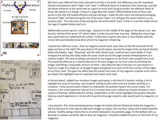
1. My front cover differed from how I planned it to look in my draft. One difference was the masthead.
Instead of putting the word “highs” and “lows” in different levels to emphasise their meaning, I just left
the whole sentence at the same level as I spent to much time trying to prefect the different levels of
those two words on In Design. It wasn't a huge deal that I hadn't differentiated levels of those two
words as the title still looked effective and eye catching. I made the title more interesting by enlarging
the word “High” and decreasing the size of the word “lows” so it still gave the same intention as my
previous idea. The only issue of decreasing the size of the word “lows” is that it is not that visible due to
the logo of Haydon School next to it.
Additionally concerning the schools logo, I placed it in the middle of the page so the yellow cross was
directly behind of the word “of” which makes it strike out and have meaning. Adding the school logo
was a good idea as it advertised the school. Furthermore anyone who went or was familiar with the
school will automatically know what school my magazine is featuring.
I placed four different issues , that my magazine would touch upon (two on the left hand side of the
page and two on the right) This was done to fill up the spaces around the image of the pin board directly
below the Haydon logo. “Recycling” and the other three issues could've been more bolder if I had
enlarged the writing and really made the issues stand out on the page instead of keeping them at a
medium height. The idea of adding a pin board to my magazine on the front cover popped into mind.
This would be effective as it would allow me to fit more images on my front cover by shrinking the
images and fitting a reasonable amount on there. I also liked the idea of the pins on a pin board so I
found an image of a single pin on Google Images and placed it on each of the four corners of the edges
of my front cover. This gave the effect that the actual front cover of my magazine could be stuck onto a
pin board. This highlights how its important and needs to be read.
In the pin board, I added four miniature images portraying a mid shot of a teacher smiling, a bin to
highlight the issue of recycling , two students smiling at each other and one student working on a
computer. These pictures were chosen to emphasizes the positive impacts the school makes. For
instance, a bin could represent how we try to increase how much rubbish we recycle and place in bins
instead of littering. Additionally the smiling stakeholders of the school highlights the positive attitudes
that you would experience in school which would encourage students, who would read my magazine, to
join.
I also placed a film strip consisting various images of articles that are featured inside the magazine. I
did this because its a fun way to add more images an colour into my front colour and it advertised the
schools healthy eating criteria that is an article featured in my contents page. To the bottom left is a
barcode so viewers would be able to buy my magazine, I should've added the price on the front of my
magazine.
2. I found my contents page was more easier to complete than my front cover as it consisted of less
things to do. I changed the title of my contents page to a sans serif font instead of bubble writing as
this was more professional and suited the rest of the writing on the page. I placed two images on
either side of the title which differed from my original plan of placing an image of the head teacher on
the right hand side. The images were both in a black background which said “Haydon School” and
“CucinA” which is the name of our school food canteen. This highlights how we are serious about
providing yummy foods to the students of Haydon school which increases the good image that the
school has to the public.
I then wrote four article names and page numbers on one section of the page. The writing was in the
same sans serif font as the title page as this looks more attractive than having various fonts which
would make it look messy. The page numbers were in a bold font and were portrayed to the right of
the article name. I used the same green colour on the descriptions as I had used on my front cover.
This was to keep familiarising my reader of the trend that my magazine has. Below the article names
were an image (three images) I was initially meant to place four images to create a film strip however
I just stuck to doing three as it was more time efficient. The first image was of a medium shot of two
students sitting down on chairs and talking. This is to represent the good communication the school
has between the students. The second image was of a high angle shot of a students uniform to
highlight how smartly dressed the students are. The last image was of the Haydon values which
connote how well respected they are around the school. In the images, I have placed in red the page
numbers people would need to turn to read that particular article. On the first image I also added a
red pin and four pins on the edges of the page to keep the theme of the pin board as featured on the
front cover.
On the second film strip I followed the same trend as the film strip above. The first image was a long
shot of the assembly hall, the second image was a long shot of the schools 6th form and the third shot
was another long shot of the schools gym. This was to familiarise my reader with the different places
that you would see around the school. I left a white gap between each image included in a film strip
so that the images did not appear to look squashed.
The last image on the bottom left hand side of my contents page was much larger than the rest of the
image to fill up the rest of the space left. The image is of a close up of a students foot wear. This is to
show that uniform is also well respected in our school. The fact that the last image is much bigger
than the rest of the images gives a professional effect from my contents page.
Overall my final contents page was much different from how I indented it to be on my draft however it
still turned out roughly what I wanted it to look like.