Task 5
•Download as PPTX, PDF•
0 likes•121 views
This document discusses the author's process of designing a poster for a band called Broken Arrow. It describes several drafts where the author experimented with fonts, colors, layout and use of white space. The final draft places the band name and social media information at the top to grab attention. It uses different fonts for the band names that are distinctive and blocky to make the page look less empty while handling the white space well. The different colors work well together without one color overpowering the others.
Report
Share
Report
Share

Recommended
Final masthead designs
I choose this font and color scheme to create consistency throughout the magazine and appeal to the target audience. Red is used to make elements stand out while black provides contrast. The informal font style suggests the varied music genres featured inside will not be too serious.
Factual page layout task 5
1) The document describes three page layout designs for concert posters at a venue called Fibbers.
2) The first design uses reversed colors and varying fonts to emphasize different elements like the band names.
3) The second design changes the background color to purple and centers the text, keeping a consistent font size.
4) The third design keeps a black background but uses red text that "screams" to audiences, with a horror-inspired font for the header to make it stand out.
Contents page powerpoint1
The document describes the process taken to design the contents page of a music magazine. Key details include:
- A black box was used as the background and colored in with a brush. Black was chosen to look good and match all colors.
- The title 'contents' is in purple, the dominant color. Contact info is in white to go with purple and black. Social media logos were added.
- A 'features' subheading in black introduces artist names and articles. Page numbers in purple match the color scheme.
- The front cover artist is used to provide continuity. Different selection tools were used to cut out the artist photo.
- The artist photo is placed in a gray
Peer feedback(1)
The document provides feedback on designs for different newspaper layouts: a broadsheet, tabloid, and fanzine.
For the broadsheet design, the feedback notes that the main headline font is too informal and would be better suited for a tabloid. It also suggests adding more content like advertisements.
Regarding the tabloid design, the feedback praises the attention-grabbing headline font but notes a minor issue with the number of asterisks used.
For the fanzine designs, the feedback appreciates the consistent color scheme and cropped photo style. However, it suggests using a clearer font color and reducing the number of fonts for better readability.
4. production experiments(1) (1)
The document describes experiments conducted for designing marketing materials for a heavy metal music festival. Key elements tested included using a radial gradient fade on posters to draw attention, including a large skull image associated with heavy metal, and using different colored text on tickets to highlight important information like dates and locations. Feedback received confirmed these techniques were effective at grabbing audience attention and clearly communicating essential details in an appealing way. Elements like the gradient fade and different colored text will be incorporated into the final marketing materials.
Research
- Nearly all magazines featured one person taking up most of the front cover to highlight their importance. This establishes a key focus for articles within.
- Double page spreads similarly featured one side with a large image of the subject to emphasize who will be discussed. This reduces required writing.
- Colors were often contrasted with the subject's outfit or image to create a visual link between them. This helps branding and recognition.
- Websites generally kept designs simple for easy navigation between pages of content. Simplicity aids understanding despite limited design complexity.
Evaluation question 5
The document discusses design elements used on magazine covers and pages that would attract audiences. These include using a large, bold masthead; a single large centered photo; limited colors like red, white, and black; capitalized or differently colored text to emphasize important words; celebrity names; and offers to entice readers. Photos, quotes, varied fonts, spaced out titles, and questions in columns make the contents visually interesting and help guide the reader through the magazine in an appealing way.
Identity branding
This document discusses how the different elements of a magazine work together to create a consistent identity. The author used the same colors, fonts, and similar images throughout their magazine to ensure the front cover, contents page, and double page spread all felt related. While the layout of each page differed based on the information and images, common branding elements like the house font, red/black/white color scheme, and people/clothing in the images allowed the magazine to have a cohesive look and feel. The goal was for readers to immediately recognize what publication they were viewing based on its unique attributes and style.
Contents page research
The document provides details about the contents pages of various music magazines. It describes the layout, use of images, section headings, and color schemes used across different magazine issues. The contents pages are consistently formatted with the magazine logo, date, section headings to help readers find articles of interest, and page numbers listed beside article titles and images. Bright colors are often used for backgrounds and fonts to attract readers and make important elements like article pages and section names stand out. Consistent formatting and features across issues helps readers easily navigate to find the content they want.
Research
The key similarities across the magazine products are:
1) They feature a single prominent person on the cover and double page spreads to indicate the main focus.
2) They use contrasting colors that relate to the featured person's clothing or image to clearly link elements.
3) The websites keep the design simple and easy to navigate between sections.
Contents page powerpoint1
The document describes the design process for a contents page of a music magazine. Key details include:
- A black box was used as the background and colored sections were added, including the title in purple and contact info in white.
- Feature names and page numbers were added in black and purple to complement the color scheme.
- An artist image was placed in a gray box to stand out from the white, black, and purple colors.
- Additional elements like an editor's letter and contest details were included to engage the target audience of 16-21 year olds.
Evaluation 1
The document summarizes how the author's media product uses, develops, and challenges conventions of real music magazines. Specifically:
- The title, "Bangerz", uses an unconventional spelling but targets a younger audience. Design elements like font and issue labeling follow conventions.
- Page layouts, like the two-column contents page, follow conventions while adding original elements like multiple images.
- Features like an exclusive interview on the double page spread develop on conventions by focusing on one artist rather than just providing information.
- Costumes and props used in photos, like headphones and clothing styles, reflect the electronic dance music genre and conventions used in other magazines to portray artists.
Evaluation 1
The document discusses how the author's media product uses, develops, and challenges conventions of real music magazines. Specifically, it summarizes how the magazine's cover, contents page, and double page spread draw from conventions of magazines like Mixmag while also adapting and challenging conventions to better suit the author's target EDM audience. Key points include using bold fonts and layouts on the cover inspired by Mixmag, including multiple images on the contents page for visual interest, and featuring an exclusive DJ interview on the double page spread rather than just informational articles. Costumes and props of models also reflect EDM iconography to represent the genre through appearance. Overall, the author draws from real magazine conventions but adapts them to craft a product
Evaluation 1
The document discusses how the author's media product uses, develops, and challenges conventions of real music magazines. Specifically, it summarizes how the magazine's cover, contents page, and double page spread draw from conventions of magazines like Mixmag while also adapting and challenging conventions to better suit the target EDM audience. For example, the title uses an unconventional spelling but bold font for visual appeal. Layouts draw from Mixmag but add more images for engagement. Clothing and props portray an aspirational lifestyle while reflecting EDM iconography. Overall, the design aims to look professional while exciting readers with its genre representation.
Question 5
The author tried to attract their audience with eye-catching design elements for their magazine, but realized they may have distracted from each other. The color scheme and layout did not resemble a magazine in the intended genre. In retrospect, familiarizing themselves with examples of magazines in that genre would have provided better ideas than designing independently. The article layout needs improvement to look more professional as the text lines were improperly measured. Overall, the author recognizes more research on magazine design conventions is needed to strengthen the layout and professional appearance of the magazine.
Masthead decisions
The document discusses the process of selecting and refining a font for a magazine masthead. The author initially chose an "acid dripping font" but realized it better represented horror genres rather than their alternative R&B music magazine theme. Feedback prompted changing the soft masthead font, as it did not match the bold cover fonts and had low quality. After further research emulating a similar real magazine, the author found a font that complemented the blocky magazine style better.
1. research yr 2
The document provides an analysis of existing fanzine products. It finds that fanzines typically use more images than text as readers do not want large blocks of text in their spare time. Bold fonts are important for any text to catch readers' attention. Front covers need to be aesthetically pleasing to attract readers. Color schemes and themes should match the topic. Images are key to showing content about subjects like street art. Both informal and formal writing styles can be effective depending on the intended audience.
Research and planning all 3
This document provides analysis and feedback on various magazine front covers, contents pages, and spreads. It discusses the effectiveness of design elements like layout, images, colors, and fonts in engaging the target audience for each magazine's genre. Both positive and negative aspects are considered for how elements appeal to readers, convey necessary information clearly, and could be improved. Market research into audience preferences is also mentioned.
Evaluation question 1
This document summarizes how the media product uses and develops conventions of real music magazines. It discusses 9 elements: including a barcode and title at the top of the front cover, an interview double page spread, a contents page listing articles and page numbers, a consistent color scheme, featuring real artists, creating layout mockups beforehand, and including free posters to promote sales. The document explains how each element follows conventions of real music magazines to make the media product feel authentic.
Question 7 pp progress.docx
The document compares the front covers of two magazines the author created. For the first magazine, the font was not appealing, there was too much text, and the colors were boring. For the second magazine, the author used a font site to choose a better font, improved the layout and color scheme in Photoshop, used headlines to encourage reading inside, and only included one pull quote to generate interest. The second magazine masthead also had an improved font and color that fit the genre better and was placed behind the main image.
Construction of the double page spread
The document summarizes the steps taken to construct a double page magazine spread. The key points are:
The interview, title, and stand first were imported from Word. The interview was changed to a 3-column format following the rule of thirds. The title size was increased to be the focal point.
The main image was imported and tilted slightly for a "young, pop vibe." Conventions like a drop cap, bylines, and page numbers were added.
Additional elements like a pink flasher, logo, artist name, and shapes were placed to draw the eye and fill white space as informed by a reader questionnaire favoring bright colors. The final steps refined the image tilt and added
Draft contents magazine process
The document describes the process of designing a magazine contents page. It discusses layout decisions such as using consistent margins and fonts, sizing and positioning images, and including common magazine elements like page numbers and feature headings. It also notes areas for improvement, such as making the layout more visually interesting and ensuring diverse representation of people. The overall goal is to create an effective contents page that connotes the style of an alternative music magazine.
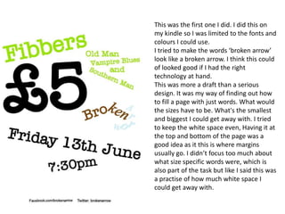
Fibbers
The document summarizes the process of creating a poster for a music event called "fibbers." The creator started with a crossword-inspired design using different fonts but later decided it looked too childish. They changed to using the same font throughout, except for the title, to make it look more professional. Text was resized and repositioned based on act popularity before finalizing a layout that was well-balanced and targeted younger audiences. The poster design was deemed professional enough for real concerts while retaining elements from the original idea.
Magazine cover process
The document summarizes the creative process behind developing a draft magazine cover. Key decisions included choosing an A4 size with white background to appeal to the target audience. The main image was cropped and edited to draw attention, and positioned within the margins with space left for the masthead and headings. Various fonts and styles were tested for the masthead, subheadings, and artist headings before final selections. Overall the creator was happy with the draft but identified areas for improvement, such as repositioning the barcode and recentering the main image, based on feedback.
Evaluation Question one
The document discusses the conventions used in real media products and how the student's media magazine both follows and challenges some of these conventions. Some conventions that were followed include using a masthead, cover lines, images, columns for text layout, and different colors to identify questions and answers in an interview. Some conventions that were challenged include using a serif font for the masthead, placing a cover line above the masthead, and positioning the lead story to the left of the main image rather than in the center. Overall, the document evaluates how the student aimed to balance following industry standards with also making some unconventional design choices.
Double page spread development diary
This document summarizes the steps taken to design a double-page magazine spread. The designer first placed a background image and additional images of band members throughout the spread. Text boxes were then added and formatted to contain an interview on the left page and an album review on the right. Additional text boxes were inserted as needed. Page numbers, logos and headlines were positioned. Quotes were pulled from the text to entice readers. The final spread featured additional text and lighting adjustments to complete the design.
Lo3
This document discusses different marketing strategies used by brands to communicate quality, price, image, value, market, and competition. For quality, M.A.C. and high-end grocery brands like Waitrose and M&S rely on elaborate advertising to imply their products are high quality without explicitly mentioning price. For price, Tesco, Travelodge, and Premier Inn prominently display price in their ads. For image, Innocent and McDonald's use bright colors and natural settings to portray healthiness. For value, Aldi compares itself to name brands. For market, makeup brands target women with similar ads. For competition, BMW and Audi subtly critique each other's awards to assert brand superiority, while supermarkets directly
On going evaluations
This document provides an evaluation of three images created by Marie for a project on portraying emotions. For the first image, Marie experimented with layering smoke in Photoshop and settled on blending modes and opacity levels to create realistic-looking smoke. The second image used watercolors painted directly onto a printed image to add smoke, with the water reacting with the ink to create unexpected effects. The third image was an accident caused by too much water, but Marie liked the damaged film effect it created. Overall, Marie learned techniques for incorporating smoke and is pleased with how the images convey emptiness and the dominating nature of emotions.
Task 8
The document discusses layout designs for a tabloid newspaper page. It notes that the masthead usually appears on the top left but other locations were tested. Using block colors for advertisements and article previews helps break up the white space. However, the designs contain too much text compared to real tabloid examples, which rely more on large images and headlines. The document expresses satisfaction with one image and headline but says more visual elements are needed to make the pages less bland.
Homeless charities
This document summarizes and compares the marketing strategies of three homeless charities: Shelter, Crisis, and SASH. It analyzes the design, color schemes, images, and messaging used in posters, websites, and other advertisements for each charity. Key points discussed include the use of emotional imagery to engage viewers, simple and easy-to-read text, consistency across campaigns, and calls to action to donate or seek help. Overall, the charities aim to raise awareness of homelessness and motivate support through impactful visuals and messages.
More Related Content
What's hot
Contents page research
The document provides details about the contents pages of various music magazines. It describes the layout, use of images, section headings, and color schemes used across different magazine issues. The contents pages are consistently formatted with the magazine logo, date, section headings to help readers find articles of interest, and page numbers listed beside article titles and images. Bright colors are often used for backgrounds and fonts to attract readers and make important elements like article pages and section names stand out. Consistent formatting and features across issues helps readers easily navigate to find the content they want.
Research
The key similarities across the magazine products are:
1) They feature a single prominent person on the cover and double page spreads to indicate the main focus.
2) They use contrasting colors that relate to the featured person's clothing or image to clearly link elements.
3) The websites keep the design simple and easy to navigate between sections.
Contents page powerpoint1
The document describes the design process for a contents page of a music magazine. Key details include:
- A black box was used as the background and colored sections were added, including the title in purple and contact info in white.
- Feature names and page numbers were added in black and purple to complement the color scheme.
- An artist image was placed in a gray box to stand out from the white, black, and purple colors.
- Additional elements like an editor's letter and contest details were included to engage the target audience of 16-21 year olds.
Evaluation 1
The document summarizes how the author's media product uses, develops, and challenges conventions of real music magazines. Specifically:
- The title, "Bangerz", uses an unconventional spelling but targets a younger audience. Design elements like font and issue labeling follow conventions.
- Page layouts, like the two-column contents page, follow conventions while adding original elements like multiple images.
- Features like an exclusive interview on the double page spread develop on conventions by focusing on one artist rather than just providing information.
- Costumes and props used in photos, like headphones and clothing styles, reflect the electronic dance music genre and conventions used in other magazines to portray artists.
Evaluation 1
The document discusses how the author's media product uses, develops, and challenges conventions of real music magazines. Specifically, it summarizes how the magazine's cover, contents page, and double page spread draw from conventions of magazines like Mixmag while also adapting and challenging conventions to better suit the author's target EDM audience. Key points include using bold fonts and layouts on the cover inspired by Mixmag, including multiple images on the contents page for visual interest, and featuring an exclusive DJ interview on the double page spread rather than just informational articles. Costumes and props of models also reflect EDM iconography to represent the genre through appearance. Overall, the author draws from real magazine conventions but adapts them to craft a product
Evaluation 1
The document discusses how the author's media product uses, develops, and challenges conventions of real music magazines. Specifically, it summarizes how the magazine's cover, contents page, and double page spread draw from conventions of magazines like Mixmag while also adapting and challenging conventions to better suit the target EDM audience. For example, the title uses an unconventional spelling but bold font for visual appeal. Layouts draw from Mixmag but add more images for engagement. Clothing and props portray an aspirational lifestyle while reflecting EDM iconography. Overall, the design aims to look professional while exciting readers with its genre representation.
Question 5
The author tried to attract their audience with eye-catching design elements for their magazine, but realized they may have distracted from each other. The color scheme and layout did not resemble a magazine in the intended genre. In retrospect, familiarizing themselves with examples of magazines in that genre would have provided better ideas than designing independently. The article layout needs improvement to look more professional as the text lines were improperly measured. Overall, the author recognizes more research on magazine design conventions is needed to strengthen the layout and professional appearance of the magazine.
Masthead decisions
The document discusses the process of selecting and refining a font for a magazine masthead. The author initially chose an "acid dripping font" but realized it better represented horror genres rather than their alternative R&B music magazine theme. Feedback prompted changing the soft masthead font, as it did not match the bold cover fonts and had low quality. After further research emulating a similar real magazine, the author found a font that complemented the blocky magazine style better.
1. research yr 2
The document provides an analysis of existing fanzine products. It finds that fanzines typically use more images than text as readers do not want large blocks of text in their spare time. Bold fonts are important for any text to catch readers' attention. Front covers need to be aesthetically pleasing to attract readers. Color schemes and themes should match the topic. Images are key to showing content about subjects like street art. Both informal and formal writing styles can be effective depending on the intended audience.
Research and planning all 3
This document provides analysis and feedback on various magazine front covers, contents pages, and spreads. It discusses the effectiveness of design elements like layout, images, colors, and fonts in engaging the target audience for each magazine's genre. Both positive and negative aspects are considered for how elements appeal to readers, convey necessary information clearly, and could be improved. Market research into audience preferences is also mentioned.
Evaluation question 1
This document summarizes how the media product uses and develops conventions of real music magazines. It discusses 9 elements: including a barcode and title at the top of the front cover, an interview double page spread, a contents page listing articles and page numbers, a consistent color scheme, featuring real artists, creating layout mockups beforehand, and including free posters to promote sales. The document explains how each element follows conventions of real music magazines to make the media product feel authentic.
Question 7 pp progress.docx
The document compares the front covers of two magazines the author created. For the first magazine, the font was not appealing, there was too much text, and the colors were boring. For the second magazine, the author used a font site to choose a better font, improved the layout and color scheme in Photoshop, used headlines to encourage reading inside, and only included one pull quote to generate interest. The second magazine masthead also had an improved font and color that fit the genre better and was placed behind the main image.
Construction of the double page spread
The document summarizes the steps taken to construct a double page magazine spread. The key points are:
The interview, title, and stand first were imported from Word. The interview was changed to a 3-column format following the rule of thirds. The title size was increased to be the focal point.
The main image was imported and tilted slightly for a "young, pop vibe." Conventions like a drop cap, bylines, and page numbers were added.
Additional elements like a pink flasher, logo, artist name, and shapes were placed to draw the eye and fill white space as informed by a reader questionnaire favoring bright colors. The final steps refined the image tilt and added
Draft contents magazine process
The document describes the process of designing a magazine contents page. It discusses layout decisions such as using consistent margins and fonts, sizing and positioning images, and including common magazine elements like page numbers and feature headings. It also notes areas for improvement, such as making the layout more visually interesting and ensuring diverse representation of people. The overall goal is to create an effective contents page that connotes the style of an alternative music magazine.
Fibbers
The document summarizes the process of creating a poster for a music event called "fibbers." The creator started with a crossword-inspired design using different fonts but later decided it looked too childish. They changed to using the same font throughout, except for the title, to make it look more professional. Text was resized and repositioned based on act popularity before finalizing a layout that was well-balanced and targeted younger audiences. The poster design was deemed professional enough for real concerts while retaining elements from the original idea.
Magazine cover process
The document summarizes the creative process behind developing a draft magazine cover. Key decisions included choosing an A4 size with white background to appeal to the target audience. The main image was cropped and edited to draw attention, and positioned within the margins with space left for the masthead and headings. Various fonts and styles were tested for the masthead, subheadings, and artist headings before final selections. Overall the creator was happy with the draft but identified areas for improvement, such as repositioning the barcode and recentering the main image, based on feedback.
Evaluation Question one
The document discusses the conventions used in real media products and how the student's media magazine both follows and challenges some of these conventions. Some conventions that were followed include using a masthead, cover lines, images, columns for text layout, and different colors to identify questions and answers in an interview. Some conventions that were challenged include using a serif font for the masthead, placing a cover line above the masthead, and positioning the lead story to the left of the main image rather than in the center. Overall, the document evaluates how the student aimed to balance following industry standards with also making some unconventional design choices.
Double page spread development diary
This document summarizes the steps taken to design a double-page magazine spread. The designer first placed a background image and additional images of band members throughout the spread. Text boxes were then added and formatted to contain an interview on the left page and an album review on the right. Additional text boxes were inserted as needed. Page numbers, logos and headlines were positioned. Quotes were pulled from the text to entice readers. The final spread featured additional text and lighting adjustments to complete the design.
What's hot (18)
Viewers also liked
Lo3
This document discusses different marketing strategies used by brands to communicate quality, price, image, value, market, and competition. For quality, M.A.C. and high-end grocery brands like Waitrose and M&S rely on elaborate advertising to imply their products are high quality without explicitly mentioning price. For price, Tesco, Travelodge, and Premier Inn prominently display price in their ads. For image, Innocent and McDonald's use bright colors and natural settings to portray healthiness. For value, Aldi compares itself to name brands. For market, makeup brands target women with similar ads. For competition, BMW and Audi subtly critique each other's awards to assert brand superiority, while supermarkets directly
On going evaluations
This document provides an evaluation of three images created by Marie for a project on portraying emotions. For the first image, Marie experimented with layering smoke in Photoshop and settled on blending modes and opacity levels to create realistic-looking smoke. The second image used watercolors painted directly onto a printed image to add smoke, with the water reacting with the ink to create unexpected effects. The third image was an accident caused by too much water, but Marie liked the damaged film effect it created. Overall, Marie learned techniques for incorporating smoke and is pleased with how the images convey emptiness and the dominating nature of emotions.
Task 8
The document discusses layout designs for a tabloid newspaper page. It notes that the masthead usually appears on the top left but other locations were tested. Using block colors for advertisements and article previews helps break up the white space. However, the designs contain too much text compared to real tabloid examples, which rely more on large images and headlines. The document expresses satisfaction with one image and headline but says more visual elements are needed to make the pages less bland.
Homeless charities
This document summarizes and compares the marketing strategies of three homeless charities: Shelter, Crisis, and SASH. It analyzes the design, color schemes, images, and messaging used in posters, websites, and other advertisements for each charity. Key points discussed include the use of emotional imagery to engage viewers, simple and easy-to-read text, consistency across campaigns, and calls to action to donate or seek help. Overall, the charities aim to raise awareness of homelessness and motivate support through impactful visuals and messages.
Banner development
The document describes the process of creating several animated banners to advertise Irn-Bru soda. It discusses initial designs for a static banner that became animated by adding flashing text. It also describes creating a waving banner by editing a video into individual frames in Photoshop. Another rolling can banner aimed to reveal the copy on the can but proved difficult to animate fully. The final banner used a shrinking text effect within the Irn-Bru hyphen to reveal the can and copy.
Advert development
This document contains reviews and critiques of multiple drafts of an advertising campaign for Irn-Bru. The reviewer notes issues with images not looking realistic, missing important branding elements, poor design choices, and a need for more professional formatting. Over several drafts, the designs are improved by modifying images, incorporating the brand logo, optimizing layouts and adding social media links. The final draft is praised for addressing prior issues and having a polished, finished look.
Experiments evidence template
1. The document discusses several experimental photography techniques that the author explored, including shutter speed, reflection, photomontage, and focus. For shutter speed, the author found that timing is important to capture movement and that colors and lights blur better than other subjects. With reflection photography, ripples in water and curved surfaces can distort reflections. Photomontage involves combining close-up photos into a collage, while poor focus can soften edges and remove unwanted details from images.
2. Across the different techniques, key lessons were that timing is important to capture movement, reflective surfaces and ripples can impact reflections, photomontage works best with many small photos, and slight blurring can soft
Task 1
Chema Madoz is a Spanish photographer known for his black and white work that creates optical illusions using everyday objects. His photography is both contemporary and traditional as he does not use Photoshop. Madoz's award-winning work from 1985 to the present makes the viewer look at things differently and think more deeply about how objects influence each other. His work conveys meaningful messages and would be displayed in art galleries, such as the Duncan Miller gallery in LA where some of his photos currently hang.
Lo4
The marketing and PR presentation aims to promote the band Brunstock's new album to gain more fans and change their image. The target audience is older teenagers and young adults aged 17-24 who are into indie, rave and dance music. The objectives are to sell over 100 albums in a month and increase their loyal fan base by 100% by November. Social media promotion and competitions on platforms like Twitter, Tumblr and YouTube will be used to appeal to the target audience. Merchandise like t-shirts and posters with bright colors and designs will also help promote the band's new sound and image.
Homeless charities
This document summarizes and compares the advertising strategies of two homeless charities: Shelter and Crisis. Both charities use colour schemes of green and red to draw attention to their posters and websites. Their ads feature images intended to elicit emotion, such as a happy family (Shelter) and a cardboard box in the snow (Crisis). The ads' text conveys the reality of homelessness and calls readers to action by providing contact details. Both charities utilize social media and their websites to spread information and encourage donations. While their approaches are similar, Crisis provides more direct calls to action and next steps on its initial ad compared to Shelter.
Evaluation
The advertising campaign uses children's drawings as images to portray the vulnerable side of homeless teenagers and remind viewers that they are still children. Each poster includes the charity's logo and contact details to raise awareness and allow people to donate. While the original intentions were to use different techniques like lighting effects or edited family photos, the final children's drawings are more appropriate for the target age group of 16-24 year olds. The campaign aims to increase sympathy for homeless youth and raise awareness of the issue by triggering memories of viewers' childhood hopes for family and home.
Existing adverts
The document provides information on the marketing strategies used by Irn-Bru across various mediums including print ads, TV ads, websites, and packaging. The print and TV ads utilize crude humor and inappropriate language to appeal to their target male demographic. The website uses a simple design with bold colors and fonts for easy navigation. Packaging emphasizes the brand colors and highlights the product benefits. Irn-Bru aims to stand out through controversial advertising that generates buzz and discussion among consumers.
Company name
This business plan document outlines sections for a company mission statement, management team, market analysis, business opportunities and concept, competition, goals and objectives, financial plan, resource requirements, risks and rewards, and key issues. The plan seeks to concisely define the company's mission and team, analyze the relevant market and opportunities for success, outline the business model and competitive advantages, establish goals and a financial model, and identify risks, resources needed, and important issues to address.
Social Action and Community Media
The document provides case studies and analyses of campaigns by several organizations:
- St Mungo's aims to raise awareness of homelessness and help the homeless through rehoming and donations. Their campaigns use images showing transformation from homelessness.
- Cancer Research aims to raise money for cancer research. Their campaigns emphasize that cancer remains a problem and research is needed to find a cure.
- FckH8 aims to legalize same-sex marriage and end homophobia through provocative videos and campaigns targeting youth on social media.
- NSPCC and Barnardos both help children, but have different campaign styles - NSPCC emphasizes branding recognition over message, while Barnardos prioritizes
Task 1
Chema Madoz is a Spanish photographer known for his black and white work that creates optical illusions using everyday objects without digital editing. His photos make viewers look more closely at things and think differently about how objects relate to each other. Sohei Nishino's "Diorama Map" project from 2003 uses photo montage techniques to collage photos from his travels into imagined maps of cities he visited, recreating his journey through memory and feeling rather than accuracy. Jerry Uelsmann was pioneering in using darkroom techniques to layer multiple film negatives together to create surreal composite images, and continues to favor traditional methods over newer digital technologies.
StumbleUpon
StumbleUpon is a website launched in 2001 that recommends web content to users based on their interests. Users can indicate what types of content they like or dislike through thumbs up and down buttons, which helps StumbleUpon better determine what else the user may be interested in. It grew rapidly after its launch, reaching 1 million users by 2002 and over 25 million registered users by 2012. StumbleUpon is free for users to create an account and discover new websites and topics.
Ideas
The document contains ideas for advertising campaigns for Irn-Bru 32 that focus on different themes:
1) A cuckoo bird cartoon to represent waking up and energy with slogans like "Wake up Lazy!"
2) A volcano to represent the burst of energy from the drink, showing the number 32 made of lava flowing down the volcano.
3) An image made by clipping mask of the main ingredients to fill in the number 32.
4) A boxer breaking punching bags with the can design to show the drink's refreshing burst of energy.
5) A close-up image of an attractive woman drinking the product to appeal to male audiences.
Starting marketing and pr
This document discusses marketing and public relations methods and techniques. It begins by outlining issues that require marketing or PR solutions such as quality, image, price, value, market, and competition. It then provides examples of how marketing addresses quality, price, value, image, and competition through advertisements. Public relations techniques discussed include press releases, media packs, briefings, press conferences, handouts, interviews, and maintaining contacts and networks. The document comprehensively explains key marketing and PR concepts with relevant examples.
Viewers also liked (18)
Similar to Task 5
Factual page layout task 5
1) The document describes three page layout designs for concert posters at a venue called Fibbers.
2) The first design uses reversed colors and varying fonts to emphasize different elements like the band names.
3) The second design changes the background color to purple and centers the text, keeping a consistent font size.
4) The third design keeps a black background but uses red text that "screams" to audiences, with a horror-inspired font for the header to make it stand out.
Task 10
The document describes the process of designing layouts for different print publications, including a fanzine, broadsheet, and tabloid. For each layout, the designer placed colored boxes to indicate where elements would go, added fonts, images, and text, and adjusted placement until satisfied. The designer felt the fanzine and broadsheet layouts turned out well but could have improved the tabloid more. Feedback provided affirmed the layouts looked professional but offered minor suggestions. The designer felt their InDesign skills improved through this project.
Task 5
This document summarizes the design process and decisions for a concert poster. Key elements included incorporating consistent principles while varying rotation, orientation and sizing to see which worked best. A red and black color scheme was used to attract attention while conveying warning. The header was made bolder to stand out. After experimenting, the designer preferred the header on the right for clarity. Artist names were in unique, modern fonts to appeal to younger audiences. Ticket prices were emphasized in a large red font. The layout was refined by fading text banners and using a shadow effect with red text. Social media links were made smaller. Mixing uppercase and lowercase for the date and time added visual interest while maintaining readability.
Unit 35 - LO3
The document outlines the process for creating a magazine from start to finish in three stages:
1. The front cover and double page spreads are designed in Photoshop using images, text, and graphics to attract the target audience and match the style of inspiration magazines.
2. The production plan schedules the work of writers, editors, layout staff, and other employees over a week to determine content, edit pages, and place advertisements.
3. The finished magazine files are sent to the printer, distributed to warehouses, and made available to the public, completing the monthly magazine production cycle.
Unit 14 - LO3
The document outlines the process for creating a magazine from start to finish in three stages:
1. The front cover and double page spreads are designed in Photoshop using images, text, and graphic elements to attract the target audience and match the style of inspiration magazines.
2. The production plan schedules the work of writers, editors, layout staff, and other employees over a week to determine content, edit pages, and place advertisements.
3. The finished magazine files are sent to the printer, distributed to warehouses, and made available to the public, completing the monthly magazine production cycle.
Page layout task 3
This document discusses the layout of a Facebook event page promoting a concert. It describes the author's process of designing the layout to establish a visual hierarchy through the use of font size, style, color, and positioning. Six different layout designs are presented and evaluated based on how effectively they distinguish the most important information from the least important according to the author's intended hierarchy. The most important information, such as the headlining band, is made to stand out the most through large, colorful text, while the least important details, like social media links, are kept smaller and more subtle. The author reflects on design choices that were ineffective at clearly communicating the hierarchy and could be improved upon in future layouts.
Media Eval - Q7
The author feels they have progressed significantly from their preliminary task to the final product in several ways:
1) They have learned how to use design software like Photoshop and InDesign more effectively and can now utilize most features.
2) Their designs have become more realistic and authentic looking by adding more magazine conventions and details.
3) They have improved at laying out pages in an appealing way for readers and maximizing the use of space.
4) Overall, they have gained a better understanding of how to design magazines that look like real publications.
Peer feedback
The document provides feedback on three layout designs: a broadsheet newspaper, tabloid newspaper, and fanzine.
For the broadsheet, the feedback notes that the main headline font is too informal and would be better suited for a tabloid. It also suggests adding more content like advertisements.
Regarding the tabloid, the feedback praises the attention-grabbing headline font and realistic holiday advert design. It notes a minor issue with the number of asterisks used in the headline.
For the fanzine, the feedback appreciates the consistent color scheme, cropped photo style, and title fonts fitting the punk theme. It recommends using a single-colored font for readability and reducing the number of fonts used.
Mini Evaluations
The document provides an evaluation of a magazine advertisement design for Irn-Bru energy drink. In the first draft, the designer tried different layouts but none worked. With tutor feedback, the second draft included sections with the product prominently displayed. Font size was an issue in the first draft but changing the font and sizing elements better balanced the design. Further improvements included adjusting the color saturation and "Barr" logo placement. The designer was pleased with addressing the key issues to create a modern, eye-catching advertisement.
Desig pro forma 2
This document outlines the development process for an advertising campaign for an energy drink called LIV. It includes initial ideas like mind maps and mood boards. Font and color scheme options are explored, focusing on bright, bold colors and fonts that convey energy and edginess. Storyboards are created showing potential advert concepts. Multiple advert designs are presented and refined, taking inspiration from brands like Monster and Lucozade. The final advert features four extreme sport images with overlaying text in black and white, representing the drink's theme of "living on the edge." Technical and aesthetic qualities of the design are discussed.
Desig pro forma 2
This document outlines the development process for an advertising campaign for an energy drink called LIV. It includes initial ideas like mind maps and mood boards. Font and color scheme options are explored, with a preference shown for the Killerhorse font in black and white or yellow. Product packaging concepts are developed. Several storyboards and advert concepts are created, with iterations made based on inspiration from other brands like Monster and Lucozade. The final advert concept includes four action images of different extreme sports alongside the drink name and slogan in black and white text styles.
7. evaluation done
The peer liked that the creator took the time to edit the background of the cover image to make it suit the page better. An improvement could have been including more buzzwords like "exclusive" on the cover to draw readers in. In general, the peer felt the cover design was well done but could have included more magazine conventions to further engage audiences.
Mini Evaluations
The document provides an evaluation of a can, magazine, and web banner design for Irn-Bru. The evaluator made several improvements, including changing fonts to make text clearer, adjusting alignments and spacing, and adding effects like motion blur to elements. Peer feedback was positive about the designs standing out and using color schemes and themes consistently across formats. The evaluator was pleased with the outcomes but noted a few further small changes could be made, like improving paintwork details or increasing depth of field elements.
Task7- Production Development (magazineadvert)
The document discusses the design process for an advertising campaign poster for Irn-Bru. It explores different design concepts including placing the Irn-Bru can on a catwalk scene, experimenting with colors and effects, and considering text placement. Key elements tested include font styles, imagery incorporation, and refinement of visual elements like shadows and glows. The goal is to create an eye-catching poster that appeals to younger audiences and reflects the brand's style through vibrant colors and humor.
Task 9
The document discusses the design choices for a page about hip hop fashion. The designer chose slanted fonts and layouts to match the hip hop style and grab attention. Images showing hip hop fashion were selected. Boxes and triangles were used in the layout to contain different elements in an eye-catching way. Colors, fonts, and positioning of elements were adjusted to look attractive and pull the page together for a young audience interested in hip hop culture.
Double page spread development diary
This document summarizes the steps taken to design a double-page magazine spread. The designer placed background images of a band, added text boxes for articles, and included page numbers, logos, headlines, and images. The designer adjusted layout elements and text boxes to optimize the design and flow of content across the two pages. Additional elements like a drop quote were included to entice readers into the full articles.
Evaluation q 1
The document discusses conventions used in the student's media product magazine. It uses common music magazine conventions like cover lines, band listings, prominent cover images of featured artists, attention-grabbing headlines, and typical rock genre color schemes. Inside, it employs organizational techniques such as headers, a tile layout for band photos on the contents page, and a repeated house style of fonts and colors throughout. The goal is to engage readers and emulate real music magazines using effective conventions.
evaluation 7
The document provides an evaluation of the author's magazine cover project. It summarizes their research, planning, time management, technical qualities, aesthetic qualities, and audience appeal. For their research, they focused on magazine covers but not double page spreads, which impacted their final product. Their planning process went well and included idea generation, choosing a genre, and creating a mood board and schedule. However, their schedule lacked detail. They completed the project on time but felt they ran out of time to improve it. Key technical elements included banners, images, and stories lined up. Aspects like the title, cover lines, and colors worked well but the main image and layout could have been improved. The author believes their target audience would
Pre- production
The document discusses pre-production paperwork that may be required for print and moving image productions. For print, it lists risk assessments, flat plans, style sheets, equipment lists, contingency plans, copy, production schedules, location recces, budgets, and model call sheets. For moving image, it lists risk assessments, storyboards, shotlists, equipment lists and bookings, contingency plans, scripts, production schedules, call sheets, location recces, and budgets. It then provides more details on what a style sheet and layout plans entail for a print production. The reflection discusses planning to create a magazine covering rock music, including photo shoots, article topics on mental health, tattoos, and artists' interests. The purpose
Planning
The document discusses several options for fonts and graphic designs for headings, titles, and text blocks in a children's book about space and planets. It considers 4 sci-fi inspired fonts, with analyses of each font's design, aesthetic, and licensing costs. Sample page layouts are proposed, including placing titles above or behind planet illustrations. The document also explores using a character, like a UFO or spaceship, to engage young readers and present information in additional formats.
Similar to Task 5 (20)
More from MarieSie
Task 7
The document discusses different designs for magazine layouts. It analyzes the strengths and weaknesses of each design, including placement of images, advertisements, pull quotes, mastheads and columns. The author's favorite design is the second one but it could be improved. Their final design decision combines elements from different layouts, such as the heading from the first design and a distinctive pull quote similar to the last design.
Task 6
The document discusses different techniques used to create a cluttered, layered text effect to represent increase and reproduction. Letters were placed unconventionally in varying sizes and angles to look messy. Font size increased by 5 points with each letter to clearly show growth. Fading text was also effective, with the last letter barely visible but still readable. Repeating the word showed reproduction simply by duplicating it rather than heavily layering, which didn't look good.
Task 3
This document discusses various design elements used in magazine layouts, including:
- Large drop capitals at the beginning of articles to draw attention.
- Margins that ensure text fits and gives the page a nice frame.
- Basic headers placed in the corner so the image and copy are more prominent.
- Grids that typically split pages into thirds, with images taking up two thirds for attention.
Task 2
The document discusses whether factual products such as textbooks and leaflets should contain bias. It argues that some level of bias is acceptable in order to effectively convince audiences of important messages regarding health, politics, and social issues. However, bias should not leave out relevant information or facts that provide alternative perspectives. Factual products should aim to educate by presenting stats and facts to help the public make their own informed decisions, rather than forcing a certain viewpoint. When events are involved, both sides should be represented without omitting details the public has a right to know.
Task 1
The document provides guidance on key considerations for effective factual writing. It discusses the importance of clarity, conciseness, accuracy, avoiding ambiguity, addressing potential bias, using an appropriate register, evidencing arguments, referencing sources, following legal constraints, and adhering to codes of practice. Factual writing aims to inform readers in an understandable way and back up claims, opinions, and arguments with solid evidence from reputable sources.
Planning pro forma
This document outlines a photography experiment planned for February 3-7, 2014. The photographer will take multiple exposures of faces and smoke in front of a plain background to portray the consuming nature of human emotion. Equipment needed includes a phone camera, digital camera, makeup, a model, matches, candles, and a plain background. The goal is to layer images to create a surreal effect.
Experiments evidence 2
The document discusses different experimental photography techniques including light writing, Harris shutter technique, and scanography. Light writing involves drawing images by turning a light on and off with long exposure shots. The Harris shutter technique takes three pictures in different colors - red, green, and blue - and layers them to show movement. Scanography uses a scanner as the camera by following the scanning light, which can create interesting reflective effects but requires a closed scanner lid to work best.
Lo2 workbook
This document discusses various marketing concepts and techniques, including:
- The importance of understanding clients and their requirements.
- Using techniques like questionnaires and SWOT analyses to understand the target market.
- Defining audience profiling and the types of demographic information included.
- Explaining the four elements of the marketing mix: product, price, promotion, and place.
- Providing examples of how companies like Coca-Cola use different marketing materials and strategies.
Lo1 workbook
Market research involves gathering information about target markets through surveys, focus groups, and interviews. This helps companies understand customer wants/needs and determine where to advertise. A market analysis presents research findings and identifies gaps. Marketing strategy sets objectives and outlines the product, price, place, and promotion plan. Advertising is important for raising brand awareness and shaping perceptions of products. Positive publicity generates goodwill while damage limitation aims to minimize harm to reputation from negative events. Lobbying seeks to influence legislation by advocating for special interests to politicians and parties.
Case study
The marketing campaign for Catching Fire targeted teenage girls by promoting Subway sandwiches inspired by the film's spicy title and a makeup promotion with Covergirl. A fake magazine was also created with an Instagram and other social media presences to keep fans engaged without heavy advertising. Posts starting 9 months before release helped build anticipation, including a photo of an empty chair that received over 2,000 likes. Everything was designed to make fans feel like they were part of the world of the Hunger Games and build excitement for the new film.
Evaulation
The document provides feedback on a project to redesign the branding and marketing materials for Irn-Bru.
1) The development stages helped identify issues with early designs and determine which ideas worked best before the final products. This informed the final outcome.
2) While technical skills like clipping masks and color overlay improved, the final pieces lacked cohesion and did not fully match the brief to rebrand Irn-Bru in a way consistent with its original image.
3) Overall, the quality of the individual pieces was high but they were too different from Irn-Bru's original branding and thus not entirely fit for the purpose of relaunching the brand. The final products were too
Constraints handout
The document discusses various constraints that could impact a marketing project, including:
- A short five week timeframe requiring careful planning and contingency time
- Potential need to source product images online or purchase the product
- Rules from the Advertising Standards Authority that could prevent certain advertising approaches if deemed inappropriate
- Copyright issues that may require developing truly original designs to avoid legal problems
Following all applicable rules and regulations is important to avoid designs being pulled or missing deadlines, but could also slow down the creative process.
Opportunities handout
This document discusses opportunities for creative and technical development in a project to create advertisements for Irn-Bru. Specifically:
- The project allows more creative freedom compared to previous charity ads, including using puns and double meanings within ASA regulations.
- A challenge is to turn limited images of Irn-Bru's mascot into a cartoon, requiring learning new technology skills.
- Being able to alter a photo angle slightly through cartoons could be useful professionally when deadlines require changing photos.
- While web banners that move are interesting, that level of interactivity may not be possible within the time frame. Overall, the project provides experience in branding a product through different media like bottles and
Stages
The document describes the process of designing an Irn-Bru soda can label over multiple iterations. The designer started with simple designs incorporating the number 32 but found they did not stand out enough. Later designs added elements like borders, slogans, logos and splashes to make the designs more interesting and eye-catching while keeping the overall style simple. The last design featured an orange splash effect across the can which the designer preferred as it filled the space effectively.
Research analysis
The document discusses a survey the author conducted to help design advertising for a charity targeted at 16-24 year olds. The author asked questions about advertising preferences, charities people donate to, and effective ad types. Responses indicated a preference for upbeat ads with some information but not too much text. Posters and billboards were seen as more effective than bus ads or websites. The author plans to create a poster, billboard, and bus stop ad for the charity based on the survey findings.
More from MarieSie (16)
Recently uploaded
Mule event processing models | MuleSoft Mysore Meetup #47
Mule event processing models | MuleSoft Mysore Meetup #47
Event Link:- https://meetups.mulesoft.com/events/details/mulesoft-mysore-presents-mule-event-processing-models/
Agenda
● What is event processing in MuleSoft?
● Types of event processing models in Mule 4
● Distinction between the reactive, parallel, blocking & non-blocking processing
For Upcoming Meetups Join Mysore Meetup Group - https://meetups.mulesoft.com/mysore/YouTube:- youtube.com/@mulesoftmysore
Mysore WhatsApp group:- https://chat.whatsapp.com/EhqtHtCC75vCAX7gaO842N
Speaker:-
Shivani Yasaswi - https://www.linkedin.com/in/shivaniyasaswi/
Organizers:-
Shubham Chaurasia - https://www.linkedin.com/in/shubhamchaurasia1/
Giridhar Meka - https://www.linkedin.com/in/giridharmeka
Priya Shaw - https://www.linkedin.com/in/priya-shaw
clinical examination of hip joint (1).pdf
described clinical examination all orthopeadic conditions .
The History of Stoke Newington Street Names
Presented at the Stoke Newington Literary Festival on 9th June 2024
www.StokeNewingtonHistory.com
How to Setup Warehouse & Location in Odoo 17 Inventory
In this slide, we'll explore how to set up warehouses and locations in Odoo 17 Inventory. This will help us manage our stock effectively, track inventory levels, and streamline warehouse operations.
Your Skill Boost Masterclass: Strategies for Effective Upskilling
Your Skill Boost Masterclass: Strategies for Effective UpskillingExcellence Foundation for South Sudan
Strategies for Effective Upskilling is a presentation by Chinwendu Peace in a Your Skill Boost Masterclass organisation by the Excellence Foundation for South Sudan on 08th and 09th June 2024 from 1 PM to 3 PM on each day.ISO/IEC 27001, ISO/IEC 42001, and GDPR: Best Practices for Implementation and...
Denis is a dynamic and results-driven Chief Information Officer (CIO) with a distinguished career spanning information systems analysis and technical project management. With a proven track record of spearheading the design and delivery of cutting-edge Information Management solutions, he has consistently elevated business operations, streamlined reporting functions, and maximized process efficiency.
Certified as an ISO/IEC 27001: Information Security Management Systems (ISMS) Lead Implementer, Data Protection Officer, and Cyber Risks Analyst, Denis brings a heightened focus on data security, privacy, and cyber resilience to every endeavor.
His expertise extends across a diverse spectrum of reporting, database, and web development applications, underpinned by an exceptional grasp of data storage and virtualization technologies. His proficiency in application testing, database administration, and data cleansing ensures seamless execution of complex projects.
What sets Denis apart is his comprehensive understanding of Business and Systems Analysis technologies, honed through involvement in all phases of the Software Development Lifecycle (SDLC). From meticulous requirements gathering to precise analysis, innovative design, rigorous development, thorough testing, and successful implementation, he has consistently delivered exceptional results.
Throughout his career, he has taken on multifaceted roles, from leading technical project management teams to owning solutions that drive operational excellence. His conscientious and proactive approach is unwavering, whether he is working independently or collaboratively within a team. His ability to connect with colleagues on a personal level underscores his commitment to fostering a harmonious and productive workplace environment.
Date: May 29, 2024
Tags: Information Security, ISO/IEC 27001, ISO/IEC 42001, Artificial Intelligence, GDPR
-------------------------------------------------------------------------------
Find out more about ISO training and certification services
Training: ISO/IEC 27001 Information Security Management System - EN | PECB
ISO/IEC 42001 Artificial Intelligence Management System - EN | PECB
General Data Protection Regulation (GDPR) - Training Courses - EN | PECB
Webinars: https://pecb.com/webinars
Article: https://pecb.com/article
-------------------------------------------------------------------------------
For more information about PECB:
Website: https://pecb.com/
LinkedIn: https://www.linkedin.com/company/pecb/
Facebook: https://www.facebook.com/PECBInternational/
Slideshare: http://www.slideshare.net/PECBCERTIFICATION
Solutons Maths Escape Room Spatial .pptx
Solutions of Puzzles of Mathematics Escape Room Game in Spatial.io
Constructing Your Course Container for Effective Communication
Communicating effectively and consistently with students can help them feel at ease during their learning experience and provide the instructor with a communication trail to track the course's progress. This workshop will take you through constructing an engaging course container to facilitate effective communication.
Chapter wise All Notes of First year Basic Civil Engineering.pptx
Chapter wise All Notes of First year Basic Civil Engineering
Syllabus
Chapter-1
Introduction to objective, scope and outcome the subject
Chapter 2
Introduction: Scope and Specialization of Civil Engineering, Role of civil Engineer in Society, Impact of infrastructural development on economy of country.
Chapter 3
Surveying: Object Principles & Types of Surveying; Site Plans, Plans & Maps; Scales & Unit of different Measurements.
Linear Measurements: Instruments used. Linear Measurement by Tape, Ranging out Survey Lines and overcoming Obstructions; Measurements on sloping ground; Tape corrections, conventional symbols. Angular Measurements: Instruments used; Introduction to Compass Surveying, Bearings and Longitude & Latitude of a Line, Introduction to total station.
Levelling: Instrument used Object of levelling, Methods of levelling in brief, and Contour maps.
Chapter 4
Buildings: Selection of site for Buildings, Layout of Building Plan, Types of buildings, Plinth area, carpet area, floor space index, Introduction to building byelaws, concept of sun light & ventilation. Components of Buildings & their functions, Basic concept of R.C.C., Introduction to types of foundation
Chapter 5
Transportation: Introduction to Transportation Engineering; Traffic and Road Safety: Types and Characteristics of Various Modes of Transportation; Various Road Traffic Signs, Causes of Accidents and Road Safety Measures.
Chapter 6
Environmental Engineering: Environmental Pollution, Environmental Acts and Regulations, Functional Concepts of Ecology, Basics of Species, Biodiversity, Ecosystem, Hydrological Cycle; Chemical Cycles: Carbon, Nitrogen & Phosphorus; Energy Flow in Ecosystems.
Water Pollution: Water Quality standards, Introduction to Treatment & Disposal of Waste Water. Reuse and Saving of Water, Rain Water Harvesting. Solid Waste Management: Classification of Solid Waste, Collection, Transportation and Disposal of Solid. Recycling of Solid Waste: Energy Recovery, Sanitary Landfill, On-Site Sanitation. Air & Noise Pollution: Primary and Secondary air pollutants, Harmful effects of Air Pollution, Control of Air Pollution. . Noise Pollution Harmful Effects of noise pollution, control of noise pollution, Global warming & Climate Change, Ozone depletion, Greenhouse effect
Text Books:
1. Palancharmy, Basic Civil Engineering, McGraw Hill publishers.
2. Satheesh Gopi, Basic Civil Engineering, Pearson Publishers.
3. Ketki Rangwala Dalal, Essentials of Civil Engineering, Charotar Publishing House.
4. BCP, Surveying volume 1
BÀI TẬP BỔ TRỢ TIẾNG ANH LỚP 9 CẢ NĂM - GLOBAL SUCCESS - NĂM HỌC 2024-2025 - ...
BÀI TẬP BỔ TRỢ TIẾNG ANH LỚP 9 CẢ NĂM - GLOBAL SUCCESS - NĂM HỌC 2024-2025 - ...Nguyen Thanh Tu Collection
https://app.box.com/s/tacvl9ekroe9hqupdnjruiypvm9rdaneWalmart Business+ and Spark Good for Nonprofits.pdf
"Learn about all the ways Walmart supports nonprofit organizations.
You will hear from Liz Willett, the Head of Nonprofits, and hear about what Walmart is doing to help nonprofits, including Walmart Business and Spark Good. Walmart Business+ is a new offer for nonprofits that offers discounts and also streamlines nonprofits order and expense tracking, saving time and money.
The webinar may also give some examples on how nonprofits can best leverage Walmart Business+.
The event will cover the following::
Walmart Business + (https://business.walmart.com/plus) is a new shopping experience for nonprofits, schools, and local business customers that connects an exclusive online shopping experience to stores. Benefits include free delivery and shipping, a 'Spend Analytics” feature, special discounts, deals and tax-exempt shopping.
Special TechSoup offer for a free 180 days membership, and up to $150 in discounts on eligible orders.
Spark Good (walmart.com/sparkgood) is a charitable platform that enables nonprofits to receive donations directly from customers and associates.
Answers about how you can do more with Walmart!"
Bed Making ( Introduction, Purpose, Types, Articles, Scientific principles, N...
Topic : Bed making
Subject : Nursing Foundation
Philippine Edukasyong Pantahanan at Pangkabuhayan (EPP) Curriculum
(𝐓𝐋𝐄 𝟏𝟎𝟎) (𝐋𝐞𝐬𝐬𝐨𝐧 𝟏)-𝐏𝐫𝐞𝐥𝐢𝐦𝐬
𝐃𝐢𝐬𝐜𝐮𝐬𝐬 𝐭𝐡𝐞 𝐄𝐏𝐏 𝐂𝐮𝐫𝐫𝐢𝐜𝐮𝐥𝐮𝐦 𝐢𝐧 𝐭𝐡𝐞 𝐏𝐡𝐢𝐥𝐢𝐩𝐩𝐢𝐧𝐞𝐬:
- Understand the goals and objectives of the Edukasyong Pantahanan at Pangkabuhayan (EPP) curriculum, recognizing its importance in fostering practical life skills and values among students. Students will also be able to identify the key components and subjects covered, such as agriculture, home economics, industrial arts, and information and communication technology.
𝐄𝐱𝐩𝐥𝐚𝐢𝐧 𝐭𝐡𝐞 𝐍𝐚𝐭𝐮𝐫𝐞 𝐚𝐧𝐝 𝐒𝐜𝐨𝐩𝐞 𝐨𝐟 𝐚𝐧 𝐄𝐧𝐭𝐫𝐞𝐩𝐫𝐞𝐧𝐞𝐮𝐫:
-Define entrepreneurship, distinguishing it from general business activities by emphasizing its focus on innovation, risk-taking, and value creation. Students will describe the characteristics and traits of successful entrepreneurs, including their roles and responsibilities, and discuss the broader economic and social impacts of entrepreneurial activities on both local and global scales.
What is Digital Literacy? A guest blog from Andy McLaughlin, University of Ab...
What is Digital Literacy? A guest blog from Andy McLaughlin, University of Aberdeen
Beyond Degrees - Empowering the Workforce in the Context of Skills-First.pptx
Iván Bornacelly, Policy Analyst at the OECD Centre for Skills, OECD, presents at the webinar 'Tackling job market gaps with a skills-first approach' on 12 June 2024
Recently uploaded (20)
Mule event processing models | MuleSoft Mysore Meetup #47
Mule event processing models | MuleSoft Mysore Meetup #47
Liberal Approach to the Study of Indian Politics.pdf
Liberal Approach to the Study of Indian Politics.pdf
How to Setup Warehouse & Location in Odoo 17 Inventory
How to Setup Warehouse & Location in Odoo 17 Inventory
Your Skill Boost Masterclass: Strategies for Effective Upskilling
Your Skill Boost Masterclass: Strategies for Effective Upskilling
ISO/IEC 27001, ISO/IEC 42001, and GDPR: Best Practices for Implementation and...
ISO/IEC 27001, ISO/IEC 42001, and GDPR: Best Practices for Implementation and...
Constructing Your Course Container for Effective Communication
Constructing Your Course Container for Effective Communication
Chapter wise All Notes of First year Basic Civil Engineering.pptx
Chapter wise All Notes of First year Basic Civil Engineering.pptx
BÀI TẬP BỔ TRỢ TIẾNG ANH LỚP 9 CẢ NĂM - GLOBAL SUCCESS - NĂM HỌC 2024-2025 - ...
BÀI TẬP BỔ TRỢ TIẾNG ANH LỚP 9 CẢ NĂM - GLOBAL SUCCESS - NĂM HỌC 2024-2025 - ...
Walmart Business+ and Spark Good for Nonprofits.pdf
Walmart Business+ and Spark Good for Nonprofits.pdf
Bed Making ( Introduction, Purpose, Types, Articles, Scientific principles, N...
Bed Making ( Introduction, Purpose, Types, Articles, Scientific principles, N...
Philippine Edukasyong Pantahanan at Pangkabuhayan (EPP) Curriculum
Philippine Edukasyong Pantahanan at Pangkabuhayan (EPP) Curriculum
What is Digital Literacy? A guest blog from Andy McLaughlin, University of Ab...
What is Digital Literacy? A guest blog from Andy McLaughlin, University of Ab...
Beyond Degrees - Empowering the Workforce in the Context of Skills-First.pptx
Beyond Degrees - Empowering the Workforce in the Context of Skills-First.pptx
Task 5
- 1. This was the first one I did. I did this on my kindle so I was limited to the fonts and colours I could use. I tried to make the words ‘broken arrow’ look like a broken arrow. I think this could of looked good if I had the right technology at hand. This was more a draft than a serious design. It was my way of finding out how to fill a page with just words. What would the sizes have to be. What's the smallest and biggest I could get away with. I tried to keep the white space even, Having it at the top and bottom of the page was a good idea as it this is where margins usually go. I didn’t focus too much about what size specific words were, which is also part of the task but like I said this was a practise of how much white space I could get away with.
- 2. For the second draft it was more about the use of colours and fonts. Which fonts suited what words better and what colours worked well together. Obviously when making a poster, the logos and font of the bands are what is used. This means you get a mix match of fonts. The aim of this draft was to test the amount of colour I could have. For example I think there is way too much red on top half of the page. The social media information is in a basic font and colour because it is least important. It’s important to the band, broken arrow, but it isn’t that important for the poster, a advertisement that is meant to hold details about a gig.
- 3. This is when design got serious. The location was at the top because this is where the gig is held. Everyone needs to know where the venue is. Since the band isn’t that popular saying the group first may put people off or make them interested easily. Again I made broken arrow look broken and used a font that made the letters arrow shaped. I used different fonts for the other names because they will have their own logos and fonts that people will recognise them for. The other information is in the same font as fibbers because that information is similar, the will be buying the tickets from fibbers so it seemed right to use the same font. The social media links have be done in the same font as broken arrow because it is their pages. It helps make the connection between the two. Finally the splash of colour that runs all the way through is nice. Since it goes through the page so evenly, it gives it a nice finish.
- 4. I have placed broken arrow at the top so it changes the eyes of the fans, making them become interested in the poster immediately. I have placed the social media information under this instead of at the bottom of the page to help show that this information is about the same thing. Fibbers is next because that’s the next important information. I like the font I have used as it stands out and can fit along the page. I have used the colour red as the broken arrow has red in it too which makes it link in nicely together. All the fonts I have used for the bands and location is blocky and makes the page look less empty. I think I have handled the white space well, filling the page the best I can without it looking crowded or distorted. The different colours work well together, before on my other design the pink was a bit over powering so I used different colours and think it’s worked well.