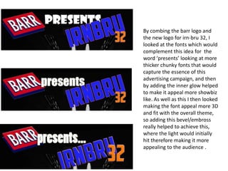
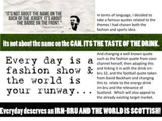
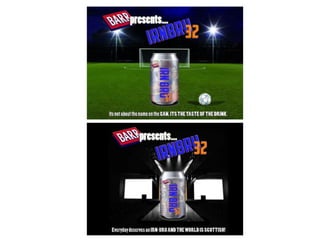
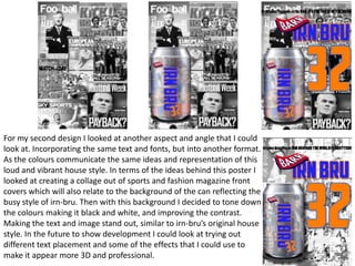
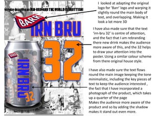
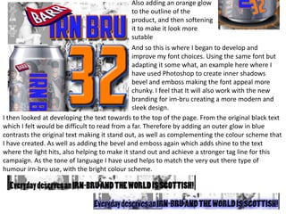
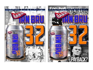
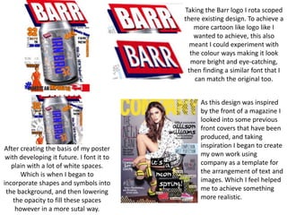
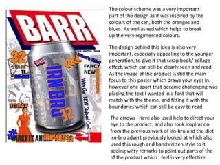
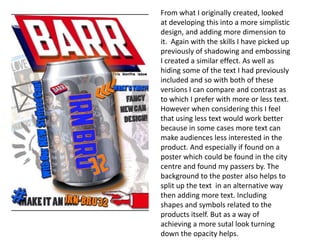
The document discusses the design process for an advertising campaign poster for Irn-Bru. It explores different design concepts including placing the Irn-Bru can on a catwalk scene, experimenting with colors and effects, and considering text placement. Key elements tested include font styles, imagery incorporation, and refinement of visual elements like shadows and glows. The goal is to create an eye-catching poster that appeals to younger audiences and reflects the brand's style through vibrant colors and humor.
GDG Cloud Southlake #33: Boule & Rebala: Effective AppSec in SDLC using Deplo...James Anderson
Effective Application Security in Software Delivery lifecycle using Deployment Firewall and DBOM
The modern software delivery process (or the CI/CD process) includes many tools, distributed teams, open-source code, and cloud platforms. Constant focus on speed to release software to market, along with the traditional slow and manual security checks has caused gaps in continuous security as an important piece in the software supply chain. Today organizations feel more susceptible to external and internal cyber threats due to the vast attack surface in their applications supply chain and the lack of end-to-end governance and risk management.
The software team must secure its software delivery process to avoid vulnerability and security breaches. This needs to be achieved with existing tool chains and without extensive rework of the delivery processes. This talk will present strategies and techniques for providing visibility into the true risk of the existing vulnerabilities, preventing the introduction of security issues in the software, resolving vulnerabilities in production environments quickly, and capturing the deployment bill of materials (DBOM).
Speakers:
Bob Boule
Robert Boule is a technology enthusiast with PASSION for technology and making things work along with a knack for helping others understand how things work. He comes with around 20 years of solution engineering experience in application security, software continuous delivery, and SaaS platforms. He is known for his dynamic presentations in CI/CD and application security integrated in software delivery lifecycle.
Gopinath Rebala
Gopinath Rebala is the CTO of OpsMx, where he has overall responsibility for the machine learning and data processing architectures for Secure Software Delivery. Gopi also has a strong connection with our customers, leading design and architecture for strategic implementations. Gopi is a frequent speaker and well-known leader in continuous delivery and integrating security into software delivery.
Dev Dives: Train smarter, not harder – active learning and UiPath LLMs for do...UiPathCommunity
💥 Speed, accuracy, and scaling – discover the superpowers of GenAI in action with UiPath Document Understanding and Communications Mining™:
See how to accelerate model training and optimize model performance with active learning
Learn about the latest enhancements to out-of-the-box document processing – with little to no training required
Get an exclusive demo of the new family of UiPath LLMs – GenAI models specialized for processing different types of documents and messages
This is a hands-on session specifically designed for automation developers and AI enthusiasts seeking to enhance their knowledge in leveraging the latest intelligent document processing capabilities offered by UiPath.
Speakers:
👨🏫 Andras Palfi, Senior Product Manager, UiPath
👩🏫 Lenka Dulovicova, Product Program Manager, UiPath
The Art of the Pitch: WordPress Relationships and SalesLaura Byrne
Clients don’t know what they don’t know. What web solutions are right for them? How does WordPress come into the picture? How do you make sure you understand scope and timeline? What do you do if sometime changes?
All these questions and more will be explored as we talk about matching clients’ needs with what your agency offers without pulling teeth or pulling your hair out. Practical tips, and strategies for successful relationship building that leads to closing the deal.
DevOps and Testing slides at DASA ConnectKari Kakkonen
My and Rik Marselis slides at 30.5.2024 DASA Connect conference. We discuss about what is testing, then what is agile testing and finally what is Testing in DevOps. Finally we had lovely workshop with the participants trying to find out different ways to think about quality and testing in different parts of the DevOps infinity loop.
UiPath Test Automation using UiPath Test Suite series, part 4DianaGray10
Welcome to UiPath Test Automation using UiPath Test Suite series part 4. In this session, we will cover Test Manager overview along with SAP heatmap.
The UiPath Test Manager overview with SAP heatmap webinar offers a concise yet comprehensive exploration of the role of a Test Manager within SAP environments, coupled with the utilization of heatmaps for effective testing strategies.
Participants will gain insights into the responsibilities, challenges, and best practices associated with test management in SAP projects. Additionally, the webinar delves into the significance of heatmaps as a visual aid for identifying testing priorities, areas of risk, and resource allocation within SAP landscapes. Through this session, attendees can expect to enhance their understanding of test management principles while learning practical approaches to optimize testing processes in SAP environments using heatmap visualization techniques
What will you get from this session?
1. Insights into SAP testing best practices
2. Heatmap utilization for testing
3. Optimization of testing processes
4. Demo
Topics covered:
Execution from the test manager
Orchestrator execution result
Defect reporting
SAP heatmap example with demo
Speaker:
Deepak Rai, Automation Practice Lead, Boundaryless Group and UiPath MVP
Builder.ai Founder Sachin Dev Duggal's Strategic Approach to Create an Innova...Ramesh Iyer
In today's fast-changing business world, Companies that adapt and embrace new ideas often need help to keep up with the competition. However, fostering a culture of innovation takes much work. It takes vision, leadership and willingness to take risks in the right proportion. Sachin Dev Duggal, co-founder of Builder.ai, has perfected the art of this balance, creating a company culture where creativity and growth are nurtured at each stage.
Generating a custom Ruby SDK for your web service or Rails API using Smithyg2nightmarescribd
Have you ever wanted a Ruby client API to communicate with your web service? Smithy is a protocol-agnostic language for defining services and SDKs. Smithy Ruby is an implementation of Smithy that generates a Ruby SDK using a Smithy model. In this talk, we will explore Smithy and Smithy Ruby to learn how to generate custom feature-rich SDKs that can communicate with any web service, such as a Rails JSON API.
Transcript: Selling digital books in 2024: Insights from industry leaders - T...BookNet Canada
The publishing industry has been selling digital audiobooks and ebooks for over a decade and has found its groove. What’s changed? What has stayed the same? Where do we go from here? Join a group of leading sales peers from across the industry for a conversation about the lessons learned since the popularization of digital books, best practices, digital book supply chain management, and more.
Link to video recording: https://bnctechforum.ca/sessions/selling-digital-books-in-2024-insights-from-industry-leaders/
Presented by BookNet Canada on May 28, 2024, with support from the Department of Canadian Heritage.
GraphRAG is All You need? LLM & Knowledge GraphGuy Korland
Guy Korland, CEO and Co-founder of FalkorDB, will review two articles on the integration of language models with knowledge graphs.
1. Unifying Large Language Models and Knowledge Graphs: A Roadmap.
https://arxiv.org/abs/2306.08302
2. Microsoft Research's GraphRAG paper and a review paper on various uses of knowledge graphs:
https://www.microsoft.com/en-us/research/blog/graphrag-unlocking-llm-discovery-on-narrative-private-data/
How world-class product teams are winning in the AI era by CEO and Founder, P...
Task7- Production Development (magazineadvert)
1. To begin with I looked at my first fashion can design,
and so to complement this Idea of the catwalk
models I looked at placing my can on the catwalk.
Finding some 3D models of the catwalk stage.
Experimenting with rota scoping and changing the
colour schemes behind the screens making it more
relatable to irn-bru. Using oranges and blues, and
then suitably turning down the opacity to make it
look more realistic, and so I feel that this Idea would
work well with my campaign as if reflects the
fashion aspects. To move forward I can now look to
adding the can of irn-bru into these locations to see
which location would suit best and the angle it is
seen from (lower or high angle) or at eye level
2. For this idea of the catwalk I looked at rota scoping an already existing images, to give it
a more cartoon feel. Which will also appeal to the younger target market. However after
completing this I didn’t feel that it looked right. Making it look too childish and not has
professional and high quality, with spaces and gaps in-between. As I also found it
difficult to create the shadowing and gradual effect over the whole image to make it
look realistic. Which I when I development my own ideas into adding different effects
and colours to the image instead of adapting the actual image. In terms of skills I have
picked up I could look to using the drop shadow into next poster I look to create as I feel
that it was the best way of making it look more 3D, and could be added to the text or an
image of the irn-bru to highlight and make it stand out.
3. After choosing the image I was most happy with I
then looked at adapting this to suit my theme.
Adding the panels to the catwalk scene in the
appropriate white and orange colours to reflect the
colour of the drink. I then also decided to look at
editing the colours to the image making them look
more striking and eye catching. Such as the black and
white colours put over the top of the image. Then
adding contrast by incorporating stronger curves into
the image between the black and white image.
Making to can of irn-bru stand out more.
4. By combing the barr logo and
the new logo for irn-bru 32, I
looked at the fonts which would
complement this idea for the
word ‘presents’ looking at more
thicker chunky fonts that would
capture the essence of this
advertising campaign, and then
by adding the inner glow helped
to make it appeal more showbiz
like. As well as this I then looked
making the font appeal more 3D
and fit with the overall theme,
so adding this bevel/embross
really helped to achieve this,
where the light would initially
hit therefore making it more
appealing to the audience .
5. In terms of language, I decided to
take a famous quotes related to the
themes I had chosen both the
fashion and sports idea.
And changing a well known quote
such as the fashion quote from coco
channel herself, then adapting this
and linking it in with the drink irnbru 32, and the football quote taken
from David Beckham and changing
this to relate to the energy drink
irn-bru and the relevance of
Scotland. Which will also appeal to
the already existing target market.
6.
7. For my second design I looked at another aspect and angle that I could
look at. Incorporating the same text and fonts, but into another format.
As the colours communicate the same ideas and representation of this
loud and vibrant house style. In terms of the ideas behind this poster I
looked at creating a collage out of sports and fashion magazine front
covers which will also relate to the background of the can reflecting the
busy style of irn-bru. Then with this background I decided to tone down
the colours making it black and white, and improving the contrast.
Making the text and image stand out, similar to irn-bru’s original house
style. In the future to show development I could look at trying out
different text placement and some of the effects that I could use to
make it appear more 3D and professional.
8. I looked at adapting the original
logo for ‘Barr' logo and warping it
slightly round the main body of
text, and overlapping. Making it
look a lot more 3D
I have also made sure that the text
‘irn-bru 32’ is centre of attention,
and the fact that I am rebranding
there new drink makes the audience
more aware of this, and the 32 helps
to draw your attention into the
poster. Using a similar colour scheme
from there original house style.
I have also made sure the text flows
round the main image keeping the tone
minimalistic, including the key pieces of
text to keep the audience interested ,
the fact that I have incorporated a
photograph of the product, which takes
up a quarter of the page
Makes the audience more aware of the
product and so by adding the shadow
makes it stand out even more.
9. Also adding an orange glow
to the outline of the
product, and then softening
it to make it look more
sutable
And so this is where I began to develop and
improve my font choices. Using the same font but
adapting it some what, an example here where I
have used Photoshop to create inner shadows
bevel and emboss making the font appeal more
chunky. I feel that It will also work with the new
branding for irn-bru creating a more modern and
sleek design.
I then looked at developing the text towards to the top of the page. From the original black text
which I felt would be difficult to read from a far. Therefore by adding an outer glow in blue
contrasts the original text making it stand out, as well as complementing the colour scheme that
I have created. As well as adding the bevel and emboss again which adds shine to the text
where the light hits, also helping to make it stand out and achieve a stronger tag line for this
campaign. As the tone of language I have used helps to match the very out there type of
humour irn-bru use, with the bright colour scheme.
10.
11. Taking the Barr logo I rota scoped
there existing design. To achieve a
more cartoon like logo like I
wanted to achieve, this also
meant I could experiment with
the colour ways making it look
more bright and eye-catching,
then finding a similar font that I
can match the original too.
After creating the basis of my poster
with developing it future. I font it to
plain with a lot of white spaces.
Which is when I began to
incorporate shapes and symbols into
the background, and then lowering
the opacity to fill these spaces
however in a more sutal way.
As this design was inspired
by the front of a magazine I
looked into some previous
front covers that have been
produced, and taking
inspiration I began to create
my own work using
company as a template for
the arrangement of text and
images. Which I feel helped
me to achieve something
more realistic.
12. The colour scheme was a very important
part of the design as it was inspired by the
colours of the can, both the oranges and
blues. As well as red which helps to break
up the very regimented colours.
The design behind this idea is also very
important, especially appealing to the younger
generation, to give it that scrap book/ collage
effect, which can still be clearly seen and read.
As the image of the product is still the main
focus to this poster which draws your eyes in.
however one apart that became challenging was
placing the text I wanted in a font that will
match with the theme, and fitting it with the
boundaries which can still be easy to read.
The arrows I have also used help to direct your
eye to the product, and also took inspiration
from the previous work of irn-bru and the diet
irn-bru advert previously looked at which also
used this rough and handwritten style to it
adding witty remarks to point out parts of the
of the product which I feel is very effective.
13. From what I originally created, looked
at developing this into a more simplistic
design, and adding more dimension to
it. Again with the skills I have picked up
previously of shadowing and embossing
I created a similar effect. As well as
hiding some of the text I had previously
included and so with both of these
versions I can compare and contrast as
to which I prefer with more or less text.
However when considering this I feel
that using less text would work better
because in some cases more text can
make audiences less interested in the
product. And especially if found on a
poster which could be found in the city
centre and found my passers by. The
background to the poster also helps to
split up the text in an alternative way
then adding more text. Including
shapes and symbols related to the
products itself. But as a way of
achieving a more sutal look turning
down the opacity helps.