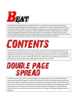
I choose this font and color scheme to create consistency throughout the magazine and appeal to the target audience. Red is used to make elements stand out while black provides contrast. The informal font style suggests the varied music genres featured inside will not be too serious.
These are my final decisions on the fonts I will use for my music magazine and the colour scheme I will use. There are also my final photos I will use in my magazine.
1. I choose this is my final front cover masthead as I think it is appropriate for a pop magazine following the
conventions and would appeal to the target audience. I used red as it is used on many magazine front covers
as it will help make the magazine stand out while also allowing it to be easily recognised as a music magazine.
I also choose to use black for second part to make it look different to other magazines while also creating a
contrast showing that the type of music featured inside is from varied genres. I choose the font I used as it
looked informal which would appeal to the target audience as they won’t want to read something very serious
so, the masthead would give an indication to what would be featured within the magazine.
I choose this font and colour scheme as it is quite similar to my front cover masthead creating a house style
throughout the magazine, however I made sure it was different so, it was more suitable for a contents page. I
choose red as the colour for my contents page masthead as it would stand out and also uses bright colours to
suggest the type of music inside. I also choose this font as it looked informal and followed the conventions of
the magazines I researched by having straight edges and being in a sans serif font.
I decided to use the same font as my contents page for my double page spread as it would help to create a
house stylethroughout the magazine making it look professional and also meaning the audience would easily
be able to recognise the magazine in the future from the font used throughout. Imade sure that the font was
easy to read, so the audience could instantly see what the article was about on the double page spread. When
choosing the font I also made sure it was bold so, it would stand out on the page and, I choose red for the
colour scheme as it was a bright colour and would contrast to any images on the page making both elements
stand out.