The document summarizes how the author's media product uses, develops, and challenges conventions of real music magazines. Specifically:
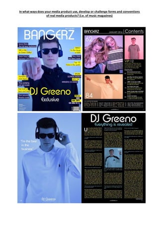
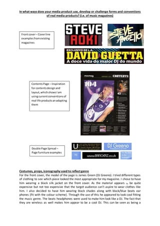
- The title, "Bangerz", uses an unconventional spelling but targets a younger audience. Design elements like font and issue labeling follow conventions.
- Page layouts, like the two-column contents page, follow conventions while adding original elements like multiple images.
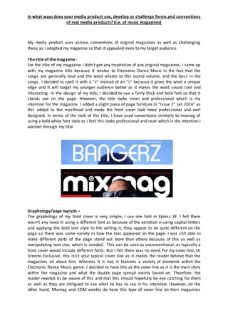
- Features like an exclusive interview on the double page spread develop on conventions by focusing on one artist rather than just providing information.
- Costumes and props used in photos, like headphones and clothing styles, reflect the electronic dance music genre and conventions used in other magazines to portray artists.